SlideMagic Blog

Frequent updates about all things presentations since 2008. Subscribe to never miss a post.

RSS

Dear Big Company

Most large companies have lost their ability to innovate and moved to a model of delivering small performance improvements quarter by quarter. Employees are often under a lot of pressure and busy with day-to-day activities that the help of freelancers is called in to supplement hands, brains, and most importantly distraction-free creativity.

As a freelancer, I try to accommodate the constraints of my big clients as best as I can. Reprioritise other clients, maybe work a few hours on the weekend now and then, trying to deliver the best work possible. Being flexible when some designs are considered “too creative”. Working with my direct contact points usually works great.

Then comes the accounting department. The electronic invoice of my highly efficient and transparent billing system gets printed out on paper, send across to a central pan-European payment processing centre, where a clerk discovers an error (info that probably sat in the body of the email or on page 2 of a PFD that did not get printed), marks the error and mails it back in regular mail from a European capital to Tel Aviv. I provide explanation by email, which get printed out, send to the processing centre, and goes back to me by mail.

Freelancers are consider suppliers, not employees, and get the supplier treatment. You did not get that PO number right, hah, hah, perfect excuse to postpone payment to you. Got you! We expect you to be flexible and human to meet that deadline, we on the other hand can be as flexible as a brick wall.

Continue reading →
·SlideMagic

SlideMagic bugs fixed

Presentation software needs to be absolutely bug free. Unlike a social media mobile app, where you can wait with grazing your news feed for a few hours, the presentation app needs to be ready for that critical 20 minute slot for the all-or-nothing presentation.

That is the reason I am keeping SlideMagic still in beta as I iron out all possible glitches. Here are some we fixed recently. If one of these caused you to stop using the app, give it another try.

  • Fixed: small (but annoying) differences in font size rendering between what you see in PDF and what you see on screen, causing words to drop to the next line when you don’t want them to.
  • Fixed: erratic font size behaviour when rapidly increasing or decreasing font sizes
  • Fixed: enabling multi-edit of cells to manage colours, font sizes of more than one cell in one go.
  • Fixed: no need to leave and re-enter the shape format menu to work on another cell
  • Fixed: Windows/Firefox UI freezes
  • Fixed: story mode drag and drop issues

SlideMagic is moving closer to production stability.

B.t.w, I updated the SlideMagic marketing site yesterday, making the positioning plain and simple: it is easy to make business presentations. Easy, that’s it. Also made the images a bit more daring.

Art: Scène d’été, or Summer Scene, is an oil on canvas painting by Frédéric Bazille, completed in 1869

·Data visualization

Graph screen shots

If you do not have access to the source data of a graph you have two approaches to getting the data into your presentation:

1. Use a screen shot

How to get the best looking chart from a screen shot:

  • Make the chart as big as possible on your screen. Sometimes you can click the graphic which opens in a new tab in your browser. In PDF, you can zoom in without losing quality. Take the screen shot of this big graph and paste it big in your slide.
  • Crop out all items of the graph that you can easily recreate in PowerPoint or Keynote: axis labels, chart titles, even the values on the X and Y axes. Next, recreate these items by hand in PowerPoint
  • Cover as many elements on the chart as possible with a white box. Legends for example hardly ever look good. Cover it and create your own.
  • Select the chart and pick “format picture” to see whether it looks better in black and white. Alternatively, use the colour picker to get your legend use the exact colour used in the chart.

2. Measure and recreate

When you do not use data labels in a chart (bar, column, line) but rely on a value axis instead, you can get a way with a lower of level of accuracy. You can literally print a chart out (the larger the better), measure the position of the data points and recreate the chart from scratch in PowerPoint or Keynote.

Continue reading →
·SlideMagic

SlideMagic example

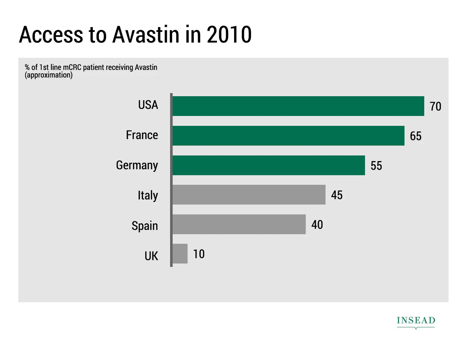
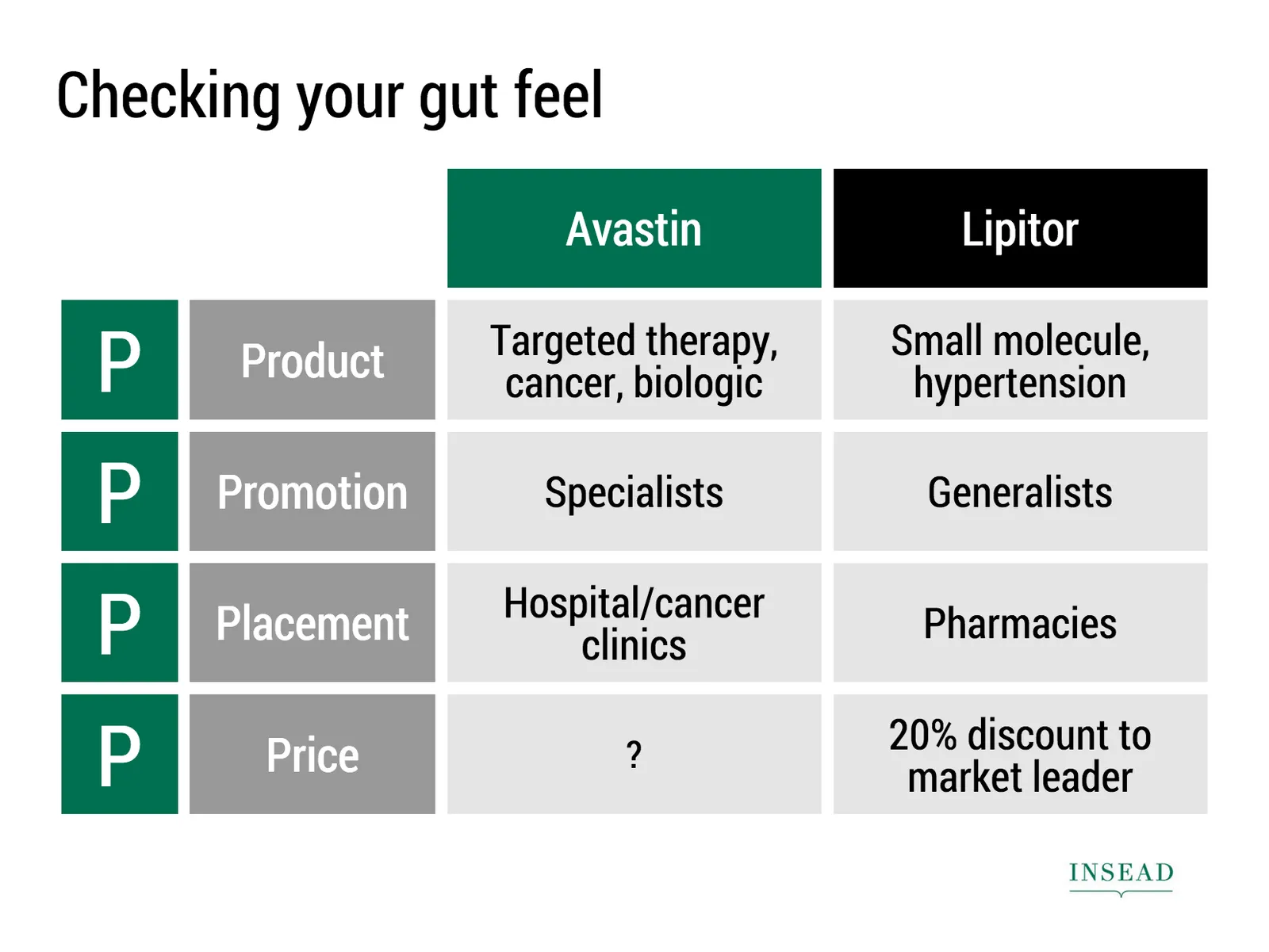
Ramzi Mrad is entrepreneur in residence at INSEAD and used SlideMagic prepare his presentation of business case: how Roche Pharmaceuticals set the price for its Avastin cancer drug in Europe. This type of presentation is exactly how I envisioned SlideMagic being used. Without any professional support, a layman designer can come up with something pretty decent. You can see his presentation here.

Art: Pierre-Denis Martin (1663–1742), Vue du Château de Fontainebleau (1718-1723)

·Delivery

Take that conference tag of

Name tags are a necessary evil when visiting a conference. The security guard can see you paid, and people can read your name, company, and role casually. It is also a great way to store the day program and your lunch coupons.

But when on stage, it looks a bit weird. When presenting right that moment, when someone watches the online video of the talk 6 months later, when the entire panel consists of 12 people with the 12 white dots on their shirts.

Oh, and also ask people to take of their tags when posing for a group photo.

Art: Albrecht Drurer, Portrait of a young Venetian woman, 1505

A brief review of Think with Paper by 53

I have been following Paper by 53 from the early days. It is a sketching and drawing app for iPad. The initial revenue model consisted of premium add ons (virtual pencils, pens, etc.), later they moved to hardware sales (a styles that is seamlessly integrated with the app).

Recently, they have extended/repositioned the app to corporate “white boarding”: designing, prototyping, brainstorming, mind mapping, problem solving, via a new release called Think.

Here is what I like:

  • Absolutely beautiful and gorgeous user interface. The pen strokes are the best I have seen on any iPad drawing/sketching app.
  • Brilliant user interface functionality. They really thought about what functionality you actually need, and then they put in the absolute minimal amount of features. You draw a box, the app cleans it up. Resizing, moving things around, perfect. Very short help videos are embedded to unstuck you if needed. Fantastic, I am jealous that I had to retain more functionality in my SlideMagic app.

Now, here is the problem that I see to get Think adopted broadly in the corporate world. And I share the pain, as I am trying to convince people in enterprises to change the presentation tools they are using.

  • White boarding is a group activity, and the current iPads are simply too small to work comfortably with multiple people. It is even a challenge for just one user. I suspect that we will see very large tablets and tablet/laptop hybrid touch screens in the near future which would solve this problem. My guess is that the huge “Minority Report”-style whiteboard that combines user input and rendering is still far away.
  • Dealing with text (important in corporate communications) is still a bit fiddly: you need to zoom in on an object, write with decent hand writing, then shrink it down again. I agree that introducing a character-based keyboard function would kill the UI and flow of the app. Still.
  • You still need some sort of artistic talent to create cute diagrams. Yes, the app does some work for you, but in the end you are confronted with an empty canvas that needs filling.
  • The app is completely anti-columns-and-rows (180 degrees difference with SlideMagic), but in the corporate world, that is how a lot of things need to be evaluated. Not every problem is a flowing diagram of interactions.
Continue reading →
·Investor presentation

Design DNA

Design DNA is engrained in a company. It shows in presentations, in the web site, in the way the office is laid out. When a visitor/user/viewer gets in touch with a company, she makes up her mind in the first millisecond about the design DNA of the company, by comparing it to all other presentations, web sites, and offices she has seen. We have all seen these stereotypes:

  • The bare bullet point presentation in the standard Microsoft Office 2007 format
  • The over-designed PowerPoint template with gradients, images with faded edges and huge logos at the top of the page
  • The social media expert website full of call to actions to buy her $5 ebook on being a social media expert
  • The traditional, hierarchal office with too many big leather board seats crammed around a too small board table in a board room that doubles as a storage room for exhibition displays
  • The hipster I-don’t-really-say-anything web site
  • The girly office full of plants and cute natural-material furniture
  • The macho office with an impressive collection of booz in the lunch room
  • The 1990s tech company web site: takes 40% of your screen and has detailed product hierarchies that get to pages that don’t really say much about that specific product
  • The startup web site where “tour”, “about us”, “benefits”, and “product” tabs pretty much say the same thing

At every point you come in contact with a client, user, investor, make sure you look the way you want to look. Even if your investor presentation looks right, that impression can be undone in one second when someone opens your web site.

Continue reading →
·SlideMagic

Dumbing down

Seth Godin believes that:

I have been thinking about this a lot, since it applies to the core idea behind SlideMagic: making a simpler presentation design tool. Usually, Seth is right, and he urges people not to avoid the inevitable critical feedback.

So, I am a dumbing down PowerPoint? I do not think so. These are two different things:

  1. Get people to adopt a different approach to presentation design
  2. Get people to use a different tool, but continue to follow their current presentation design habits

I try to do 1, and the SlideMagic tool supports the approach.

  • SlideMagic is a new corporate visual presentation language
  • It always looks aesthetically pleasing
  • 90% of your time can be spend on your idea, 10% on jotting it down at a computer

So I think I am “smarting down” business presentation design. But hey, maybe I am biased and do not see things as they really are…

Art: British war time propaganda poster

How to make frosted glass in PowerPoint

Follow these simple steps:

  1. Apply the “blur” photo filter to your background image
  2. Create a very light grey box
  3. Add 45% transparency

Diagrams that bring it all together

Strategy consultants or IT architects love the diagram-that-brings-it-all-together. Customer needs, key capabilities, competitive differentiations, routes to market, all glued together in harmony to describe that perfect concept. It makes perfect sense to you.

The problem: it is too much to digest for the person who sees the diagram for the first time.

One better approach is to start with stories for the individual bits of the concept, and only in the end stitch everything together. If you feel it hard to part with that diagram early in the presentation, you can put it up and jokingly brush it aside/apologise and say you are taking it a bit slower. After you have explained a component of the diagram you can slowly build the picture up step-by-step.

Art: Portrait of a Philosopher (Artist’s brother, Pavel Sergeyevich Popov), 1915