SlideMagic Blog

Frequent updates about all things presentations since 2008. Subscribe to never miss a post.

RSS

Do you need a 101 section?

Some presentations are highly technical, and are mostly designed for highly technical audiences, investor presentations for advanced biotech products for example. The question is, should you include a “101” section in the presentation that explains the technology to the layman?

My answer: yes.

One, it is useful for non-technical investors, but even for the die hard pro, it is good to frame the overall story in the right context. For these specialist audiences, this part of the presentation will only take 10 seconds, for novice audiences you will have to spend a lot more than that.

An added benefit is that the 101 analogy, freed of scientific detail, is often a better way to describe/visualise what the problem is you are actually solving, and why - until now - it has been so hard to crack by others.

·Colors

Colour schemes that work in PowerPoint

I am still breaking my head on this, but some colour schemes look great when you see them presented in a brand guideline, but look dull/boring in PowerPoint. More and more I think that this is because what PowerPoint is: basic slide compositions and boring/neutral Arial/Calibri fonts (especially to keep things readable on mobile devices).

  • Colours that come out poorly: earthy tones: brown, olive, curry, faded red, faded blue
  • Colours that come out great: bright and fresh purple/red, pink/blue, mint green, used as accent colours in compositions that are dominated by grey shades and big black contrasting typography.

One of the nice things about design is that you cannot always explain/rationalise why something “just is not right”.

Art: Peter Paul Rubens, Rainbow Landscape, 1636

Most VCs are reasonably smart people

Here is an excellent post about 16 startup metrics on the Andreessen Horrowitz blog. The content of the post is interesting, but what is even more interesting is the tone in which it is written. The tale of a sober, reasonable person having to undo reality distortion fields in investor pitch decks. Investors try to understand what is going on.

Here is what you should do:

  1. Understand what is going on yourself. Pick the relevant metrics for your business. See what is happening.
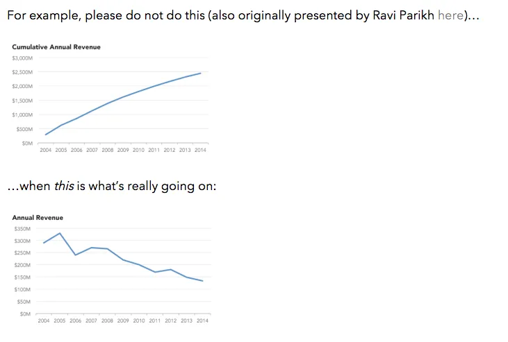
  2. Present what is going on reasonably honestly. There is no need to emphasise a poor statistic with highly effective data visualisation. But pulling a totally obvious trick (like a broken axis) will have zapped all your credibility before the VC is even trying to understand what the chart means.

·Investor presentation

Should you add financial projections in a startup pitch presentation?

Everyone knows that you made them up, nobody knows the future, all startup pitches predict hundreds of millions of revenues at some stage in the future. Why bother putting these shaky financials in?

Yes, there is no point in including your highly precise 10 year financial forecast model, exactly for these reasons, but, there is still a place for financials in your pitch. Here is what I usually do.

  • A reasonably detailed and precise “forecast” of the short term financials. In most startups, this usually involves only costs. And unlike the revenues, you can be pretty certain about where you are going to spend that investment on in the near future. The benefit: 1) investors know where their money goes, and 2) investors see that they are talking to a CEO who seems to know what she is doing, has things organised.
  • A very high level annual revenue outlook for the next 5 years. Nobody will pay much attention to this hockey stick chart.
  • But - and this is the useful bit - add another slide that shows in a few simple calculations what you would have to believe in order for that year 5 revenue and profit number to be true. The best is a multiplication of 5-10 simple numbers: # countries, people / country, market share, price / user, gross margin, fixed $ million cost. You teach the investor how your business model works (what factors are important) and provide a way to evaluate whether your forecast is highly optimistic, or totally insane. The underlying Excel model can still be very detailed (it should be), but the 5-10 numbers should be very simple. I have had design projects where the company went back and revisit the Excel model because of an inconsistency in these high level numbers.
Continue reading →
·Data visualization

Table or bar chart?

Back in the good old days at McKinsey, we tend to put any range of data in a column or bar chart, even if that meant a chart with just one column, or one chart.

A nice clean bar/column chart works beautifully to visualise a data range. Especially if there are big differences between the values of the chart. If the differences between the numbers is not that big (I do not like broken axes), or you have lots and lots of data to present (the data labels just become too small), I resort back to a simple table.

Stick all the data in, round things up nicely, and use accent/shading background colour to make your messages pop.

I must admit, I start using tables more and more. (And that is why they are so easy to make in SlideMagic)

Art: Louis-Philippe opening the Galerie des Batailles, 10 June 1837 (painted by François-Joseph Heim)

·Data visualization

Confusing ranges

A large of the data presented in business presentations is uncertain: future forecasts, market (share) estimates, competitive comparisons. Many people express that uncertainty by presenting numbers as ranges: cost per bottle as between $1.50 and $2.00.

While working with ranges might be required in a spreadsheet calculation, I don’t like to use them in presentations:

  • It clutters the slides with double the amount of data labels, and/or double the amount of text in tables
  • It becomes hard to work with totals, add things up. Five of these 1.5 to 2 becomes 7.5 to 10. Adding negative numbers into the equation will give totals that nobody can work out from the top of their head.

So what to do? I would stick the mid point of the ranges as a point estimate in the presentation, and makes sure it is a nice, rounded number (7.49544 looks to certain). Much simpler and much clearer.

Art: a painting depicting women inspecting silk, early 12th century, ink and colour on silk, by Emperor Huizong of Song.

·Images

Stock image sites come second

My use of images has changed a lot over the past year. I have now reached a point where stock image sites come in as a last resort. And when I do, clients often push back and ask me to look for something different than that cheesy, cliche, polished stock image.

So, most of my image search starts with Google Images, with the option “labelled for re-use”. or I browse through some of these excellent sources of free presentation images. (Although I must say that the latter now become so popular that you start recognising images instantly because of over-use).

·SlideMagic

Thoughts on user interfaces

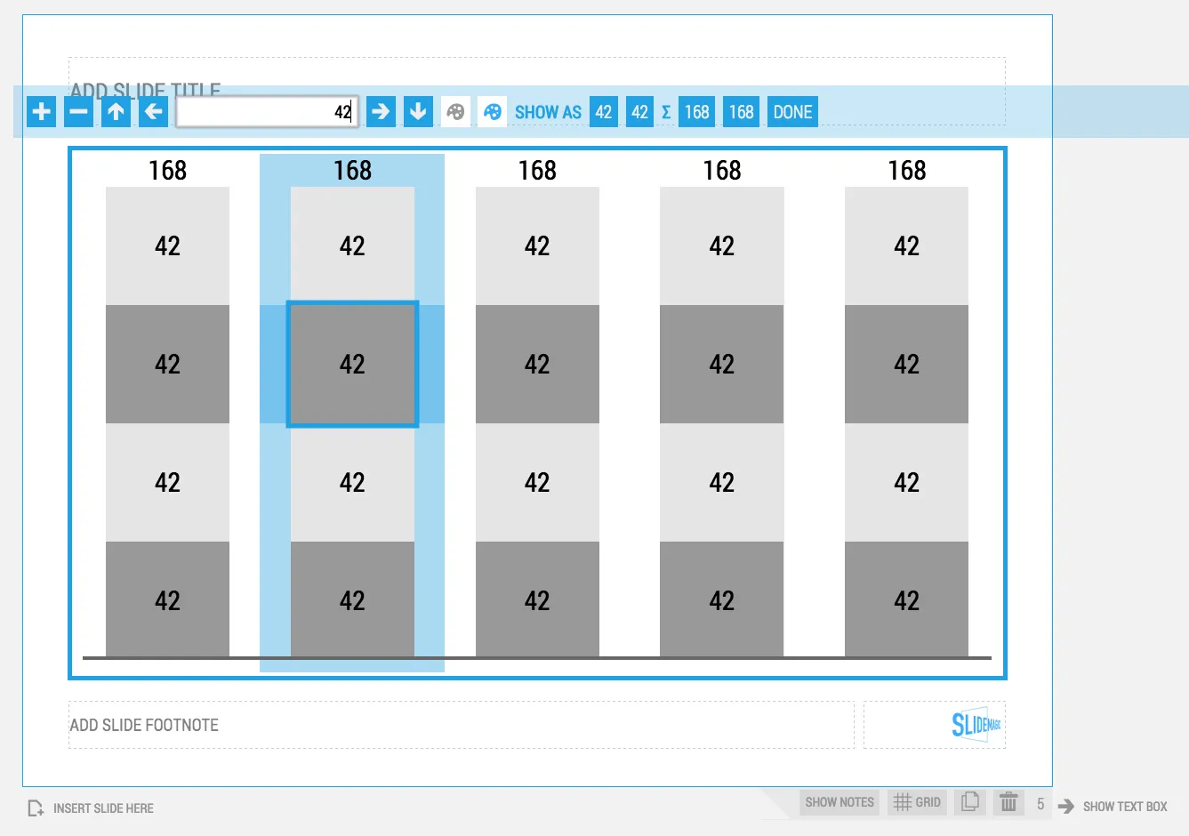
As I am making progress with my presentation design app SlideMagic, I spend a lot of time thinking about user interfaces (UI) for office applications.

Part of the reason that it is so hard to wean people of Microsoft Office applications is that they have gotten used to the mouse/click/dropdown user interface. Spreadsheets, word processors (who uses them still?) and presentation design software all basically have that same UI.

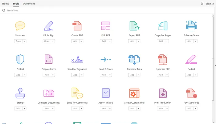
The drop down UI started out pretty simple. File, edit, help menus. Over the years ribbons and tool bars have complicated things. Most people now use a fraction of the functionality that is available to them. As soon as a program does not have that familiar dropdown UI, people are in trouble. I had a hard time understanding the new Adobe Acrobat UI. It is beautifully simple, but it takes time to figure out how to do very basic operations (zooming in and out, combining multiple files into one, rotating mixed up pages of a scan).

Over the past years, user have gotten to know a second UI: the mobile device. The solution for office apps is super simple functionality that draws heavily on icons, UI elements that we have learned from mobile devices.

See how it can work in SlideMagic.

·Sales presentation

Sales presentations can be technical presentations, and vice versa

Often, clients tell me that they have to present to an audience of engineers, so the presentation should not be a “marketing” presentation.

The bad interpretation of this is: we are engineers presenting to engineers, so we can get away with text-heavy slides and diagrams full of numbers. We engineers understand each other. As soon as we add pictures or try to make the presentation more visual in other ways, we lose credibility.

What is really going on is this: if you are selling a high tech product there is no way you can avoid well, talking about the technology. But the high tech world is full of presentations written by people who do not really understand the technology, for an audience who does not really understand the technology. These presentations lack substance but are rich in marketing buzzwords. Engineers will recognise them in a second, and don’t want you bring “one of those”.

We need to eliminate two misconceptions:

  • Technical presentation content cannot sell
  • A senior (and/or) sales presentation audience does not understand technology

Here are some of the things I do to create technical sales presentations:

  • Insist on explaining how it works in human language without “black boxes” or “secret sauces”. The Einstein quote about a 6 year old who can understand everything if told in the right way applies here.
  • Very focussed data visualisation. Technology advantages are often beautifully simple: things are faster, cheaper, smaller. Rather than writing a bullet point “we are 33% smaller”, put in that very complicated data chart that shows the full richness of your research, but add 2 big bold lines that are 33% apart.
·Story

Do you need the "Thank you" slide as the last page?

Here in Israel everyone puts a “Thank you” slide as the last page of the presenting. Almost to thank the audience as it is impossible for the voice to be heard during the roaring applause. People ask me, should you use it?

It depends how.

The huge “thank you” with a big cheesy stock image of applause is definitely not the way to go. A dense page the repeats/summarises the entire presentation in detail also won’t work.

You want to end any presentation with a strong upbeat message. The worst ending is, “well, this is it, we are running out of time, and I just managed to stay in my slot”. It is better to put up a slide that puts in some call to action: “Sign up now to change the world!” or something.

For investor presentations, this is a bit harder. “Wire to this bank account” is pushing it too much. In these cases I actually put up a slide with a small/subtle “Thank you” (for your attention) title and the contact details of the person in charge of fund raising at the bottom.

As a visual I tend to use the a memorable photo, graph, concept from the presentation that works as a memory shortcut to my entire story.