SlideMagic Blog

Frequent updates about all things presentations since 2008. Subscribe to never miss a post.

RSS
·SlideMagic

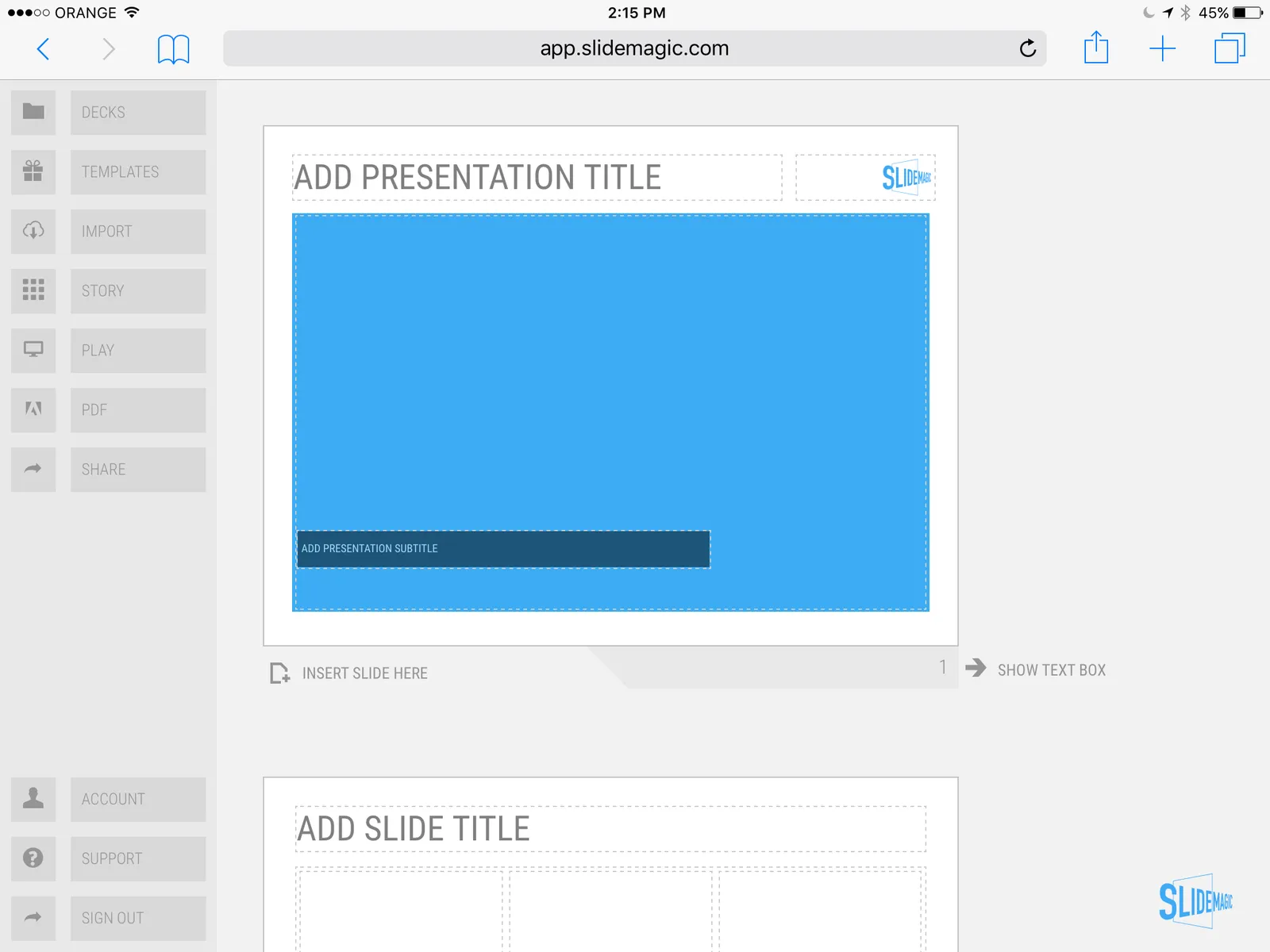
SlideMagic on iPad

I have never been a big believer in focussed and productive presentation design on tablets, but presenting documents (mostly in 1-on-1 meetings) and making last minutes edits are important on mobile devices.

We are not making tablets a design priority, but have deployed some changes to the code that makes SlideMagic run pretty smoothly on an iPad (iPhone is still not optimal). Try it out and report back any bugs. Android tablet users, let me know what happens (I have not tried things out there yet).

With the large iPad Pro coming out later this year, there could be a brighter future for SlideMagic on iPad given the very simple menu structure we use.

 Screen shot of SlideMagic on my iPad Mini 2

Screen shot of SlideMagic on my iPad Mini 2

McKinsey exhibit make-over with SlideMagic

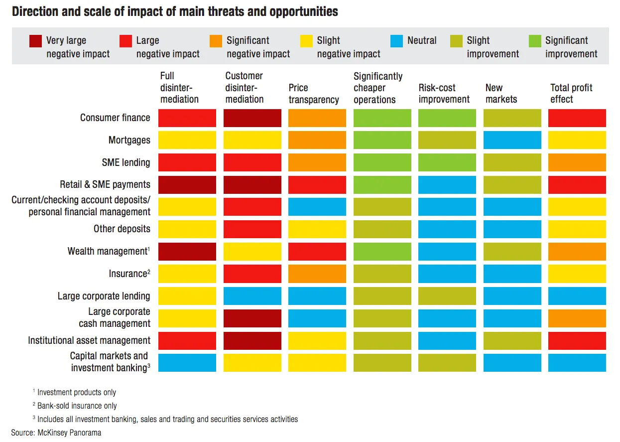
See the McKinsey exhibit below. (I found it in a LinkedIn stream, so I cannot source it to the original article.)

This table is an example of a pros/cons trade off or feature comparison matrix. I find them very useful to visualise the impact of multiple trends, or to trade off complex issues. Still there are a few things that can be improved:

  • The finance sectors are not ranked, it is better to sort them based on the total profit impact
  • There are too many steps in the scale, resulting in too many colours. And, the colours are not chosen according to a consistent colour scale. Especially the greens, they are different types of green
  • The title of the chart is woolly
  • The row labels are too long and complex
  • Column headings are not centred, they look weird
  • The foot notes are too prominent

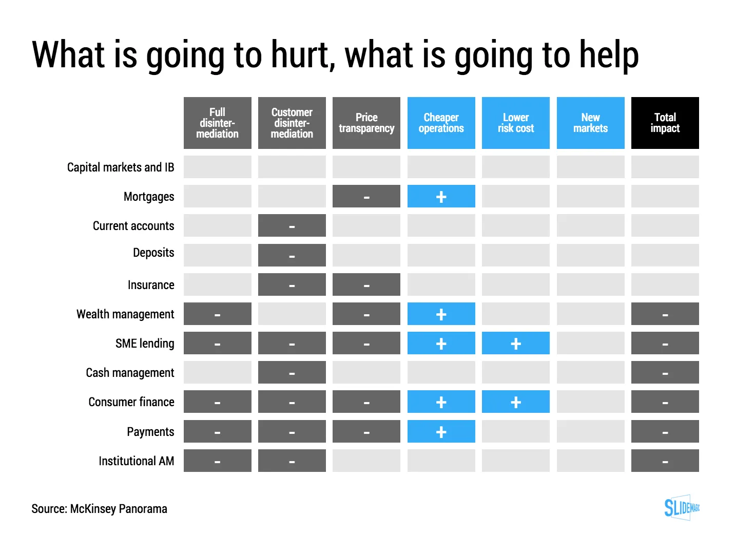
I have tried to recreate the chart in my presentation design tool SlideMagic. Manipulating tables in SlideMagic is especially easy since it uses a very strict grid system. I collapsed a number of categories into one. The result is that I lost some precision, but I gained a much better visual representation of the effects. If you want, you can add a second layer of data to this chart, by inserting numbers (on a scale from 1 to 7, or on a scale of -3 to +3) to show more granular data.

If you want to use this chart as a template for your own presentation, follow this link and clone the chart in your own SlideMagic decks.

·Story

3 steps to a good slide

Here are the basic 3 steps to come to a good presentation slide. And for 2, you do not have to be a stellar designer to get them right. For step 3, you can use my presentation design app SlideMagic)

  1. Decide on one message, one message only. Here is where most people go wrong: they try to put more than one idea on a slide. Too many things to grasp at once, too much content/clutter on the slide. Only if your message is: “There are 15 reasons why you should stop smoking”) might you consider a list of 15 small bullet points.
  2. Decide on a basic slide structure. The only structure most people use is the list. But there are other (simple) ones that you should consider. A contrast (box on the left, box on the right), a ranking (bar chart), an overlap (Venn diagram), pros and cons (table), cause effect. They are not that hard to put on a slide.
  3. Get the design right. Now, here it might be trickier for the layman. Fixing alignment, proportions, grids, colours, white space, etc. etc. SlideMagic users won’t have to worry much about this, for everyone else, here are some of the guidelines I have implemented in SlideMagic:
    1. Everything lines up
    2. Everything lines up according to a grid
    3. Calm colours: one accent, lots of shades of grey
    4. Safe (sans serif) font
    5. Slides look similar in one presentation (positioning of titles, margins, etc.)

There is no reason to get 1. or 2. wrong, and you can learn 3. over time.

Continue reading →
·Story

Contract editing versus presentation editing

In business, legal documents are edited in great detail. Exceptions here, clauses there, footnotes. It goes back and forth between parties. In this process that can take weeks, both sides get to know the text inside out. The dense text is actually a pretty useful format to communicate and avoid ambiguities.

Presentations are different. Most of the time, the audience sees the slides for the first time. Most of the time, they will see/internalise only part of the visual. Most of the time, the slide is a not a final legal document that will be signed right there and then.

So editing/designing slides can be a bit different. Distracting tangents, bubbles with exceptions, tiny footnotes. These details will not really register, and worse: confuse the audience. Editing a presentation is different from editing a contract.

Art: Pieter Brueghel the Younger, The Village Lawyer or The Tax Collector’s Office, 1626

·Images

NASA Apollo photo archive

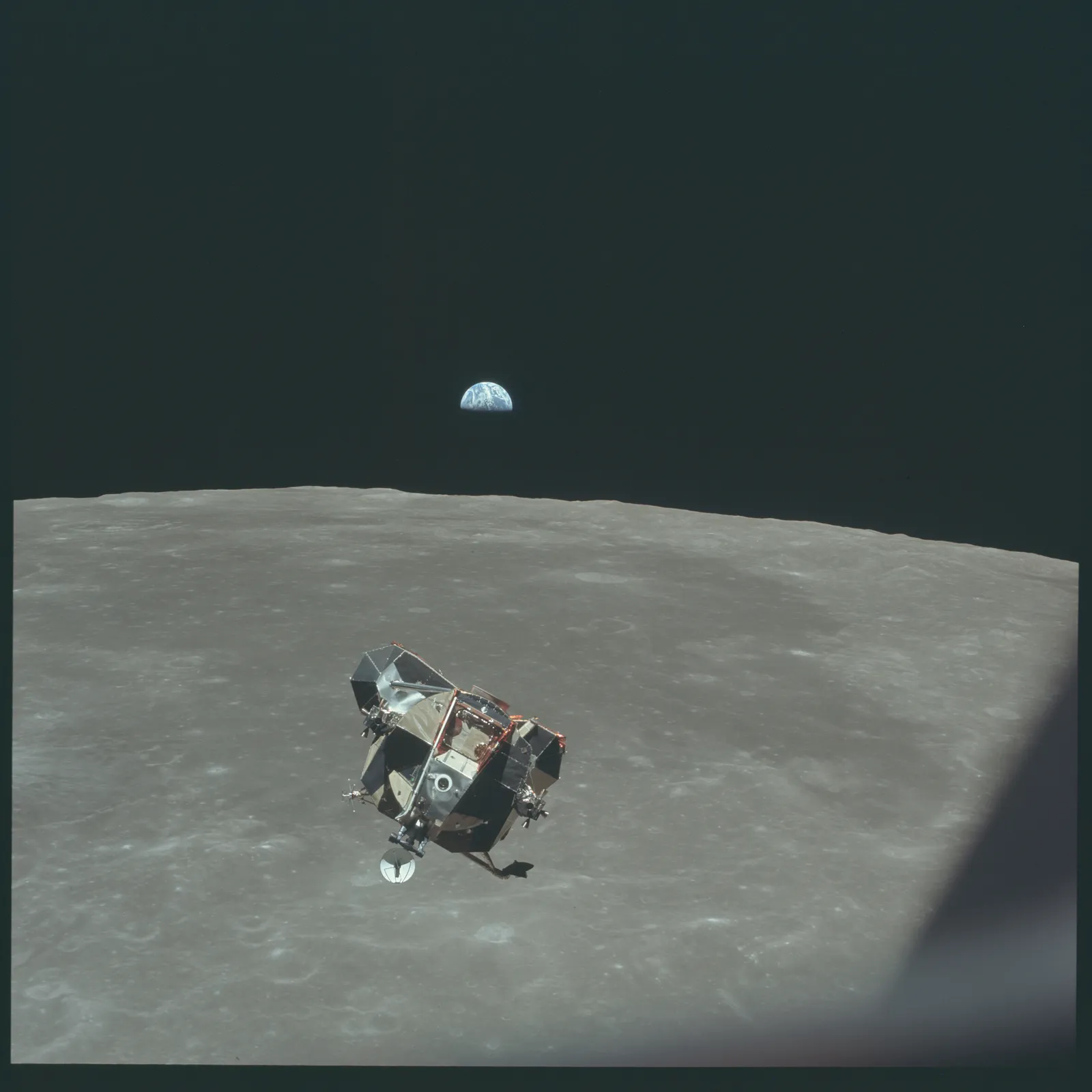
NASA has uploaded a ton of public domain images of its Apollo missions online. Free to use in presentations. You can find them here. You can find more sources of free images here.

Big pompous marketing slogans

Twenty years ago in business school we were taught that you should be able to express the customer benefit in one (and only one) sentence. Many have picked up on this habit. The mistake they make is to use that sentence directly for customer audiences. These statements are intended for the marketing strategists. Writing the sentence forces you to think who you are, and who you are not. Springing that marketing jargon directly to the consumer will lead to confusion.

  • The customer might not understand what it means: it is too vague / general
  • The customer might not understand what it means: it contains technical jargon
  • The customer might not believe it: it uses language that is overused by other products that have disappointed in the past
  • The customer might not believe it: it makes promises that seem too good to be true

Good marketing slogans / texts usually have 2 components:

  1. A very clear description of what it actually is you offer
  2. Some humorous, interesting twist that makes you remember what it is all about (after you understood number 1.)

AirBNB is a nice example. It does not talk about the ever changing world, increasingly busy life styles, premium relaxation, cross cultural enriching experiences, discerning travellers, price comparison versus hotels.

Art: detail of “Blah, blah, blah” by studio Louise Campbell

More than one captain on the ship

Writing presentations with multiple people can be challenging. Everyone has their own perspectives. Here are some ideas to stay productive:

  1. Quickly hack together a preliminary story flow as a check list that you have all required content on the radar screen. Resist the temptation to argue.
  2. Separate the work on the content charts, and the final story flow. Whatever the story flow ends up being, you need to those competitive positioning charts, P&L forecasts, team bios. Allocate responsibilities and get this work done.
  3. Once the building blocks are completed, sequence and stitch the flow of the presentation together. This is the point where you can argue and debate. Charts that summarise the flow can be designed after you have agreed what that flow is.
  4. The person who actually has to stand up and give the presentation has the decisive vote. If not, chances are that she will deviate from the group story flow while on the stage anyway. “What we really wanted to say is this” [click to page 15].

Art: James Tissot, Captain Frederick Gustavus Burnaby, 1870

Presentation designers vs. other designers

Every other project, I encounter other designers (web, print) at clients, and sometimes we end up having discussions about my project. Feedback I often get:

  • I use very basic fonts
  • I use old fashioned shapes, I do not use icons
  • I frame images on slides rather than letting them “bleed” of the page

Part of this is personal taste, part of this has to do with the world of presentations, which is different than other design disciplines

  • Fonts:
    • Presentations get edited by many people, on many different operating systems, all the time. These machines are unlikely to have the required custom fonts installed. Brochures are designed once and sent to print, presentations are live documents edited by groups of people.
    • Presentations are business documents that need a calm and professional look. Cute fonts might look nice on one page, but 40 pages in (once you got down to next year’s budget data), you get tired of tehm
  • Shapes and icons
    • Icons work in UI design, or on small mobile phone screens. Icons work if the user can remember them, see them often, repeatedly (the floppy disk to save a file for example). Icons that are less clear (a factory to visualise business), or cliche (dollar signs to show revenue). These icons take up space and do not add much value
    • Basic shapes without sophisticated borders and straight angles are calm, easy on the eye, and are very efficient to hold text and can be edited by non-designers
  • Framing images: there are a few types of presentations slides. Big images is one. But there are also tables, graphs, text pages, and girds of images/text boxes. While big images might look good bleeding of the page, it makes the design look less consistent with the other pages in the deck. Hence that I frame them most of the time, to make the title pop out of the slide without the need for semi transparent text backgrounds. Have a look of some of the classic graphic designers from the 1960s, they often frame images as well in white space.
Continue reading →
·Typography

Line breaks deserve your attention

When you write a block of text, the editor will insert line breaks without you noticing. Fonts are relatively small and the resulting text blocks look always good.

Designing presentation slides is different though. The position of every word and every line break counts. You face similar problems as the headline writer of a newspaper, or the designer of a poster.

  • Make sure important words that need to be seen together, stay together: “blue [break] ocean strategy” breaks the connection between critical words
  • Make sure the text is balanced across the page, without weird right paragraph endings. If required, change the font size to make words just fit, or drop to the next line. Add line breaks manually if you have to
  • And if it still does look weird, rewrite that headline into one that does look good

Yes, contradicting myself: my blog engine sometimes makes a mess of blog titles on certain screen sizes. I cannot control line breaks here…

Art: The Cliff Walk at Pourville, an 1882 painting by Claude Monet.

The new stack chart UI

I have recently deployed a new user interface for the stack chart in my presentation app SlideMagic. You can now edit things live on the screen rather than in a separate spreadsheet.

Stack charts are the biggest UI challenge of SlideMagic. How to keep them simple… It is getting there but not perfect yet, I still need to fix the suggested rounding algorithm and make it easier to create a legend. Let me know your thoughts.