SlideMagic Blog

Frequent updates about all things presentations since 2008. Subscribe to never miss a post.

RSS
·Sales presentation

Pitch to self versus pitch to customer

Many marketing documents are written to pitch to the author, not the potential customer. When pitching to yourself:

  • You do not have to explain what your solution actually does, you know it already
  • You can boil down critical aspects of the pitch in just a few “place holder words”. Reading them will trigger your memory to pull up 15 pages of value proposition in a nano second
  • You have a lot of different customer segments to worry about, so you dilute the story a bit to appeal to as many different customers there are, emphasising a few extra benefits here and there
  • You do not have to explain technical marketing jargon, as an expert you know it all

Think about this.

Image: Hollywood actress Constance Talmadge, head-and-shoulders portrait, facing right, looking into mirror.

·Layout

Lining up logos with tag lines

Often, graphics design is about details. It is difficult to pin down why something just does not look right. The answer: small little things. See the bottom of a magazine ad below. The logos on the left and right have tag lines/sub brands: above on the left, and below on the right. The graphics designer simply centred the image files, but our eyes wants to centre not the entire image, but the main text of the logo. It looks like the logo on the right is positioned too high.

If you cannot get excited by this you should not become a graphics designer…

Illustration: Gemini constellation

·Creativity

No, also presentations cannot be designed by committee

Marketing, Investor relations, corporate communications, business development, everyone likes to have a say in the design of the next keynote address of the CEO at that important industry conference.

When the team “works” on a presentation, you usually get the following pattern:

  • Long meetings in a conference room, with a few people dialing in by phone (people who cannot see the slides), discussing the key messages on each slide
  • Long email exchanges without an organised discussion thread to log changes

Design by committee also does not work for presentations. Here is why it goes wrong:

  • In the end, you need to pick a consistent approach to the story. Mixing and matching parts of approach A and parts of approach B is not going to give you a “best of both worlds” result. The only way to get something consistent is to have one person write it.
  • A committee focuses on the slides, adding footnotes, changing headlines, shuffling the order. And while doing that, they feel like they are “programming” the verbatim of the CEO (who is not in the room). Wrong, in the end the CEO will pick his own story, sometimes despite the slides.
  • In a committee there is no one doing the real work, at the end of the meeting, the most junior person at the table probably gets tasked with “incorporate all comments into a new version and email it around by 9AM”. That junior person might have dropped / not understood a few comments, and probably lacks the spine to push back against more senior executive in the company (who made a point that does not make sense).
  • You will for sure miss the contribution of introverts
  • The casual observer in a committee meeting often does not have the in-depth understanding of how the presentation is built, and what is written on which slide. As a result, noticing that important elements are missing, she will suggest to add comments, bubbles, and footnotes on random slides to make sure that the key messages are “at least written down somewhere”.
  • Committees under time pressure like to give drastic input. After a 3 hour discussion: “oh yeah, the deck is too long, collapse 35 slides into 10”, leaving the junior team member confused what to do.
Continue reading →
·SlideMagic

Multiple weak signals make a strong one

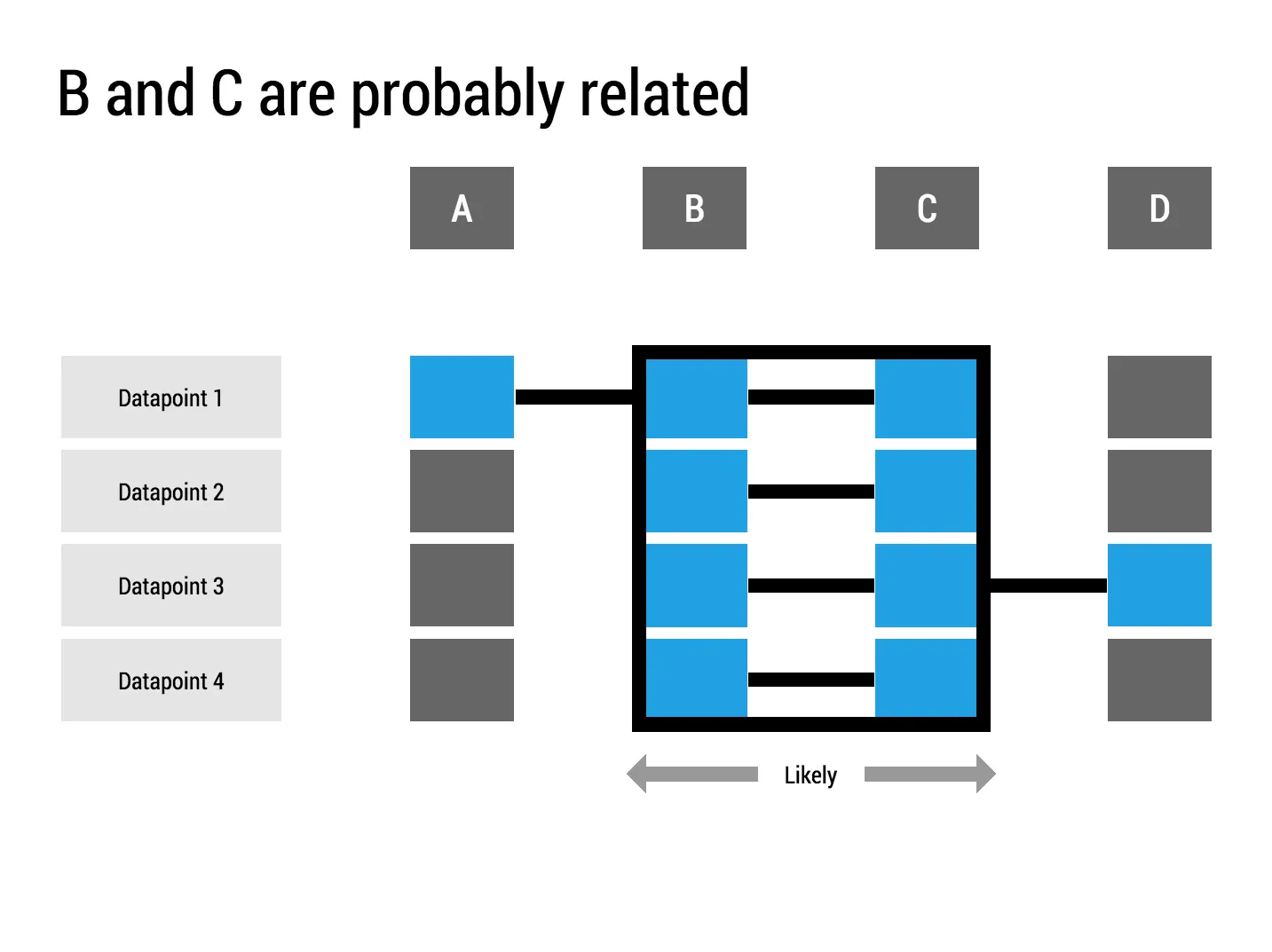
I played around with the new “connectors” in my presentation app SlideMagic and used them to create a chart that visualises how multiple weak signals can come together into a strong one. I have added this chart to the SlideMagic template with charts that I discussed on the blog, you can clone it to your SlideMagic account here.

The slides from my talk at Microsoft TLV

The accelerator of Microsoft Ventures Tel Aviv invited me to speak this week. I used my presentation app SlideMagic for the design and presentation of the slides (in the lion’s den of PowerPoint). You can view and clone the slides to your own SlideMagic account here. If you do not have an account yet, the app will let you create one.

Some of these slides are hard to understand without verbal explanation. But, this presentation pretty much follows the narrative of my book about presentation design. Check it out, it is free to read.

·Story

Where to put the team page?

This is the dilemma in many investor presentations, in the front, in the back? Usually, I put the team slide in the second half of the presentation, after you tackled the pitch of the problem/solution. The slide sits in the “about” section, alongside financials, organisation, milestones, etc.

There are exceptions, here are some reasons to put your team slide in the front:

  • The team is actually the key story of the pitch: if your company consists of unusual people (the former this, the former that), than better start with it right
  • The majority of your team is sitting in the room, physically. A team slide upfront is a great background for the introduction of your people
  • Your company is all about combining different disciplines, which have never been combined before. A time slide (specifically designed to show the cross-functional expertise) might help support this point.

I usually design 2 versions of the team slide:

  • A summary slide that highlights the main message about team that you want to emphasise (we worked together for 5 years before, we worked for very important companies before, each of us has 5 patents, etc.)
  • In the appendix of the document a more elaborate, traditional CV description of the backgrounds, you can use font size 8 here.

Art: Scotland Forever! by Elizabeth Thompson, 1881

Don't fill the time because you can

“How much time do I have?” is the first question many speakers ask when getting invited to speak at an event. It is an important question: a 5 minute presentation is dramatically different from a 20 minute one. Beyond 20 minutes though, it does not make that much of a difference. These presentations are “long”. I very much doubt that you will do a better job in convincing your audience in 60 minutes than in 20. In fact the opposite might be true.

If you get offered a 60 minute slot, ask yourself whether you really need it, or you should cut it to 20-30 minutes instead.

Image taken from WikiPedia

Breathe

If you answer a question with lots and lots and lots and lots of information, and can indicate a number of things:

  • You know a lot about the substance
  • You are insecure
  • You don’t really know the answer and try to talk around it
  • You will be difficult to work with because it is hard to interrupt you and engage in a dialogue
  • You did not understand the question fully and try to make sure to answer any related question

Better to answer that question short and to the point.

Art: Joseph Ducreux, [Self Portrait](https://en.wikipedia.org/wiki/Joseph_Ducreux#/media/File:Joseph_Ducreux_(French_-_Self-Portrait,_Yawning_-_Google_Art_Project.jpg), 1783

Watch out with "super slick"

Many of my clients start our conversation with a request for a “super slick” presentation. I think “slick” is not the most important requirement of a business presentation. I usually go for a restrained, professional look. Here is why too much slickness might backfire:

  • Nobody trusts a smooth talking politician or car salesman. Super slick graphics might just give the impression that there is something to hide.
  • Spectacular moving visual effects might just make the audience giggle, because it sort seems out of place for the setting of a small conference room presentation
  • Complex graphics create technical and practical problems. They take a lot of space making it harder to share documents, videos often go wrong in live presentations, breaking the flow/momentum of a pitch, custom-made graphics are hard to edit and change (presentations are living creations that change all the time), fonts always create problems when they are not installed properly
  • “The cliff”: often I see incredibly sophisticated presentation starts (slide, 1, 2, 3), but pages 4 to 50 look incredibly boring with standard bullet point slides.
  • Often the key to a pitch is not a dramatic trend, but a small, clever innovation that makes you stand out. Investing a lot of time (and money) in visualising a mega trend that is already pretty obvious to everyone (“facebook is big” for example) is a waste of effort and takes the attention away from the really important point in your presentation

“Slick” does not always help to make your message clear.

Continue reading →
·Books

Free presentation design resources

This may sound like a link bait title, but there is a lot of useful stuff buried in the archives of my blog that is there free for you to use. Click the “3 dots” at the top right of the site to access a drop down menu with more options. Among them:

And of course there is the full version of my book about presentation design that can be accessed free of charge.

Art: Jan Davidsz. de Heem, Still-Life of Books, 1628