SlideMagic Blog

Frequent updates about all things presentations since 2008. Subscribe to never miss a post.

RSS

What makes a presentation look professional?

It is hard to nail down why good design looks good, and poor design does not. We see it, but articulating why, it is hard. A good designer has an “eye” for design (a combination of talent and experience) to make things just look right.

Having said that, here are some of the things to pay attention to.

  • Layout along a grid, everything is spaced out, lines up
  • Restraint:
    • Colours, not too many
    • White space, have the courage to leave things blank
    • Font sizes, maybe smaller is better than screaming big, if it adds white space to the page
  • Limited number of words per line (10 points text on a 16:9 slide spanning the entire width does not read very well) and carefully selected line breaks
  • Nice images that set the right mood (avoid cliche stock images)
  • Use vertical positioning as well as horizontal ones (a different way of saying there are more slide compositions than lists)
  • People thought about every word, sentence, shape on the page. Changed it, repositioned it. Changed it again. Good slides very rarely come out right in the first iteration.

All the above can be found in any design book. We read it, we understand it, and still when opening a PowerPoint template when we are back at work, we ignore pretty much all the rules.

A good exercise could be to make one slide (just one), look exactly like a poster designed by a Swiss graphic designer from the 1960s that you like, or maybe like a slide that Steve Jobs used once. Push yourself really hard until the style is identical. You will be surprised by the amount of changes you need to apply to your design.

Continue reading →

"The technology is not important"

Founders tend to cut out slides about the technology of a startup in an investor presentation. Too detailed, too difficult, they (potential investors) won’t understand.

But I usually push back. In early stage startups, the technology is actually almost the only asset the company has. And, every technology, yes every technology can be explained and understood (it is a presenter problem, not an audience problem). Believing that you can’t might also cause huge offense with your potential investor.

And there is the opportunity to show how clever your platform is. Here are some steps that I usually take when presenting technology to investors:

  • Find out what bits are interesting, innovative, and what bits are not. In IT for example, there is usually some process: we load the data, we do this to it, then store it there, sync it here. But usually, one of these steps is the clever one. An approach to an algorithm nobody has taken before for example.
  • Dive really deep into the interesting bits, and leave everything else at a higher level. Invent, show a case example where your technology comes up wit something counter intuitive, unexpected.
  • Quantify, make it tangible where possible. If this is big data, show how much data you need to process.
  • Clean up diagrams (architectures, process flows), re size boxes, align them on a grid, group things that belong together, use colours. You will notice that even the most complicated architectures can be visualised in a simple way. Listen to how the “technical guy” talks you through his diagrams. Often it will be completely different from what is on the slide. Ditch the existing visual diagram and visualise the verbal one.
Continue reading →

A nice pie chart background

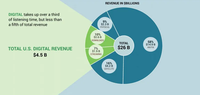
I saw this pie chart in the presentation below (full of interesting Internet stats). It is interesting to extent the chart into its own background. It is easy to recreate with some triangles and rectangles, you need to fiddle a bit with the angles of the triangles to get it right.

Here is the full presentation in case you are interested:

Art: Still Life with Turkey Pie, 1627, Pieter Claesz

Arrows in SlideMagic

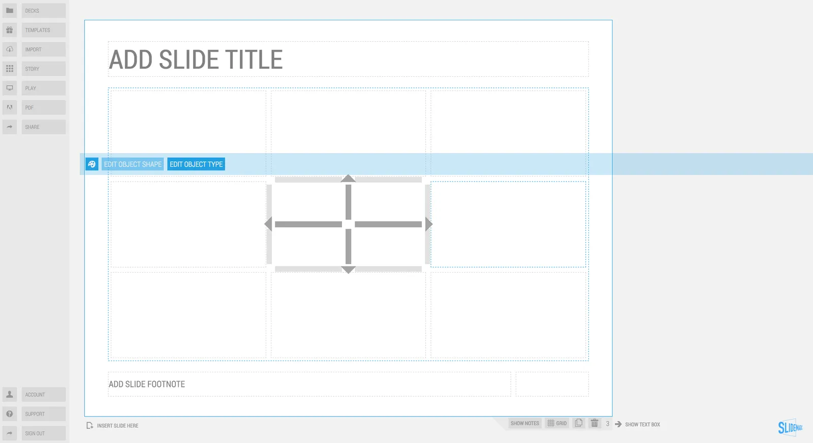
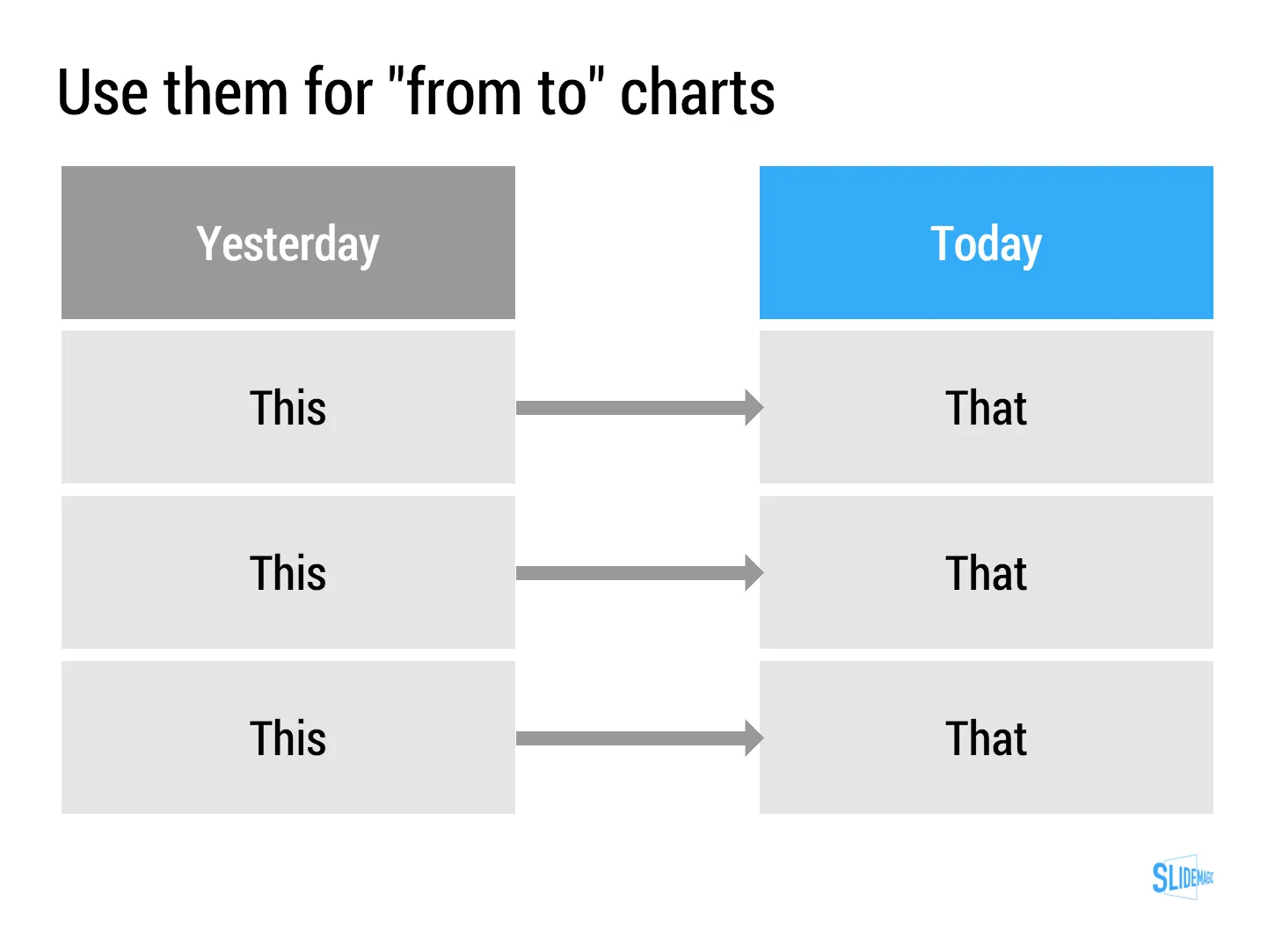
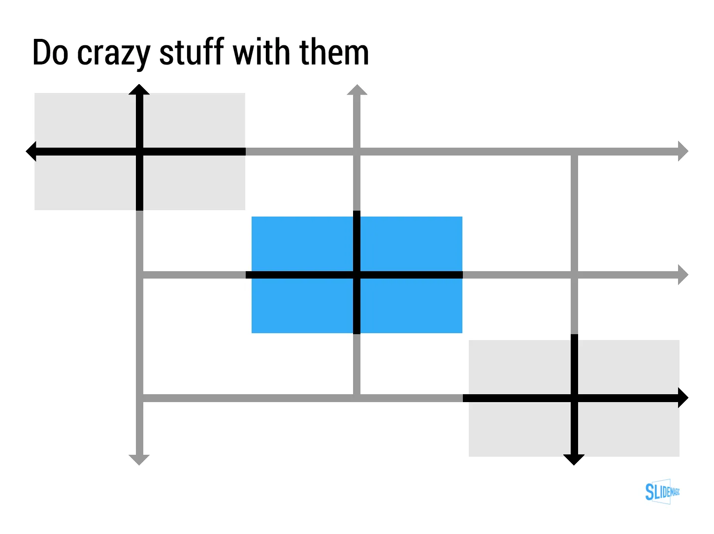
Based on many requests, we deployed the ability to create arrows in SlideMagic. You will notice a more elaborate user interface when working with connector objects. Try them out and let me know what you think.

Art: Guido Reni, Reclining Venus with Cupid, 1639

·Hardware

Presentations on mobile devices - taking stock

Five years after the iPad launch let’s take a step back and see what is actually happening in the world of presentation software and the use of mobile devices. My observations are based on the people I see around me everyday: startup employees (mostly mid 30s to 40s) and staff in big corporates (a bit older).

  • Designing. Apple has made a big inroad in terms of hardware, but it is still PowerPoint that runs on a laptop machine that is the preferred set up to create slides. I have not encountered anyone who uses a mobile device to do this. Apple Keynote is pretty much still a niche application.
  • Frankensteining / finding stuff. Cloud-based file systems can be confusing to use. I still do not understand exactly what happens when Keynote on iPad tells me it is converting a regular Keynote file. In practice, the file system that everyone is using is… the email inbox and sent box. People with gmail can find stuff faster than Outlook users.
  • Viewing. Yes, more and more, people use their mobile devices to view a presentation. And it is not the iPad, a tablet, it is the mobile phone, where people squint to see what is in the slides. These are investors looking at a pitch deck, these are managers/superiors proving input on a slide. Think about it, this might be a more important audience for your slides than the ones sitting in conference room.
  • Emergency edits. Still laptop, although a tablet could work here, few people use it in a corporate setting.
  • Coffee chat, 1 on 1. Mostly laptop, I see fewer iPad/tablets than I saw 1-2 years ago.
  • Conference room. Laptop. The crappy VGA projector is being replaced by crappy LCD screens. Presentations that look beautiful on your retina display, look absolutely horrible on an LCD screen with poor resolution and overly bright settings. (Test, test, test). Advanced meeting rooms now allow you to airplay your presentations into the screen. People use their laptops to do this, not their mobile devices.
  • Big keynote. Conference laptop with a memory stick plugged in.
Continue reading →

"I don't believe you"

The other day I had a frank discussion with a client. Usually, when an investor does not believe you, she might ask a polite clarification question, leave some hints in her body language, but most of the times, probably move on.

When preparing the pitch, we can be more frank. The answers to the “I don’t believe you” point were as follows.

  • Repeat the description of what the system can do one more time. But I understand that that is what the system is supposed to do, I just don’t believe it can deliver.
  • Remind me of the credibility founder. Yes, the track record of the entrepreneur is very impressive, and no, I have not doubted a single second that there was an issue with the management team. I am just suspicious that the technology cannot deliver what it promises.
  • State that my question is really, really easy to address, but that I fail to understand the big questions that I should be asking: how to make money of this. (And then the second question is answered, not the first one).

Answer the investor’s question, even if you think it is not a smart one, or the right one. If not answered, you will have had a nice meeting, but blocked the door to the next step in the due diligence process.

Text: “[The Ghent Altarpiece - Singing Angels (detail)](“Jan van Eyck - The Ghent Altarpiece - Singing Angels (detail) - WGA07642” by Jan van Eyck (circa 1390–1441) - Web Gallery of Art:   Image  Info about artwork. Licensed under Public Domain via Commons - https://commons.wikimedia.org/wiki/File:Jan_van_Eyck_-_The_Ghent_Altarpiece_-_Singing_Angels_(detail)_-_WGA07642.jpg#/media/File:Jan_van_Eyck_-_The_Ghent_Altarpiece_-_Singing_Angels_(detail)_-_WGA07642.jpg)” by Jan van Eyck (circa 1390–1441)

·Story

Let go

Some presentations stay in use for years. The designer has made small updates to slides, but overall the document has not changed. While the slides are more or less the same, the story probably has moved on.

Signs that this is the case:

  • The presenter puts the first slide on, and then runs the entire presentation without clicking to the next slide
  • The presenter discounts every slide, “what this slide really should say is [this] and [that]”
  • The presenter skips through the presentation

If this is happening, it is time to let go of the presentation and create a new one from scratch. A fresh presentation that follows the narrative of your latest story.

I tried doing this the other day, but when asked for feedback, I got the old presentation back with bullet point added here and there, because “it was more familiar to edit” than the new one. I am going to push back.

When it does not work out

I design probably around 100 presentations per year and over the past decade or so there have been a few projects (out of 1000+) where it did not work out between me and the client.

  • The biggest one: the story was actually not that compelling. Even the best design effort can turn a poor story into a great one
  • The client insisting on very remote, forced, unnatural visual analogies.
  • The client insisting on overly “spectacular” animations and graphics (1. I think they do not add anything to the story, the opposite is probably true, and 2. they are hard to do in PowerPoint).
  • Not being at the core of the design process, when you are 2-3 steps away from another team that is writing the story and designing slides.

Art: Escape from the ‘Luxborough Galley’John Cleveley the Elder, 1760

·Software

How to recover lost PowerPoint 2016 files after a crash

Note: this blog post discusses PowerPoint 2016 for Mac.

PowerPoint 2016 is great, but it still crashes left right and centre, all the time. Autorecovery does not always work, and when you forgot to hit SAVE every 5 minutes in the heat of a presentation design project, you are stuck.

The good news: you can often recover data, even when PowerPoint thinks it is lost.

PowerPoint autosaves your files in the background, without your realising it. Make sure you have switched this on, you can set the save interval in PowerPoint settings:

Normally after a crash, PowerPoint will automatically restart and present you with the last file that was auto saved. Normally… If not, try the following.

  • In the Mac finder window, open the “Go” drop down, press ALT, to show the LIBRARY folder and click it.
  • Once in Library, go to  Containers > com.microsoft.Powerpoint > Data > Library > Preferences > AutoRecovery
  • Have a look at the files there and spot a file with a “_autorecover” ending to its name, taking into account the time it was saved.
  • Copy this file just to make sure
  • Rename this copied file with the “.pptm” extension at the end. Ignore all warnings you are presented with.
  • Double click the file and cross your fingers

There is no 100% guarantee this will work, but it is worth a try

One more tip: as soon as you see the small “spiral of death” spinning across the PowerPoint screen develop the instant reaction to take a screen shot of the application. If you are lucky and you grab the slide sorter window, you have captured a miniature icon of all your slides, which should save a lot of time recreating them. Worst case, you just got the thumbnails on the left of your screen that are in the regular slide editing window.

Continue reading →
·Story

Presenting the recommendations

After 3 months of hard work, your project is finished and you have been invited by the CEO to present the results. What to do?

  • Wrong: present the project process. This is the team, this is when we kicked off, then we did this, then we did that, then we involved this, then we did that.
  • Wrong: put the entire document in PowerPoint and present the full detail of all the analysis, wait with the conclusion until the very last slide
  • Wrong: give a very high level fluffy summary full of buzzwords

So what is right?

  • A very short background of the project and who was involved
  • A clear articulation of the decisions you want approved
  • Detailed backup/rationales for decisions that are not “no brainers” (a complicated trade off of multiple factors, an analysis with surprising/counter-intuitive results)

Not presenting all the work does not mean it was a waste of time. It was necessary work to get you to suggest the decisions.

Art: 1965/1 - ∞: Detail 2.289.862 - 2.307.403, Roman Opalka, Neue Nationalgalerie, Berlin, image by Esther Westerveld