SlideMagic Blog

Frequent updates about all things presentations since 2008. Subscribe to never miss a post.

RSS
·Software

The user is always right

Sometimes I get the strangest support questions by users of my [presentation app SlideMagic](http://Mobile/tablet apps all look very cute but it is often incredibly difficult to find the most obvious functions.). Obviously, the user did not explore the help pages, or did not try out all the menu options, or did not understand the philosophy behind SlideMagic. Initially, I felt like pointing that out. Now I figured out that it is my problem, not the user’s.

User interface is entering an interesting phase. Mobile/tablet apps all look very cute but it is often incredibly difficult to find the most obvious functions. Desktop/laptop applications have become so bloated that obvious functions are hard to find, or are still in places “because they have always been there for the past 10 years” to serve the large install base of users. Every time I set up a new presentation, or create a new slide in PowerPoint I find myself doing a large number of repeat clicks (by now at incredible speed) that basically do very simple things (creating and aligning a grid of boxes for example).

I keep on trying to get it right.

Art: Vladimir Makovsky, Teacher Visiting a Village, 1897

·Images

Selfies are not professional head shots

Images are a great way to liven up an “about” page on a web site or a team page in a presentation. The best images are the one where all team members are present in one image. You can overlay name tags and get a great composition. No issues with images in a different style, images that are outdated. And it shows how well the team works together.

Second best alternative is individual images. But please avoid selfies. Most people assume that where-is-the-button-I-need-to-press look when taking a selfie. It does not come across very professional. The least you can do is ask a colleague to take a quick picture with your phone if you are in a hurry.

What if things did not change that much?

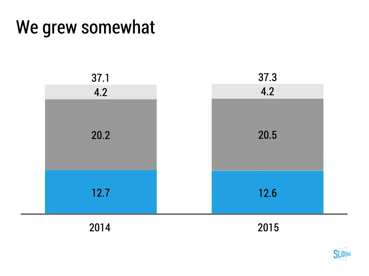
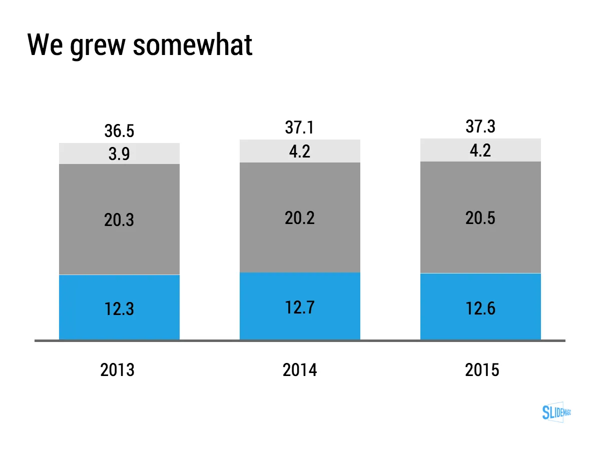
Many large companies grow only a few % points per year. They are large and mature businesses. And many quarterly investor presentations have charts like this in them:

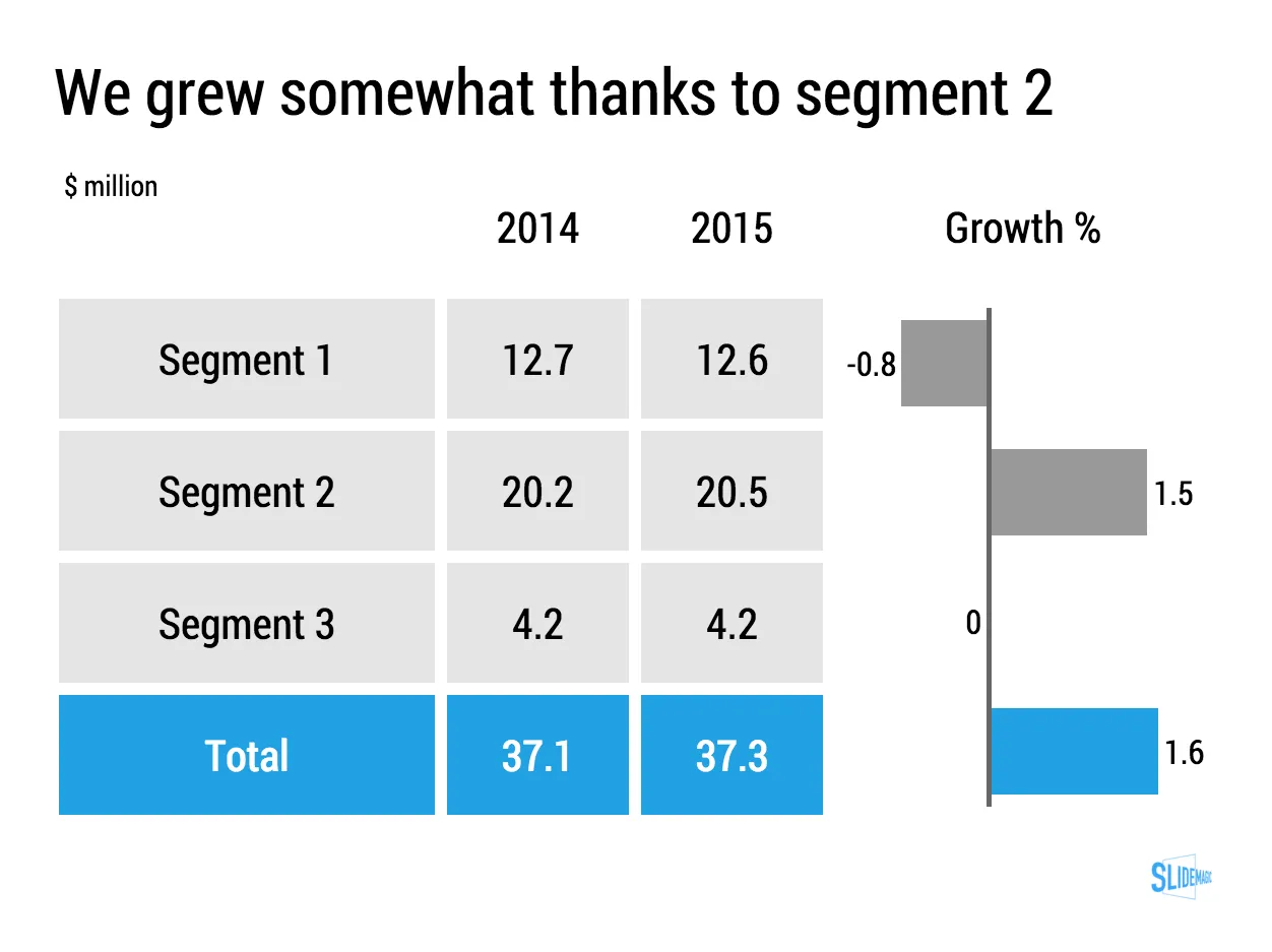
When things don’t change that much, a stacked column chart like this one might not be the best way to show the data, maybe a good old table is better. Stacked column chart show the relative proportion of values at the expense of legibility, especially for small categories that can be hard to read. If nothing changes in the proportions, a table will be easier to digest.

For these big companies, analysts do not focus that much on the absolute numbers, it is the differences in growth percentages that matter. To give the growth numbers more visual power, a combination of a table and a bar chart can be a powerful visual tool.

You can clone this chart and others that I used on the blog into your own SlideMagic account buy clicking this link.

Art: Portrait of Daniel Lambert

PowerPoint conversion is now live

PowerPoint conversion is now live in the SlideMagic app. The back office workflow is still a bit improvised, but it works.

I see many users requesting PowerPoint conversions of the SlideMagic templates, in the hope that they can use the simple SlideMagic slide manipulation functionality in good old PowerPoint. That will not work in most cases. All elements of a SlideMagic chart line up beautifully in a grid, and when converted to PowerPoint, all these blocks become individual PowerPoint shapes. If you do not touch them, they look great, but try to make changes to a slide layout, and you have to go through tricky resizing and re-alignment exercises. It is this type of work that probably makes up 50% of my bespoke presentation design work and which was the main driver to try to automate it.

Before committing to developing SlideMagic, I have tried extensively to program a smart PowerPoint template that could do similar things, but I could not get it to a level that was simple enough for a layman designer to use it. Believe me, I tried (really hard).

I hope that SlideMagic users will feel increased confidence to give the app a try now that they know that there is always a way back to PowerPoint, if they want. But at the same time, I think users that have given the app a real opportunity to show itself (create one presentation start to finish), will see the limitations of PowerPoint and make the switch.

Whether there will be a PowerPoint import feature as well? The answer is a definitive “no”. Because of the fundamental differences in design approach SlideMagic takes, it is not possible to convert PowerPoint into SlideMagic presentations.


Continue reading →
·Investor presentation

Two related product stories

Sometimes, your company has 2 products with similar, but different stories. Pitch the products in full detail sequentially duplicates some of the common parts of the story (and bores the audience) A generic pitch followed by example 1 and example 2 makes the product pitches too weak.

A possible solution that I recently applied to a medical technology startup:

  • Layout the basic idea behind the innovation that is shared between the products, not necessarily as a pitch, but more to educate the audience
  • Set up the company as a combination of 2 parts
  • Do a full pitch for product 1 (without repeating the basic concept that was explained in the introduction)
  • Do a slightly shorter pitch for product 2, just highlighting the differences in the technology for product 2 compared to product 1.

Art: John Everett Millais: Twins, Kate Hoare and Grace Hoare, 1876

Citrix slide make over

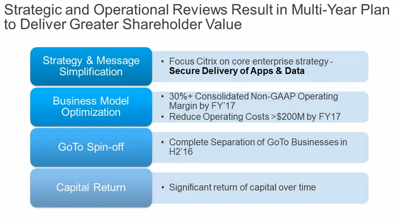
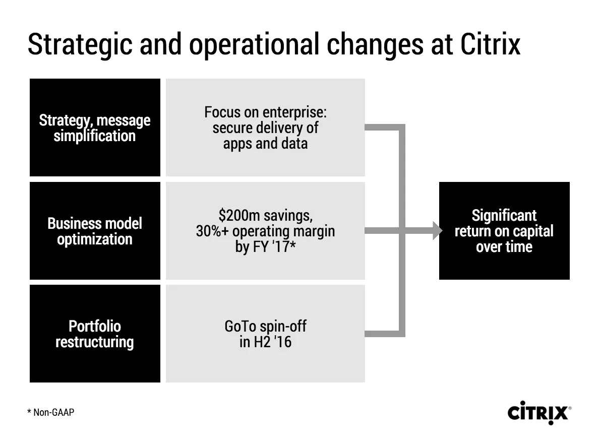
Citrix announced a corporate restructuring recently. The slides that were used are typical of many corporate PowerPoint presentations. Here is an example:

This slide looks like it came straight out of the consulting report that preceded the decision to make the changes. There are a number of things that can be improved:

  • The look & feel does not match Citrix’ clean black and white corporate identity
  • The slide uses a standard Microsoft PowerPoint smart object, with “dirty” gradients
  • No attention has been given to typography: “H2’16” is orphaned on a 2nd line, the light boxes are too narrow to contain 3 lines of text
  • Messages are repeated on the left and right side of the chart
  • There is a cause and effect relationship in the chart (we do this and get ROC in return) that is not reflected in the way it is laid out.
  • The headline is a but woolly.

I tried to fix these issues in this quick makeover in my presentation app SlideMagic. I kept the 30% margin and $200 cost cut info in the business model optimisation box, although you could argue that that is an outcome of the strategy as well. A true business model optimisation would be “price increases” or something.

If you want you can copy and clone this slide to your own SlideMagic account by clicking this link. Not yet a SlideMagic user? Sign up here to try it out.

iPad Pro and presentation design

I have been reading the reviews of the Apple iPad Pro and the Microsoft Surface Pro with great interest. Analyst Benedict Evans and many others claim that iOS/Android powered devices will replace OSX/Windows computers as the main computing tools we use.

Illustrators and designers seem to love the devices. Big surfaces with a precise pencil signal the end of the expensive Cintiq devices.

Writers (bloggers, journalists) complain that they miss the mouse/track pad on these devices. It is hard to go back and forth from keyboard to screen to move quickly through text and cut/paste sentences.

Presentation design might actually be a good fit for a bigger tablet, if you can make things run smoothly without the need for the attached physical keyboard. It would require a redesign of the user interface though, the mouse-based UI is too complicated, and the current mobile UIs are too counter-intuitive, many functions are hidden. SlideMagic might fit the bill, I am going to find out soon.

Still, there is the difference between “it works great” and mass adoption in big enterprises…

·Software

Convert SlideMagic presentations to PowerPoint

Many people have asked for this feature. I might have found a partially automated solution for this. Partially means, slides are converted automatically, but the overall workflow is still manual.

Before I start investing a lot of resources (time and money) in developing a fully automated solution, I want to test demand. Soon, I will be adding a “PowerPoint” button to SlideMagic, but in the interim, you can email to (ppt at slidemagic dot com) an editable link of your presentation (generate it via the SHARE menu in SlideMagic) and we will send you back a PowerPoint file.

It is important to send the link using the SHARE function, nobody but you can open the links in your browser for privacy/security reasons.

Make sure that you have the Roboto Condensed font installed on your machine. It is a free font provided by Google

  1. Exit PowerPoint
  2. Go to the Roboto Condensed download page
  3. Tick the 400 and 700 boxes
  4. Download using the “arrow down” icon at the top right
  5. Double click the downloaded files to install the fonts
  6. Re-open PowerPoint

Roboto Condensed cannot be installed on iOS devices. If you want to edit your converted SlideMagic presentation in PowerPoint for iOS consider replacing the Roboto Condensed font for Helvetica Neue Condensed. Here is how to swap fonts across an entire presentation on a Mac. But hey, SlideMagic runs pretty well in Safari on iPad, no need to convert to PowerPoint for this.

Some disclaimers:

  • It is a partially manual solution, please be patient, delivery can be instant or take some time.
  • A human will open your presentation, we are nice people and unlikely to read it all in detail and/or post things on the Internet though. Still some corporate compliance regulations might have an issue with this
  • There might be glitches in the quality of the conversion, if so, we would like to hear about them.
Continue reading →
·Story

"This is my usual introduction"

“When I put up the first [incredibly busy bullet point] I start of with this introduction before I take people through the slide”

Usually, these introductions are great. They come out naturally, in a conversational style. Next time:

  1. Use that introduction as the opening of your presentation, add a visual slide here and there to support the story. And don’t stop there, finish the entire presentation in that style
  2. Second best option. Put in a black slide before your busy opening slide and tell that introduction without encouraging people to start reading your bullet points.

Image: New Zealand rugby team performing the “haka” in 1932

·Layout

I like to frame images

Big, confident images look better on a presentation slide. The maximum size of your image is achieved when you let it “bleed” of the page (the term comes from the age of print, where the ink would drip of the corner).

These full size images look great if your presentation is just images. In most cases, my client work is not. Hence, I prefer to frame my images within a box of white (or black). Some people say it is bad practice, I disagree:

  • You do not have to worry about legibility of slide titles
  • Photo slides look consistent with other slides in the presentation
  • I think, it actually looks very distinguised

My presentation app SlideMagic caters for both formats, so don’t worry if you disagree with me. You can clone the slides below (and all other slides I have used on the blog) into your own SlideMagic presentation via this link.

The image was found on unsplash, free images under a do-whatever-you-want license