SlideMagic Blog

Frequent updates about all things presentations since 2008. Subscribe to never miss a post.

RSS
·Delivery

Slide makeovers are not always enough

Most of my clients actually know how to present visual slides. Their problem: they don’t have the slides. But once I create them, they get used quickly to the new presentation format without a lot of training. This is probably because they can identify with the target audience. A CEO pitching a startup idea is the sort of person you would pitch a startup idea to.

Scientists have a double problem. Yes, their slides need work, but the bigger problem is that they often need to cross into a different audience type than they are used to presenting to. Scientist, engineers, lawyers, have their own language for talking to each other, which can actually be every effective. But if you put a scientist with newly designed visual slides in front of an investor audience things start to break down without the proper training.

When deadlines were very short, I have recommended these clients to stick to their existing slides and practice their delivery, postponing the make over of their entire slide deck for the next conference a few months down the road.

Art: Louis Pasteur by Albert Edelfelt, 1885

·Sales presentation

The country update

I get many clients who are some kind of local distributor or agent in a country and are asked to present an update on their business to the global headquarters of the company. Most of these clients have some sort of standard presentation that they use in the local market:

  • First up: the history of the company
  • Then missions statements, organisation charts
  • Then examples of advertising and campaigns for the product

But think about the corporate headquarters, they are likely to see 150+ country presentations that look more or less the same. They hear 150+ company histories that are similar. They have seen many ads for their product. They probably have a computer system in which they can call p the sales results by country and compare them against last and year, and, more importantly, against other countries.

Here is another approach:

  • Keep the obvious stuff very short, here are our brands, here are the results.
  • Think in what way your country might be different than other markets (population concentration, market preference, local competitors) and discuss how you solved these specific challenges.
  • Use lots of photos that give a good visual impression of how your product is positioned in the local market.

Image from WikiPedia

·Delivery

Cold phone messages

Shortly after writing my post about cold emails, I received a cold, automated phone message. They did one thing right, don’t call from a number with hidden id. But then:

  • It took a few seconds to start the message, presumably enabling me to say “good morning, who is calling”?
  • Then the message started (I heard the crackling recording background noise kicking in).
  • The voice that of a famous radio news reader, did not sound natural
  • And worst of all it started of with: “I know that these type of message…” [beep] [beep] [beep]

I wasted 2 seconds on this.

Now, automated sales messages are not the same as follow up calls for checking whether your recipient got the presentation you emailed, but still think about the parallels. An unplanned incoming phone call is always a disruption, an apology makes the experience even worse and will cost you valuable seconds.

Image by CGP Grey on Flickr

·Creativity

Designing on small screens

I have argued many times before here that design work on small screens is difficult. It is OK to fix typos in a presentation on a tablet or phone, but the small screen is not the right interface to focus your creative energy. This was the reason that my presentation design app SlideMagic launched as a web app rather than as “mobile first”.

The issue is not constrained to graphics design. Recently I started venturing in iPad apps that aim to be perfect replicas of ancient analog synthesisers. The Moog Model 15 iPad app is a technical wonder by packing so much sound in a small device, and offering a graphical user interface that enables you to connect wires everywhere.

 Keith Emerson in front of a Moog synthesizer  ( image from WikiPedia )

Keith Emerson in front of a Moog synthesizer  ( image from WikiPedia )

The problem is the lack of screen real estate. You have to scroll constantly to go from one end of a wire to another. You cannot get the full picture of what you are doing. An I think that the experience would not have been much better on a laptop either, still to small. You need a very large monitor to get the same experience as standing in front of the actual instrument.

 This goes further I think. Laptops, and before that, crappy 768 pixel, 80x25 character monitors were big contributors to the design mess in business presentations. A big empty white board works better to design charts than a small A4 piece of paper.

Continue reading →
·Investor presentation

Cold emails

Now that I am a CEO of an Internet startup (www.slidemagic.com) my email address is slowly spreading in the databases of app developers, PR people, recruiters, marketing consultants, SEO firms etc. Although not in the same quantities, I start getting the type of pitch emails that venture capitalists, journalists, bloggers must be getting.

Most of these emails actually get through spam and other gmail filters. In some way or another, the recipient will look at them. Especially now that mobile devices enable you to kill dead time with gracing through your email field.

The majority of these emails get totally ignored. First of all because of basic hygiene that has been discussed in thousands of blog posts before: generic subject line, generic “hello there” greetings, spelling mistakes in names, etc.

But there is a bigger thing that turns me of: the way they are written.

  • Too generic. The sender has not bothered to check out what my app does, what stage my company is in, what sort of services I might need. Instead, it could have been highly personal and relevant (what features my app lacks, which LinkedIn contacts we have in common, etc.)
  • Too complete. The email tries to do a full pitch of the company and its services. As a results things sound bland. You will never land a contract with a cold email. Better is to write something very short, but intriguing. Something that does not cover everything you want to offer me, but makes me hit reply to find out more.
  • Specific links to specific information are missing. A portfolio to look at, apps that you designed, not just the root of your web site.
Continue reading →
·Story

10 slides in, and we have not made the big point yet

Impatient audiences of senior management or investors often complain (rightfully so) that they have been listening for 10 minutes, 10 slides, and still the main point of the presentation has not been made.

The common reaction to this feedback:

  • Shuffle slides around, and drop slides from the back of the presentation all the way upfront. The result: a broken story flow. The sequence of slides in the front does not make sense anymore, and the left over slides in the back don’t connect together.
  • Cram a lot of content on the first 3 slides and call them “summary”. The result: your audience never gets to see you beautiful, highly visual slides in the back, as you are fighting your way through the bullet points in the front.

What causes the delay?

  • Think about why it takes you so long to get to the point. Does the audience needs all that background? The company mission? The company history?
  • Think about what the audience means when they say “getting to the point”? Do they really want the full detail of your solution on the first page, or would simply telling your audience what you are about quickly be enough to calm them down and stop them from guessing?
  • Think about whether your existing summary is stuck in the middle: too long to serve as a real teaser for what is about to come, and too short to give the full detail of the pitch.
  • Are you taking too much time to present your slides? Uuuh, uuums. Side tangents. Details, exceptions, apologies for rounding errors, footnotes.
  • Are you going off script: you put up a slide, but take the story in a different direction (“let me give you some context first”)
  • Do you spend too much time on the obvious: explanation of buzzwords (“let me explain what the sharing economy is”, “look at this data about the stellar growth of mobile phone penetration”).
  • Are you reading out all the elements of a slide one by one, but because someone else designed the slide for you, they don’t really fit the way you want to tell the story. So after you are done reading, you tell the message the way you wanted it, effectively presenting each slide twice.
Continue reading →
·Hardware

Amazon Kindle Oasis review

I got my hands on a the new Amazon Kindle “Oasis” (affiliate link). It is the 3rd Kindle device I bought. The first one for the sheer benefit of not having to ship physical books across the Atlantic to Israel, the second one after the e-ink, “alway on” screen was implemented, and now the super light Kindle Oasis.

What I like:

  • Super light, compact build. About as high as high as an iPhone 6, but wider. The screen size is more or less the same is my old Kindle, the edges just got a lot thinner. It is the perfect aspect ratio for reading.
  • The device fits nicely in your hand, with more battery bulk added to one side of the device. Keeping the weight close to your hand makes the device feel lighter. This lever effect makes the iPad feel heavy when held with one hand.
  • A fantastic screen. “Retina” crisp. Works in bright daylight, works at night. (The latter apparently without disturbing your sleep patterns)

What I don’t like:

  • Poor battery life. Well this is relative, but I got spoiled with my previous Kindle that I could charge every week or so. The protective cover adds an extra battery, but also a lot of weight to the device.
  • The touch screen page switching behaviour is sometimes a bit unpredictable.
  • The price: almost $300.

Overall a great device and worth the upgrade from my ancient Kindle. If you currently own a Kindle Paperweight though, maybe wait for an upgrade with better battery performance.

·Investor presentation

"Let me explain it to you again"

A good pitch of an idea provokes feedback of the audience. If people are just sitting there, watching politely, smiling, and walking out of the room, you are unlikely to land an investment.

When you get feedback (praise, criticism, difficult questions), it is important to realise who it is coming from. Do people care about you, want to help you? Do you they have the right background?

  1. Your mother: she totally admires everything you do, but in most cases might not have deep knowledge of what it is you are actually doing
  2. An industry incumbent who cannot see any change happening having worked in the field for 30 years
  3. A (potential) competitor who is jealous
  4. A friendly investor who does not understand the field
  5. A friendly investor who does understand the field
  6. An interested investor who is negotiating with you
  7. A friend of a friend of a friend who is an expert in the field but who was arm twisted in listening to you to return a favour but does not really have time for this and/or you
  8. Etc.

Pay special attention to people who know what they are talking about, or people that are an example of a type of audience you are going to pitch to a lot (confident, successful investors, that might not fully understand the ins and outs of your market). Group one helps you bullet proof the content, group 2 helps you bullet proof the presentation.

What sort of feedback do you get:

Continue reading →

Who are the SlideMagic pioneers?

There are 2 categories of people that are trying out my presentation design app SlideMagic for real, and they are encouraging me that I on to something useful.

  • Business school / university students. They work in a relatively risk free environment. Risk free from a creative perspective, there is no boss who tells them to stick to the rules. But on the other hand, the audience for their pitches is smart and pretty brutal when it comes to feedback. And finally, this younger generation appreciates good design.
  • Former clients who have come to appreciate my presentation design style and now discovered that they can get there 80% of the way without paying for a bespoke project

Art: William Hahn, Going Home, 1878

·Software

Curves in PowerPoint

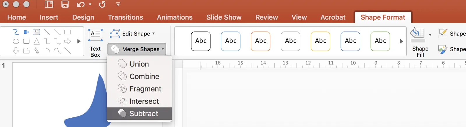
PowerPoint allows you to draw curves as lines, but it is harder to make fills under a curved line without resorting to actual data charts. Here is what I do: I use rectangular shapes to cut/shave a shape. See below. Notice that it is also possible to fill your custom shapes with images.

 Draw a shape

Draw a shape

 Position your knife

Position your knife

 Use the

Use the “subtract” function to cut the shape

 Horizontal knife

Horizontal knife

 One more cut

One more cut

 Fix the edges with format shape - edit shape - edit points

Fix the edges with format shape - edit shape - edit points

 Add an image if you want

Add an image if you want