SlideMagic Blog

Frequent updates about all things presentations since 2008. Subscribe to never miss a post.

RSS
·Layout

Start with counting

The most fundamental feature of my presentation design app SlideMagic is the strict use of a grid to layout your slide. And there is a good reason for that.

Every slide I design start with counting. How many points. How many options. How many pro’s and con’s for each argument. How many years. How many competitors. How many types. How many team members. How many steps.

Even or odd number of items? If you end up with a nasty number (11, 13 for example), you find ways to combine 2 points, leave one of, split one up.

Then think of shapes, which boxes are “long” (text), which boxes are square (images, icons), which boxes vary in text content, which are the same.

Then comes the thinking about layouts: 3x3 5x1, 1x4, 2x2?

Almost every slide has a table hiding in it.

Image from WikiPedia

Authentic videos

Today the Israeli startup Airobotics came out of stealth mode. They made a very good introduction video. Not only because of the graphical production quality and the story line. It is narrated by the company founder (foreign accent, some grammar mistakes) instead of a slick professional voice over. It makes the whole communication so much more authentic. Well done!

Communications around the Brexit debate

I have been observing the debate in the UK about whether it should stay in or leave the EU from across the Mediterranean.

  • Like most big decisions, the debate is all emotional and “shooting from the hip”. Bureaucracy, immigration, sovereignty are all candidate topics for huge debates even in the absence of facts. Most people decide based on gut feel and it will be impossible to force 60m voters to sit through a micro-economics lecture about the impact of the EU. But the other extreme, 5 seconds sound bites by politicians will not work either. In a conference room, a well-designed presentation can offer a solution, in politics, I have no solution I am afraid.
  • The biggest problem is the option that is offered. Instead of a simple “leave” or “remain”, the voter should vote on 2 specific plans with all the economic and political arrangements worked out, or at least, in a slightly more advanced stage.
  • Arguments of both camps are often targeted at the believers, the people who already have bought in to a specific choice. You win elections by convincing the doubters.

Maybe politicians need to communicate like John Oliver. It still takes 14 minutes though.

Direct democracy has its problems:

  • You can cherry pick issues to vote on without the context/constraints of all policies (“are you for or against a tax hike?”)
  • You ask people to make decisions on simple black/white choices, without presenting the practical, day to day consequences, or a nuanced compromise
  • Voter turnout is an issue
  • And yes, voters don’t take the time to understand options fully
Continue reading →

Customisable toolbar in PowerPoint (finally)

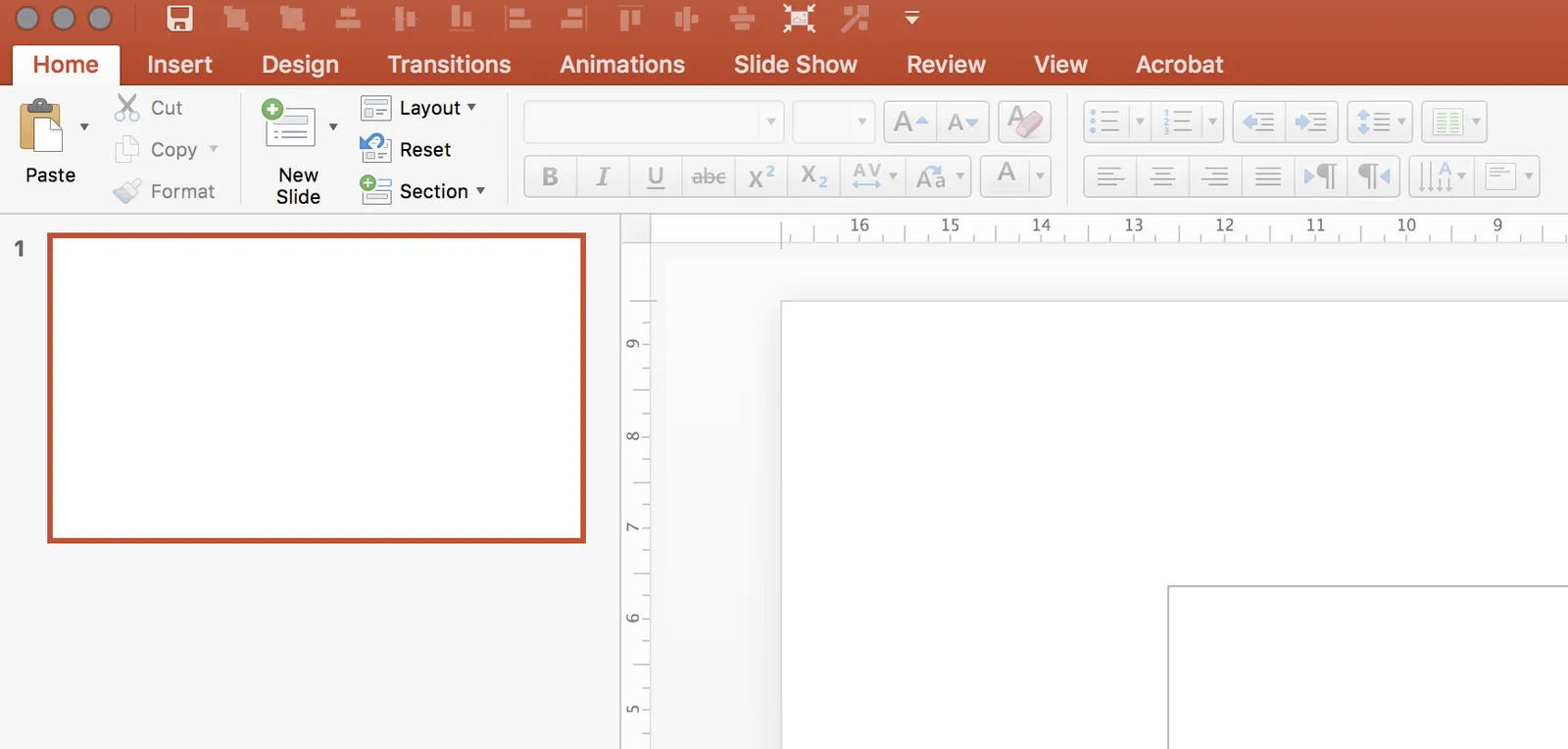
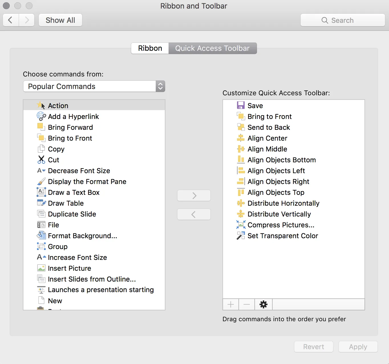
It looks like Microsoft has been listening. You can now completely customise the top quick access tool bar. For PowerPoint power users this will save a lot of time. Especially for aligning and distributing objects.

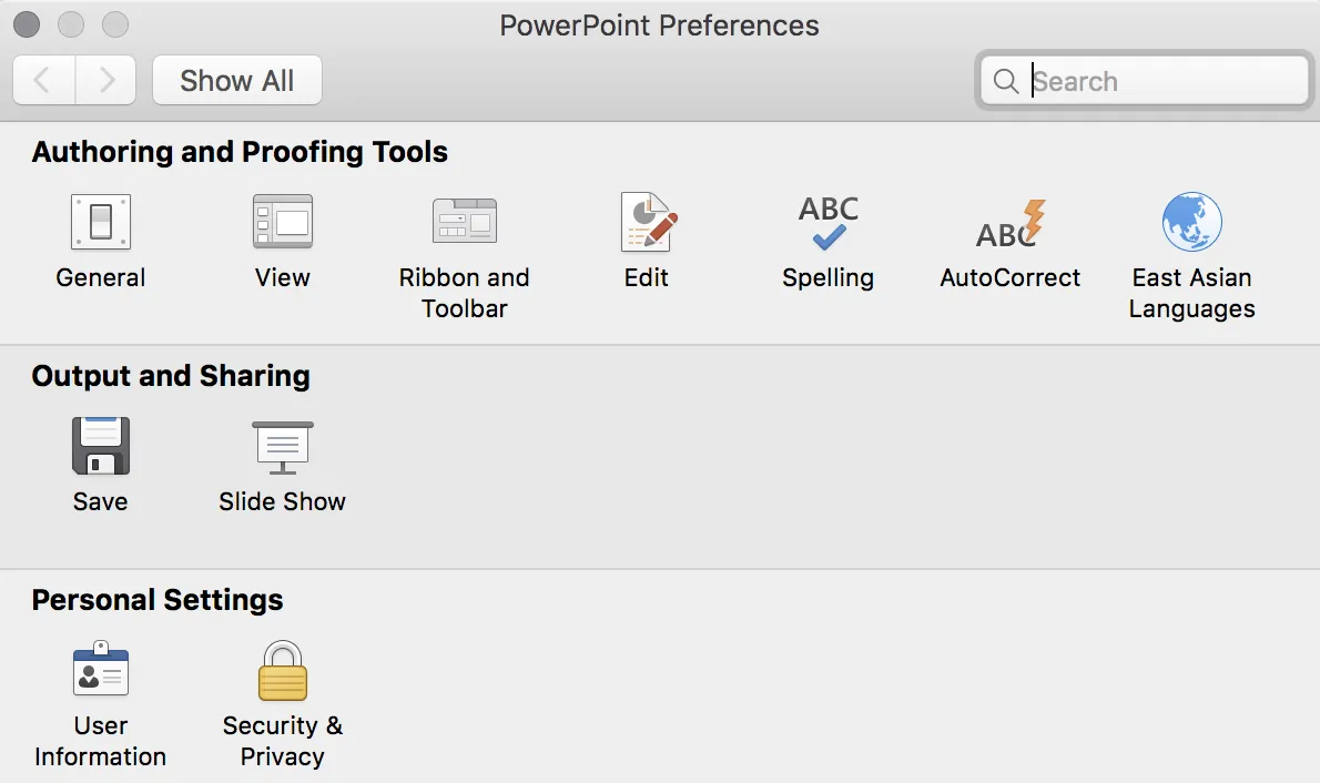
Make sure you have the latest update installed, and you will have access to a new icon in the PowerPoint preferences dialogue box.

For some reason, I still cannot find all the functions though. Flipping and rotating for example. Maybe I have not looked good enough, and/or there is still a small bug that needs to be ironed out.

I would like to recreate that ideal tool bar I posted about back in 2008.

Top image from WikiPedia.

·Layout

More complicated slides

For some reason, I find myself designing more complicated, busy slides recently. Busy does not mean more text and bullet points. Busy means showing complex arguments in diagrams: boxes that overlap, are interwoven, move from one into the next.

My guess there are a number of potential reasons:

  1. My presentations are mostly investor decks, and the most important use of my slides is actually the moment when the recipient opens and reads them on the computer. The standup presentation that follows (if the first screening was successful), is almost a formality in terms of slide content, it is more about having the opportunity to get the know the people behind the slides.
  2. Misuse of cliche stock images or forced visual analogies have started to make people tired of certain big picture slides. “Oh, it’s going to be this type of presentation, let’s page down to the meat quickly”.
  3. Larger, and higher resolution screens create a temptation to design more complicated slides (thinner fonts, thinner lines, more subtle colour shadings). Today, these slides even look great on a retina iPad. (Old crappy VGA projects are a different story though).
  4. Big, page filling image slides, are actually not that hard to make and this might be a segment of work that gets done more and more in-house.

So, not a return to crammed bullet points, but diagrams lifted to a higher level.

Image: Brianna Privett on Flickr

·Layout

How do you do it?

A question I often get after a very simple make over of a slide. Answer:

  • Make boxes the same size
  • Line everything up in a grid
  • Cut excess filler words and passive verbs
  • Us one accent colour
  • Harmonize fonts
  • Reset image aspect ratios
  • Fit everything inside a frame with white space around it

“You make it sound so simple, but it is not.”. It actually is. If you struggle doing it in PowerPoint, use SlideMagic, my presentation app.

·Delivery

Slide makeovers are not always enough

Most of my clients actually know how to present visual slides. Their problem: they don’t have the slides. But once I create them, they get used quickly to the new presentation format without a lot of training. This is probably because they can identify with the target audience. A CEO pitching a startup idea is the sort of person you would pitch a startup idea to.

Scientists have a double problem. Yes, their slides need work, but the bigger problem is that they often need to cross into a different audience type than they are used to presenting to. Scientist, engineers, lawyers, have their own language for talking to each other, which can actually be every effective. But if you put a scientist with newly designed visual slides in front of an investor audience things start to break down without the proper training.

When deadlines were very short, I have recommended these clients to stick to their existing slides and practice their delivery, postponing the make over of their entire slide deck for the next conference a few months down the road.

Art: Louis Pasteur by Albert Edelfelt, 1885

·Sales presentation

The country update

I get many clients who are some kind of local distributor or agent in a country and are asked to present an update on their business to the global headquarters of the company. Most of these clients have some sort of standard presentation that they use in the local market:

  • First up: the history of the company
  • Then missions statements, organisation charts
  • Then examples of advertising and campaigns for the product

But think about the corporate headquarters, they are likely to see 150+ country presentations that look more or less the same. They hear 150+ company histories that are similar. They have seen many ads for their product. They probably have a computer system in which they can call p the sales results by country and compare them against last and year, and, more importantly, against other countries.

Here is another approach:

  • Keep the obvious stuff very short, here are our brands, here are the results.
  • Think in what way your country might be different than other markets (population concentration, market preference, local competitors) and discuss how you solved these specific challenges.
  • Use lots of photos that give a good visual impression of how your product is positioned in the local market.

Image from WikiPedia

·Delivery

Cold phone messages

Shortly after writing my post about cold emails, I received a cold, automated phone message. They did one thing right, don’t call from a number with hidden id. But then:

  • It took a few seconds to start the message, presumably enabling me to say “good morning, who is calling”?
  • Then the message started (I heard the crackling recording background noise kicking in).
  • The voice that of a famous radio news reader, did not sound natural
  • And worst of all it started of with: “I know that these type of message…” [beep] [beep] [beep]

I wasted 2 seconds on this.

Now, automated sales messages are not the same as follow up calls for checking whether your recipient got the presentation you emailed, but still think about the parallels. An unplanned incoming phone call is always a disruption, an apology makes the experience even worse and will cost you valuable seconds.

Image by CGP Grey on Flickr

·Creativity

Designing on small screens

I have argued many times before here that design work on small screens is difficult. It is OK to fix typos in a presentation on a tablet or phone, but the small screen is not the right interface to focus your creative energy. This was the reason that my presentation design app SlideMagic launched as a web app rather than as “mobile first”.

The issue is not constrained to graphics design. Recently I started venturing in iPad apps that aim to be perfect replicas of ancient analog synthesisers. The Moog Model 15 iPad app is a technical wonder by packing so much sound in a small device, and offering a graphical user interface that enables you to connect wires everywhere.

 Keith Emerson in front of a Moog synthesizer  ( image from WikiPedia )

Keith Emerson in front of a Moog synthesizer  ( image from WikiPedia )

The problem is the lack of screen real estate. You have to scroll constantly to go from one end of a wire to another. You cannot get the full picture of what you are doing. An I think that the experience would not have been much better on a laptop either, still to small. You need a very large monitor to get the same experience as standing in front of the actual instrument.

 This goes further I think. Laptops, and before that, crappy 768 pixel, 80x25 character monitors were big contributors to the design mess in business presentations. A big empty white board works better to design charts than a small A4 piece of paper.

Continue reading →