SlideMagic Blog

Frequent updates about all things presentations since 2008. Subscribe to never miss a post.

RSS
·Concepts

"Visual story telling" has become a buzzword

I noticed this Tweet the other day of buzz words that are banned in the Conrad shop:

“Visual story telling” is one of them. And I must say, there is something to it. (Yes, this is a professional presentation designer speaking). Yes, business presentations should be stories, yes business presentations should be visual. But when you find yourself in stuck in a meeting where 15 captains try to set the plot for a presentation, and you hear someone saying “let’s take a step back everyone, and synthesize what we have brainstormed so far, so that we can spend the next hour doing visual story telling”, you probably roll your eyes.

Buzzwords are created when you have seen useful concepts being abused too many times and visual story telling is joining the ranks of them.

·Data visualization

Visualizing contrasts

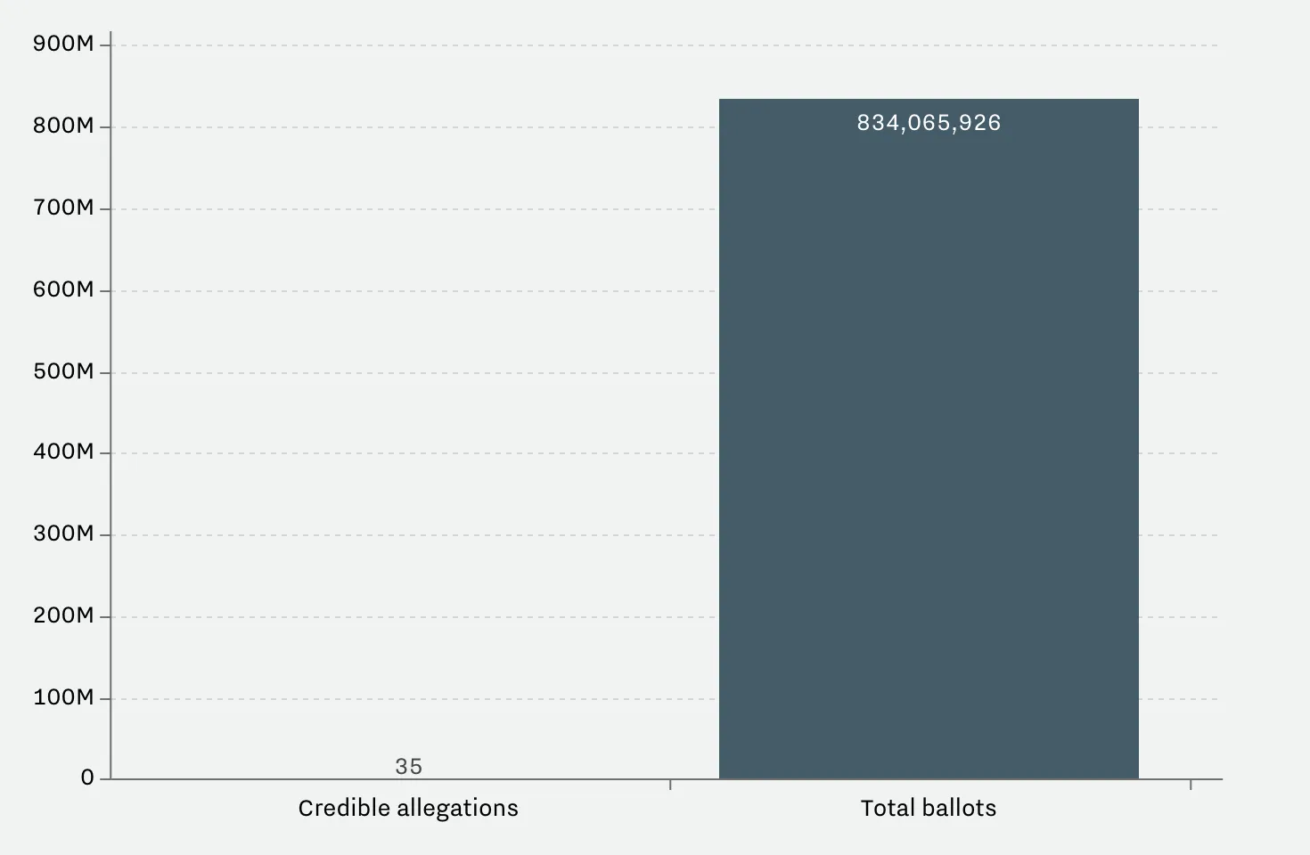
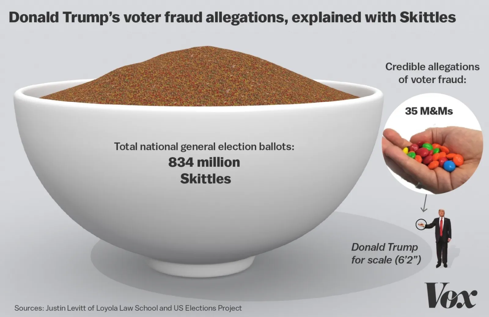
This article on Vox tries to find statistics on voting fraud in the US. I will stay out of politics on this blog, but the 2 graphs it uses show the power of a good visualization.

 A column chart shows the relative difference, but fails to communicate the large overall absolute value of the right column

A column chart shows the relative difference, but fails to communicate the large overall absolute value of the right column

 The image does a better job to depict the statistics. It requires some math and Photoshop skills though to produce

The image does a better job to depict the statistics. It requires some math and Photoshop skills though to produce

The column chart is the correct representation of the 2 values, but it fails to communicate the huge amount of ballots we are talking about in the right column. The image does a better job, but it will be hard to construct for a layman designer.

Image from WikiPedia

·Investor presentation

Investor versus client positioning

In most big B2B enterprise sales dialogues the client understands the market, knows the key players out there, knows the issues she is trying to solve. They don’t care about margins, market sizes.

In most investor pitches, the potential investor knows the broad market segments that sound similar to the one you are operating in, knows how big they are roughly, knows major competitors. They are less interested in specific feature comparisons.

Presenting your differentiation, what makes you special, is different to each of these audiences.

Image from WikiPedia

·Software

PowerPoint Designer - first impressions

Microsoft has been adding a number of features to PowerPoint recently. One of them is Designer. In the Design tab of the ribbon, a new button appears on the right “Design Ideas”. Clicking it generates alternative layouts of your slides on the right side of your screen.

The layouts are pretty nice. Microsoft has “automated” the design of 2 types of slides:

  • Image collages, multiple photos get put in different suggested grids, with place for a title
  • Process bullet points that can be translated to horizontally spaced out sequences of equally sized shapes.

Both are useful. Layman designers usually have no idea how to crop a nice photo collage, and translating that bullet list into a horizontal sequence looks nice, especially on wide 16:9 screen.

But here comes the but.

  • The algorithm only works on these types of slides, so layman presentations will look inconsistent as same slides cannot be improved by the algorithm
  • And in case of the bullet transformation, PowerPoint needs to analyze the text with language processing, to decide that you are describing some kind of process. I had a hard time to trigger the algorithm, and in the end typed the exact same text as was used in Microsoft’s explanation web post.

Microsoft is on the right path, these suggested layouts look a lot nicer than the SmartArt objects. And, getting layman designers to use some sort of grid is the biggest possible improvement you can create in slide design.

But I think it will take some time before language interpretation will be so sophisticated that PowerPoint understands the meaning of a slide and can pull a suggested layout from its library. That’s one step above asking Siri to book a movie for you.


Continue reading →

At Web Summit - Lisbon early November

Wearing the hat of a startup CEO (SlideMagic), I will be attending Web Summit in Lisbon the 2nd week of November. Let me know if you are there as well and would like to shake hands.

Image via WikiPedia

The industry landscape chart

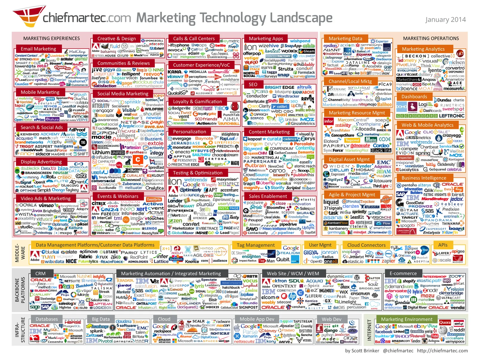
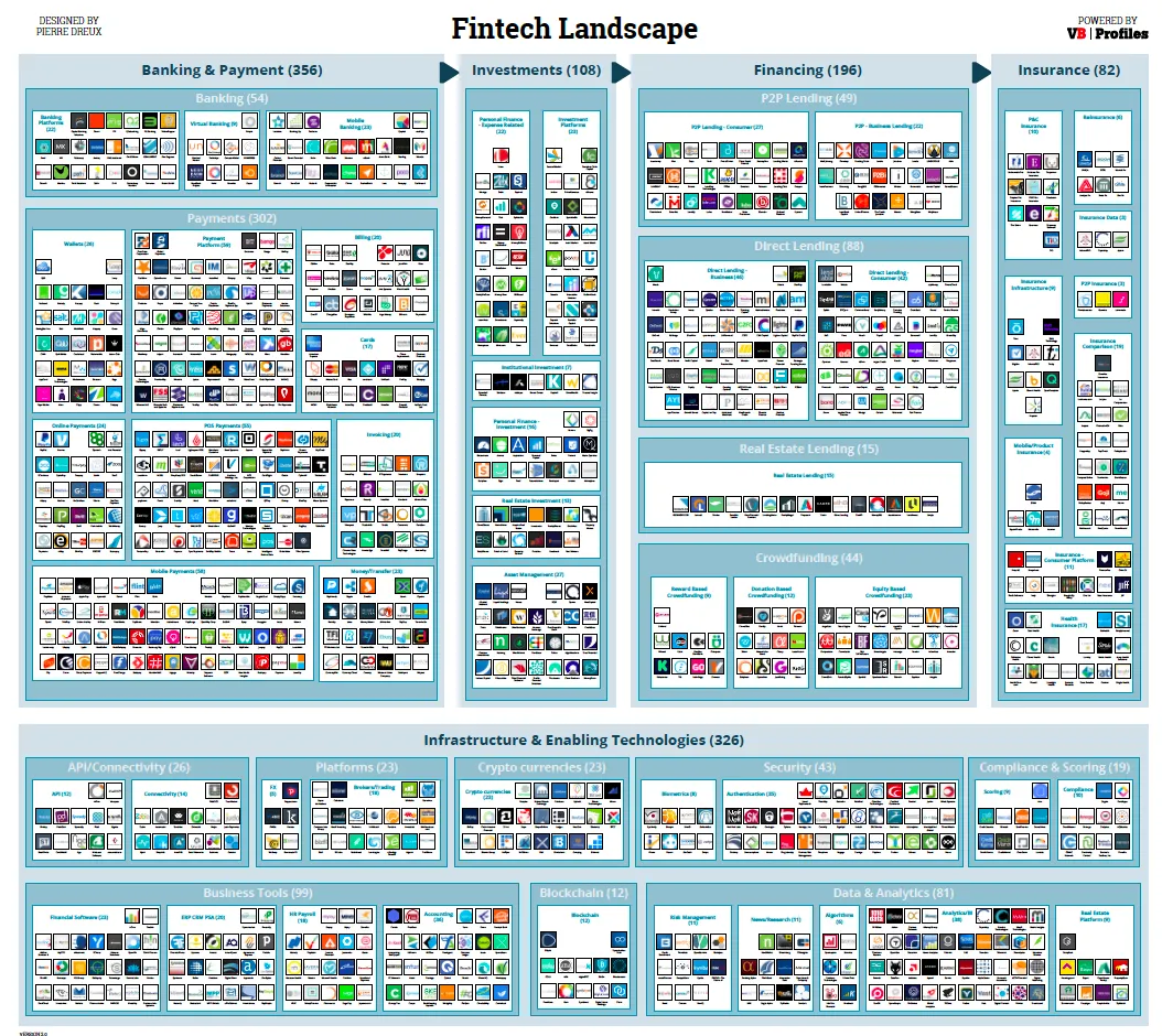
There are a lot of these type of industry charts around. The only message it conveys as a slide is “there are lots of players in the industry”. More information is too hard to read. I think zooming presentation tools such as Prezi do not always help make your presentation more effective, but in this case, it could provide useful in creating a “ponder chart” where you can zoom in and out of specific sections.

·Story

A personal speech

We recently celebrated my daughter’s Bat Mitzvah and here is the process I went through to produce my short speech:

  • I did not make too big a deal out of the speech, it is not the State of the Union, I wanted to express my feelings to my daughter, and focus the attention of the entire crowd for a few minutes on her.
  • I created a digital notebook accessible from all my devices weeks in advance. Here I jotted down ideas: stories, memories, jokes, anecdotes, as they came along. It is hard to come up with ideas 24 hours before
  • About a week before the event, I wrote down a whole version, and put it away
  • A few days later during a bike ride a crafted an entire new story in my head, shorter, simpler, and less dry. Immediately after dismounting from the bike I wrote that one down.
  • I rehearsed a couple of time and created a short bullet point lay out of my talk that I could print in small font and hold in my hand. Important points are the key element of a paragraph (you can summarize those in 4 words if you have to), and lists (“what was that 3rd character trait again?”)
  • During the speech i made sure that I was really “into the story” feeling the meaning of the words while saying them (i.e, not pressing play from memory and just recite text without processing what it means).
  • Instead of uttering “uhm”, I tried to keep the composure and pause to form the next key idea in my mind before speaking it out.
  • And yes, I did not use slides!
·Investor presentation

Which clients raise money?

I see dozens and dozens of technology startups and yesterday I sat back and jotted down the similarities between my clients that manage to raise money. Disclaimer: it is not scientific, it is not conclusive, and in many cases I actually do not get updated on whether the fund raising round was successful or not.

Here are some similarities:

  • More than one exceptional team member, the company is not just carried by one strong CEO
  • Straight to the point discussions during the briefing meeting, no buzz words, no vague marketing frameworks, no empty discussions about flow in the absense of substance
  • A positive and happy working environment. Supportive feedback, respecting people’s time instead of negative comments all the time, insisting on unreasonable deadlines, making people wait a long time, calling in person meetings to communicate something that could have been done in a phone call. These are places you want to do your best
  • People are open to reposition, change things that are pretty fundamental to the company.
  • Taking advice and input form people the right way. Some people get listened to, others ignored.
  • A realistic awareness of strengths and weaknesses

OK, you need to have a good business concept. But looking back at the above points, these are companies that designers like to work with (and presumably investors want to work with them as well). There is a contagious, positive energy among them.

·Creativity

It is not your fault

Back in the days as a junior analyst at McKinsey you would often see a deck or listen to a presentation that you would not understand completely. Being 23, I usually kept quiet and assumed that this was my problem, not the presenter’s.

Now at more than double that age, I still have the same issue: I often don’t get why something is so special, so unique, so difficult to do from reading a slide or listening to the presenter. My IQ has not changed much (it probably got worse), and yes I have learned things, but the biggest difference that I have gained the confidence to know that it is not my fault. It is OK to ask a question that might sound trivial.

Photo by Matthew Paul Argall

Metaphors only when you need them

Some concepts are so simple to explain that they do not need a (visual) metaphor. If you don’t need one, don’t use one. They will sound forced, and actually makes the message of your presentation more difficult to understand.

Here are situations where I do rely on metaphors:

  • Make size comparisons that are hard to imagine
  • When there are lot of different things that need to be covered. You can set up the metaphor at the beginning of the presentation, and continue to build on it throughout the deck.
  • When it is possible to compare yourself to a winning business idea that revolutionized another market, preferably a long time ago.

Image from WikiPedia