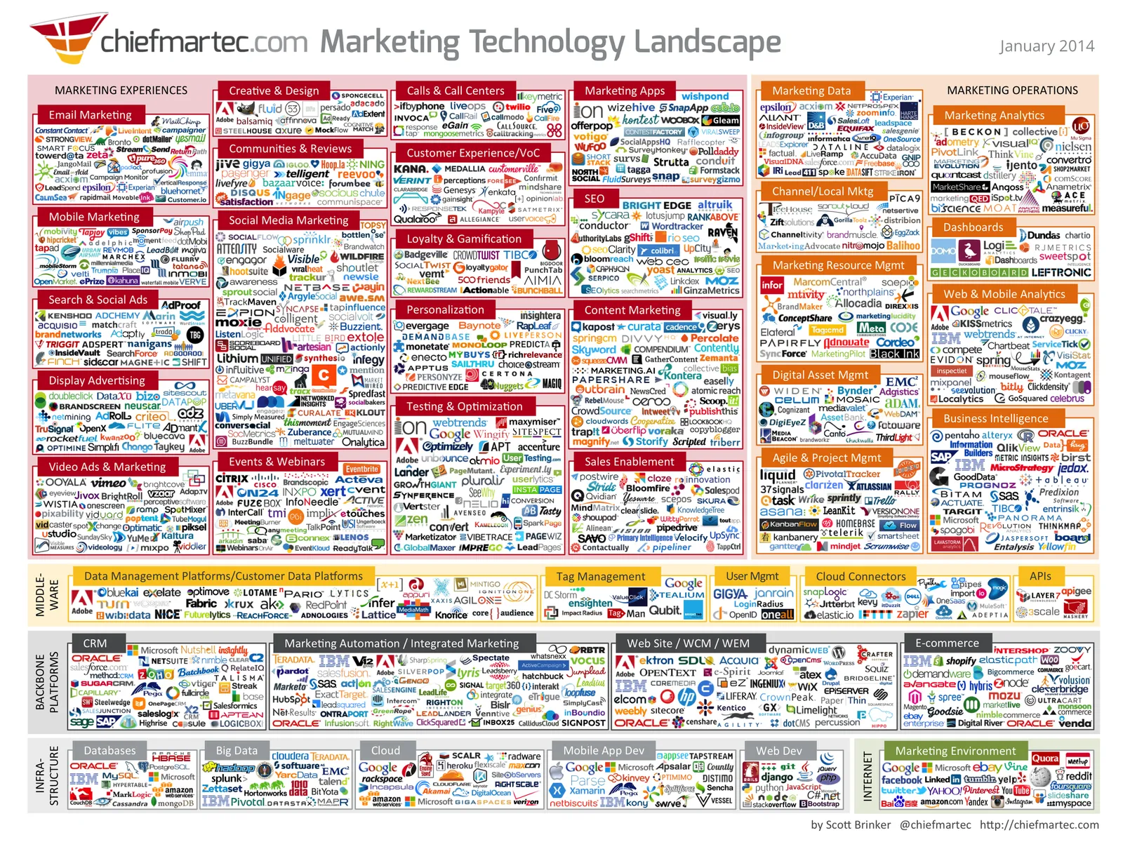
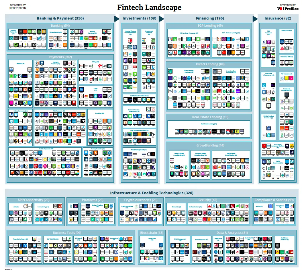
There are a lot of these type of industry charts around. The only message it conveys as a slide is “there are lots of players in the industry”. More information is too hard to read. I think zooming presentation tools such as Prezi do not always help make your presentation more effective, but in this case, it could provide useful in creating a “ponder chart” where you can zoom in and out of specific sections.