SlideMagic Blog

Frequent updates about all things presentations since 2008. Subscribe to never miss a post.

RSS
·Hardware

Designers are upset with Apple

Apple launched the new MacBooks a few days ago, and designers are not happy. Read all the comments here for example. The competition makes more powerful machines, Apple still does not make a 4K standalone display.

But there is also a psychological element to this. We designers used to use our Macs to show to everyone that we were different. We were free to buy cool equipment while most of the “other people” were stuck with crappy machines supplied by the corporate IT department.

Maybe reality has caught up with us designers. For most graphics design application, almost any computer will do. PowerPoint being at the bottom of performance-intensive applications, I have stopped looking at horse power as the main buying criterium for computers.

Still Apple is dropping the ball here and there. No innovation in productivity software (I am trying to add my bit of innovation with presentation app SlideMagic), and a proliferation of adaptors to connect devices, even those that are within the Apple ecosystem.

All of this leaves the door open to a new super premium computer brand. If I were Microsoft, I would create a “Lexus” in computing and court those style-conscious designer elitists again.

Small rebranding

The advantage of being a small operation is that decisions can be executed quickly. My branding has moved from “Axiom One”, “Slides that Stick”, “Sticky Slides”, “Idea Transplant” to “Slide Magic”.

SlideMagic is the name of my app, and Idea Transplant stayed the name of my professional presentation design business. I am now retiring Idea Transplant. The name is fantastic, and says exactly what I do, but it is not very catchy “can you spell that email address one more time please?”, and is confusing to clients. My presentation design app does not get any “brand aura” (buzz word alert), and most importantly, the blog name SlideMagic does not add value to my professional presentation design business.

So to keep things clean and simple, Idea Transplant will be come “Slidemagic Bespoke” with the same look and feel as the app. In practice, people will call it “SlideMagic” with the bespoke bit mainly used as a small tag line on the web site.

I am now also going through the clean up of all my social media accounts. Bare with me as I cleaning up all the correct URL redirects etc.

·Software

Status reports in PPT

This Tweet caught my attention:

Yes “status reports” are a distinct category of presentations. Some sort of weekly, monthly, quarterly updates, that follow more or less the same template. A lot of time is spent (wasted) on creating these. In the short run, you can do a lot with workflow automation. For example create the entire presentation in Excel, which has the same drawing and charting capabilities that PowerPoint has. And yes in the end, SAAS dashboards might replace them all together, if, and that is a big if, the dashboard is designed well.

The “other” type of presentation, the one in which you pitch an idea, a budget, an investment, is here to stay. Each story is different, each pitch is different. Still, people spend too much time on PowerPoint to create them (hopefully my presentation design app SlideMagic will change that), but the creative process will not be automated anytime soon.

Image from Wikipedia

·Software

Two new screen interfaces

Both Microsoft and Google launched new screen-based devices over the past few days.

The Microsoft Surface Studio is a desktop computer with a very large touch display. It can be used in regular upright mode, or folded down, which turns it into a giant, almost-horizontal tablet. There is a new interface gadget, a cylinder that you put right on the screen.

I think this might be the future of desk-based design interfaces. Portable tablets are too small. Upright touch screens are to cumbersome. This hybrid looks great.

Google introduced the Jamboard, a big touch screen that is meant for white boarding in meetings. The main feature is the collaboration supported by Google software. You can upload, edit, move things, and people not in the room can join the conversation remotely.

The features look impressive, the size of the screen might still be a bit small though to enable really productive group collaboration. Time will tell.

·Creativity

"We just need an hour together"

“I just need an hour of your time to sit together to improve my slides. I know exactly what I want to say in tomorrow’s presentation and all the slides are ready, they just need to be more visual”

I get this type of request often, and I usually turn it down. In one hour, 24 hours before the presentation, you can fix the layout of the slides a bit, but this is where it ends…

A proper presentation design process needs to go through a number of stages:

  • The first briefing, what is the idea you are actually pitching
  • Maybe in the same meeting, the more in depth questioning of the issues. The designer needs to ask the naive/ignorant questions
  • Then putting the whole thing to rest, and scribble some ideas for potential slides over the next few days to come
  • The creation of a basic graphical look and feel, usually I pick a “no brainer” slide for that, the content is crystal clear, it is just about style, fonts, colors layout.
  • Then the drafting of the full deck, going back and forth between “no brainer” slides and the tricky ones.
  • This draft gets then iterated back and forth
  • Finally: rehearsing

It takes more than 1 hour, it needs more than 24 hours, it is not a polish of the existing presentation, which will have vanished totally in the process.

Image from Wikipedia

·Advertising

Different interpretations

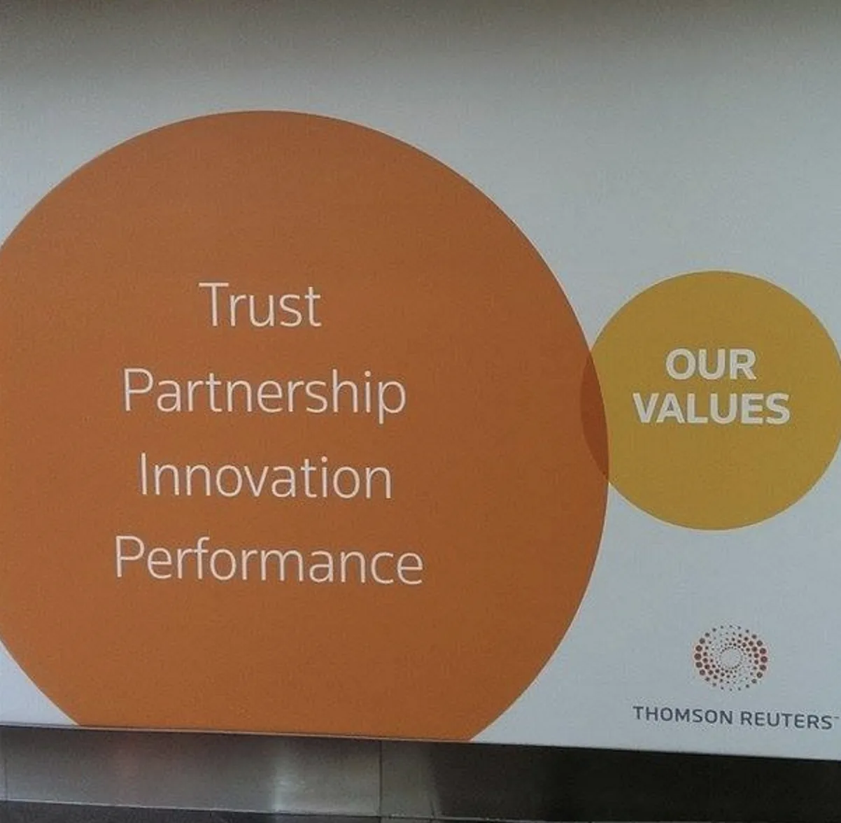
Here is a picture of a bill board snapped by a friend on Facebook. Venn diagrams are very useful in presentations. But there can be a catch.

There are 2 possible interpretations:

  1. Intended: we are just so much bigger than these good things
  2. Version b: our values do not really include all these good things

Have you key slides checked by a few different people, especially if they go in front of many eyes.

·Concepts

"Visual story telling" has become a buzzword

I noticed this Tweet the other day of buzz words that are banned in the Conrad shop:

“Visual story telling” is one of them. And I must say, there is something to it. (Yes, this is a professional presentation designer speaking). Yes, business presentations should be stories, yes business presentations should be visual. But when you find yourself in stuck in a meeting where 15 captains try to set the plot for a presentation, and you hear someone saying “let’s take a step back everyone, and synthesize what we have brainstormed so far, so that we can spend the next hour doing visual story telling”, you probably roll your eyes.

Buzzwords are created when you have seen useful concepts being abused too many times and visual story telling is joining the ranks of them.

·Data visualization

Visualizing contrasts

This article on Vox tries to find statistics on voting fraud in the US. I will stay out of politics on this blog, but the 2 graphs it uses show the power of a good visualization.

 A column chart shows the relative difference, but fails to communicate the large overall absolute value of the right column

A column chart shows the relative difference, but fails to communicate the large overall absolute value of the right column

 The image does a better job to depict the statistics. It requires some math and Photoshop skills though to produce

The image does a better job to depict the statistics. It requires some math and Photoshop skills though to produce

The column chart is the correct representation of the 2 values, but it fails to communicate the huge amount of ballots we are talking about in the right column. The image does a better job, but it will be hard to construct for a layman designer.

Image from WikiPedia

·Investor presentation

Investor versus client positioning

In most big B2B enterprise sales dialogues the client understands the market, knows the key players out there, knows the issues she is trying to solve. They don’t care about margins, market sizes.

In most investor pitches, the potential investor knows the broad market segments that sound similar to the one you are operating in, knows how big they are roughly, knows major competitors. They are less interested in specific feature comparisons.

Presenting your differentiation, what makes you special, is different to each of these audiences.

Image from WikiPedia

·Software

PowerPoint Designer - first impressions

Microsoft has been adding a number of features to PowerPoint recently. One of them is Designer. In the Design tab of the ribbon, a new button appears on the right “Design Ideas”. Clicking it generates alternative layouts of your slides on the right side of your screen.

The layouts are pretty nice. Microsoft has “automated” the design of 2 types of slides:

  • Image collages, multiple photos get put in different suggested grids, with place for a title
  • Process bullet points that can be translated to horizontally spaced out sequences of equally sized shapes.

Both are useful. Layman designers usually have no idea how to crop a nice photo collage, and translating that bullet list into a horizontal sequence looks nice, especially on wide 16:9 screen.

But here comes the but.

  • The algorithm only works on these types of slides, so layman presentations will look inconsistent as same slides cannot be improved by the algorithm
  • And in case of the bullet transformation, PowerPoint needs to analyze the text with language processing, to decide that you are describing some kind of process. I had a hard time to trigger the algorithm, and in the end typed the exact same text as was used in Microsoft’s explanation web post.

Microsoft is on the right path, these suggested layouts look a lot nicer than the SmartArt objects. And, getting layman designers to use some sort of grid is the biggest possible improvement you can create in slide design.

But I think it will take some time before language interpretation will be so sophisticated that PowerPoint understands the meaning of a slide and can pull a suggested layout from its library. That’s one step above asking Siri to book a movie for you.

Continue reading →