Off the grid
We are celebrating the Jewish new year here in Israel. I am off the grid with my family here in the Negev dessert. Apologies for the low post frequency!



Frequent updates about all things presentations since 2008. Subscribe to never miss a post.
We are celebrating the Jewish new year here in Israel. I am off the grid with my family here in the Negev dessert. Apologies for the low post frequency!
You got 30 minutes with a senior executive to present your case in a highly politically charged issue. Many people bring a very long deck that starts slowly, industry trends, backgrounds, history, until finally at 25 minutes we get to the real issue.
These type of presentations are not TED talks were we take the audience on an inspirational journey. Everyone in the room pretty much knows the background and history (if they did not, they could have read it the night before in your document), probably knows the arguments both sides are making.
Your 30 minutes is best spent showing why the combination of your arguments is the best one. You need to get the point early in your presentation, and have at least one slide that puts all the options, pros and cons on a page. Other slides in the presentation are backups for the points you are making.
Yes, that one slide can be busy, but it should not be unreadable.
Venture capitalist Mark Suster posted a quick video about this issue.
His advice:
He has a point. BUT, I would keep that bio slide super short, maybe limit it to the CEO and/or people who are presenting in the room and put the dense, detailed CV information in a slide later in the back. Grinding through lots of CVs of everyone on the team can break the momentum of the presentation (unless everyone on your team is a unique rockstar). Also not every startup has that rock star team (which probably gets you a minus from Mark anyway).
A final note, if you are presenting to Mark, there is no question, put that full bio slide on page 2. You should research every person you pitch to, and this is how he likes to see things, so that’s what you do.
It is interesting to to see the side-by-side video shots of the presidential debate of last night.






Here is what you can learn from Hillary when confronted with an unpredictable debater:
The second debate will probably be more interesting as both candidates will have had the opportunity to analyze the first debate. You can watch the full version of the debate in this video.
Now that all my data is backed up constantly to the cloud, I have been become more daring when it comes to updating machine operating systems. So, over the weekend I upgraded my client production machine to Sierra, and I could upgrade the iWork applications (I only use Keynote) as well.
Keynote become “7.0”, a big upgrade number. PowerPoint and Keynote are both highly mature pieces of software, they work very well and have not changed that much over the years. The big new features in Keynote 7.0: realtime collaboration and live presentations.
Real time collaboration is the main advantage that web app Google Slides has over desktop applications Keynote and PowerPoint. Earlier, Apple launched an iCloud-based version of Keynote where multiple people could access the same file in a web browser. The problem with this format was that the iCloud version lacked a few crucial features compared to the desk top version. If you started out working in iCloud only, there are no issues. But in most cases, you would group-edit a document online that was originally created on a desktop. I struggled finding certain formatting coloring functions which made it hard to keep slides in consistent look, and missed certain table and data chart manipulation functions online (making it hard to edit existing tables and data charts).
In Keynote 7, collaboration is now done right from the desktop app, all features are supported. During the Apple product announcement (video) it all worked perfectly. I tried things, and it worked less perfectly, but maybe because I was trying to collaborate with myself (trying to edit a test presentation in parallel on my phone). I did not get to invite people via iMessage, the email link worked, but there was a significant delay in syncing of the edits, creating sync conflicts. I assume that Apple being Apple will iron these issues out (and they might not happen in a proper collaboration set up where I am not trying to trick the system in collaborating with myself).
One way to cover up poor growth numbers is to break the vertical axis of a column chart and start it at a high number. It is even PowerPoint’s default, see the chart that comes out when entering, 1000, 1001, 1002, 1003 and 1004.
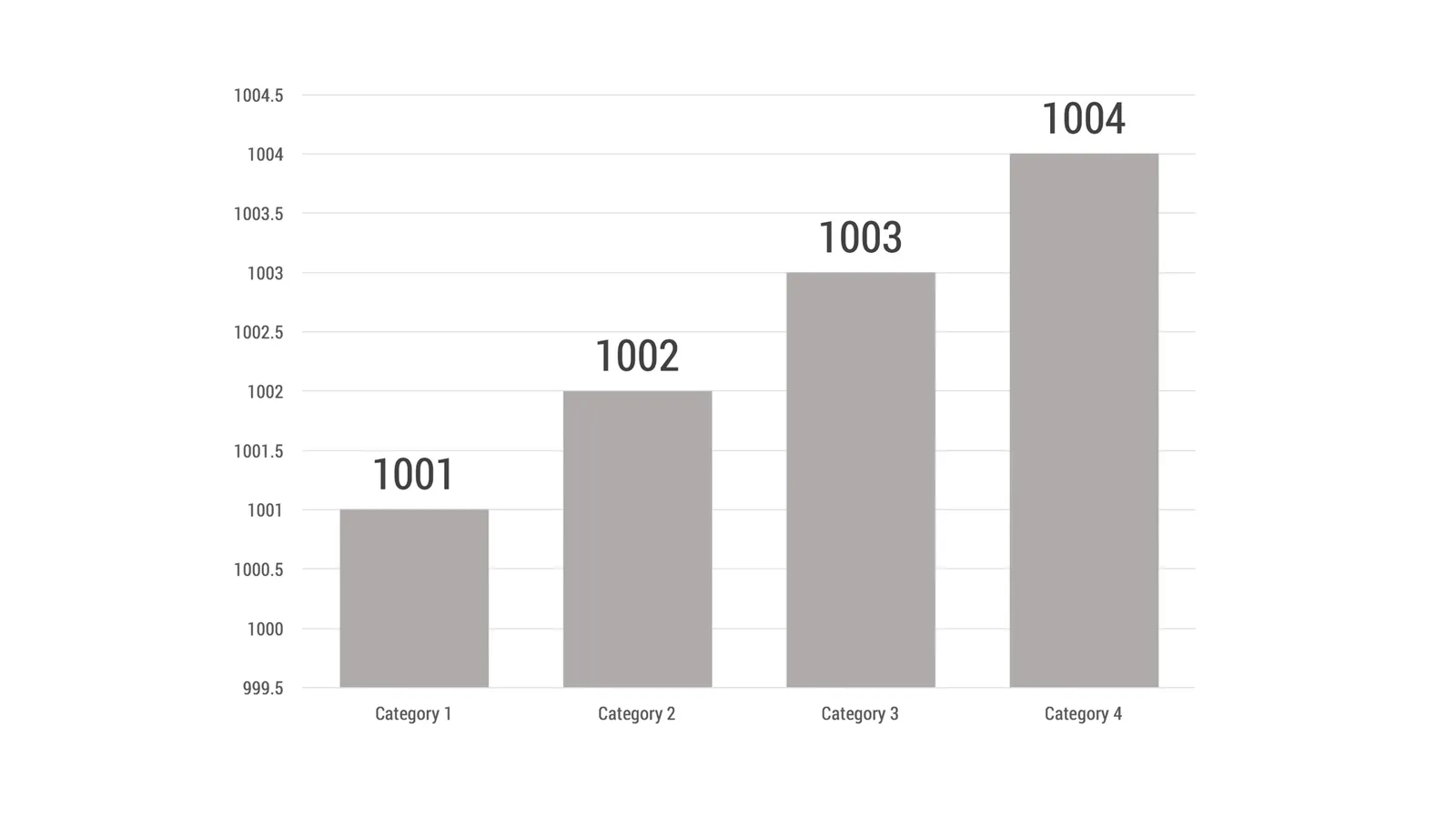
The smart audience will instantly recognise it and discount your ethics. “If she is trying to cover up this one, there must be other skeletons in the closet inside the deck as well, better start looking for them.”
The best option in these situations might be to stay honest. Maybe show a table of numbers rather than a column chart that stays flat. Maybe break down your sales by subsegment, and show that there are promising products out there that can contribute to future growth.
When you use my presentation app SlideMagic, you will notice that it is actually not possible to break the vertical axis.
Image from WikiPedia
Surprisingly few organisations have a proper style guide with instructions for logos, colours, fonts, etc. This is always the first thing I ask for when starting a new presentation design project. As a presentation designer, I need the colours most.
If your organisation does not have one, here is a great tool to create your own: Frontify. You can start with a logo image, extract the colours from it, and take it from there.
When you start at a blank or partially complete slide, it is tempting to put that key message in. You don’t have the overview of the entire presentation, so the key point will appear - duplicated - on many pages.
The same thing I often see happening on corporate web sites: multiple people make edits on different pages independent from each other.
The slide and the page on its own make sense, the overall story looks garbled and duplicated.
Most product pitches go something like this:
The story gets repeated, which makes the whole things boring. A better option is to elaborate on the problems, but then keep the solution section relatively short. You can even show a grid of small screen shots of all your “problem” slides, with tick marks over each one of them.
Presentations have one audience. If you have 2 messages for 2 different audiences you need 2 presentations, or one presentation with 2 clearly marked sections. Using presentation A for audience B does not work, and diluting the content (a bit of A, a bit of B) results in nothing.
If you are lucky, you need to do some extra presentation design work. In the worst case, you might have to back to the fundamental positioning of your business, product, project, idea and cut one of the two options.
.jpg/1280px-Burke_Lake_Park-_Broken_Tree_(14345421196).jpg)
