SlideMagic Blog

Frequent updates about all things presentations since 2008. Subscribe to never miss a post.

RSS
·Software

Maps in Excel

Microsoft has been adding some new features in Excel recently (I am using the Mac version). I am so used to working with the software that I rarely look at new feature additions, unless they are staring me in the face.

One of buttons that got my attention are Bing maps: you can now plot data on locations in a map. You enter a table with locations and a numeric value, and they get plotted in the appropriate location. The map zooms in and out. When you drag the map from Excel into PowerPoint, it becomes a static image of the last zoom level.

I think this is very useful as an analysis tool for for example a retailer who wants to visualise stock levels across its stores.
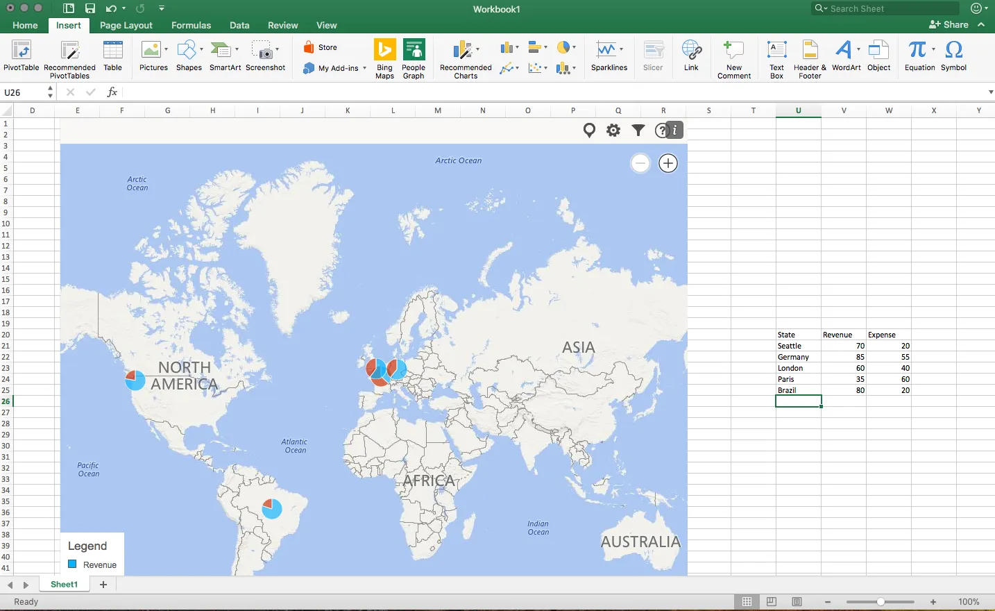
The implementation on a Mac is still a bit crude: it would be great if you could shade entire countries based on a value, conditional formatting. (I see that the Windows version is much more advanced).

Also, the graphical appearance of a Bing map is not designed with a presentation in mind. The map has lots of unnecessary clutter, and random geographical labels are displayed depending on zoom level, pretty much like the map you are staring at when the in-flight entertainment system is switched of just before your plane lands.

Hopefully the Mac version will be upgraded to the features of the Windows version soon.

·Layout

2 ways to stretch objects in PowerPoint

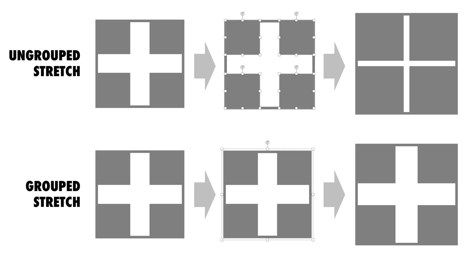
Use these 2 ways of stretching objects in PowerPoint to your advantage. One will make objects closer together, the other maintains the spacing between them. I never paid much attention to this in the first 2 decades of presentation design, but after noticing it, it has proven very useful over the past weeks. Better late than never.

·Investor presentation

The purchaser vs the investor

Tech product pitches are different for a enterprise IT purchase officer and an investor.

The purchasing department might be interested in the full list of user benefits, a detailed description of the features, all written in a language that sounds familiar and resembles the one that is used by the billion dollar tech giants, creating a sense of security that they are dealing with a stable product company that knows what it is doing.

The investor is probably too impatient to read through long tech marketing copy highlighting benefits such as productivity, efficiency, scalability, central dashboards. Yes, there is one box to tick whether the company is able to sell to corporate IT departments, but the bigger question is whether this technology fills a big enterprise need that should be very easy to explain. On the back of that, it should be logical to understand why existing players have not/could not have solved this.

Marketing pitch <> Investor pitch.

Image via WikiPedia

Netflix pitch in 2001

See fragments from it here:

It is easy to say “haha” now that we are in 2017, and think of all those VCs in 2001 that missed this “great” opportunity. Remember, Netflix actually struggled for a long time, even after their IPO. And back in 2001, there were other companies that could pursue Netflix’ business (Blockbuster itself, Amazon). Not an obvious investment decision then.

Leaving the content aside, you can still learn from this email pitch. It is incredibly personal, even informal and it does a good job in explaining the whole business in just a few sentences. A big bold slide deck full of stats about how people are switching from tape to DVD, would not have done a better job.

Image by Marit & Toomas Hinnosaar on Flickr

·Data visualization

Consistency in financials

Financial projections of new business ideas are totally made up / not accurate, so being of by a few million here and there would not matter? We can make quick changes in our financials in the presentation slides, and then “forget” about updating our financials spreadsheet with the new information.

While the absolute numbers of your financial model might be totally pulled out of the hat, it is the thought process of how you got to them that is still valuable for investors. How does your business model work? What would I have to believe in order for your year-5-dream-scenario to come true?

And that model should be consistent across all your documents: presentations, spreadsheets, budgets, everything:

  • Discrepancies make you look sloppy (a little preview of things to come when you need to work together with an investor on a Board)
  • A consistent model of totally made up numbers makes sure that everything is, well, consistent. If you just slashed sales & marketing cost by 50% but maintain the same amount of sales people, something goes wrong.
  • Inconsistencies make it harder to understand your story for an outsider. If sales are $50m on one page and $49m on another people get confused. You established “$50m” as a mental shortcut for year-5-sales-in-the-most-optimistic-scenario, and all of a sudden you create a new shortcut.

So, even if nobody can predict the future accurately. there is still value to create a consistent financial model the same way as you would for a business in which you know every single detail (next year’s budget of an established company for example).

Continue reading →

Off the grid

I am on a short break at the moment do not maintain a blog post pipeline to pretend that I am working 365 days a year. I will start posting again soon when I am back at my desk. Sorry…

Simple vs simplistic

As a developer of an app, you are deep into its features. How do you stack up versus alternatives, we offer x, we offer y, we offer z. It can sometimes sound offensive when, as a presentation designer, you come back with a very simple visualisation of a competitive differentiation. This is not a simplistic dumbing down of the story, this the way users / buyers make decisions, and investors understand your story.

·Layout

Digital car instrument clusters

I had the opportunity to drive a BMW the other day with al all digital instrument display panel. Car manufacturers have something to learn about design. The display tried really hard to look like an analogue one, reflections, depth effects, glow edges, gradients. The whole thing feels very PowerPoint 2007 / Windows 7 / Nokia to me.

Also, a digital display opens up the possibility to re-arrange how the smaller data elements are displayed (kms, fuel tank, etc. etc.), but BMW did not (yet) do that.

Car instrument panels are up for a big shake up. I think the answer is not displays that mimic analog gear, plus eliminating buttons and replace them with touch screens and menu diving. Instead, I would opt for a beautiful, minimal display of essential information, and actually, very high quality, regular “analogue” buttons.

It affects not only the user/driver experience today, but also whether cars will eventually turn into a classic or not. To make the parallel with electronics, old gear from the 1960s / 1970s can still look/work beautiful, while designs from the 1980s and 1990s with low res/poor digital interfaces look cheap and ugly. Digital displays that look advanced today, will be totally obsolete in 5 years from now.

We will see what happens.

·Investor presentation

Checklist for a VC fund investor presentation

A VC fund who is raising money itself asked me the other day to give some example slides of other VC fund decks I have been working on. Showing slides is not possible because of confidentiality, but I could jot down the usual pieces of content after browsing through a dozen recent ones. Here we go in random order:

  • Bios of the investment team, emphasizing different things: investment exit record (if present), how long people have been working together (in and outside the fund), the diversity of skills the team has (including running operations in a business), the big brand employers they have been working for in the past
  • Examples of deal flow they saw last month (sanitized of course)
  • Their perspective on the particular geography they work in (which sectors are hot, where valuations are reasonable, how things have changed over time, how things compare to Silicon Valley)
  • Their perspective on which technology sectors are attractive, which ones not.
  • The network to potential acquirers of companies they have
  • Returns, investment track record, big exits
  • The story behind how the partners in the fund met
  • What sort of deal flow funnel they want to build (how many companies they see, due diligence, investment, etc.)
  • The legal and organization structure of the fund
  • Quotes from entrepreneurs they invested in about them
  • Social media follower stats
  • Pictures of events for entrepreneurs they organized
  • First page screen shots of industry articles they have written, interviews that were published, images of TV appearances
  • Some sort of competitive map of all funds in the same space, highlighting how they are different without “thrashing” their colleagues
  • A list of achievements they had with their portfolio companies, which clients they introduced, which hires they were involved in, which companies raised follow-on investments
  • Which famous LPs invested in their funds (very confidential stuff)
  • Profile pages of portfolio companies
  • Some sort of BCGmatrix not about products but about portfolio companies, which ones are OK, which ones are stars, which ones are write offs
  • List of advisors
  • A slide with legal terms of the fund (fees, carry, etc. etc.)
  • And: evidence of how uniquely “hands-on” the investment team is with their portfolio companies (every fund says this)
Continue reading →
·Layout

Slideuments and graphics designers

Many designers with excellent skills in web and/or print design somehow cannot deploy their talent very well in PowerPoint/business presentations. I have been thinking hard about why this could be.

The key challenge I think is the tight relationship with content and design. In print/web the design of a page does not really change that much if the content changes (it is still a block of text, an image, and an icon that fit in the same overall grid). In a business presentation, everything goes upside down when your competitor analysis needs to include 3 instead of 2 dimensions.

The second reason is - I think - that both people who write presentations and designers who polish them, stick to the conventional slide format: title across the top, list of bullets.

Now here is an interesting experiment for a 100% graphics designer who is not allowed or does not have the knowledge to touch any of the content (the classical print graphics designer situation). Assuming the presentation is a slideument (meant for reading rather than presenting).

Hand over the material in a word processor, as a long text file rather than a partly finished PowerPoint presentation. Now give the designer total freedom to present this material in any form she wants, even in any software she wants, using any page layout she wants.

Changes are you might get a pretty good lucking slideument by taking “PowerPoint” and its familiar layout out of the equation.

Image via WikiPedia