SlideMagic Blog

Frequent updates about all things presentations since 2008. Subscribe to never miss a post.

RSS
all posts

Search results for “web design”

·Concepts

How to present pros and cons

A question came in on Twitter the other day:

My answer is: a simple table, like this one I prepared quickly in my presentation app SlideMagic (you can clone it to your own SlideMagic account in the presentation template file that contains on the slides I have used on this blog).
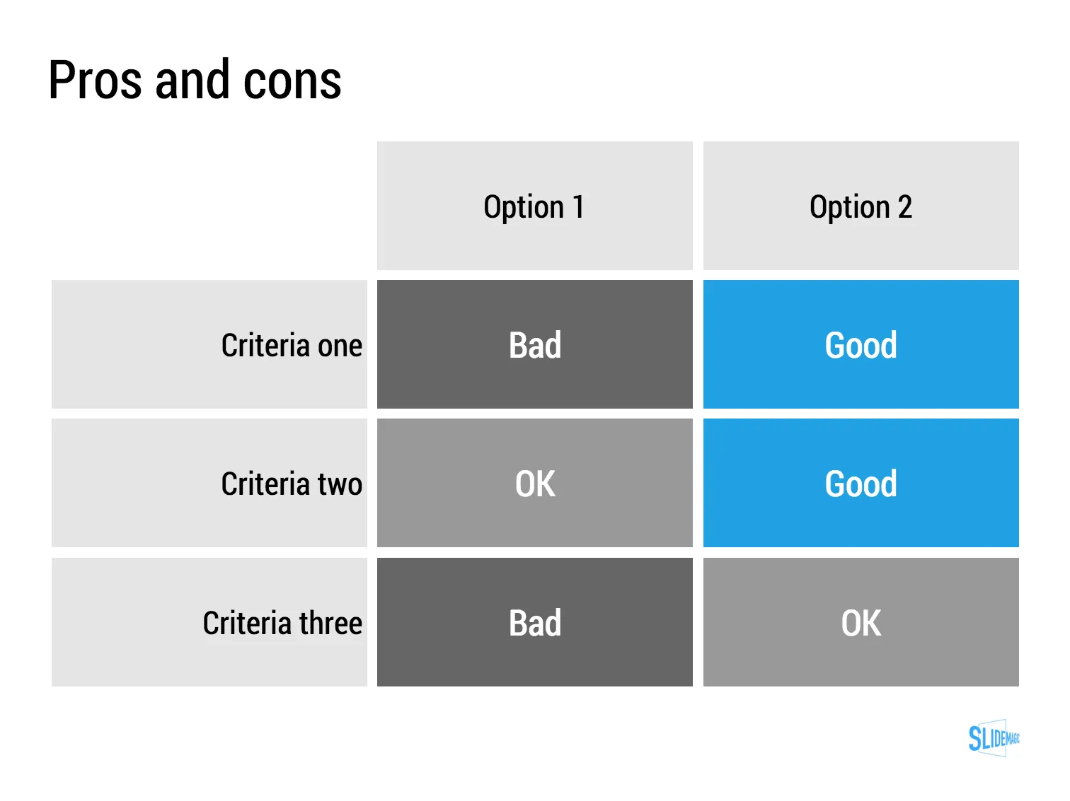
The difference between a good pro/con slide and a bad one is not the design in itself, it is how your present the argument. A presentation slide is a tool to get a decision, it is not a laundry list of pros and cons that you evaluated in your analysis. Put your analysis aside, and design from a blank sheet of paper:

  • Group similar arguments together, if an argument is sort of the same, combine them
  • Sort the rows in the table in such a way that things visually line up. For example you start with rows where both options are “good” (all blues), then do the "OK/good"s, then the "OK/OK"s. etc.
  • Isolated and focus those arguments that are going to drive the decision and/or are controversial. "Option 1 is cheaper, option 2 is faster but the what will make the difference is whether we think [criterion 3] is important.
  • Cut words rigorously until you have a page that is still meaningful but does not look cluttered.
Art: weighing of the heart versus the feather of truth

·Typography

Calibri light

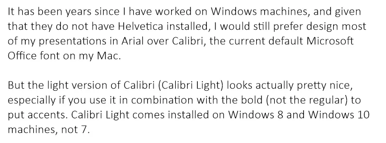
It has been years since I have worked on Windows machines, and given that they do not have Helvetica installed, I would still prefer design most of my presentations in Arial over Calibri, the current default Microsoft Office font on my Mac.

But the light version of Calibri (Calibri Light) looks actually pretty nice, especially if you use it in combination with the bold (not the regular) to put accents. Calibri Light comes installed on Windows 8 and Windows 10 machines, not 7.

Goodbye Arial.

Image on WikiPedia

Citrix slide make over

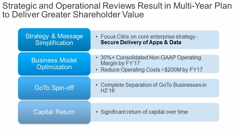
Citrix announced a corporate restructuring recently. The slides that were used are typical of many corporate PowerPoint presentations. Here is an example:

This slide looks like it came straight out of the consulting report that preceded the decision to make the changes. There are a number of things that can be improved:

  • The look & feel does not match Citrix’ clean black and white corporate identity
  • The slide uses a standard Microsoft PowerPoint smart object, with “dirty” gradients
  • No attention has been given to typography: “H2’16” is orphaned on a 2nd line, the light boxes are too narrow to contain 3 lines of text
  • Messages are repeated on the left and right side of the chart
  • There is a cause and effect relationship in the chart (we do this and get ROC in return) that is not reflected in the way it is laid out.
  • The headline is a but woolly.

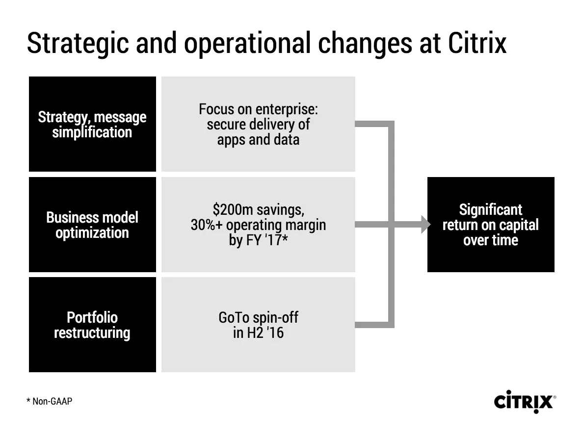
I tried to fix these issues in this quick makeover in my presentation app SlideMagic. I kept the 30% margin and $200 cost cut info in the business model optimisation box, although you could argue that that is an outcome of the strategy as well. A true business model optimisation would be “price increases” or something.

If you want you can copy and clone this slide to your own SlideMagic account by clicking this link. Not yet a SlideMagic user? Sign up here to try it out.

·Layout

I like to frame images

Big, confident images look better on a presentation slide. The maximum size of your image is achieved when you let it “bleed” of the page (the term comes from the age of print, where the ink would drip of the corner).

These full size images look great if your presentation is just images. In most cases, my client work is not. Hence, I prefer to frame my images within a box of white (or black). Some people say it is bad practice, I disagree:

  • You do not have to worry about legibility of slide titles
  • Photo slides look consistent with other slides in the presentation
  • I think, it actually looks very distinguised

My presentation app SlideMagic caters for both formats, so don’t worry if you disagree with me. You can clone the slides below (and all other slides I have used on the blog) into your own SlideMagic presentation via this link.

The image was found on unsplash, free images under a do-whatever-you-want license

·Layout

Lining up logos with tag lines

Often, graphics design is about details. It is difficult to pin down why something just does not look right. The answer: small little things. See the bottom of a magazine ad below. The logos on the left and right have tag lines/sub brands: above on the left, and below on the right. The graphics designer simply centred the image files, but our eyes wants to centre not the entire image, but the main text of the logo. It looks like the logo on the right is positioned too high.

If you cannot get excited by this you should not become a graphics designer…

Illustration: Gemini constellation

The slides from my talk at Microsoft TLV

The accelerator of Microsoft Ventures Tel Aviv invited me to speak this week. I used my presentation app SlideMagic for the design and presentation of the slides (in the lion’s den of PowerPoint). You can view and clone the slides to your own SlideMagic account here. If you do not have an account yet, the app will let you create one.

Some of these slides are hard to understand without verbal explanation. But, this presentation pretty much follows the narrative of my book about presentation design. Check it out, it is free to read.

Arrows in SlideMagic

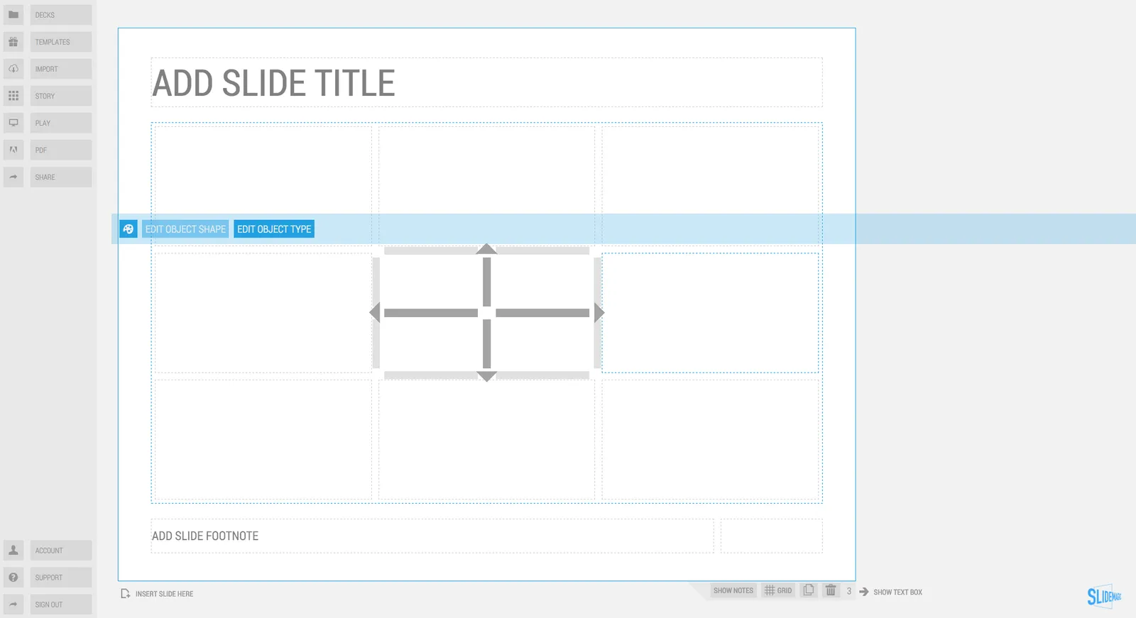
Based on many requests, we deployed the ability to create arrows in SlideMagic. You will notice a more elaborate user interface when working with connector objects. Try them out and let me know what you think.

Art: Guido Reni, Reclining Venus with Cupid, 1639

·Software

How to recover lost PowerPoint 2016 files after a crash

Note: this blog post discusses PowerPoint 2016 for Mac.

PowerPoint 2016 is great, but it still crashes left right and centre, all the time. Autorecovery does not always work, and when you forgot to hit SAVE every 5 minutes in the heat of a presentation design project, you are stuck.

The good news: you can often recover data, even when PowerPoint thinks it is lost.

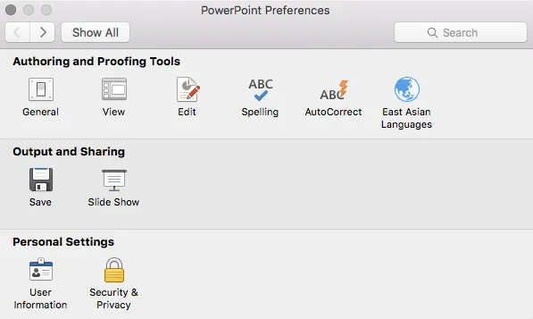
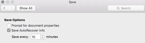
PowerPoint autosaves your files in the background, without your realising it. Make sure you have switched this on, you can set the save interval in PowerPoint settings:

Normally after a crash, PowerPoint will automatically restart and present you with the last file that was auto saved. Normally… If not, try the following.

  • In the Mac finder window, open the “Go” drop down, press ALT, to show the LIBRARY folder and click it.
  • Once in Library, go to  Containers > com.microsoft.Powerpoint > Data > Library > Preferences > AutoRecovery
  • Have a look at the files there and spot a file with a “_autorecover” ending to its name, taking into account the time it was saved.
  • Copy this file just to make sure
  • Rename this copied file with the “.pptm” extension at the end. Ignore all warnings you are presented with.
  • Double click the file and cross your fingers

There is no 100% guarantee this will work, but it is worth a try

One more tip: as soon as you see the small “spiral of death” spinning across the PowerPoint screen develop the instant reaction to take a screen shot of the application. If you are lucky and you grab the slide sorter window, you have captured a miniature icon of all your slides, which should save a lot of time recreating them. Worst case, you just got the thumbnails on the left of your screen that are in the regular slide editing window.

Continue reading →
·SlideMagic

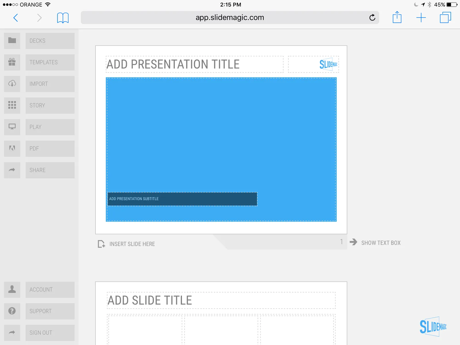
SlideMagic on iPad

I have never been a big believer in focussed and productive presentation design on tablets, but presenting documents (mostly in 1-on-1 meetings) and making last minutes edits are important on mobile devices.

We are not making tablets a design priority, but have deployed some changes to the code that makes SlideMagic run pretty smoothly on an iPad (iPhone is still not optimal). Try it out and report back any bugs. Android tablet users, let me know what happens (I have not tried things out there yet).

With the large iPad Pro coming out later this year, there could be a brighter future for SlideMagic on iPad given the very simple menu structure we use.

 Screen shot of SlideMagic on my iPad Mini 2

Screen shot of SlideMagic on my iPad Mini 2

McKinsey exhibit make-over with SlideMagic

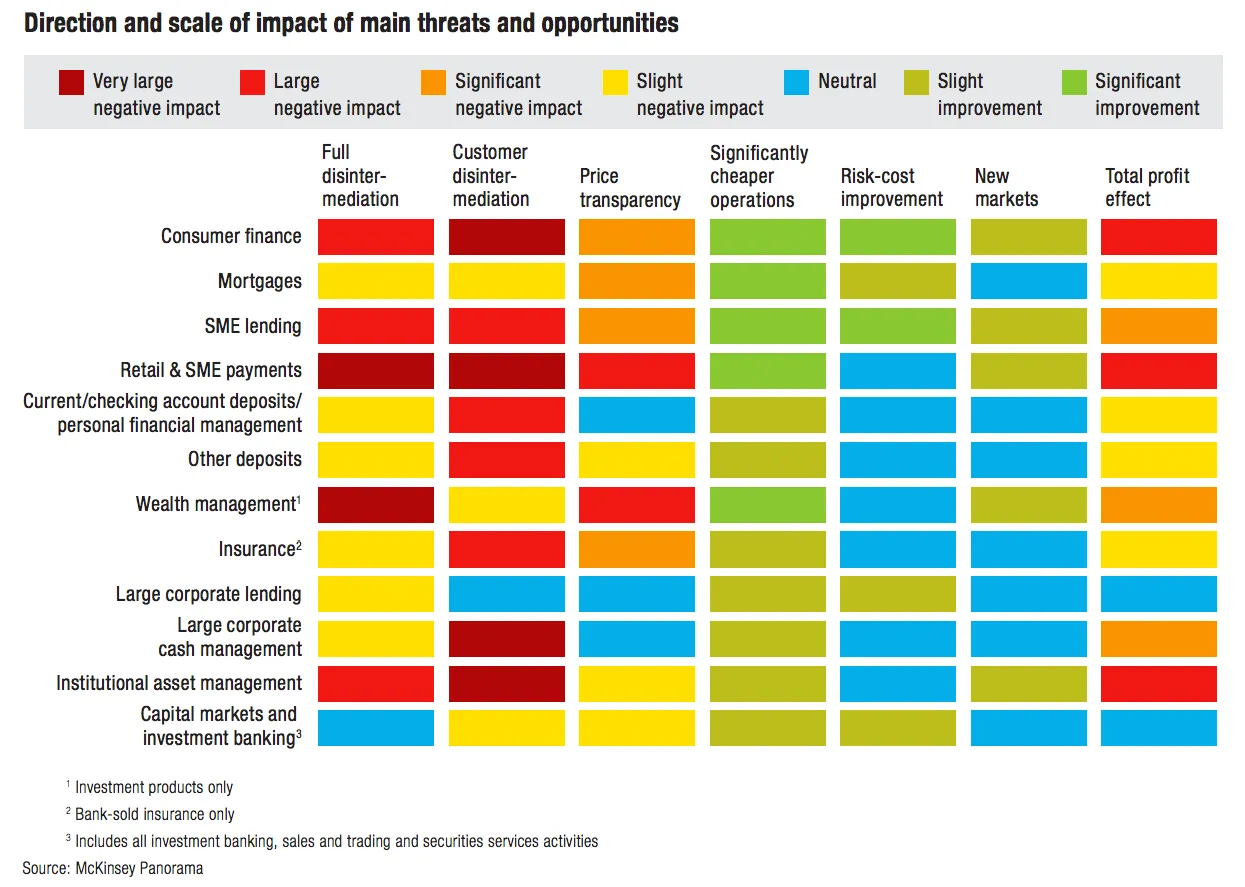
See the McKinsey exhibit below. (I found it in a LinkedIn stream, so I cannot source it to the original article.)

This table is an example of a pros/cons trade off or feature comparison matrix. I find them very useful to visualise the impact of multiple trends, or to trade off complex issues. Still there are a few things that can be improved:

  • The finance sectors are not ranked, it is better to sort them based on the total profit impact
  • There are too many steps in the scale, resulting in too many colours. And, the colours are not chosen according to a consistent colour scale. Especially the greens, they are different types of green
  • The title of the chart is woolly
  • The row labels are too long and complex
  • Column headings are not centred, they look weird
  • The foot notes are too prominent

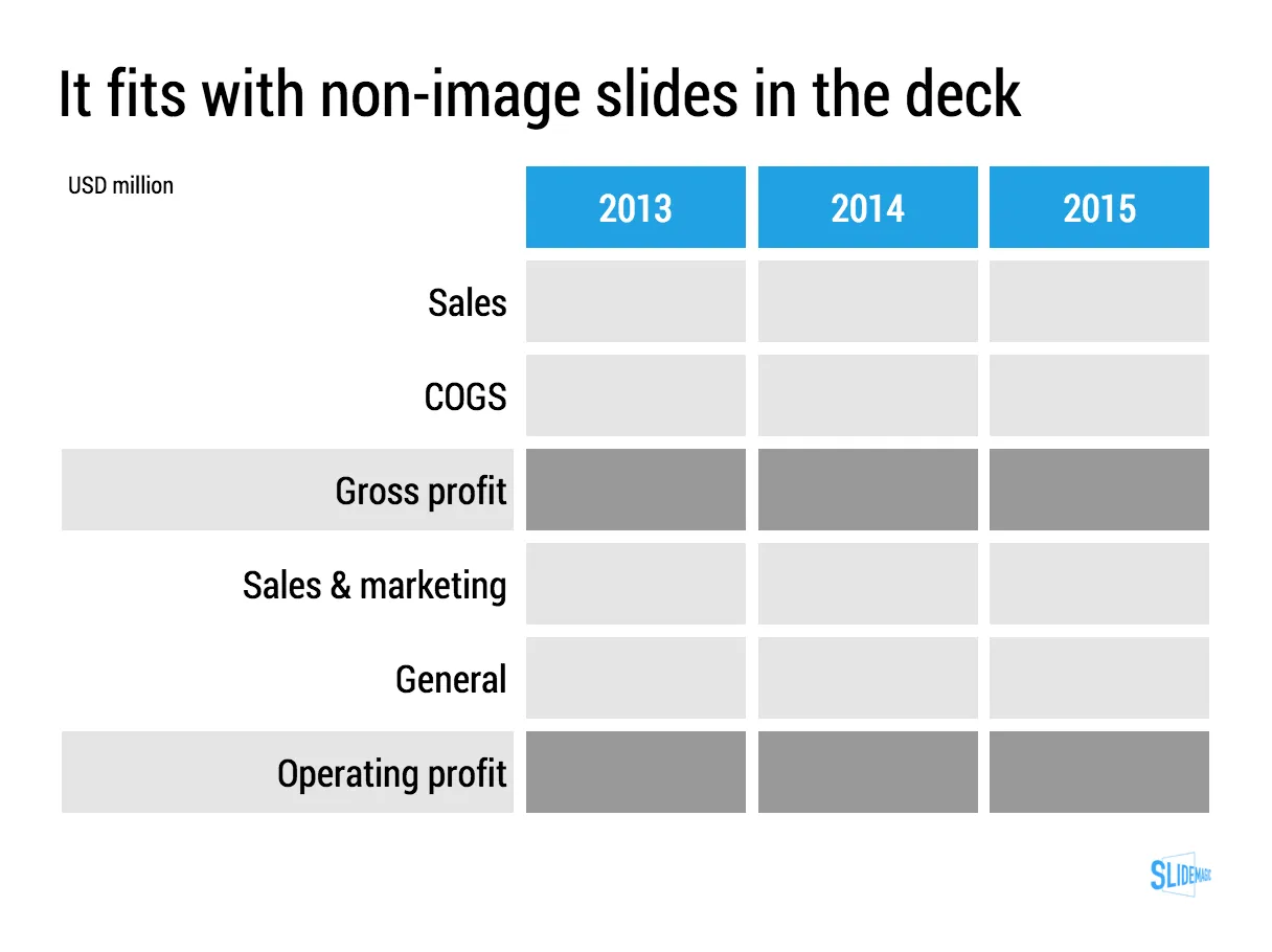
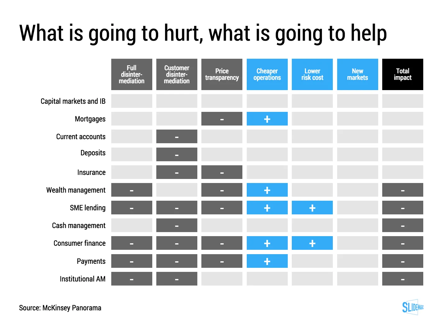
I have tried to recreate the chart in my presentation design tool SlideMagic. Manipulating tables in SlideMagic is especially easy since it uses a very strict grid system. I collapsed a number of categories into one. The result is that I lost some precision, but I gained a much better visual representation of the effects. If you want, you can add a second layer of data to this chart, by inserting numbers (on a scale from 1 to 7, or on a scale of -3 to +3) to show more granular data.

If you want to use this chart as a template for your own presentation, follow this link and clone the chart in your own SlideMagic decks.