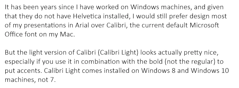
It has been years since I have worked on Windows machines, and given that they do not have Helvetica installed, I would still prefer design most of my presentations in Arial over Calibri, the current default Microsoft Office font on my Mac.
But the light version of Calibri (Calibri Light) looks actually pretty nice, especially if you use it in combination with the bold (not the regular) to put accents. Calibri Light comes installed on Windows 8 and Windows 10 machines, not 7.
Goodbye Arial.