SlideMagic Blog

Frequent updates about all things presentations since 2008. Subscribe to never miss a post.

RSS
all posts

Search results for “web design”

·Concepts

Merging flows

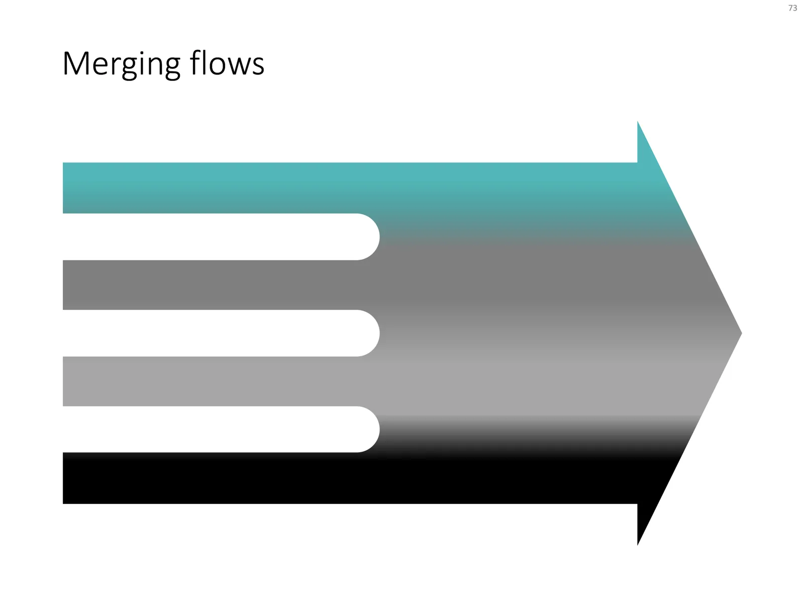
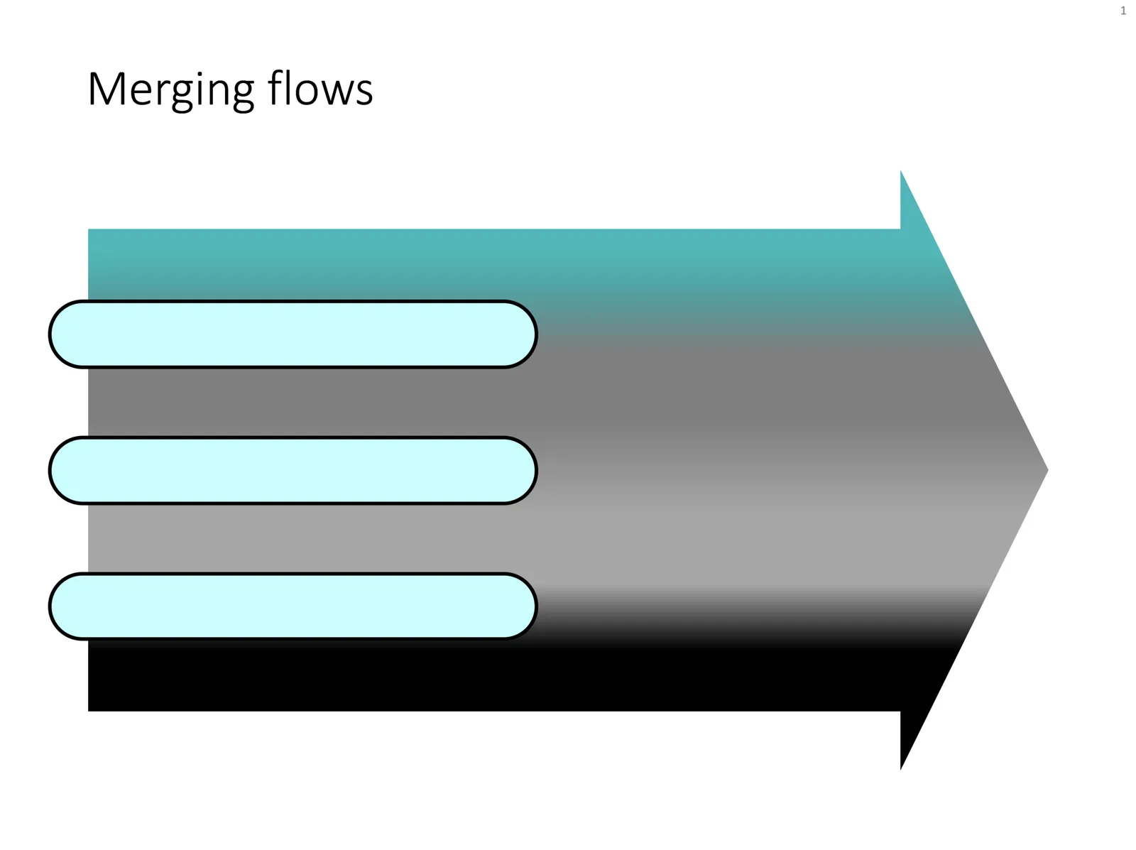
Here is a chart that visualises the merging of different flows. See in the second image what components I used to build it. Play around with the gradient stops to get the colours right.

Feel free to copy this design, or download it ready-made from the SlideMagic template bank.

·Concepts

Sankey diagrams in PowerPoint

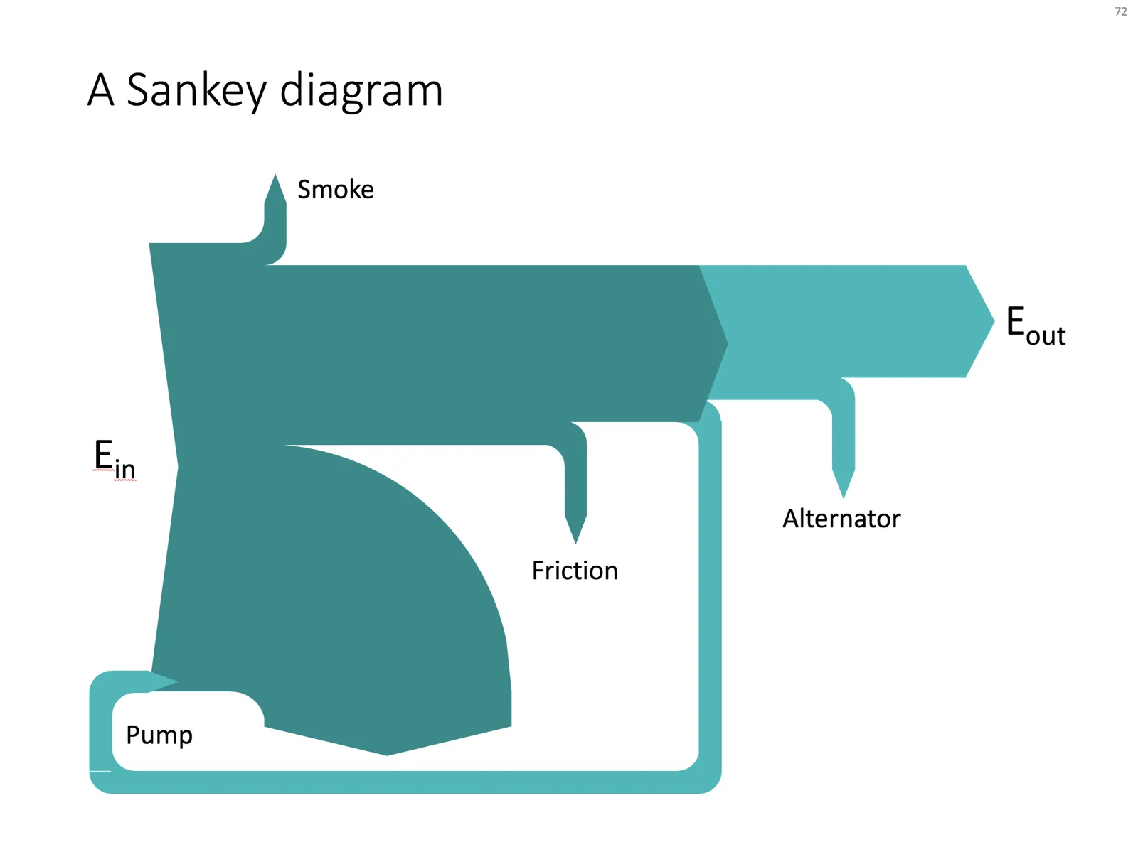
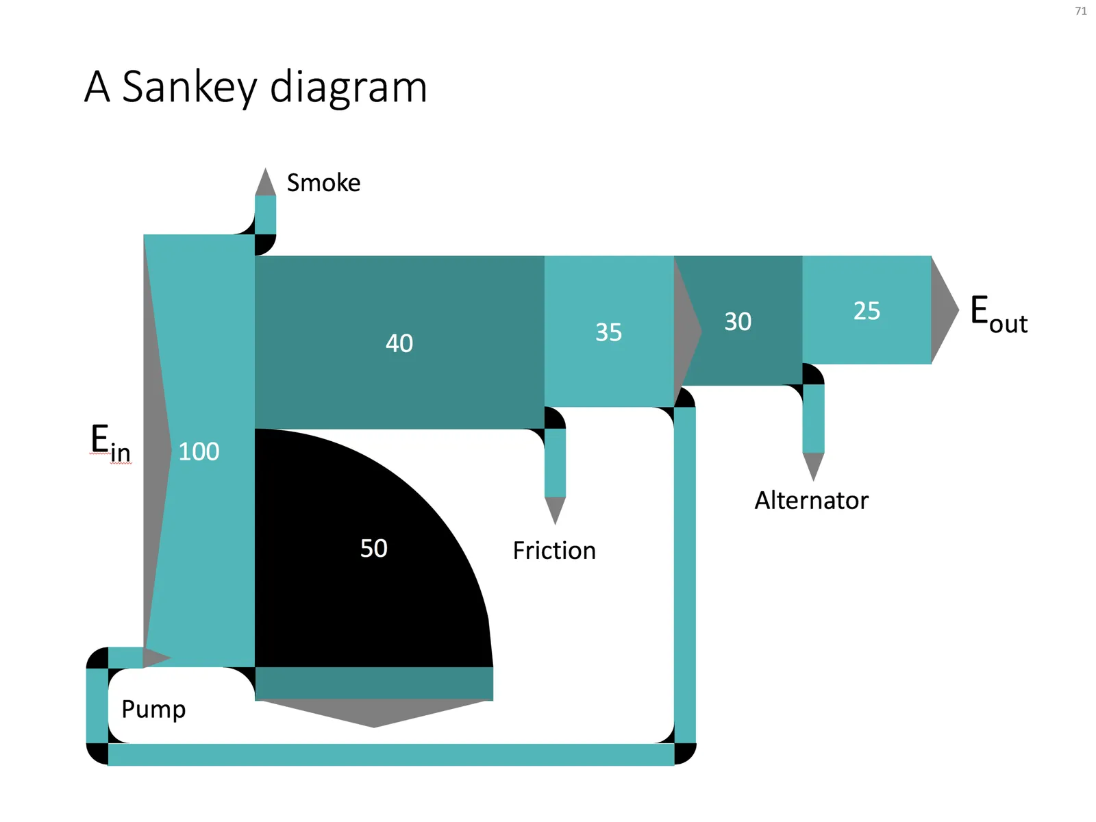
Sankey diagrams are tricky to make in PowerPoint, in the absence of a standard tool, you have to DIY the diagram from individual components. See below the approach I took to recreate a Sankey diagram that is used as an example on WikiPedia.

Here are the steps I took:

  1. Make it easy to make size adjustments by setting the height of the first block to 10cm
  2. Create all the square blocks
  3. Create the quarter circle shape (shape subtract) and put at the appropriate corners
  4. Create the inverse circle shape (take a square and subtract the quarter circle) and place it on the other side of the corners
  5. At triangles where necessary, note that I also used a white triangle at the entrance of the system.

The solution is not perfect, but it works. Feel free to copy this design, or you can download this chart from the SlideMagic template bank.

·Concepts

Popping out of the box

Unlike many designers, I actually like framing my slides, leaving white space around the edges. Stretching your picture all the way to the slide boundary looks nice on one page, but creates inconsistencies with more traditional data slides, and reduces the readability of slide titles.

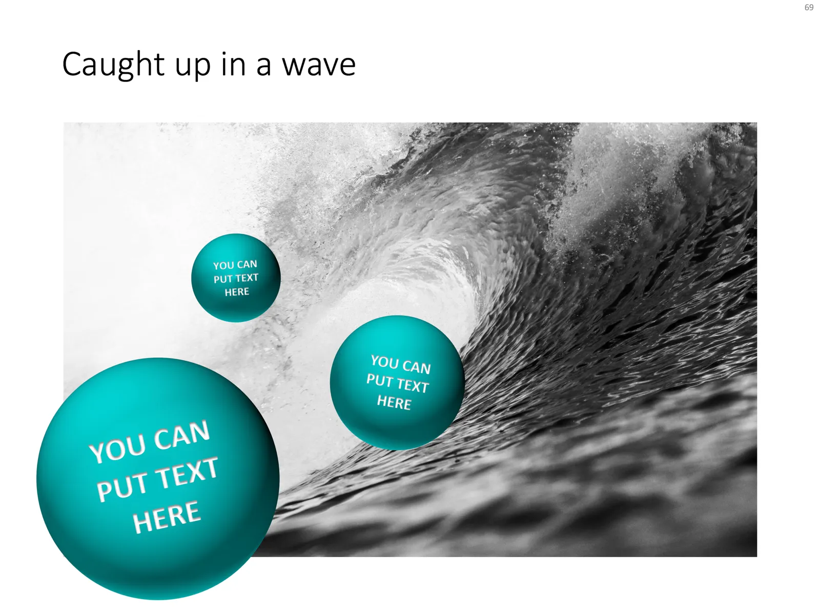
One advantage of the frame is that you can make things pop out, a trick that is often used in magazine design. See below an example I made using that approach.

Feel free to copy the design above, or buy it ready for you to use from the SlideMagic template store.

SlideMagic versus the competition

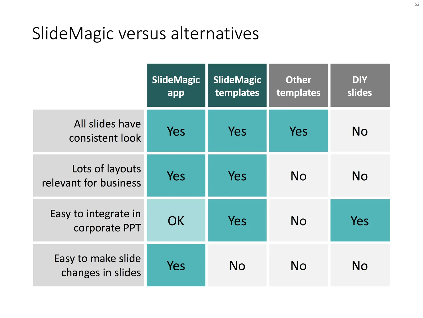
Today, I added a slide to the SlideMagic template store that shows how I usually visualise some sort of competitive comparison or product differentiation. I took SlideMagic itself as an example:

  • A simple yes/no table
  • Use the accent colour to emphasise features
  • Sort columns and rows in order to keep as many “yes” boxes together in a nice pattern

The slide pretty much sums up how I see SlideMagic. In the app, it is really easy to change slides, in PowerPoint it can be a bit of an exercise to add a column in a 4x5 grid and keep everything nice and organised. Most online template stores try to hard with design that look horrible when pasted into a corporate PowerPoint template, and most of all, template stores are run by designers and not by former strategy consultants, so they won’t always have the charts you actually need most in a business presentation.

Feel free to “steal” my design and copy it yourself, or download it instantly from the SlideMagic PowerPoint template store. Have a look at other slides in the template store about competition and competitive advantage.

Photo by Alex Holyoake on Unsplash

Juggling URLs

All the SlideMagic businesses and web sites run on different platforms. Through design, I have tried to keep a consistent look and feel as you click from one environment to the other. Yesterday, I made some drastic changes to URLs, and consolidated the facebook pages into one. Let’s see what all this does to my Google search results, but more importantly, hopefully all the redirects work and the user experience stays good.

Here is everything as it stands at the moment. There is still room for more consistency…

Let me know if you experience any broken links or other issues.

·PowerPoint

My own clean PowerPoint template

PowerPoint templates get corrupted over time. It usually starts with a template that was designed by a print graphics designer as an after thought after designing the logo and the business cards: creating slide layouts without paying much attention to the technical issues of programming a template that can be (ab)used by thousands of employees. Then over, slowly but gradually, “foreign” templates infect the original until nothing is left of the original.

I go back to zero every time I design a new presentation. The file that I put up in the SlideMagic template store is pretty much the one I start every new presentation design project with. It is really simple. You can customise it with your own colours and you are good to go.

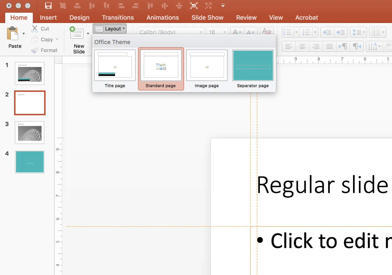
When creating a new slide, go to the “Layout” button in the top left of the menu to create a select a new slide layout.

·Templates

Soft launch of the SlideMagic template store

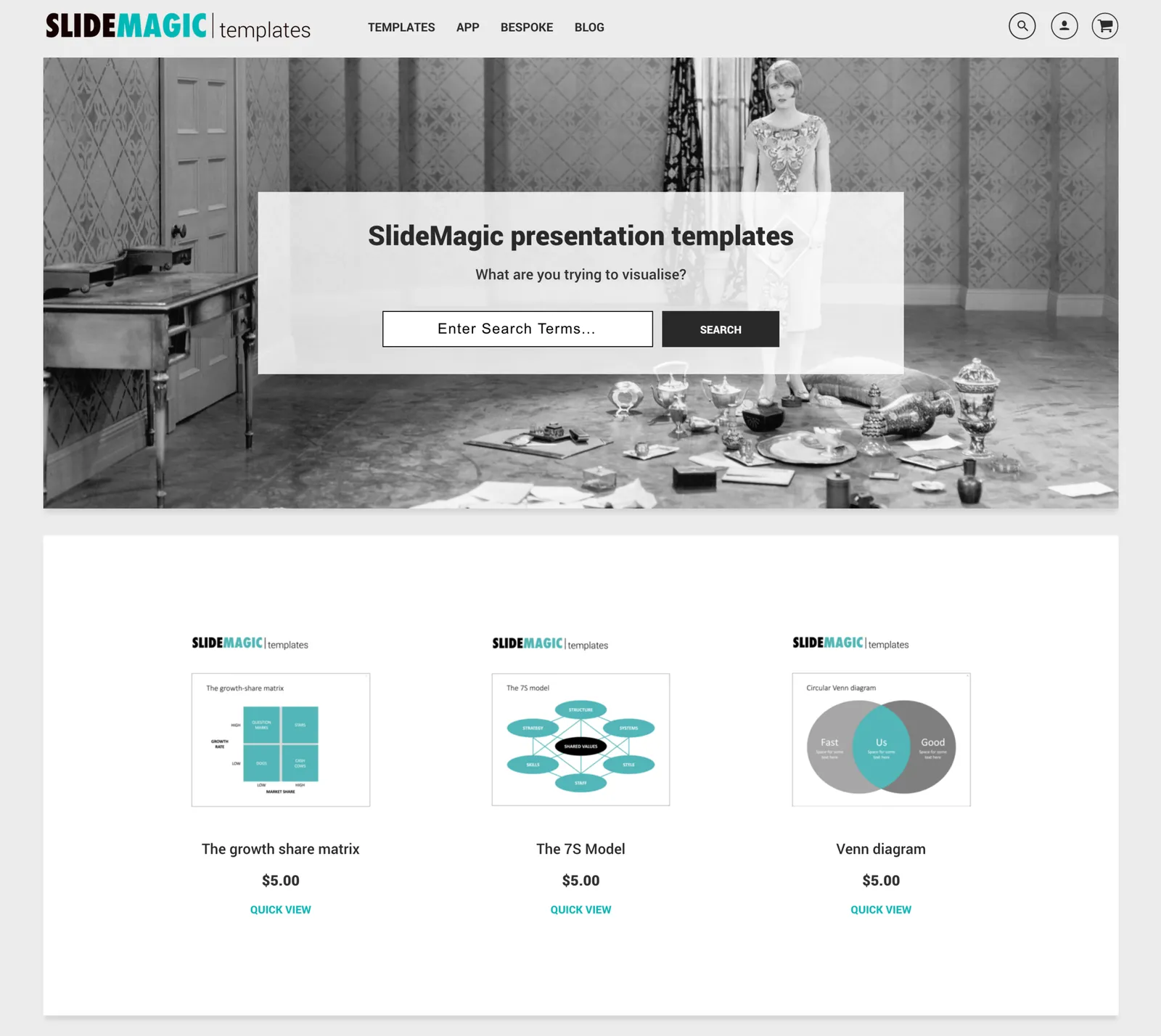
Many users of the SlideMagic presentation app ask for the slides that the app generates in PowerPoint format. In response, I have built a SlideMagic presentation slide template store. The basic store infrastructure is finished, but the amount of slides available is still small.

It was quite interesting to see how in 2017 it is possible for a designer to pull of a full-fledged digital content eCommerce store with downloads and payment processing in a matter of days. (OK, my computer science engineering degree came in handy a few times when I had to go deep into HTML to customise the store template in a few places). A few years ago I was toying with the same idea, but the required investment in technology would have been a lot higher.

The main shortcoming of PowerPoint templates vs my presentation design app also applies to my own template store: templates are hard to customise. Adding a row of boxes to an existing design and getting everything to line up properly requires a bit of design skill. It is a trade off you have to make. The app is free to use, and makes these adjustments really easy. Where possible I will add slide variants to accommodate the layman designer where possible.

There are thousands of presentation template stores on the Internet and I tried to make mine different. All stores try to hard: designs are too sophisticated, full supporting graphical clutter that makes slides hard to customise and hard to fit in to corporate templates. My slides are incredibly simple and should blend in nicely when pasted into another corporate colour scheme.

Continue reading →
·Software

Maps in Excel

Microsoft has been adding some new features in Excel recently (I am using the Mac version). I am so used to working with the software that I rarely look at new feature additions, unless they are staring me in the face.

One of buttons that got my attention are Bing maps: you can now plot data on locations in a map. You enter a table with locations and a numeric value, and they get plotted in the appropriate location. The map zooms in and out. When you drag the map from Excel into PowerPoint, it becomes a static image of the last zoom level.

I think this is very useful as an analysis tool for for example a retailer who wants to visualise stock levels across its stores.
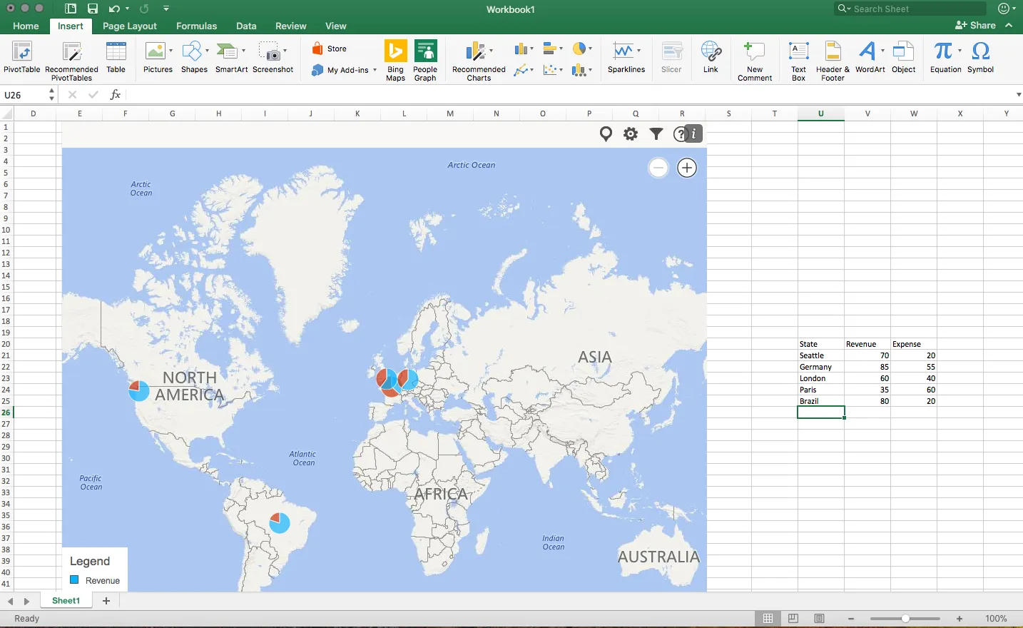
The implementation on a Mac is still a bit crude: it would be great if you could shade entire countries based on a value, conditional formatting. (I see that the Windows version is much more advanced).

Also, the graphical appearance of a Bing map is not designed with a presentation in mind. The map has lots of unnecessary clutter, and random geographical labels are displayed depending on zoom level, pretty much like the map you are staring at when the in-flight entertainment system is switched of just before your plane lands.

Hopefully the Mac version will be upgraded to the features of the Windows version soon.

·Layout

2 ways to stretch objects in PowerPoint

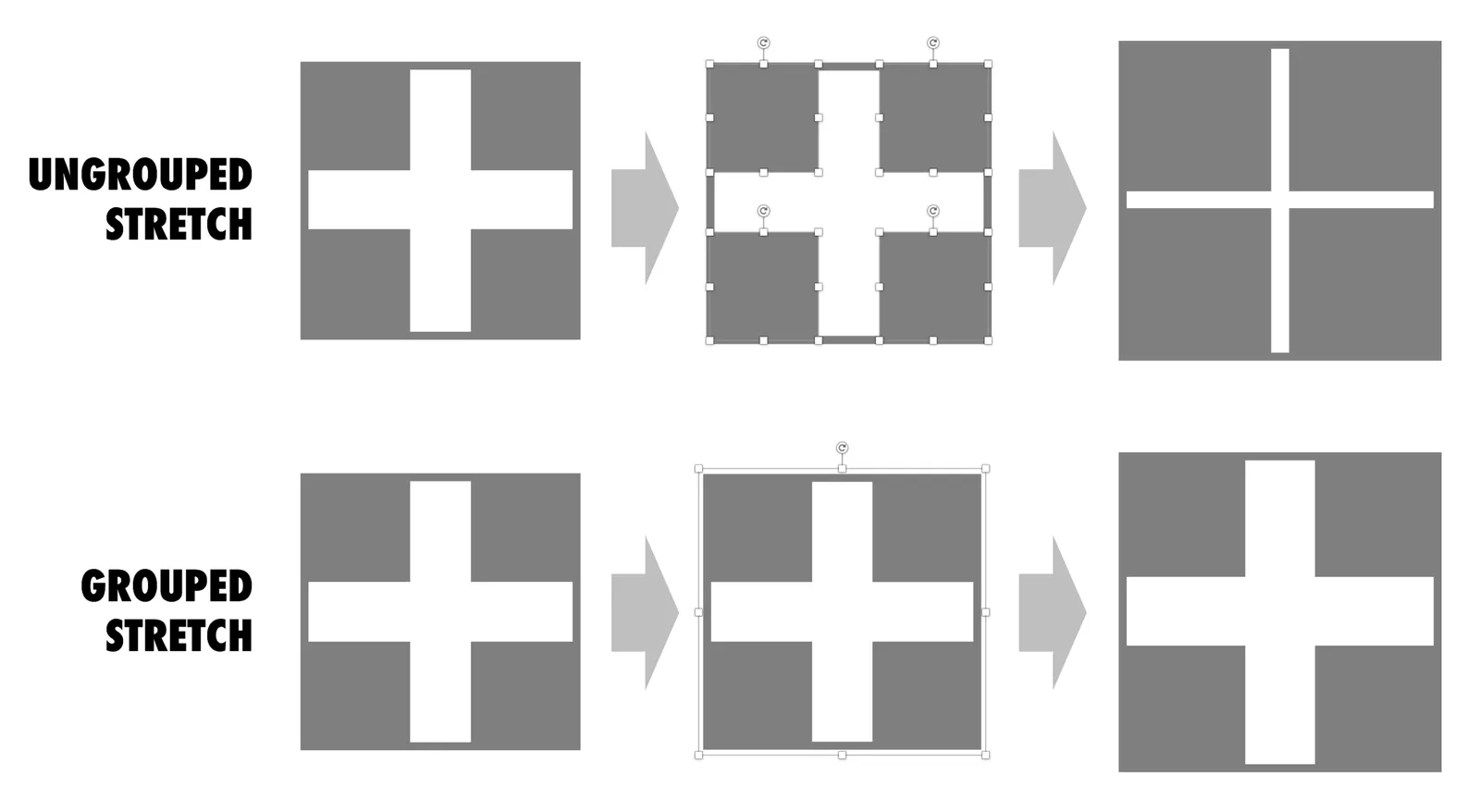
Use these 2 ways of stretching objects in PowerPoint to your advantage. One will make objects closer together, the other maintains the spacing between them. I never paid much attention to this in the first 2 decades of presentation design, but after noticing it, it has proven very useful over the past weeks. Better late than never.

Yesterday's Apple special event

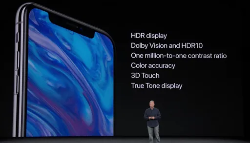
Apple’s product announcements are probably business presentations with the largest audiences ever and an example for all of us on slide design and stage delivery. Yesterday was no exception: a well-rehearsed performance and great looking slides in minimalist Apple style.

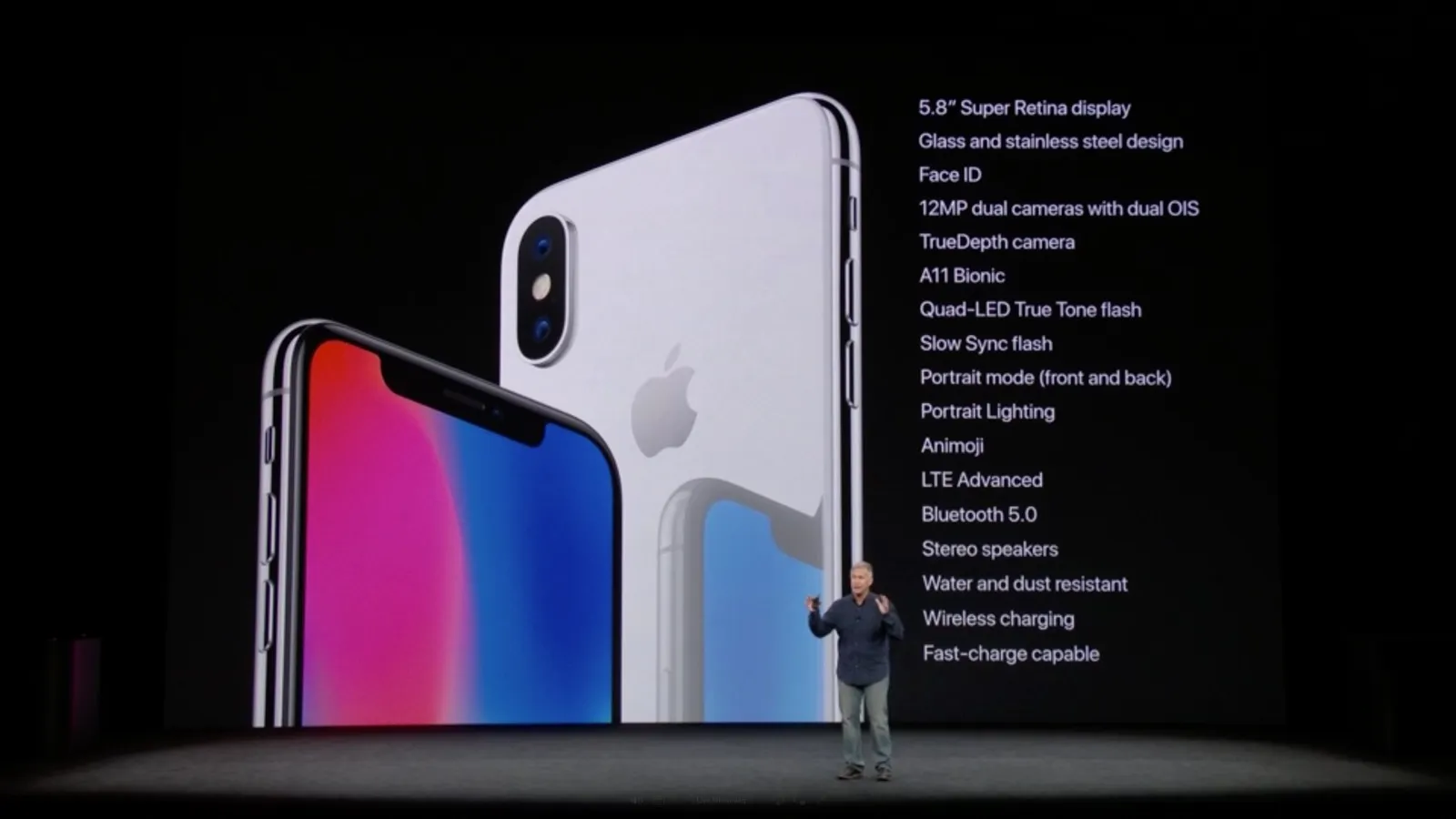
In about 5% of the slides, Apple slipped into the feature list trap though. Whenever it was time to wrap up the presentation of a product, a slide with a beautiful photo appeared, with a list of bullet points appeared, summarizing the features. Phill Schiller was rushing through the list, mentioning certain bullets, skipping others, repeatedly looking down at the stage monitor to keep on script.

Bullet points can happen to the best of us.