SlideMagic Blog

Frequent updates about all things presentations since 2008. Subscribe to never miss a post.

RSS
all posts

Search results for “web design”

·Concepts

A multi-dimensional comparison

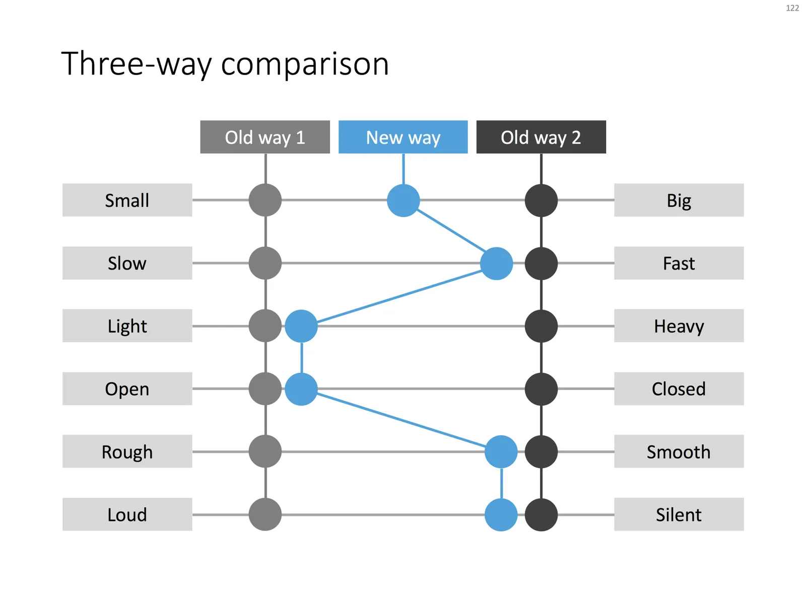
This chart can be your weapon of choice when you need to visualise a complex comparison: multiple options, multiple dimensions, and subtle differentiations (beyond “yes” or “no”). You can position the balls anywhere in between the extremes. When using the slide for your specific situation, it might have to go through a number of iterations. Choose the order of the dimensions in such as way, that the lest complicated line pattern emerges.

Feel free to copy the design, or download the completed slide from the SlideMagic store.

New year, new branding

Christmas and New Year are regular working days in Tel Aviv, so this week was an excellent time to give my branding a major overhaul. The Dutch masters and the quirky vintage images did get a bit stale, so I replaced them with a new fresh look, all in SlideMagic blue. The best wishes for 2018 to everyone!

 The presentation design app

The presentation design app

 The template store

The template store

 The bespoke design business

The bespoke design business

·Concepts

SWOT analysis

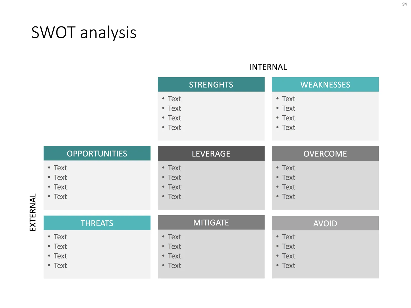
You have been searching “SWOT” a lot in my slide template store, and got blank results. So, by popular demand, I added a SWOT slide template.

The slide is a bit too dense to put up in your next TEDTalk, but that is never the purpose of a Strengths-Weaknesses-Threats-Opportunities analysis. A SWOT is an analysis rather than a presentation tool. In my life as a strategy consultant at McKinsey, a SWOT analysis rarely solved a big strategic problem start to finish, but it is usually a great tool to get people started.

It can be especially useful in big group discussions where strategic debates can go all over the place. Putting an empty SWOT framework on a flip chart immediately calms the group down and focuses the meeting.

I expanded a bit on the traditional 2x2 (4 boxes) model: the SW, and OT boxes are now put on the side of the matrix, leaving space for 4 new boxes in the center that enable you to scribble what you are actually going to do about all these internal and external factors.

(I vividly remember that 50% of the group discussions around a SWOT whiteboard were about in which box to throw a particular thought).

Feel free to copy the design, or download the SWOT analysis ready made from the template store. You can find there more examples of strategic frameworks as well.

·Investor presentation

Presenting your team

Team slides are tricky: there is so much to tell when you have 3 people with a 20 year career. Where to start?

I tend to split the problem in 2: put complete bio slides in the presentation appendix, and focus on a few messages about what makes that team special in the main presentation. What is the story of the team?

  • Do they have diverse, complimentary backgrounds?
  • Have they worked for very famous companies?
  • Have they founded and sold a lot of businesses before?
  • Do they have very unique scientific knowledge?
  • Do they have a particularly long work experience?
  • Are they a proven team, that has worked together in the past?

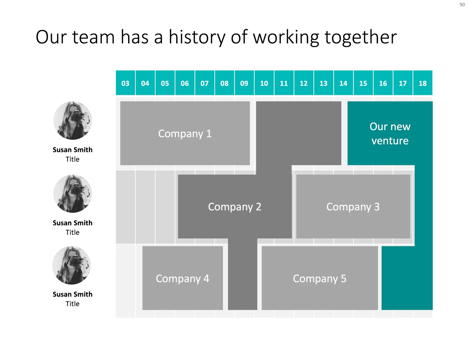
Each of these messages merits a completely different slide. The slide below would be an example that covers the last of the above points, a team that goes back a long time together. Rather than dry bullet points describing their background, I laid out the “CVs” horizontally on a timeline, and make very strong visual connections for periods where people overlapped at a company.

Feel free to copy the design, or download the slide from the SlideMagic template store.

·PowerPoint

Turning a bar chart into a Gantt diagram

Project Gantt charts are a pain to create in PowerPoint. Screen dumps from professional project management software are too detailed and don’t have the right look & feel. Manually resizing blocks is tedious, and oh boy, what if you have to add or change an activity…

I often use a disguised stacked bar chart to create project flow charts in PowerPoint.

First, you need to look at the content. Like my approach with all data charts, project plans should not be copy pasted directly into PowerPoint. Project planning, data analysis, is not the same as presenting the result to an audience, you need to disconnect the two activities. This means in most cases starting with a blank sheet of paper.

Purely from the stand point of communication (not planning): which activities should be grouped together, which separated? What is a logical phasing? Sometimes, nitty gritty activity details are crucial for planning purposes (exact roll outs for each city), but can get pretty boring in a presentation. Sometimes the opposite is true, a small pilot might be worth highlighting in the presentation.

Once you have this sketch, you can transfer it to PowerPoint. PowerPoint does not have pre-configured Gantt chart templates, but the stacked bar chart can provide a solution. See the chart below as an example:
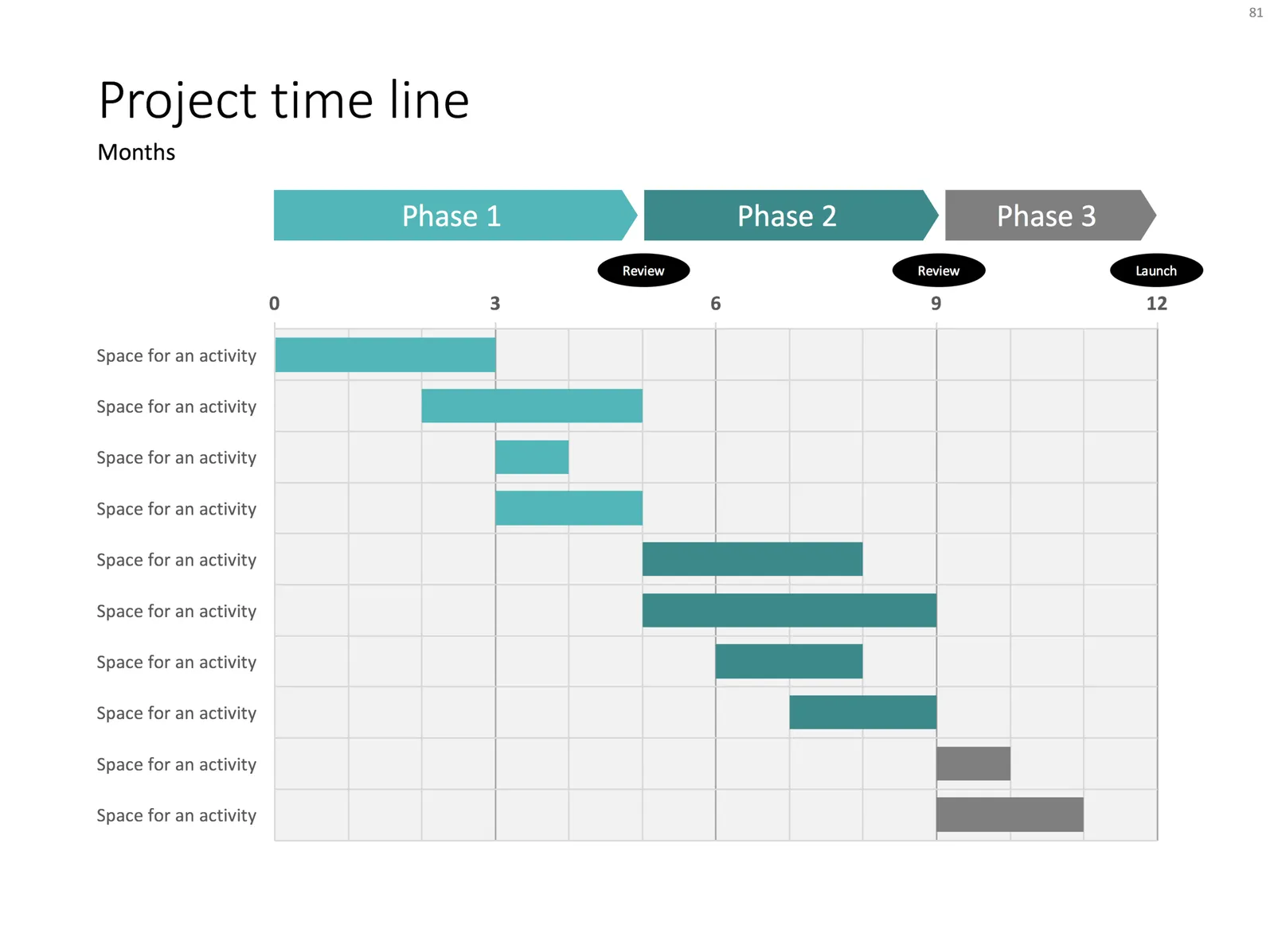
It takes a bit of thinking to set up, but once in place, it is easy to make small changes to the length of the bars and/or add and subtract activities without having to go through the hassle of lining up everything again.


Continue reading →
·Layout

Evidence from press clippings

Here is a slide I often encounter in draft publications: a screen shot of a news web page, with a few words circled in the middle of the article. There are a few problems with this:

  • The circled quote is often impossible to read
  • The other elements of the web page screen shot compete for attention: the big headline, the photo. The article was not designed to focus the attention on your circled text
  • Today’s web pages are crammed with screen elements that you don’t need on your slide: social media like buttons, advertising
  • A screen shot of a random news web site does not carry the same credibility anymore as a cut out article of the 1935 New York Times once did

There are better way to show that piece of evidence:

  • Incorporate data in a bar chart, comparing it to something, and putting the news web site in the bottom source line
  • Creating a big quote page, again quoting the news web site as a source

When should you use news web sites? Maybe if the headline in a very credible news source is what you need. But then, cover unwanted screen clutter with white boxes to draw the attention of the audience to that headline, and nothing else. Here is an earlier blog post about formatting newspaper screenshots.

Photo by G. Crescoli on Unsplash

·Data visualization

Presenting survey results

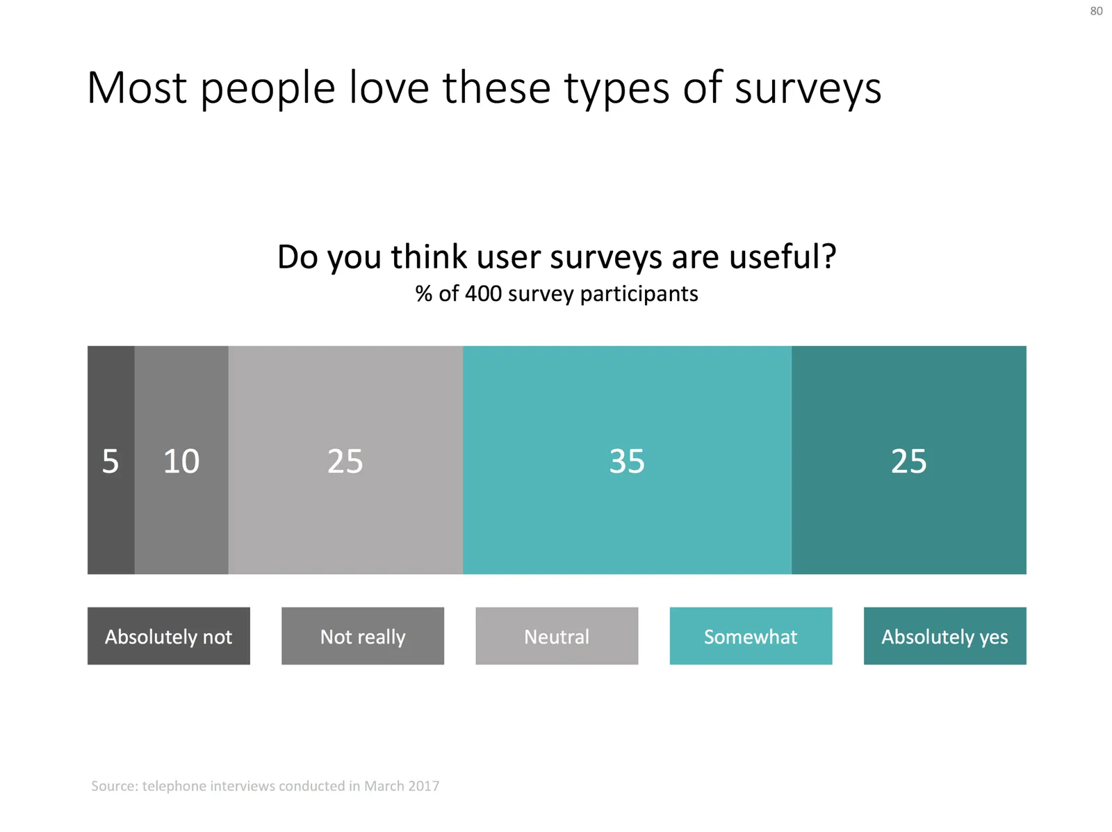
Here is a chart I usually use to present the result of a survey:

  • Horizontal bar chart, stripped of all axis labels, data labels, etc.
  • Consistent color coding to support the message you want to come out
  • Text place holders for the survey’s conclusion, and the factual info: what question was asked, when it was asked etc.

Feel free to copy the design or download the chart from the SlideMagic template store.

Photo by Alex Kotliarskyi on Unsplash

·Concepts

Some decision charts

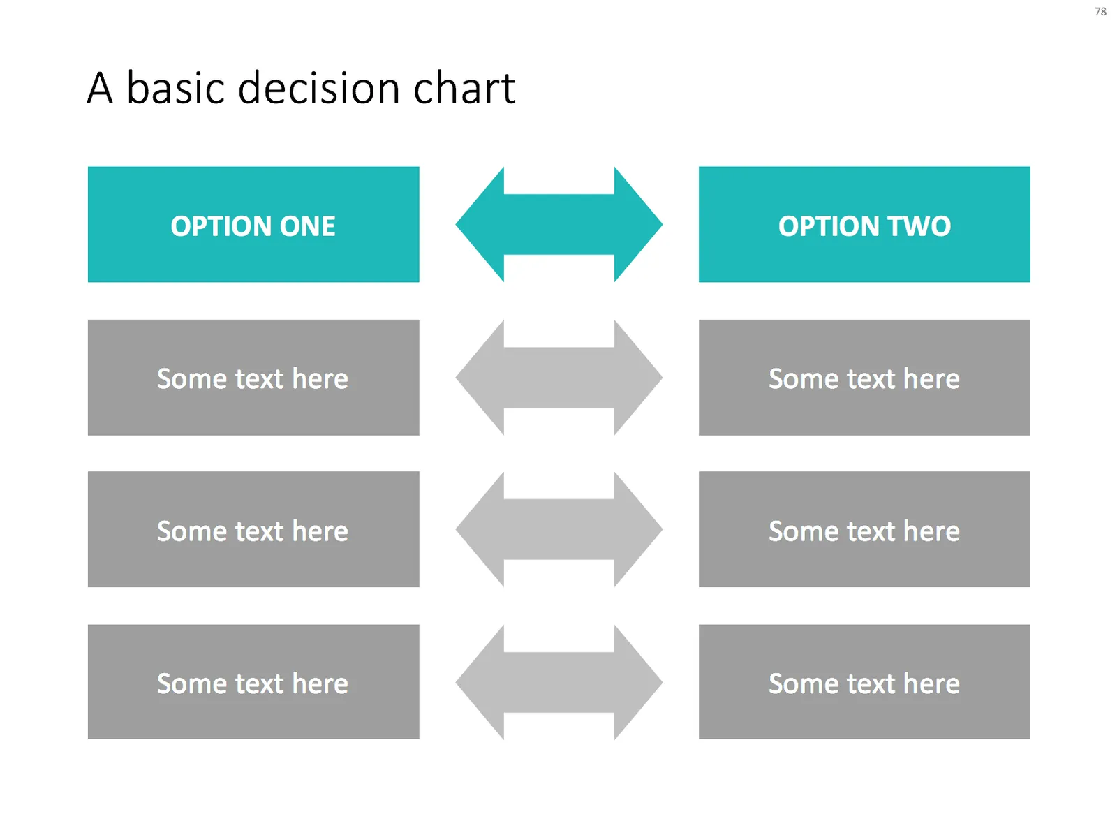
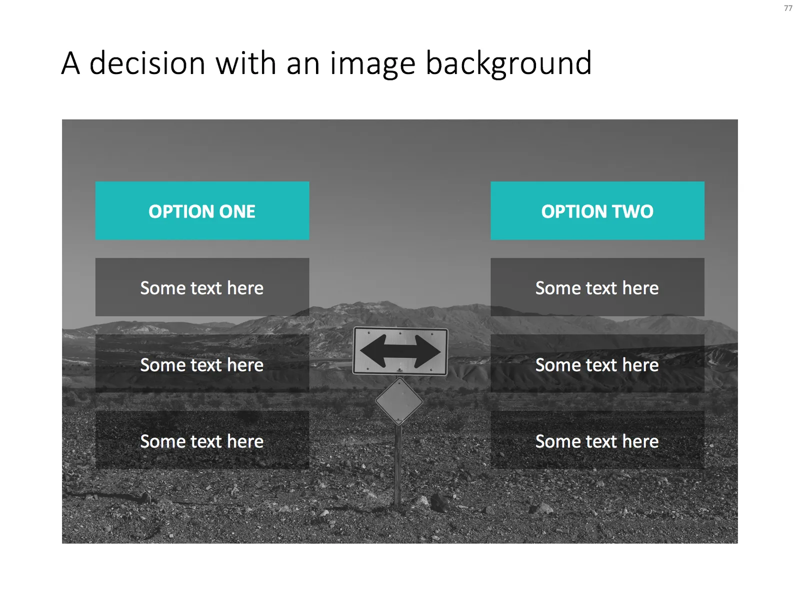
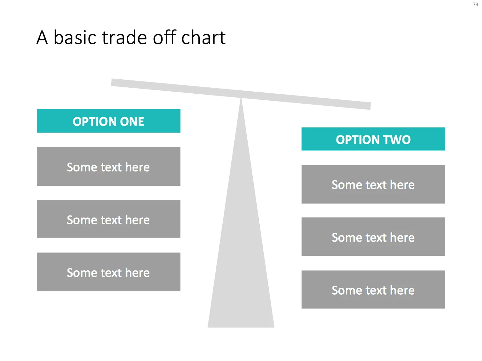
Simple charts are often the best. I added a few slides to visualise a decision or a trade off the store: simple boxes, the same boxes over an image background, and a minimalist scale. With the latter, it is not the objective to make a photo realistic rendering of a scale, but rather give a subtle visual hint of which arguments win.

Feel free to copy the design, or download them from the template store

·PowerPoint

Using perspective in PowerPoint

Today, there are many tools to create 3D visuals: images, videos, evening 360 degree virtual reality simulations. Most of the time, these perfect 3D compositions are overkill for business presentations. But sometimes, 3D compositions can help communicate your message. I am thinking of “road ahead”, “obstacles” and other concepts that are common in business presentations.

PowerPoint which is aimed at non-professional designers, does not have very powerful 3D object manipulation features. If you try to use the few that are there (3D object rotation, adding depth to shapes, putting drop shadows), the result often don’t look realistic.

My PowerPoint 3D abilities more or less followed the 3D development of a child who learns to draw. First, no perspective, then adding the side view without making things vanish into an imaginary horizon, then acknowledging the horizon, but not being consistent about, until finally you get what is actually happening and being able to tell why what you draw somehow does not match reality.

Most of the time, I ignore the built-in PowerPoint 3D features. Instead, I use regular shapes which I put on the slide canvas with some help of temporary lines. You can have a look at the example below. Objects should more or less fit within the boundaries of the lines, and text should be resized accordingly.

So, two principles:

  1. Only use 3D in PowerPoint when you actually need it to express a point. 3D for the sake of 3D does not make your charts look more fancy or clear
  2. When using 3D, keep it simple, and pay more attention to the proportion and positioning of the objects than “sophisticated” 3D effects
Continue reading →
·Typography

Small differences in font sizes (don't)

Visual emphasis is important in graphics design: it creates a sense of hierarchy, what should be viewed first, and what are less important details. In many draft presentations I see, people use tiny variations in font size to create emphasis. For example, the first sentence of a text block might be in font size 16 rather than 14.

This approach does not work. The viewer will hardly notice the difference in font size, and worse, small differences in font size give the text block an unbalanced look when seen from a distance.

It would not be fair to blame the amateur designer for this though, the standard PowerPoint bullet point template has this font size hierarchy baked in.

So, what is a right way to do it?

  • Try to avoid having to resort to this, make your text blocks short enough so they can stand on their own
  • Use white space and location on the slide to differentiate headings from other text blocks
  • For headings, pick other differentiators: bold, all caps, and use the style consistently through your presentation.
  • Inside a text box: subtle use of bold and color (main text dark grey, emphasis black) works great
  • Another don’t: underlining, on a computer screen it almost looks like a correction (or a hyperlink from the 1990s)
  • For major headings (such as slide titles), it is perfectly fine to use font size as a tool, just make it a big size difference when compared to other text elements on your slide.