SlideMagic Blog

Frequent updates about all things presentations since 2008. Subscribe to never miss a post.

RSS
all posts

Search results for “mckinsey”

·Culture

Presentations is culture

I remember doing a project for a TV broadcaster back at my days at McKinsey. Because the client was in the business of communication, it was very picky on how reports should be written and presented.

Presentations are part of your corporate culture. If they look sloppy, are full of pages with boring bullet points, contain incomprehensible diagrams, are loaded with buzzwords, it says something about the organisation that produces them, especially when you requires staff and customers to sit through them.

Maybe you invested a lot in that first meeting sales presentation, but you can’t keep it up in the decks for the 2nd, 3rd or 4th due diligence meeting. This is where you show your real face.

These follow up decks do not have to be master pieces of graphics design, they still should look decent, consistent and on-brand.

(SlideMagic is here to help).

Photo by Raphael Renter on Unsplash
·Story

"Let's put that slide in the appendix"

These were the dreaded words of your McKinsey project manager when she ripped out your analysis masterpiece from page 10 to page 57 in the document. Then, as a junior analyst, I felt depressed as I interpreted this that my work has been for nothing.

Here are some things that project manager could have said in addition:

  • Most of the time, slides that communicate the answer are completely different from slides that show how you got to the answer.
  • Related: the project is moving on now, we have convinced the client that our assumptions are correct, now we need to get them to move and take action
  • Without that slide that sits now on page 57, we would never have gotten where we are now. If we still had to talk about that analysis on page 10, we probably were doing something wrong

Photo by Nana Smirnova on Unsplash

·SlideMagic

SlideMagic analytics

Over the weekend I re-wrote the entire analytics engine of SlideMagic. (Apologies for the frequent app updates).

I had a whole bunch of tools installed, some of them dating bask a long time when I just started out with the blog. They were spitting out a lot of data that was never really used. Web analytics brings back memories of my time as a McKinsey consultant. The client having a massive and sophisticated business intelligence (“BI”) information system that could produce any breakdown of any segment at any time. Our work was to find what actually mattered, which often was a surprisingly simple chart.

If you are running a massive web site with billions of hits, then A/B testing the colour of buttons might make you money. You hire the web analytics consultant, let her do her work, and in the end your return on investment is a 0.005% uptake in conversion on a billion of clicks minus the cost of the data analysis project. The result is a massive amount of trackers that follow you across the internet.

SlideMagic no longer has them. I went back to basics, and put a very simple system in place, that gives me the information I need given the growth stage SlideMagic is in (making sure that the product works flawlessly). In the process I could also eliminate any possible information that could, if you really wanted to, identify a user. All is clean now, and I understand/control 100% what is actually going on with your data.

Continue reading →
·Layout

Weave effect in slides

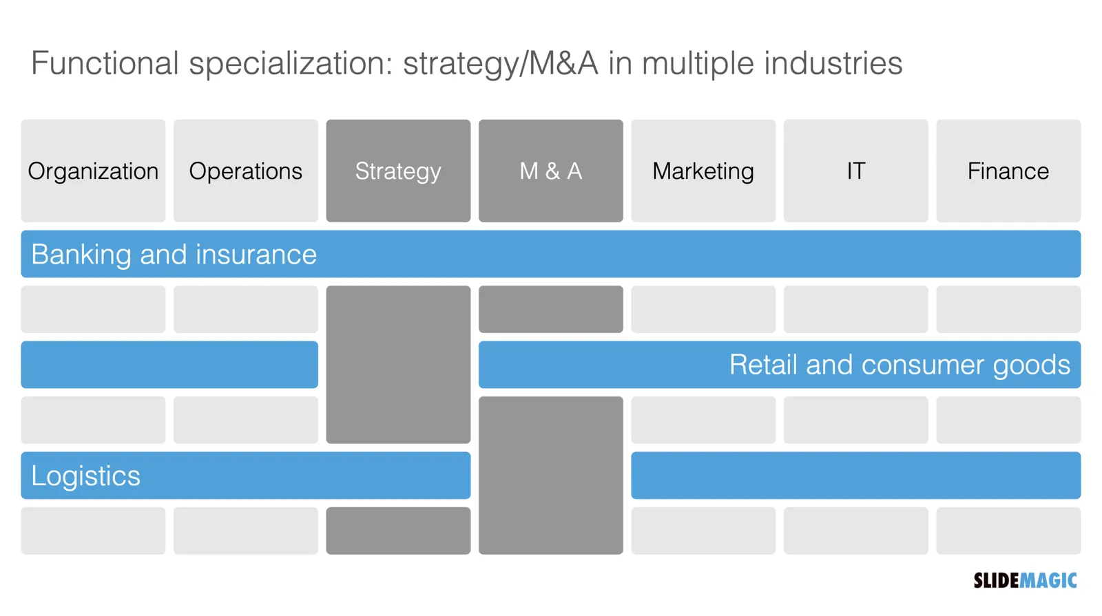
See the slide below. A weave effect shows how vertical and horizontal things are interconnected (in this case stuff I did back at McKinsey). It is impossible to weave shapes in programs such as PowerPoint or Keynote, they cannot be on top in one spot, and at the bottom in another,.

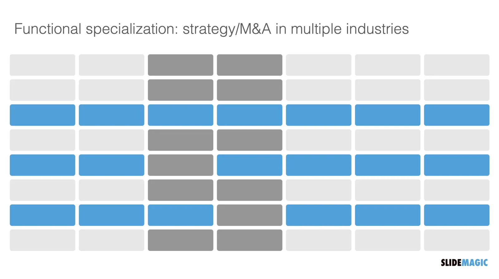
One way to get around this is the visual trick I applied here. Stick to a flat grid of boxes and colour/connect them to fake the visual effect. Super easy to make, super easy to change (adding, removing rows and columns). Below is the basic grid structure I used for this chart:

In PowerPoint and Keynote it can still be fiddly to line up all the boxes, especially when you want to make changes to a grid. You might have to resort to tables with very fat white margins between cells,. In SlideMagic it is super easy and even fun to create these charts. (Pro tip: SlideMagic converts to PowerPoint and can do the hard work for you).

I have added a variant of the slide to the SlideMagic template database (find it here, or simply search for “weave” in the desktop app)

·Concepts

Organisation charts

Organisation cultures are changing. Traditional hierarchies becomes less important, and project teams often become the engine of doing things. Also outsiders such as freelancers do not fit in nicely in big structures. At my time in McKinsey in the 1990s, we could have full meetings about whether a line should be dotted or not, and who would have to be drawn slightly higher than someone else on a page. Mistakes here were especially painful in a presentation to the management team.

Organisation chars in presentation are tricky for two reasons: it is hard to get all the boxes right on the page from a technical point of view, and it is hard to make everyone happy that the hierarchy and lines of the boxes reflect reality.

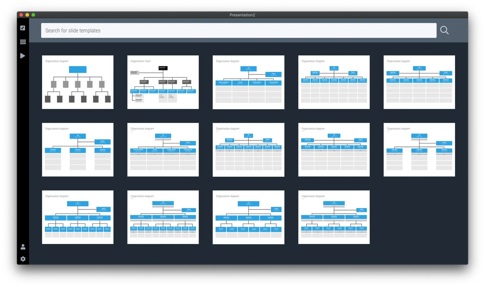
At the request of a user I have added a few more organisation charts to the SlideMagic slide template database. Complex organisation diagrams are not SlideMagic territory (if they are. hard to draw, the audience must also find them hard to understand). Instead, I created a few simple templates that can lay out the structure of an organisation in simple way, cutting the amount of lines, and increasing the size of text boxes.

If you present your chart as a a rough summary of the organisation rather than an exact reflection of hierarchy, you might just get away with it. If you pretend to be precise, people will nitpick…

The “connector” element in SlideMagic is still the weakest drawing tool and I am thinking about a new diagramming user interface now that my front end HTML design skills have improved significantly over the past year. As usual, the problem is not technical. Also in PowerPoint with its more sophisticated diagramming interface, it is hard to get connecting. lines to do what you want. They always angle and bend in a different way than you want them to.

Continue reading →

The typos that matter

The tweet “ruin a band’s name by changing one letter” is spreading at the moment. Everyone makes typos, including me on this blog. And typos are hard to spot, especially for people who are totally immersed in their writing efforts. They stop seeing the individual words, they somehow become a placeholder for a specific thought. “Ah, this paragraph covers the competitive positioning”.

In my early years at McKinsey as an analyst, it was my task to correct graphics designers who were working on the team’s slides. I was never really good at it, and always wondered why the senior partner could walk in, look over my shoulder, and catch one. I would never have been a good lawyer.

Certain typos are more important than others. Typos on page 1, sit there for everyone to see on the projector when the room fills up over the course of 30 minutes. Typos in the potential client’s name are never helpful. Typos that turn around the meaning of an entire sentence (forgetting ‘not’ for example) are an issue. And typos in financial data can be catastrophic.

If these financial typos are completely disconnected from reality, you probably get away with them. Buying an oil refinery for $25 rarely makes sense. But if values are close $3.3b versus $3.5b (oops, number from the previous model), it gets trickier. It’s “just” $200m… (That same senior McKinsey partner would always go to the last page to check the fee number in the project proposal).

Always double check that acquisition bid or price list and maybe cover yourself with some small print somewhere.

Continue reading →
·Software

Do you need Excel training or model training?

This tweet caught my attention:

I spent a decade as a strategy consultant at McKinsey crunching spreadsheets, mostly company valuations. And all of those, I did with the very basic Excel functionality: simple calculations between 2 cells.

Like PowerPoint, Excel is packed with fancy features that actually distract form what you are really need to worry about: setting up a proper model. Complicated formulas collapsed in one cell create opportunities for bugs to sneak in. Also, when you need to expand or adjust your model, it is a lot easier when everything is neatly laid out in front of you. In all my models, I could understand the flow of calculation line by line.

The golden rule of analysis applied: “if it looks wrong, it is probably wrong”. (In the 1% of cases this is not true, you are probably on course to receiving a Nobel prize for a major new insight).

I did invest some time in finding a way to make my spreadsheets look good. Numbers rounded, cells aligned. If you are staring at something that looks scrappy, you will treat it as a scrappy back of the envelope.

The exception to all of this might be cases where you treat Excel as a database application. Setting that up properly will require some training.

Photo by Wonderlane on Unsplash

·Data visualization

How to design management dashboards

The number of app installs of SlideMagic 2.0 is still small, but the graph has a similar shape as the exponential graphs we all have gotten used to over the past weeks.

Modern analytics tools allow you to track literally everything under the sun in your app and/or web site. Instant information overload supported by colourful graphs that look good, but don’t say much. This overload of data is similar to the ones I would encounter as a consultant at McKinsey. And now, 15+ years later, I find myself following a similar approach to making sense of it for my own app.

Most case examples about analytics are built for established apps and web sites with huge customer flows you can micro analyse whether the check out button should br green or red. SlideMagic is not there yet.

  • I find myself going through a certain cycle. It starts with a basic question, “how many people did actually install the app”, which results in a daily manual routine to find the latest number, which then gets translated into a proper query in an analytics app. I check whether my analytics tool is consistent with the numbers I can dig out of my own server. Slowly, slowly, I get a sense of how the app behaves with a consistent set of data that I can recognise.
  • Slowly, slowly, I start adding more questions to the picture, and make sure that I keep a picture of how they relate.
  • Each factor has a specific visualisation: some are lines, some are bars, some uniques, some totals, some cumulative, you need to play around with it.
Continue reading →

Working like crazy without being tired

Back at McKinsey I had a grueling lifestyle: long hours and always feeling tired. Many years later, i think I put in the same amount of hours getting SlideMagic 2.0 up and running, but…. I am not feeling exhausted all the time.

The secret? Focus. No commute, no travel to (unnecessary) meetings, I can pretty much get 10-13 hours of productive time each day (6 on weekends).

Also it helps to focus on what you liking doing next: crack that difficult algorithm, make the site look better, do the accounting, it is all a different mindset that is not available on command. Being able to choose what to work on is great.

Work in progress.

Photo by Vladislav Muslakov on Unsplash

·Layout

Against the light

In the early 1990s at McKinsey, presentation design was actually document production. Hand-written sheets of paper would be entered into a computer by full time graphics designers. Each word, each line, each graph. Then the whole thing would be printed and bound in books.

I remember the final quality check of the Amsterdam office manager: holding the pages against a strong light to see whether the titles, footers, page numbers, and margins of the slides lined up. You were in trouble if they didn’t.

Getting these basics right is very hard in today’s PowerPoint, If you copy and paste slides between masters, the alignment of objects will be off. If you change screen sizes (from narrow to wide screen and back), things go all over the place. Or, if you use/buy other people’s templates, they won’t fit well in your company’s slide layout. This is not PowerPoint’s fault, any software that needs to give total design freedom to its users will have this side effect.

I went through this the hard way myself, as I am making the slides of my “old” template store compatible with the new format of SlideMagic 2.0. Hundreds of slides that require small corrections to get things to line up properly.

With SlideMagic, professional designers might complain about the lack of flexibility in layouts, the rest of us will be extremely happy with how easy it is to tweak templates, screen sizes, and copy slides between presentations.

Photo by Bank Phrom on Unsplash