SlideMagic Blog

Frequent updates about all things presentations since 2008. Subscribe to never miss a post.

RSS
all posts

Search results for “web design”

·Art

Using historical paintings as an inspiration for color schemes

Great painters use colors to set the emotion of a painting. An example is Van Gogh’s “Le Cafe de Nuit”. He talks about this painting in one of his letters to his brother Theo:

I have tried to express the terrible passions of humanity by means of red and green. The room is blood red and dark yellow with a green billiard table in the middle; there are four lemon-yellow lamps with a glow of orange and green. Everywhere there is a clash and contrast of the most alien reds and greens, in the figures of little sleeping hooligans, in the empty dreary room, in violet and blue. The blood-red and the yellow-green of the billiard table, for instance, contrast with the soft tender Louis XV green of the counter, on which there is a rose nosegay. The white clothes of the landlord, watchful in a corner of that furnace, turn lemon-yellow, or pale luminous green.
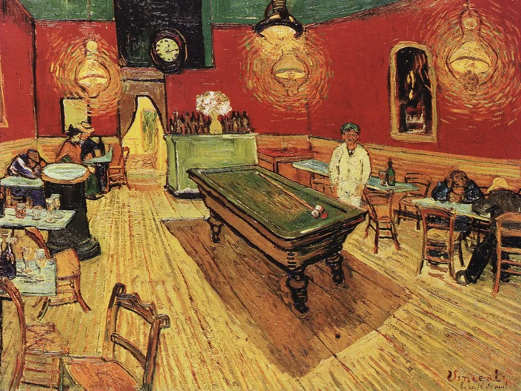
It is interesting that Van Gogh talks about clashing colors, but the end result is in fact a very harmonious ensemble of colors.

Painters use intuition and a sharp eye for real-life images to create a suitable color scheme. You can “borrow” a bit of their genius by using painting as an input source for tools such as kuler to create your own color combinations. In fact, paintings might be a better source than images for this purpose.

The result is good, but not as perfect as the original. I miss the digital equivalent of the artist color pallete to mix and match colors as you go. I am starting to experiment though with going “off color scheme”, injecting here and there colors in slides that do not fit 100% with the defined presentation colors.

·Books

Great book "Tasteful Color Combinations" - not even available on Amazon

Found hidden away on a shelf in the book shop of the Tel Aviv Museum: “Tasteful Color Combinations” by Naomi Kuno. It is not even available on Amazon, that’s why I have trouble finding a good web link to it.

The book contains 455 color schemes (with detailed RGB  and CMYK codes), organized in 14 chapters each with a different mood. (“Nostalgic and melanchology”, “humanistic and natural” to name two). The first edition was published in Japan in 2004, and the English translation is not always perfect, adding to the charm of the book.

Some examples of colors schemes available (exact quotations from the book):

  • 241, Formal Kimono: the color of a patterned formal kimono for a married woman
  • 255, Homely: the cozy warm color of home where a cheerful laugh is always heard
  • 359, Glory and fame: glory and fame never fades away when quality is accompanied. The blue is for glory and the red and gold are for fame.
  • 370, Rococo -1: the elegant rococo period colors of Fragonard’s paintings and dresses
  • 111, Ryugu castle: the color of a town of Ryugu castle in a deep sea, where princess Otohime and beautiful fish are said to inhabit, in a legend story of Japanese fantasy.

The colors of 111 below as an example:

I have used this book a number of times as a source of inspiration for finding color schemes for seed-level technology startups that need help developing their very first fund raising presentation. (Other techinques to find a good color scheme can be found here).

Continue reading →
·Design

Getting rid of image tags in PDF files

PDF is the preferred format for emailing out presentations:

  • Small file size
  • Clean presentation without the risk of an accidental edit

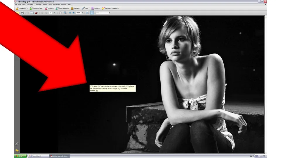
PDF conversions sometimes transfer the full file path and file name of an image in your presentation into a PDF image tag (see example below). Not very pretty.

To get rid of these image tags: Open the PDF file in Adobe Acrobat. [In version 8]: go to view, navigation panels, tags, click options, uncheck “Document is tagged PDF”, re-save the file and they’re gone.

·Cartoons

Using Rube Goldberg machines in your presenation

A Peugeot ad finally got me to the source of these brilliant cartoons of incredibly complex machines that perform very simple tasks through a sequence of carefully timed actions. No, they were not pioneered by Road Runner and The Coyote that’s chasing him. Cartoonist such as Rube Goldberg and Heath Robinson are one of the most famous creators of these systems. Today, there still are many annual Rube Goldberg contests that challenge high school students to invent one of their own.

This Honda commercial from a few years ago is a beautiful example of how you can use Rube Goldberg-type effects in visual communication.

How to use it in PowerPoint? Animating one of these machines is a challenge… Two suggestions.

  1. Build up audience anticipation. Use a simple cartoon to create a tension about something that is about to happen. The same way that a novelist leaves room for the reader to fill in the blank spaces. See an example on Nancy Duarte’s blog: the hanging piano that is about to fall is a more powerful visual than that of a broken piano on the floor.
  2. “There must be a better way to do this”. This is a concept I often need to get across in fund raising presentations for technology startups. Showing a very complex Rube Goldberg machine does the trick for me. (Another technique making the same point is using vintage images, here an “auto wash bowl” long before the automated car wash was invented).
Continue reading →
·Design

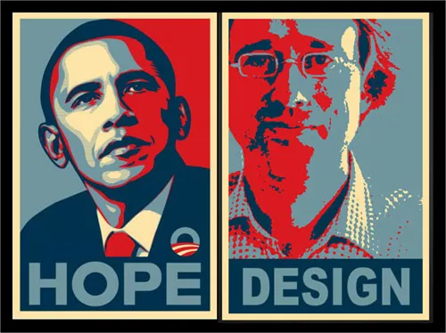
Humor - your own Obama icon poster

The Obama poster by Shepard Fairey is the icon of 2008.

Here is a tool to make your own. You see, there is still some work to do before I can make it as a presidential candidate.

Jokes aside. Icons can be powerful visual tools to use in presentations. Famous historical moments, famous historical pictures, famous historical posters.

An earlier post about real historical images from LIFE magazine available on Google.

·Design

Chart concept - the audience as the patient

Some images can literally make the audience feel that they are the patient. Suffering, helpless. Other variations on the theme: a dentist with a buzzing drill, or less medical, someone “zapping” you away to another channel with a television remote control.

Image via BigStockPhoto. The good thing about a medical picture is that the most of the faces of the models in the image are covered, hiding that this is not a “real” image.

Update, here a version of the remote control image:

·Design

Experiment with typography - slice up those paragraphs

Typography is a major under-utilized tool in PowerPoint. On the right a standard PowerPoint display of a large 100pt text. Wide distances between lines, not very interesting. On the left, I cut it up in 3 pieces and started to re-align characters vertically. I am only starting to learn.

·Design

Make big things look huge by adding something small

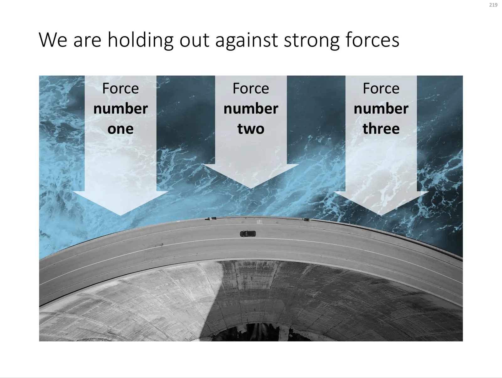
The 2 tiny people, and their 2 tiny shadows make the whole dam look huge. You probably remember your highschool physics teacher explain: “if the nucleus of an atom is a strawberry, its electrons would be flying around the football field”.

Something to think about when making your next slide composition. Image purchased from iStockPhoto

UPDATE: I have now added a chart concept featuring a dam in the SlideMagic template store, you can download it here.

 A PowerPoint slide template featuring a dam

A PowerPoint slide template featuring a dam

·Design

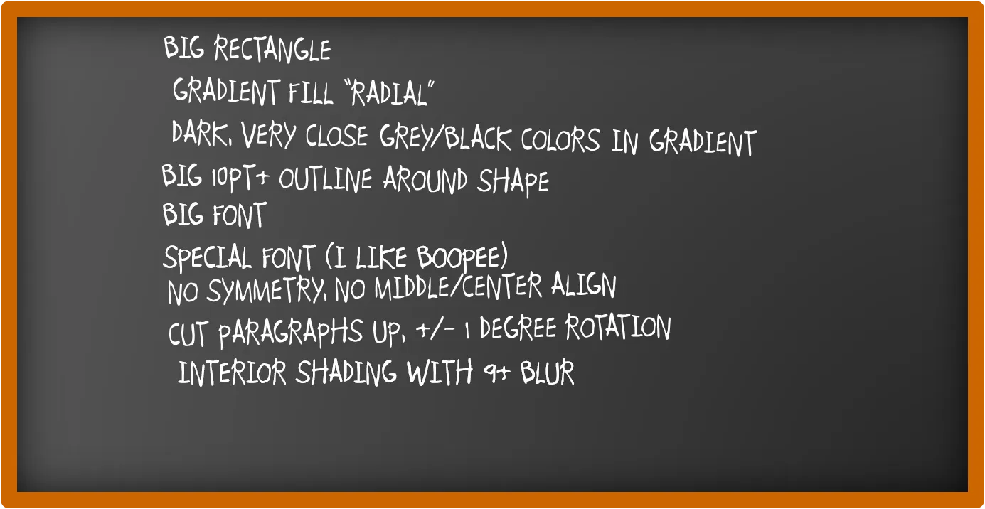
How to recreate a realistic looking chalk board in PowerPoint

After graffiti, now the less permanent graphics of the chalk board. I scribbled some suggestions on a black board below (click image for a larger picture):

Now that we are on the subject, check out my favorite Bart Simpson chalkboard generator as well.

·Advertising

So hard to do - "real" art in PowerPoint

PowerPoint effects, PhotoShop, and a bit of typography/fonts enable an amateur to create PowerPoint slides that start approaching the capabilities of a graphics professional. Not so fast.

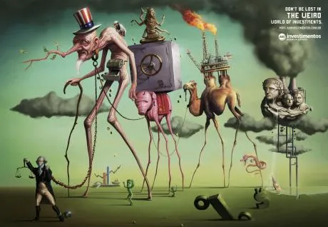
This ad for a financial services firm shows that good artwork cannot (yet) be matched by a PowerPoint slide.

  • Taking someone like Dali as the inspiriation for a slide
  • Creating the characters and the elaborate backgrounds
  • Insert the detail and small “jokes”

You immediately “get” this ad. Another one I took from Ads of the World (larger image here).