

Great painters use colors to set the emotion of a painting. An example is Van Gogh’s “Le Cafe de Nuit”. He talks about this painting in one of his letters to his brother Theo:
I have tried to express the terrible passions of humanity by means of red and green. The room is blood red and dark yellow with a green billiard table in the middle; there are four lemon-yellow lamps with a glow of orange and green. Everywhere there is a clash and contrast of the most alien reds and greens, in the figures of little sleeping hooligans, in the empty dreary room, in violet and blue. The blood-red and the yellow-green of the billiard table, for instance, contrast with the soft tender Louis XV green of the counter, on which there is a rose nosegay. The white clothes of the landlord, watchful in a corner of that furnace, turn lemon-yellow, or pale luminous green.
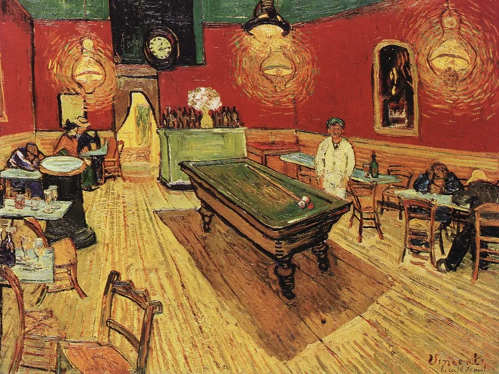
It is interesting that Van Gogh talks about clashing colors, but the end result is in fact a very harmonious ensemble of colors.
Painters use intuition and a sharp eye for real-life images to create a suitable color scheme. You can “borrow” a bit of their genius by using painting as an input source for tools such as kuler to create your own color combinations. In fact, paintings might be a better source than images for this purpose.

The result is good, but not as perfect as the original. I miss the digital equivalent of the artist color pallete to mix and match colors as you go. I am starting to experiment though with going “off color scheme”, injecting here and there colors in slides that do not fit 100% with the defined presentation colors.
5 comments
The bar with a palette of five colors shown at the bottom of your post is not a very inspired scheme for the minority of the population with red-green color blindness. For them the middle and rightmost colors in your palette would appear almost identical, so your slide would just slide rather than stick! I had not thought about this problem until I read a post about Slides for Color Blind Audiences at:
Run your palette through Vischeck. I bet you will NOT like the results.
Richard Garber
But if you need more pleasant result you need to choose a main color, supportive color and accents.