SlideMagic Blog

Frequent updates about all things presentations since 2008. Subscribe to never miss a post.

RSS
all posts

Search results for “web design”

·Design

"Excuse my English" - slides that cannot stand on their own

I put the slides I used for a presentation on SlideShare despite that they actually do not stand on their own very well.

One piece of feedback I got is that I should not apologize for speaking poor English on the first slide. Rather as a presenter, you should radiate confidence. Makes perfect sense. This is actually not what the slide with the Dutch soccer supporters was meant to say… I was apologizing for not speaking Hebrew.

In this context, the mismatch was harmless and even funny. In other situations it might not be.

I enjoyed receiving so much positive feedback on the SlideShare slides. Thank you very much. The benefits of sharing the slides far outweigh the drawbacks in this case.


·Design

Keep your images real

Today, Photoshop can do a lot, but it is still hard to make that perfect photo composition. Today, the New York Times used this image in an article about research to improve concentration.

Nice Photoshop work, but:

  • The composition is good, but not perfect. Either do something that is 100% real, or completely not real (i.e., a photo cartoon)
  • The image catches attention (“what is that scary device attached to this person’s head?”), but does not immediately create the link to concentration. A real image would have been better (5 builders NOT looking away from their work as a woman passes by for example).

Keep your images real.

·Data visualization

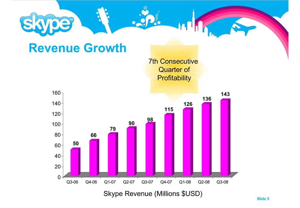
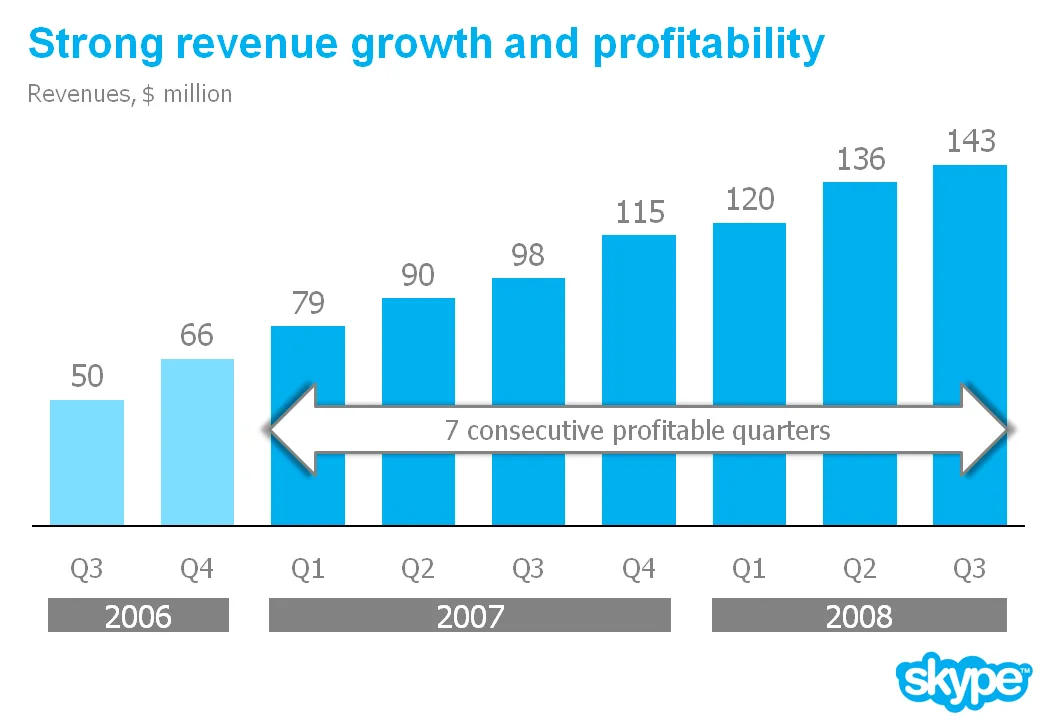
Chart make-over example, sorry Skype

I am preparing a speech and needed a case example for a chart make over. Sorry to be picking on Skype again… A great color scheme plus a chart I discussed before. I have nothing against Skype, this is just for educational purposes.

Here is a list of changes:

  • Reduce the template to a logo at the bottom right of the page, eliminating all other distracting elements. I really like white space.
  • Rigorous application of the corporate colors and fonts.
  • Simple column chart without 3D
  • No need for a vertical axis if you use data labels
  • Re-wrote the headline
  • Replaced the yellow star to give the text more connection to the numbers (still it would have been better to show the actual profit numbers)
  • Smiling, I made a typo in the revenues of Q1 2008

The idea is to make the data as calm as possible. Also note that through consistent use of corporate colors there is no need for additional “house style” graphical elements on the pace. You can see from a mile’s distance that this is a Skype chart.

·Design

Use images to tap into collective memory

You do not need to use data all the time to get a point across in your presentation. Sometimes a good image is enough to tap into our collective memory.

·Design

The emperor's new presentation is boring!

Two useful approaches to evaluate your presentation:

  1. Go in slide-sorter view to get a sense for how someone sitting in the back row will see your slides. If you can’t follow them, they won’t be able to either.
  2. Ask your 4-year old daughter. Although she cannot grasp the content, her intuitive reaction to the images is honest feedback about how boring your presentation really is (or not).
·Design

McKinsey on the McKinsey cost curve

A decade of strategy consulting work at McKinsey has not made me a big believer in standard frameworks. Most business problem require a tailor-made approach without the buzz words and generic statements you find in most airport business best sellers.

There is another problem with frameworks: a framework to solve a business problem is usually not the framework to communicate a business solution. Problem solving and presentation are two different things.

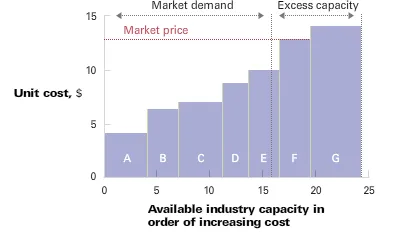
McKinsey’s “enduring ideas” series periodically discusses one of the classic frameworks from the world of management consulting. This month it discussed the cost curve.

  • On the vertical axis you show the cost per unit
  • On the horizontal axis you line up the competitors in order of their production cost
  • (Unusual) you change the width of the column to reflect the production capacity of a player
  • Drawing a vertical line where capacity = demand shows you what the market price of the (commodity) product will be, and who is making money/who is not.

This framework is maybe an exception. A slightly modified column chart can serve both as a problem solving tool and a communication instrument. If there is incomplete information, 3 people can spend 2 months to develop it (running all the analysis), but once it is there, it shows what’s going on in a (commodity) industry on one very insightful piece of paper (piece of PowerPoint slide).

·Data visualization

How to do a McKinsey-style source of change chart

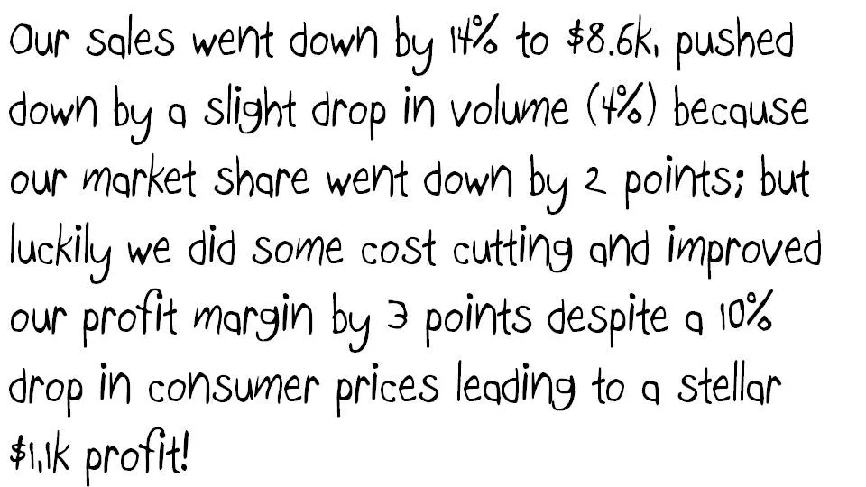
Some numbers today. The source of change is a tool to explain the delta between two numbers in terms of its components. Assume you need to get the story below across in a crisp presentation.

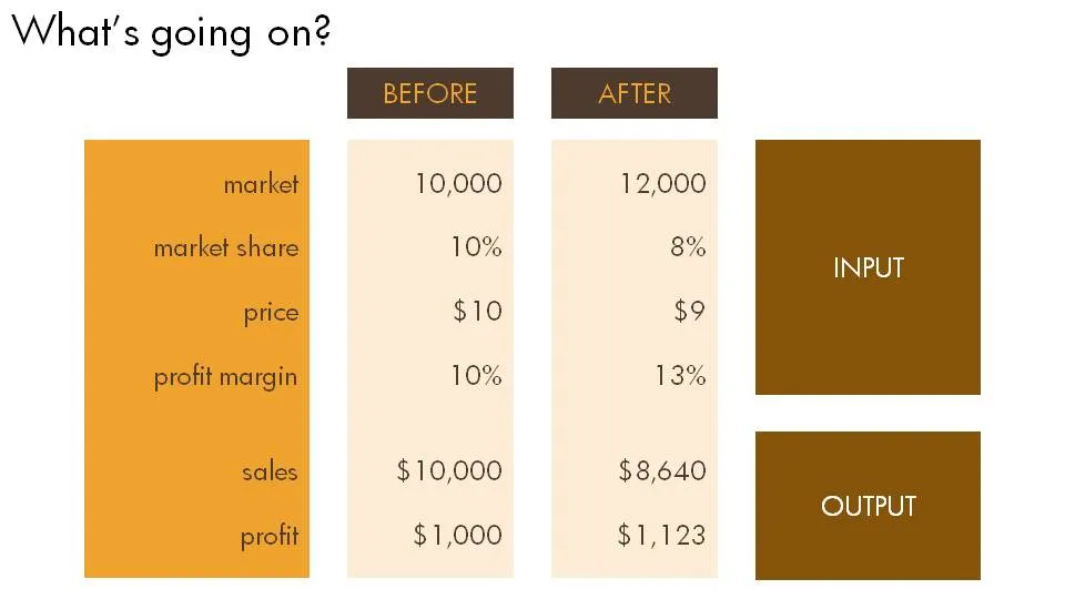
The first thing is to understand what’s going on. Get some more information until you have the full picture in a clear table.

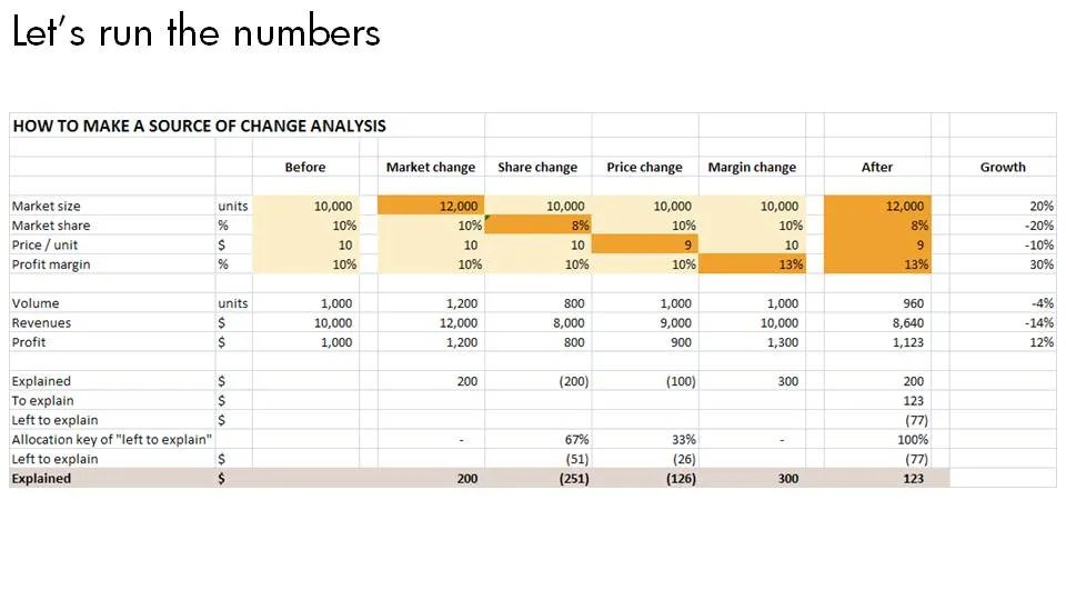
Now let’s do the analysis. This is the tricky part, the text below does not do a good job in explaining this, you can click the spreadsheet for a bigger and more visual explanation.

  1. Calculate the profit in the “before” scenario using a formula that just uses inputs
  2. Now stretch each of the variables that change to their “after” value, jot down the value, and return the value back to its original number
  3. Repeat for all the variables and see what delta in profit you managed to explain.
  4. Calculate what is left to explain, and allocate that to the individual values.

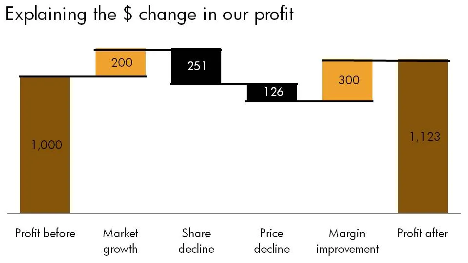
Finally put the values in a

nice waterfall

chart.

·Concepts

They don't need to read it anyway

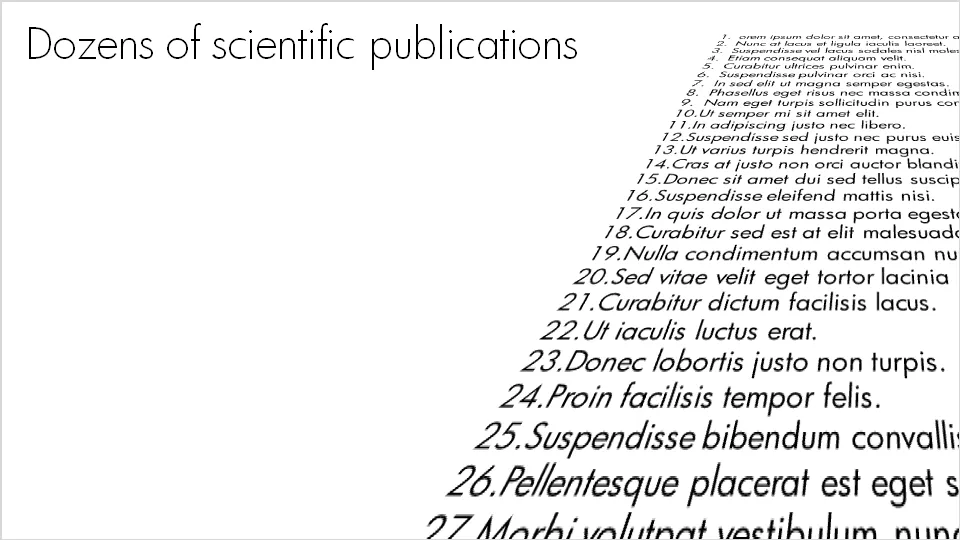
For some points you want to make in a presentation, it doesn’t really matter whether the audience can read the content or not. Example: “here is my long list of scientific publications”.

  • The text was simply “3-D rotated” in PowerPoint (make sure to set the perspective to the maximum 120 degrees).
  • I left the text (that nobody will read) “bleeding” off the page to leave room for white space around the title line (that should be read)
  • In my case I filled the text box with nice lorem ipsum, but these charts are most powerful when you use actual text (that nobody will read): my actual list of publications with ISBN numbers and publication dates for example
·Advertising

Everyone can draw - iconic graphics

Look around you and see how powerful simple graphical shapes can be. The ad below is an example (text below Chaplin: “It’s the hat.”).

A larger image can be found here on Ads of the World.

·Data visualization

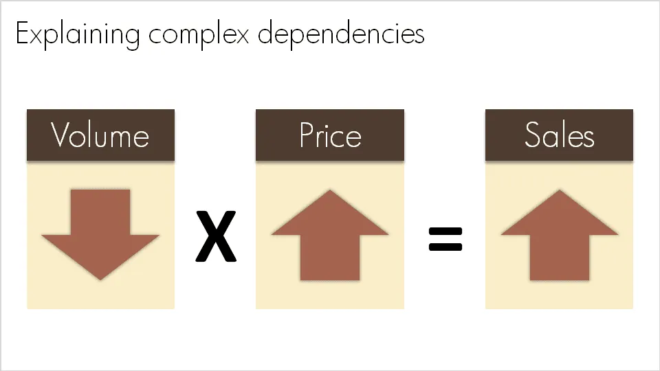
Basic equations to visualize complex dependencies

A question like “What happened to sales last year?” sometimes requires a complex answer. “Well, it is a bit complicated: volume went down, but then prices went up, but as a result sales were up”. A simplified mathematical equation can help you visualize this.

Sometime in the near future I will post here how to do a proper “sources of change” analysis.