Chart concept - painted billboard
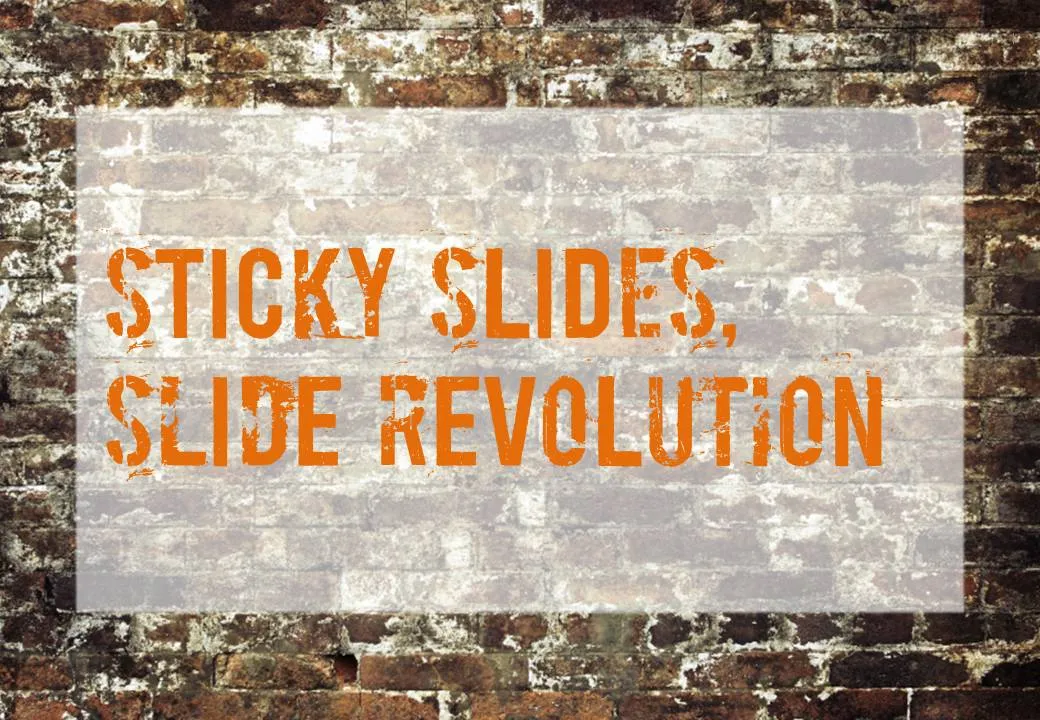
This vintage-style ad found on Ads of the World can easily be replicated in PowerPoint. A white box, semi-transparent with a bit of soft edges and a nice font against an image of a brick wall and you’re done.



Frequent updates about all things presentations since 2008. Subscribe to never miss a post.
This vintage-style ad found on Ads of the World can easily be replicated in PowerPoint. A white box, semi-transparent with a bit of soft edges and a nice font against an image of a brick wall and you’re done.
PowerPoint files can still contain information that you thought was long gone. Watch out with this, especially when sharing files with outsiders via email, or on content sharing platforms such as SlideShare.
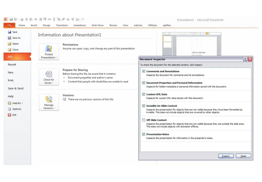
The easy solution is to convert PowerPoint files to PDF. If you want to stick to the PowerPoint format, here are some things to watch out for:
P.S. Image tags can be an unwanted piece of information in PDFs, here is how to get rid of them.
One the biggest hassle of PowerPoint 2003 was that when you resized a data chart, all the fonts got completely squeezed. Only PowerPoint pros new that you had to open the chart, and once it’s open in Microsoft Graph, you can resize the object without doing damage. Any other person (99.99% of the population) went for the squeeze.
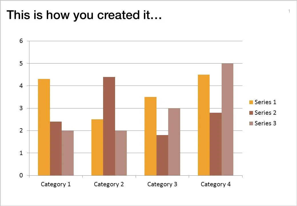
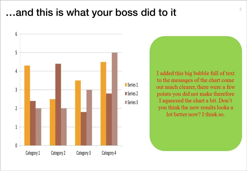
If there is one reason to upgrade to PowerPoint 2010 (2007 also solves this), this is it.
But here you are, the corporate IT department insists on keeping the company on Office 2003, and you just got your 45-page back from your boss who “edited things for clarity” and you’re on to present tomorrow morning 9:00.
This will save you:
I will be around Paris some time this August. I am not sure whether it will work out in the end, but maybe we can organize a meetup in one of my favorite places there. If you are interested mail me at contact [at] axiom [dot] co [dot] il. (Image credit bfraz)

It is important to pay attention to camera positions when selecting images for your presentation. This wave that is about to crash on top of the photographer is a great example. Add some dramatic typography and the audience can almost feel the need to swim to the shore before it’s too late.

Image via iStockPhoto.com.
You take a picture of a cloudy sky, and hand write a text with a healthy dose of “glow” and you can create your own skywriting images.

Here is how people used to do this before the age of PowerPoint:
I have been working with PowerPoint 2010 for a few days now, here are some of my first impressions. I am discussing the upgrade from PowerPoint 2007 to 2010. (2003 users: see my earlier post on upgrading to 2007.)
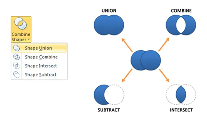
For heavy PowerPoint users, I recommend upgrading to PowerPoint 2010 not so much about the advertised “big” new features, but amount a number of minor changes that make a big difference. Here are a few that I have discovered so far:
Should 2003 users upgrade: definitely, 2007 users, probably only the heavy users. An (affiliate) link to everything Microsoft Office 2010 on Amazon.
This ad reminds us how easy it is to create a visual concept with elementary shapes and nothing more than basic drawing skills.

Via Ads of the World.
Presentations and PowerPoint are an integral part of corporate suffering in cubicles, the reason why they get featured often in Dilbert cartoons. Here is today’s cartoon.
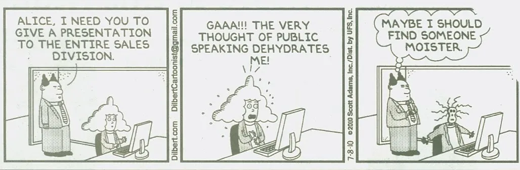
A reminder of the excellent post by PowerPoint Ninja back in 2009 with dozens of cartoons on the subject. In exchange for using the comic, here is an (affiliate) link to everything Dilbert on Amazon.
UPDATE. After a comment by Rowan below: the Dilbert site is now searchable, and you can actually buy comics for your PowerPoint presentation, for a reasonable price. As an example, here is a search for all PowerPoint-related Dilbert cartoons going all the way back to 1989.
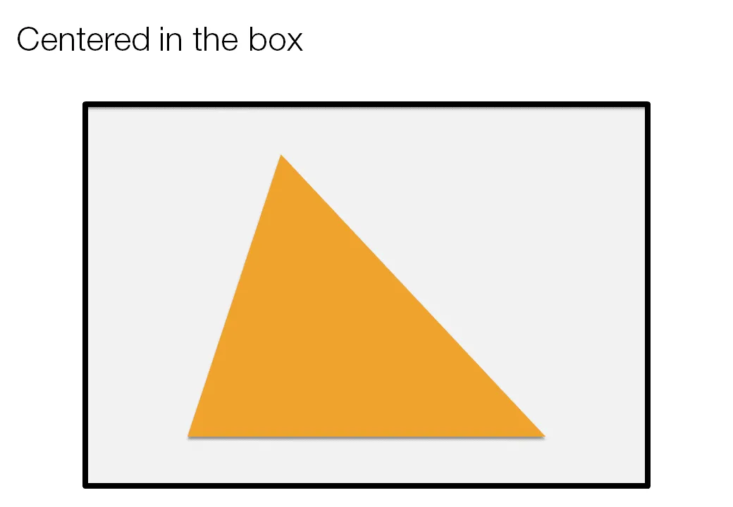
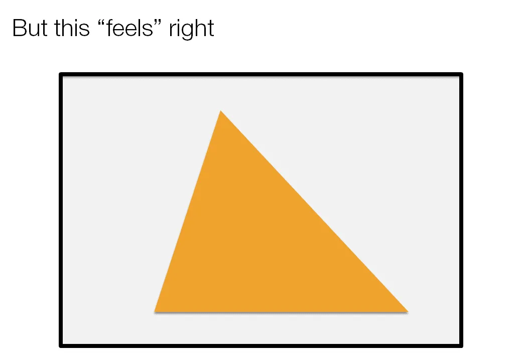
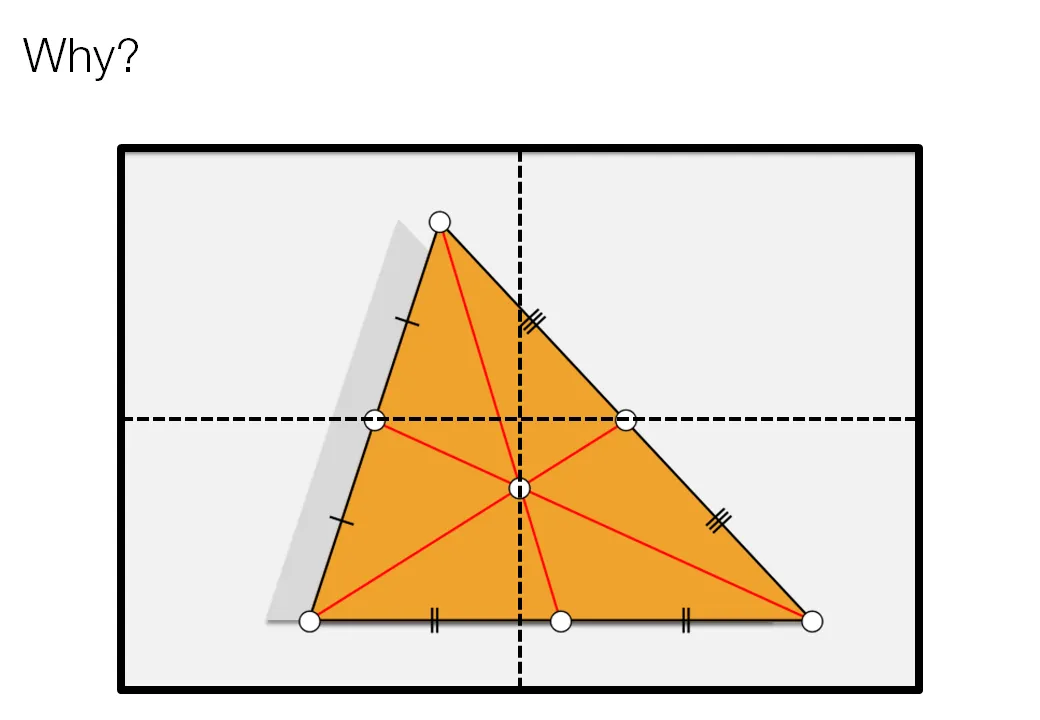
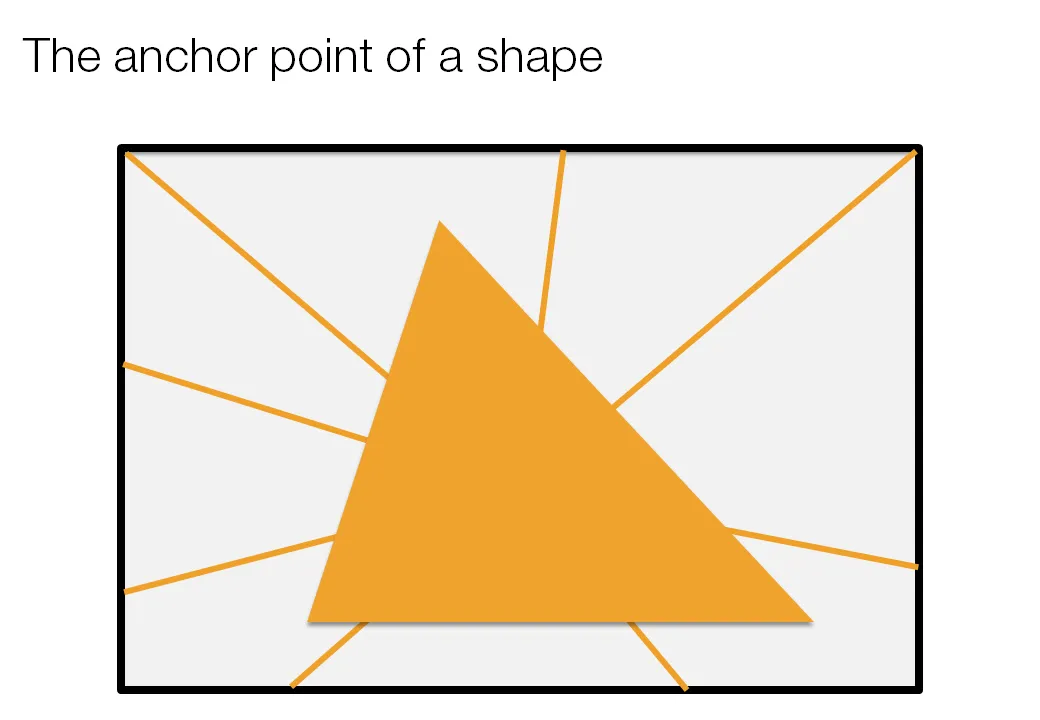
Call me a nit picker, but I always feel this urge to fix the direction of a connecting line or an arrow pointing to an object in a slide, or to position an object exactly where it feels right.
Intuitively, I am looking for the centroid of a shape. Running complex mathematical analysis every time you need to place an object on your slide would be overkill, however, keep the concept in mind.