Compare all fonts installed on your computer
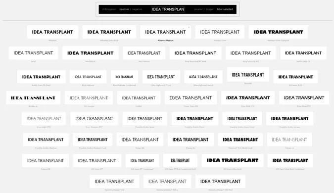
A nice link tip from Gee Ranasinha: the site Wordmark.it shows you a text in any font that you have installed on your computer.


Frequent updates about all things presentations since 2008. Subscribe to never miss a post.
A nice link tip from Gee Ranasinha: the site Wordmark.it shows you a text in any font that you have installed on your computer.
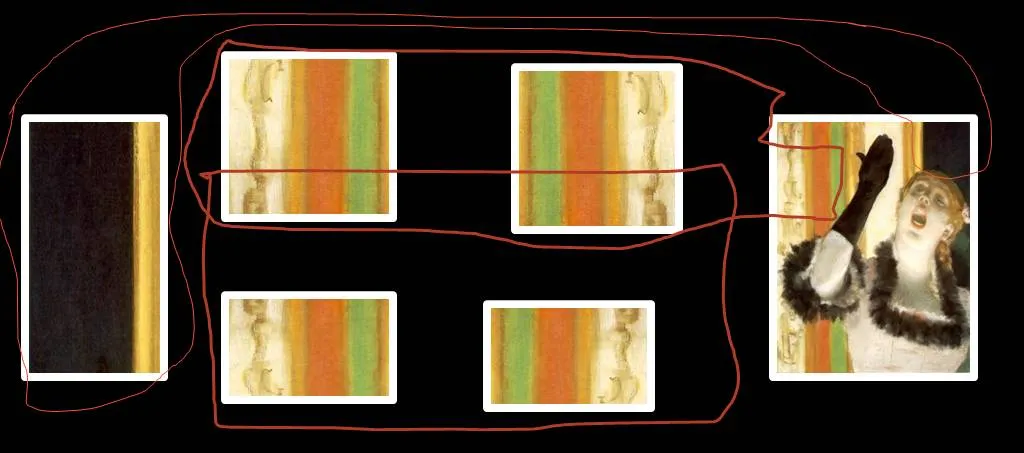
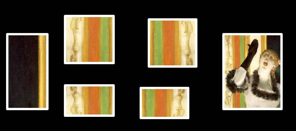
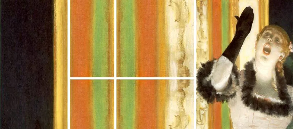
One of the images in the slider of my Idea Transplant web site needed some extension. Here is how I re-used some components of Degas’ original painting and make it fit in today’s widescreen format. I hope he will forgive me.


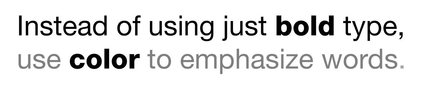
Putting body text in a slightly lighter color gives you opportunities to emphasize words beyond putting them in bold.
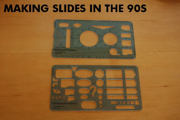
Look what I found in the box with drawing tools of my children: my old McKinsey exhibit rulers! I would carry these with me 24 hours a day in the 1990s. All charts were sketched by hand before being handed over to graphics assistants who would convert them into computer visuals (first overhead slides, then PowerPoint slide shows).
The sketching by hand is a really good thing. But the limited number of available shapes restricted the creativity somewhat, all charts looked very similar as a result. See that big question mark? In case you did not know the answer (yet) :-).
Here is the post to close 2010 and wish you all the best for 2011: Angry Birds fonts in PowerPoint.
And you are done!

There is a stunning statistic in this interview with the developer of Angry Brids by Hilz Fuld: More than 200 million minutes every day is spent on playing Angry Birds. This sounds like a lot, but it is still hard to put the figure in perspective.

Statistics need to be put in some form of context. Pick the one that is most useful in your presentation.
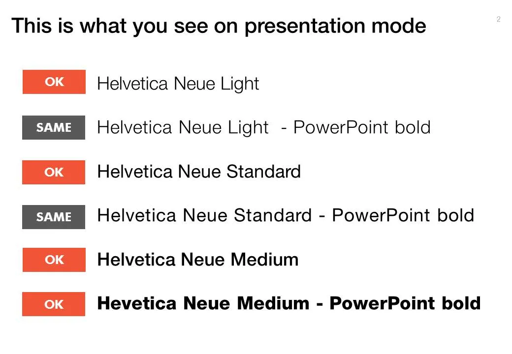
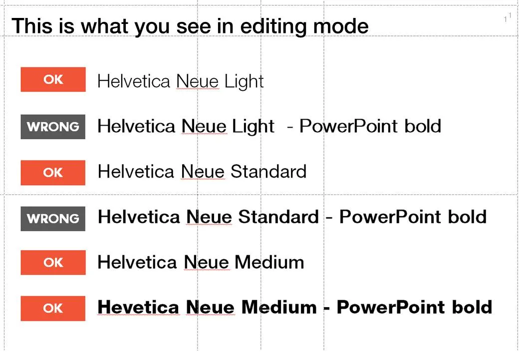
When PowerPoint does not have the right bold or italic font variation installed, it tries to emulate the real thing. For example in the case of bold, it plots slightly overlapping version of the same letter next to each other to make the characters look heavier.
But when you install the correct fonts they get put in slightly random places. Look at the editing screen below (click on the images to see a larger picture). You can see where things go wrong as PowerPoint tries to fill in the missing gaps. Strangely enough in presentation mode, it displays these fonts as regular type.
Secondly it takes some tweaking to get the right font you want:
Fonts remain mysterious.
Here is a picture taken from my window on December 23, you see that winter has not really arrived in Tel Aviv yet. A wonderful holiday to all of you.

You think hard about that perfect opening sentence that encapsulates it all: what the company is about, what you sell, what customer problem you solve, when you were founded. You write it down, change it, discuss it with your team, edit it, and memorize it by heart.

Then you use it for a live audience: all key messages stashed in just 10 seconds of beautiful prose. All your audience has to do is register this, and they can basically skip the presentation. All that has to be said, has been said.
But hey, it did not stick?
While you were uttering your first sentence, the audience was looking at the woman in the picture of your opening slide (I want a jacket like that), trying to figure our your accent (Canada?), wondering when the next coffee break would be (11:15 on the agenda, but we are behind schedule). In short, all but pay attention to that perfect sentence.
Gear up your story slowly and give the audience time to familiarize themselves.
Image credit Markus Bollingmo.
Somehow, this big bulldozer looks scarier after a treatment with PowerPoint 2010’s blur filter. If you do not have PowerPoint 2010 installed, you can find it in Photoshop as well. The second advantage is that a blurred image is more friendly to put text on.