SlideMagic Blog

Frequent updates about all things presentations since 2008. Subscribe to never miss a post.

RSS
all posts

Search results for “web design”

·PowerPoint

Mission statement on slide 2?

Mission statements are supposed to be the ultimate piece of prose: in one sentence you have the entire essence of a company: what you stand for, what your values are, how you treat customers, everything. This is serious stuff. Making jokes about the mission statement is often considered committing sacrilege.

Mission statements often feature on page 2 of a corporate presentation, right after the title slide. Here you are: our company in one sentence.

It takes time to develop a good mission statement. Projects to craft one can take weeks. The entire organization needs to be involved. Words need to be adjusted. Values need to be discussed.

And that is exactly the problem for an external audience. They miss the context of the 3-week project. They miss the background of the debate. They have no idea about that offsite where you discussed your company’s values. For someone who reads the mission statement for the first time, it is well, just another sentence with familiar sounding words.

The ultimate example of the Curse of Knowledge.

When I pooh pooh mission statements in presentations I did not mean to make fun about the values of your company. I think mission statements are valuable. Slide 2 of your presentation is just not the right place for them.
·Layout

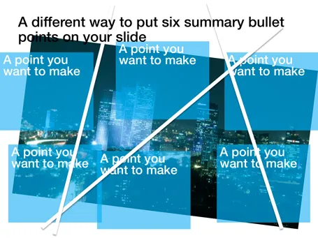
Disguising bullets in boxes

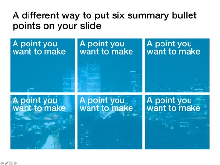
Fancy frameworks (pentagons, triangels) are bullet slides in disguise. Here is a concept that I recently used to put the 6 most important building blocks of a business on a slide. Keep the text really short.

·Images

The usage context is enough

Many of today’s VC pitches are about some sort of mobile technology. It is very hard to find good images of people using modern phones at shop check outs (stock photographers: this is a business opportunity). I actually am not to concerned about showing the device. Giving a good feel for the usage occasion is much more important.

·Delivery

Your monitor device

Rock bands use massive monitor speakers to hear themselves play in a concert. When you run a virtual presentation, you need something similar. Slide transitions can be delayed especially when you use high res images. You are on the next page, but your audience is not.

To prevent this, log into your own webinar with a second computer, or even an iPad or internet-enabled smart phone to see what your audience is seeing. The really skillful presenter switches slides on his own computer but continues to talk about the slide that is still in front of the audience.

Image by Anirudh Koul

·Data visualization

Unconventional balance sheet visualization

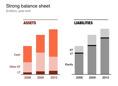
Financial statements are completely unsuitable to put on a PowerPoint slide: too dense, too much information. I like to use column charts to represent this information and dramatically cut the number of categories in the process. After a while, even accountants get used to it. The chart below gives an example of a balance sheet, in a real presentation I would add data labels rounded to 1 digit behind the dot.

·Images

Being too explicit?

I just returned from holiday and this interior shot of a Tuscany bathroom (taken HERE near the marble excavation sites of Carrara) is an interesting visual. The explicit instruction makes it so tempting to do the opposite. I complied, but am wondering how many times the sign is ignored.

·PowerPoint

Making quotes prettier

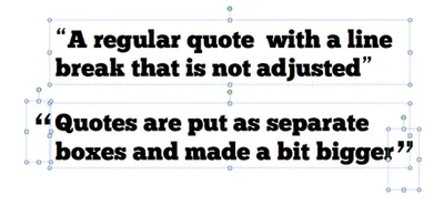
Slides with quotes can be powerful. The standard lay out of quotes is not very interesting. I make manual adjustments to increase the size of the quotes, and make sure the first quote has a small indent. See an example below.

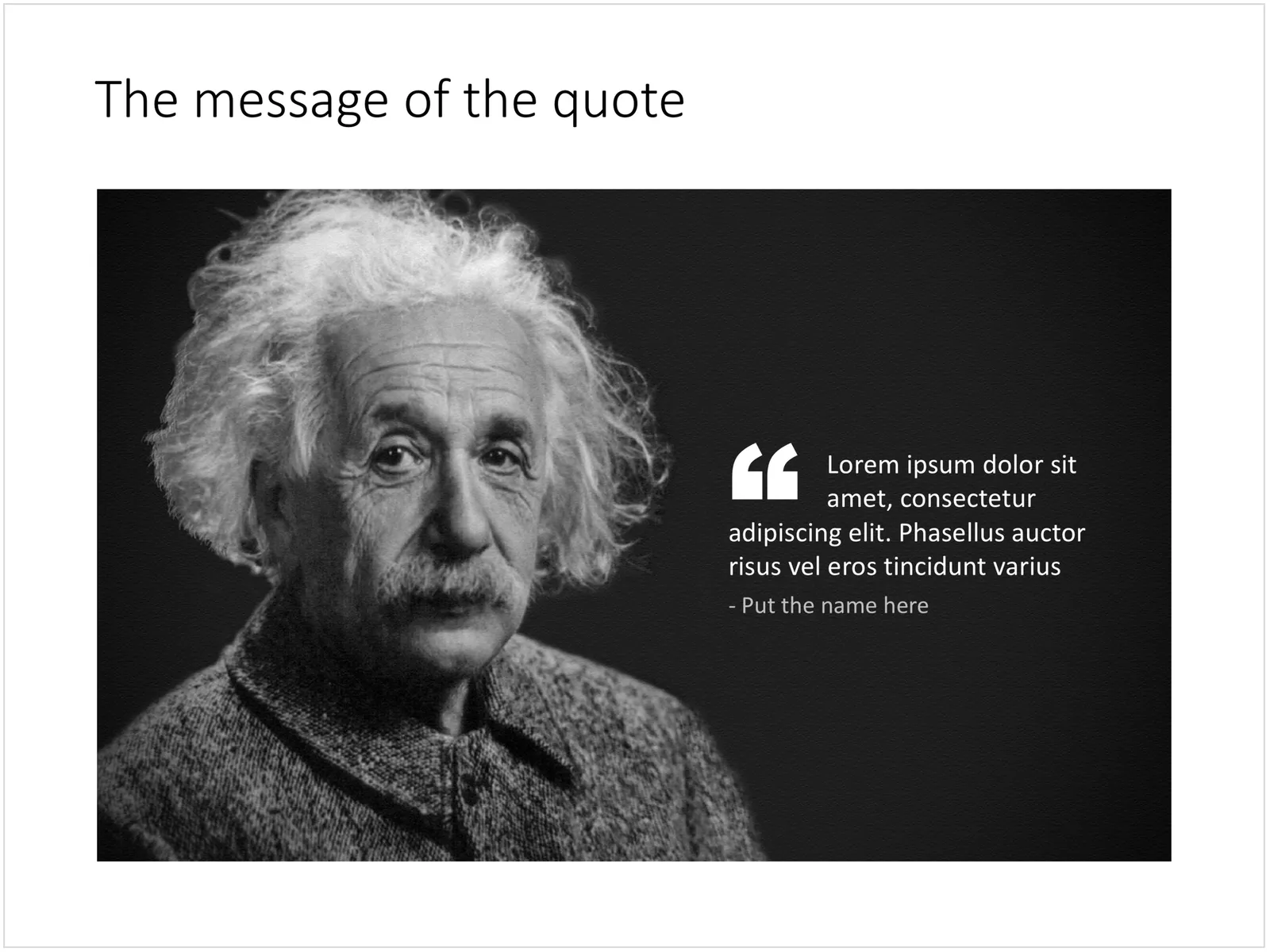
Update January 2018: I have added quote slides in the SlideMagic template store, below is an example:

 A PowerPoint slide with a quote

A PowerPoint slide with a quote

·PowerPoint

Holiday schedule

Over the next weeks I will be spending more time with my family, and less time at the computer. Hence, the frequency of posting on the blog will go down. But many of you are probably doing exactly the same thing, so hopefully you will not feel too deprived of your daily dosis of presentation inspiration.

·Images

Icon images

What do I mean by an “icon image”? A direct visualization of the title or a concept. For example: a small image of a wallnut on the summary “In a nutshell” slide, a photo of Albert Einstein on the page that reads “Smart product architecture”, a bag full of $100 bills on the revenue model chart.

These images are similar to icons that people use in computer software or web sites. They quickly remind the viewer what it is that you are talking about. But these icons are exactly as inefficient as text in getting your message across. When the audience sees the word “smart”, or sees the small image of a brain, it still does not understand why that product architecture is so smart.

You can find a better visualization.

·PowerPoint

Editing for clarity does not always add clarity

You emailed the presentation to your boss, and it comes back the next day with the comment: “I edited it for clarity”. What this means is that she edited the text in the first few slides, but probably ran out of steam after page 14.

Bosses have this urge to take out the fountain pen and start scribbling (could you print that slide deck please?), especially on first pages. They do not take the time to digest the entire slide deck (20 minute story), but rather want to make sure the summary page is right. Make sure the vision is in. Make sure that we mention that benefit. Make sure to emphasize the long history of the company.

Editing text is useful for books or legal contracts, text on a presentation slide can only absorbed 50%. The audience will not remember how you put that sentence exactly.

So, spending a lot of time on carefully crafting sentences is not the best use of your time. Given that, why not focus on writing short, punchy headlines and add the nuances in your verbal explanation.