

Blog post

Making quotes prettier

August 17, 2011 ยท by Jan Schultink
โ† all posts

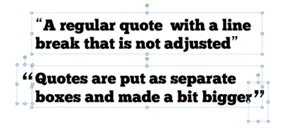
Slides with quotes can be powerful. The standard lay out of quotes is not very interesting. I make manual adjustments to increase the size of the quotes, and make sure the first quote has a small indent. See an example below.
Update January 2018: I have added quote slides in the SlideMagic template store, below is an example:
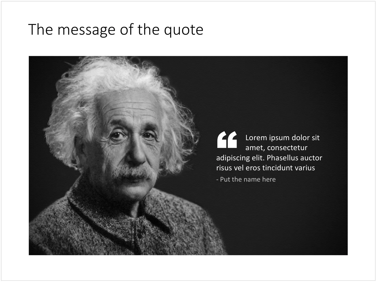
 A PowerPoint slide with a quote

A PowerPoint slide with a quote

PowerPointPresentation designTypography

About this blog

Notes on all things presentations โ€” design, storytelling, and AI workflows.

Subscribe now to never miss a post.

RSS

About SlideMagic

A platform for business presentations.

A free student plan is available.

4 comments

Fred E. Miller2011-08-22 01:33:07
Again, I've learned something by reading your blog, Jan.

Thank you@
Nolan Haims2011-08-18 14:53:01
I use transparent marks a lot like Geetesh suggested, but I also often change the type face for quotes to Times or Georgia or something with more roundness than what is offered by my body content font (Helvetica, Franklin Gothic, Century Gothic, etc.)

I just don't find the blocky quote marks in those typefaces aesthetically pleasing, especially at larger sizes.
Geetesh2011-08-18 03:08:20
Great tip, Jan. I like that you added separate text boxes for the opening and closing quotes. You can also add quotation mark graphics of different types, inserted as graphics -- these could be quite large and semi-transparent, and can even overlap (actually under-lap, but I guess that is not a word!) the actual quote a little if re-ordered to be placed behind the quote text.
Jan Schultink2011-08-18 06:33:16
Good suggestions