Online versus offline
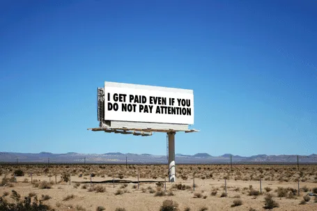
Online, advertisers pay by the click. In the offline world, not yet. This slide was made using Photoshop’s vanishing point filter and some fat Futura Condensed Extra Bold


Frequent updates about all things presentations since 2008. Subscribe to never miss a post.
Online, advertisers pay by the click. In the offline world, not yet. This slide was made using Photoshop’s vanishing point filter and some fat Futura Condensed Extra Bold
Spirals are a great way to visualize an endless repeating of something. Stock image sites are full of images of real staircases, rendered ones, or other images that have a spiral structure. You can use the visual as-is, or add text (maybe in circles that get smaller and smaller) to shows that something is going on forever, that something is repeatable.
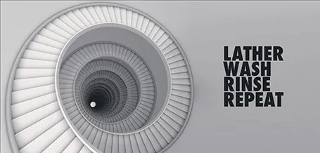
Some people associate a diagram like this with a downward spiral. I do not see it that way, you?
Almost every pitch presentation talks about something that is missing. A simple image of a paper hole is a great way to visualize it. You can have one, you can have fifteen, you can cut out the white background and put the whole into something else. You can find hundreds of paper holes on stock image sites.

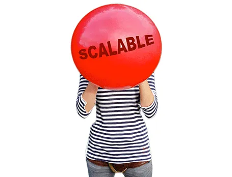
Using a visual cliché can happen to the best of us… I recently was guilty of this one. “We are scalable!”
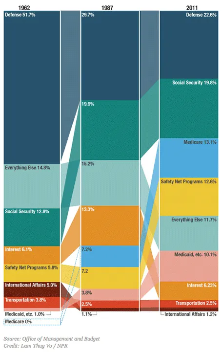
This column chart about government spending on NPR breaks a lot of conventions. Years at the top, no totals, data labels inside, not on the second column, repeated in the third, and it tries to visualize both the size of the values and the order in which they appear with the semi-transparent connections. For an on-screen presentation it is too much to digest, for careful on-screen reading it might be OK. What do you think?
The NYT published an infographic that compares technology IPOs over time, including the facebook IPO of last week. At first, it looks really nice, it resembles bubbles going up in the air (a sentiment shared by many left out in the golden rain). It shows just how many of these IPOs we have had, and the billions in value they have created. And that is probably all the casual reader is left with when clicking to the next page.
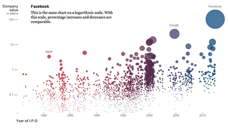
On closer inspection, things are less clear. The value on the y-axis is the same as the size of the bubble. A good description of the axis labels is missing. And the things that the graph wants to display, could be visualized much better in a dedicated data chart for each conclusion:
Still, if you are a newspaper, maybe getting across that bubbly feeling is more important than the visualizing the insight.
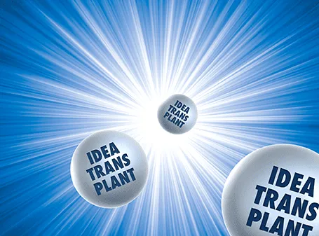
The star burst is often used in retro advertising. You can pick one up from any stock image site to create a background for a composition with a lot of depth.
A year after discovering it, I finally got around to reading Moonwalking with Einstein(affiliate link), by Joshua Foer. A journalist gets fascinated by memory championships, and takes on the challenge to participate himself. On the way he explains how to train your memory, and puts memory in a historical context.
Why am I interested in these types of books? Presentations are all about helping people remember your story. We all know that forcing people to remember bullet points be repeating and repeating and repeating them does not work. The brain needs a visual story around which to store your message.
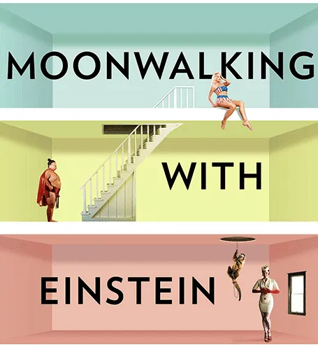
And it turns out that is exactly what memory champions do. They commit random numbers, names, facts, to rooms in virtual memory palaces in their brain. These palaces are often based on places the contestants know very well: a home, a school, a library. In these rooms, the objects are placed in the most outrageous (memorable) ways possible, including smells and sounds. After you put everything there, you can simply take a walk in your virtual memory palace and see all objects in front of you.
Scientists now think that the brain actually never forgets anything (capacity: 10-100TB). The problem is accessing the information. The brain needs an emotional stimulus (smell, visual) to unlock its memory. Slightly different than a indexed memory access of a computer. People think that we are so good at remembering places, locations, stories is survival: how to find a place with food, and then more importantly, how to find the way back home was a more useful skill in the stone age than remembering phone numbers.
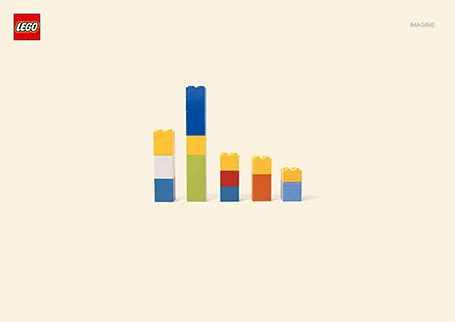
I love Lego. The ad below looks like a PowerPoint column chart, but also like the Simpsons family. It shows the power of imagination that many of us forget about when we grow up. (More ads here on Ads of the World).
I think that wireless video technology will transform home entertainment and the corporate conference room. In the latter, hopefully we might see the end of battles with laptops, cables, and projectors before we can get down to showing our presentation. It will take time before the last conference room is Airplay enabled, but I am keen to accelerate things.
It is already possible to Airplay iPhone and iPad screens on your Apple TV, but font issues still complicate the transfer of presentation files from computers to mobile devices. Currently, Airplay mirroring is not supported for Macs. The next version of Mac OSX will allow Airplay mirroring of Mac screens wirelessly to your Apple TV.
If you cannot wait, well, there is an app for that. Airparrot enables sending your Mac screen wirelessly to you Apple TV ($10). The app has many customization features, allowing you to adjust the performance/quality trade off and select which screens you want to transfer, or even which apps. You can switch off the cursor.
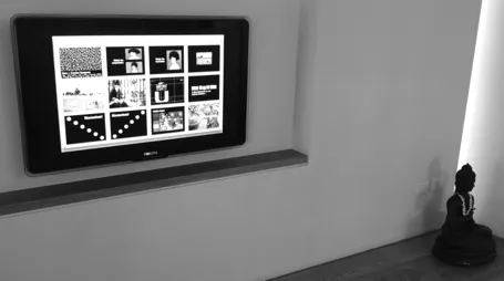
Still we are not yet living in the world of 1-click Airplaying of video. Television screens have a lower resolution than computer screens. So before using the app, you need to downgrade your Mac display to 1280x800, the closest to my Apple TV 1280x720 resolution. After that some fiddling with the screen remote to get the right aspect ratio. The resulting screen sharpness is OK, but not the pin-sharp feel you get from watching an HD movie. It is perfectly fine to play presentation slides (which are often 1024x768), but less than optimal for other applications.