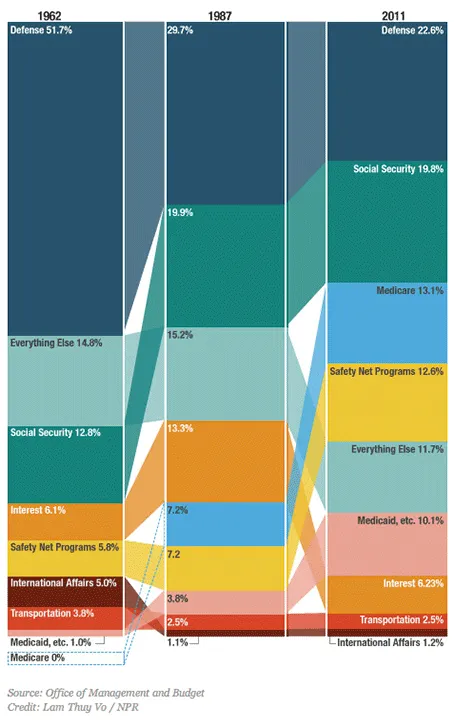
This column chart about government spending on NPR breaks a lot of conventions. Years at the top, no totals, data labels inside, not on the second column, repeated in the third, and it tries to visualize both the size of the values and the order in which they appear with the semi-transparent connections. For an on-screen presentation it is too much to digest, for careful on-screen reading it might be OK. What do you think?