

The NYT published an infographic that compares technology IPOs over time, including the facebook IPO of last week. At first, it looks really nice, it resembles bubbles going up in the air (a sentiment shared by many left out in the golden rain). It shows just how many of these IPOs we have had, and the billions in value they have created. And that is probably all the casual reader is left with when clicking to the next page.
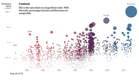
On closer inspection, things are less clear. The value on the y-axis is the same as the size of the bubble. A good description of the axis labels is missing. And the things that the graph wants to display, could be visualized much better in a dedicated data chart for each conclusion:
- How many IPOs in what year: column chart
- Top ranking of IPOs by value at the opening day: bar chart
- Top ranking of IPOs by value in 2012 $: bar chart
- % share price movement on day 1: bar chart (probably only show big, well-known offerings)
- % return on investment 3 years later: bar chart (again for household name IPOs)
Still, if you are a newspaper, maybe getting across that bubbly feeling is more important than the visualizing the insight.