Lego Simpsons
I love Lego. The ad below looks like a PowerPoint column chart, but also like the Simpsons family. It shows the power of imagination that many of us forget about when we grow up. (More ads here on Ads of the World).



Frequent updates about all things presentations since 2008. Subscribe to never miss a post.
I love Lego. The ad below looks like a PowerPoint column chart, but also like the Simpsons family. It shows the power of imagination that many of us forget about when we grow up. (More ads here on Ads of the World).
Recently, I needed to find a good visualization of modularity in a presentation. Lego is a nice concept, but maybe a bit cliché. Not if you use this really cool LEGO design tool: LEGO Digital Designer. It is a full 3D design environment in which you can create any LEGO object you want, and even submit it to LEGO to buy a box with the pieces plus a build instruction. It comes with a large online library where people can upload and download designs.
Here is an example of the Empire State Building. You switch on an animation of how the building is built up as the bricks fly in from all directions. Great stuff.


If you are in to LEGO, here are some earlier posts about it. Christoph Niemann uses LEGO to model New York city. This ad visualizes the power of imagination that kids have, but grown ups seem to have lost.
Christoph Niemann (web site) is a highly talented artist whose illustrations have appeared on magazine covers ranging from the New Yorker to Wired. He posts on a regular basis on his blog in the New York Times, where this set of cartoons based on Google maps caught my attention.

He recently published a new (board) book with snap shots of New York modeled in Lego bricks: I LEGO N.Y. (affiliate link). A sample image below.
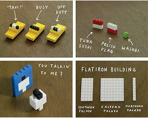
Now here is a presentation challenge: construct your entire presentation in tiny Lego scenes, photograph them and paste them into PowerPoint. Not as crazy as it might sound.
UPDATE. One of my readers, Daniel Cabrera, used LEGO images to construct a presentation for a university project. In this case, the images were sourced from the web.
I found this great Lego ad yesterday on SlipperyBrick:

Sometimes relying on audience imagination can work, sometimes it does not.
Most project or research result reports go like this:
This is almost a chronological recording of your work. Logical, organized, exhaustive. Your peer scientist, boss, teacher, will approve, you did the work thoroughly and got to some interesting findings.
It is not the most exciting structure though. Most novels or movies do not follow a chronological timeline. To make things more interesting, you need to take your audience through a story, which might mean breaking the logical flow a bit.
The key to story writing in business is to pick off the questions your audience is likely to have next. The biggest one first (often surprisingly: “what are we talking about?”), which leads to the next big one (“Isn’t Google doing this already?”), which leads to the next one, (“That does not sound like a big deal to me?”), etc. etc… The sequence of questions are different for each situation, depending on your topic and your audience.
The results upfront approach works well in business: leaving your audience guessing will just distract them. When it comes to movies, you might want to leave the plot reveal to the very end…
The more I work with SlideMagic, the more I realise that it is not really a presentation design tool in itself, it is a tool that supports a philosophy how people in corporations should communicate with slides. Ultimately, I might write all this down in a more organised way, but hey, why not use this blog post to throw out my ideas.
How do we get there, and how does SlideMagic help?
A decade ago, the first stock photo web sites started at $1 per image. Over time prices have been creeping up to $15 or even more. I could buy 10 or more of these for a client presentation. Now I see the amount of money I spend on images going down again.
What can stock image sites do?
Let’s see if the stock sites are listening
Art: Gerard van Honthorst (1590–1656) , Allegory of Painting, 1648
Here is a concept that you can use in many investor and/or sales pitches for technology:
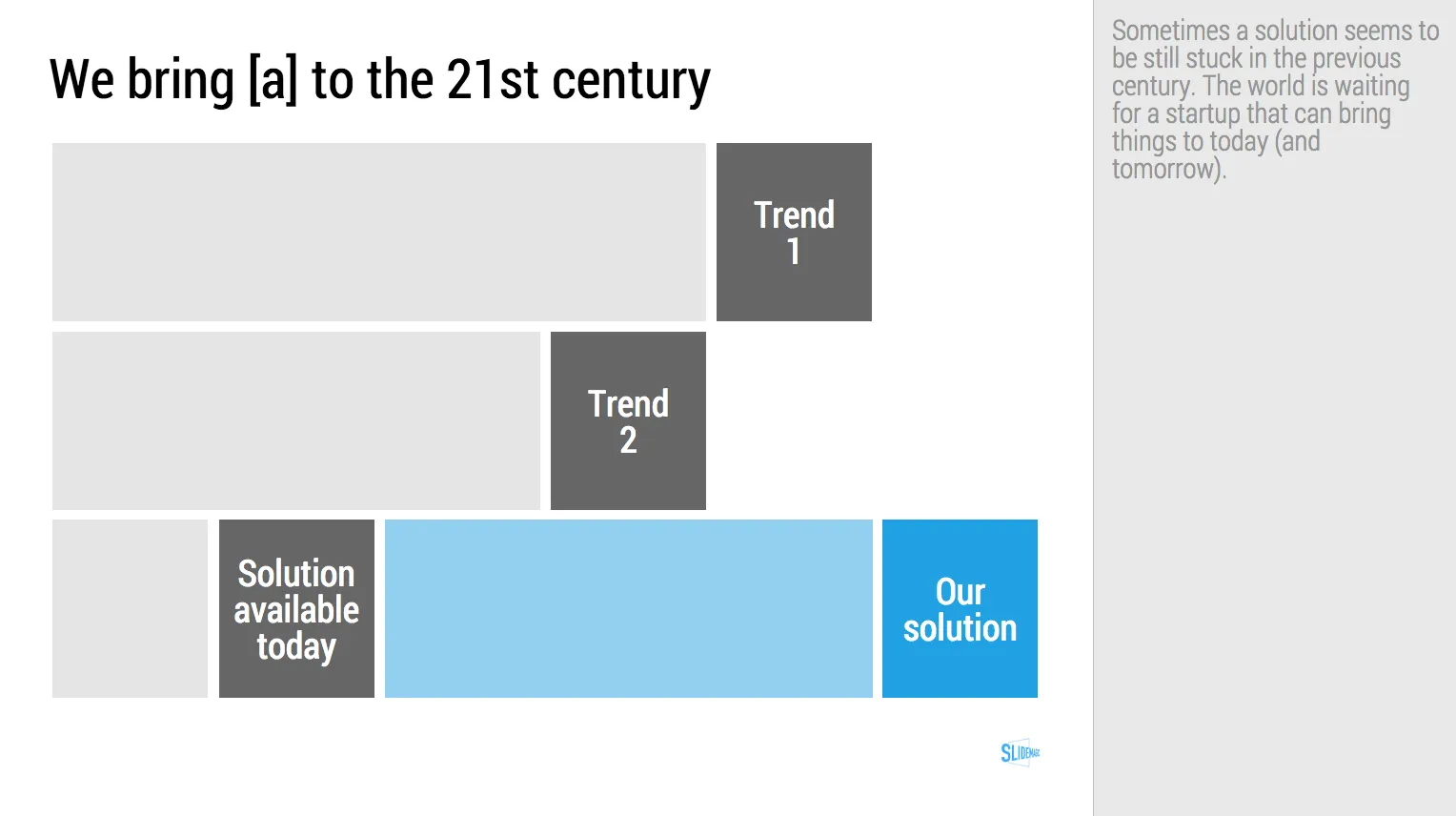
While [a] and [b] have moved on, [c] is still pretty much stuck in the 1950s despite a lot of technological development. Our company is going to fix that.
I have added a slide to the SlideMagic startup pitch template library that reflects this idea, Two “arrows” moving to the right, and a third one which is catching up. Look at the simplicity of the graphics which exactly fits the philosophy of SlideMagic. It looks pretty, it gets the message across, is easy to design. A new business language that does not need arrows, drop shadows, and gradients. It is almost a Lego-like abstractification (is that a word?) of a complex visual.
Art: Le derby d’Epsom, painting by Théodore Géricault, 1821 Subscribe to this blog, follow me on Twitter
I tend to look at it as a new business communication design language. When you give people simple building blocks they end up doing great things with it. Look at Lego. Look at Twitter. Constraints actually drive creativity.
I can see the confirmation that it works in the behaviour beta users. Advanced designers who are looking for the most advanced features miss certain functionality (but hey, check out that automatic light to dark background conversion). Some people are confused by the user interface which is radically different (read much more simple) than PowerPoint. But the user who makes a first effort to go through the dip and actually makes a presentation for real is hooked.
I could have written a book, created a training program, but I thought I would never get the reach that a web based tool could give. Hence the presentation design app SlideMagic.
So the ambition is not to remove PowerPoint from corporate desktops, it is bigger than that. The ambition is to change the way people talk to each other in business.
Art: Rene Magritte, La trahison des images, 1928–29, Image credit: Nad Renrel on Flickr.
