SlideMagic Blog

Frequent updates about all things presentations since 2008. Subscribe to never miss a post.

RSS
all posts

Search results for “web design”

·Presentation design

From social media war to dialogue

I live in a tense part of the world and have observed many discussions on social media where people trying to convince others they are right. I convince people for a living, so I am jotting down some thoughts below on how to engage in these discussions, and hopefully turn war-like exchanges into dialogues.

In order not to have this post hijacked by a political discussion, I am leaving my political viewpoints out here. Here we go in no particular order:

  1. Be polite, correct, calm, composed, rational. Nobody believes a screaming maniac.
  2. Listen, listen, listen and look for a very specific mistake, misconception that can be corrected. Generic statements that answer another point then the ones raised are not useful and ignored.
  3. Set your ambition level. You are unlikely to correct someone’s fundamental beliefs in just 1 paragraph.
  4. Realise that your most important audience might not be the person you are interacting with, but rather the many more that glance over the comments, the secondary audience is bigger
  5. Make your point very personal, human, and show that there is a normal person on the other side of the line
  6. Nobody likes to see more detail of gory images or screaming graphics
  7. Be short and to the point, on social media, nobody reads long paragraphs. If your text is longer, add lots of paragraph breaks
  8. Be sure to engage/correct a big opinion leader with lots of followers/readers: polite, super short, very specific fact to correct a very specific mistake/misconception
  9. Use sources that are credible, close to the opposite site of you. Linking to a highly biassed patriotic web sites full of the wrong flags is not going to make people read them
  10. Highlight facts or details that are not widely known/used in the media
  11. Try not to start with me, me, me, but start with the opposing viewpoint and show why it is causing a problem. Understand the stereotype that the other side might have of you, and try to soften it (you can even refer to it directly).
Continue reading →
·Data visualization

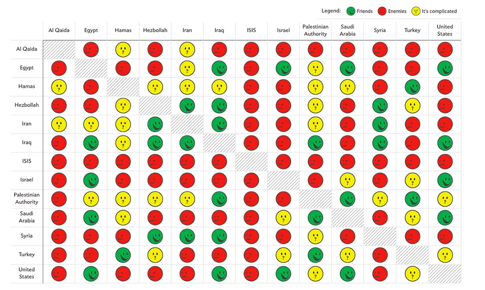
Middle East friendships

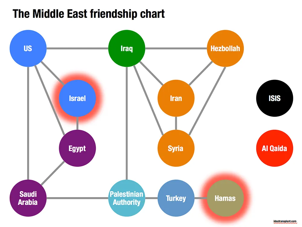
Slate created a beautiful map showing the complexities of the friendships in the Middle East:

Go to the original here and click on each of the smileys for additional information. The message of this chart is clear: it is complicated. The same information can be displayed simpler by focusing on the just the green relationships. The following pattern emerges, highlighting among other things why it is so difficult to get Israel and Hamas to communicate.

·Images

Overwhelming images

Images are much better than words to amplify a message, but sometimes they can be too distracting. If people are staring in awe at this stunning photograph you found, they might just forget for a second about the message you are showing/talking about.

Image source

·Images

Twitter goes PPT

Twitter is keen to find ways to become more accessible to a broader audience, beyond the tech-savvy early adopters. The answer so far: images. Images grab the attention better than obscure hashtags and @ reply’s, and - sneakily - provides a way around the 140 character limit on a Tweet.

The results, lots of poor visuals. This large headshot is an attention grabber, but I am not sure whether Twitter users will take the time to read through the dense bullet points.

·Images

Picfair

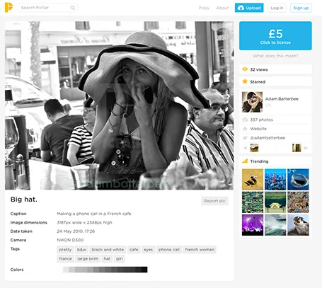
A new stock image site Picfair joins the crowded market. It is a market place where photographers set their own price for their work. You can search by theme and keywords.

The good: The site has not been invaded (yet?) by the producers of plastic, cheesy, generic stock images. Photographs are interesting, spontaneous, and original.

The bad: Because of the lack of stock libraries, the range is (still) limited, and this is not the site to find banal but practical images (a bucket on a white background).

Hopefully one of the many small sites that try to provide an alternative to the stock photo giants will rise to become a player that is big enough to serve as a one-stop-shop for quality images.

(Image in this screen shot by Adam Batterbee)

·Art

NY Met puts collection online

The New York Metropolitan Museum of Art has put 400,000 super high resolution images of their collection online, free to use. Great for use in presentations.

·Keynote

Screenshots are great

Aspect ratios, dots per inch, file formats and conversions, forgetting where you saved that file, these are all problems that are disrupting my creative workflow. More and more I just work with screen shots. If the image looks sharp on my big 27" monitor, I crop it as I want it, and use it in my presentation. It could have been a JPG, a PNG, a web page, a PDF document, a Keynote file, it does not matter. CMD-SHIFT-4- and “click”, done.

·Keynote

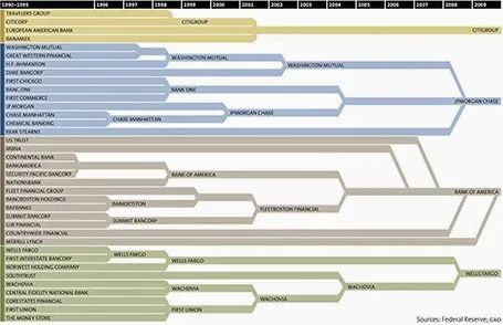
Consolidation chart

This is a nice way to show consolidation in an industry. You can digest the chart in 2 ways: on the podium you see the big picture of consolidating financial institutions, reading in close-up on the screen, you can see the details. The chart could have been better if the width of the arrows would represent the assets under management of the banks, some of these acquisitions were bigger than others.

[Off topic] There is a populist discussion going on in the comments of the original post. I did a lot of strategy work in banking mergers and there are different ways to look at the concentration in an industry. The top level player count is an easy statistic, but what is more relevant is the choice that customers (especially small businesses) have on the ground. How many different bank branches are within a 10km range at any point in the US? If there are 30 banks, but each concentrate on a specific state, then the market looks very competitive, but on the ground, customers face a monopoly. On the other, if all 4 banks are represented in most small villages, the market could be competitive.

·Data visualization

Word repetition

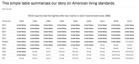
Some busy charts can still be highly effective. See the one below about the declining relative income of wealth classes in the US. The repetitive “United States” could have been replaced with something visually calmer, but the current works actually pretty well.

See that this charts presents other information as well (which countries did well), but the viewer is unlikely to take notice (and she does not need to).

The original article in the New York Times can be found here.

·Data visualization

Funny

Most infographics are a bombastic compilations of overcomplicated, trying-too-hard, visualisations of facts that are not always that insightful. These simple graphs by Danish writer/artist duo Mikael Wulff and Anders Morgenthale are well executed and actually pretty funny.

A compilation of charts here on the Zero Hedge blog, and here is the web site of the original creators Wumo.