

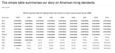
Some busy charts can still be highly effective. See the one below about the declining relative income of wealth classes in the US. The repetitive “United States” could have been replaced with something visually calmer, but the current works actually pretty well.
See that this charts presents other information as well (which countries did well), but the viewer is unlikely to take notice (and she does not need to).
The original article in the New York Times can be found here.