SlideMagic Blog

Frequent updates about all things presentations since 2008. Subscribe to never miss a post.

RSS
all posts

Search results for “web design”

·Art

Book review - 1001 paintings you must see before you die

Paintings are excellent inspiration for presentation design:

  • Color schemes designed to provoke an emotion, often going against the rules of color theory
  • Lessons in composition and page layout
  • Ideas to give your presentation a distinct style or personality

The Dutch educational system plus graduate degrees in computer science and business administration have not contributed much to my knowledge of art history. I want to catch up quickly, but it turned out to be more difficult than I thought:

  • There are many web sites devoted to a painter or a museum, I have yet to discover one that cuts across artists, locations, styles and periods in time
  • The same issue is true for many art history books: one style, one painter, one museum.
  • More-over art history books (surprisingly) have usually more text than images in them. Text full of elaborate interpretations by the author, that is clearly written with student education in mind.

How happy I was to find this book: 1001 Paintings You Must See Before You Die.
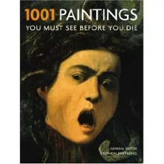
Thousand pages of one painting per page, designed as a guide for museums to visit before your time on the planet is up (but then, there is no clear museum index, and many paintings are taken from private collections).

Leaving this small criticism aside, I found this book truly useful to digest a vast amount of images of paintings in a short time. Color picture, a bit of background on the artist, a bit of background on the painter. It contains both the block busters such as the Mona Lisa as well as lesser known works of art. Great.
Continue reading →
·Art

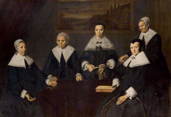
Frans Hals: 27 shades of black

It is thought that Vincent van Gogh once admired the Dutch painter Frans Hals (1580-1666) for using 27 shades of black in one painting. If you study the works of the Dutch masters carefully, you can see that they actually do use very little color. (Here is an example from Rembrandt: black, red, yellow) Part of this is due to space limitations on the color palette. Pink skin tones take a lot of space, leaving not much room for other colors.

Painting above: Frans Hals, The regentesses of the Old Men’s Home in Haarlem, 1664, Oil on canvas, 170.5 x 249.5 cm

There is a similarity to designing presentation slides here. You use shades and tints of the same color to create a calm background visual, while directing the eye of the viewer with bright highlight colors to the important information on the slide.

·Design

Why does Helvetica look so great on a Mac and so poor on a PC?

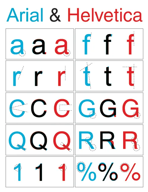
I like the clean Helvetica font in print material. I like the Helvetica font in presentations designed on a Mac. Somehow, the PC version does not appeal. The answer is: it’s not Helvetica. To save on royalties, Microsoft included the look-alike Arial with its Office software suite. The fonts look similar, but there are subtle differences. And they make all the difference.

Image designed by the ragbag, found via Swiss Miss.

I have not solved the problem myself. I think none of my clients have Helvetica installed on their PCs, and despite workarounds, I hesitate to create font issues with my presentations.

·Design

FedEx shows: no need for an elaborate PowerPoint template

An ad from FedEx found on Ad Goodness:

Proof for one of my 101s of PowerPoint design: ditch the elaborate PowerPoint template (with colorful horizontal bars, big logos, and other graphics repeated on each page). From a mile’s distance, anyone can see that this is an ad by FedEx. Achieved by consistent use of colors on a completely white background. They can almost do without the small logo in the bottom right.

Related reading: the 2nd post on this blog from July 2008

·Design

Photo subtitles (redux)

I talked about slide subtitles before as an idea to add detailed content to a “Zen-style” presentation with big images and few words, content that can be read when the document is viewed without a presenter being present.

I start using photo subtitles more and more as I increasingly move away from staged/fake stock images and use real images in my presentations. When using a creative common image from Flickr, it is important to give credit to the photographer, that is one thing to in the footer.

But the photo footer can also include a little bit more background information on what we see in the image, information that does not always have to contribute to the slide. The full details of the painter, the painting title and the place where the painting is currently displayed. The fact that the Paris cafe you see on the image is actually Cafe de Flore, in an image from 2006.

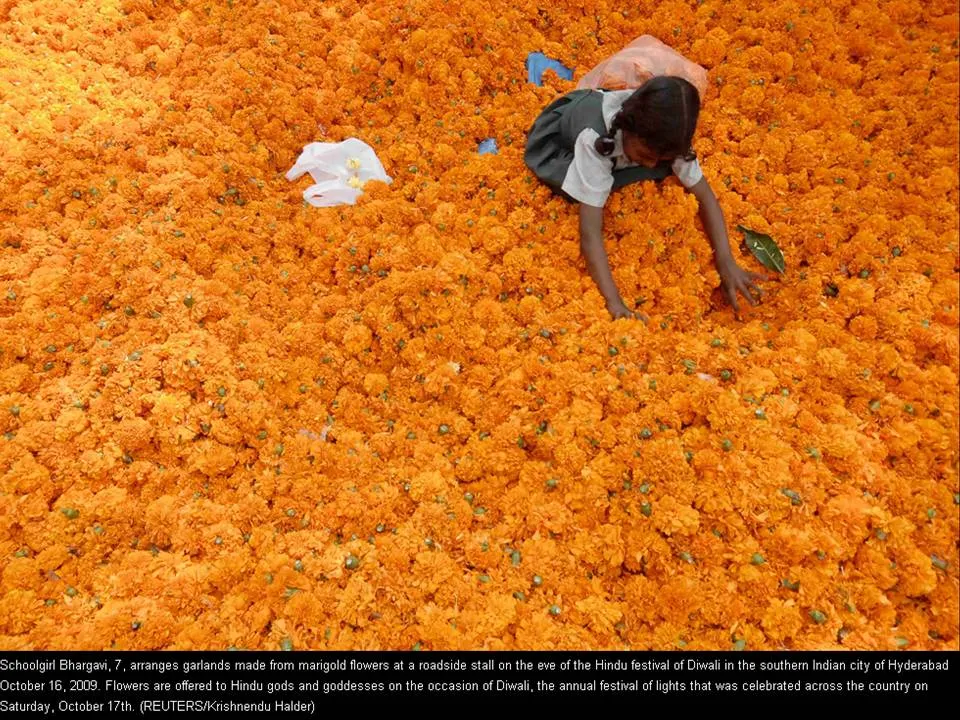
The Big Picture section of boston.com should feature in the RSS reader of every presentation designer. It is an almost daily stream of beautiful images (often more than 1MB a piece). The image below (related to the Diwali celebrations) was taken from it. You see a good way to format an image subtitle (with - in this case a lot of - information) as white text in black at the bottom of the photo.

·Data visualization

Adoption curves - how long does it take?

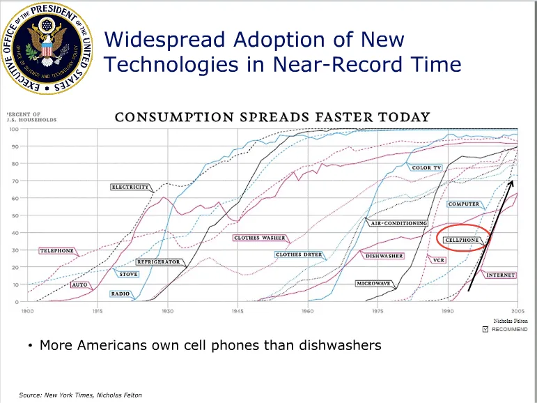
Adoption curves are a great way to compare the speed at which ideas spread, technologies were adopted or great companies were born. They are basic line graphs with the starting year set to zero. An alternative visualization would be a simple bar charts with “number of years before x reached y”. While simpler, this approach loses a lot of information: the absolute size, the rate of adoption, and changes in the rate of adoption over time. The classic use is to show that new technologies are getting adopted faster and faster. A good example can be found in Mary Meeker’s 2009 Internet presentation:

Mike Pulsifer found a chart that does not make all starting years zero, here is what happened:

Finally, interactive data visualization tools can add another dimension to adoption curves. See this example of a chart that shows how many years it takes to transform a startup into a large company (thank you Michael Eisenberg). The opening chart is far too busy to show in a PowerPoint presentation, but that’s not the objective here. These charts are designed for pondering over: select and de-select lines, mouse-over data, etc. If you had to translate this chart into PowerPoint, you would have to use a number of slides to highlight the messages you want to stand out.

·Design

Setting your presentation's personality

Usually, I still fail to do this 100%: setting the personality of a presentation and using it consistently throughout the slides. What contributes to a presentation personality:

  • The basics: colors and fonts
  • Slide design approach: huge images/few words, “Economist-style” data diagrams (headline message supported by a graph), bullets (uh oh), cartoon-style, etc.
  • Type of images: color or B&W, “tacky” stock images or real pictures, people or landscapes/buildings or isolated objects, funny or serious, vintage or recent, images-only or illustration-only, etc.

One example of a consistent personality is a teenage bedroom: decoration, posters, are all in a consistent style. And the style fits the personality of the owner as well.

Let’s think of a few possible presentation personalities:

  • Vintage 1950s images (family scenes, food advertising, first electrical appliances)
  • College humor (brutal, in-your-face, “funny” stock images isolated on white)
  • Zen (few colors, calm images, Helvetica light font)
  • Feminine (paintings, elegant images, some frivolous elements)
  • Economist (clean/neat data charts, one after another)
  • Cartoon (hand drawings, cartoon-type fonts, including very fat ones [“BANG”])
  • Napkin-style (simplistic drawings, hand-written/white-board style comments on printed text)
  • Macho (black background, performance cars)
  • Big words on a white background
  • Big words on a colorful background (Tom Peters)
  • Anti-design presentation (see Dave McClure’s work, I am only discussing his presentation personality, not his real one…)

The list can go on forever. Think about personality when designing your next presentation, taking into account your own personality, the topic at hand, your audience’s personality, your mood. And try to stick to it.

Continue reading →
·Design

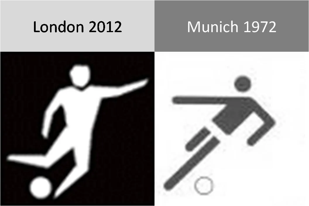
The new London 2012 Olympic pictograms

The pictograms for the 2012 Olympic games were launched yesterday, designed by Yasmine. Glancing back over the pictograms of the past decades (a new set is designed for every tournament), I actually still like those of the 1972 Munich games best (designed by Otl Aicher). Simple, recognizable, and full of movement and energy.

Somewhat related, designs for Olympic posters that were not adopted in an earlier post. Again simple and full of motion.

·Concepts

Chart concept - easier to get in than out

Some places are easy to get in, and hard to get out. (That one-off discount which becomes permanent for example). How to visualize this?

Things that come to mind (the one-way revolving door, permanent temporary structures such as the Eiffel Tower or the London Eye) are not obvious when you use them in a slide. “You see, your discount scheme is a bit like the Eiffel tower”. Blank stare.

Images of someone stuck in a well and looking up into the light do work. The idea was triggered when I found myself inside the double helix staircase in the Château de Chambord in France, and looking up. Stock image sites also have lots of “inside a well” images.

There is a bigger point in this: presentation designers should look at cinema direction to move audiences inside a scene or a situation and make them “feel” what your message means. A future blog post on this is in the pipeline

·Design

How to scale an image to full-size in PowerPoint

Most people have now caught on to the idea of using large images in presentations. But with a few graphics design tricks you can make things look even better:

  • Make sure that they are not stretched or squeezed: the proportions between height and width are the same as in the original
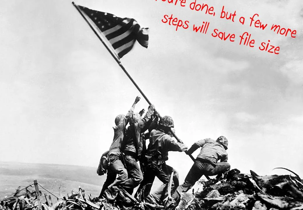
  • If the image is big, go all the way and have it cover your entire slide.

Here is how to do it:

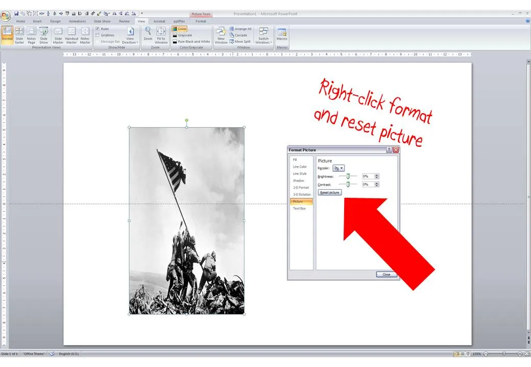
  1. Right-click the image, select format picture and click “reset picture” to restore the original aspect ratio (between height and width)
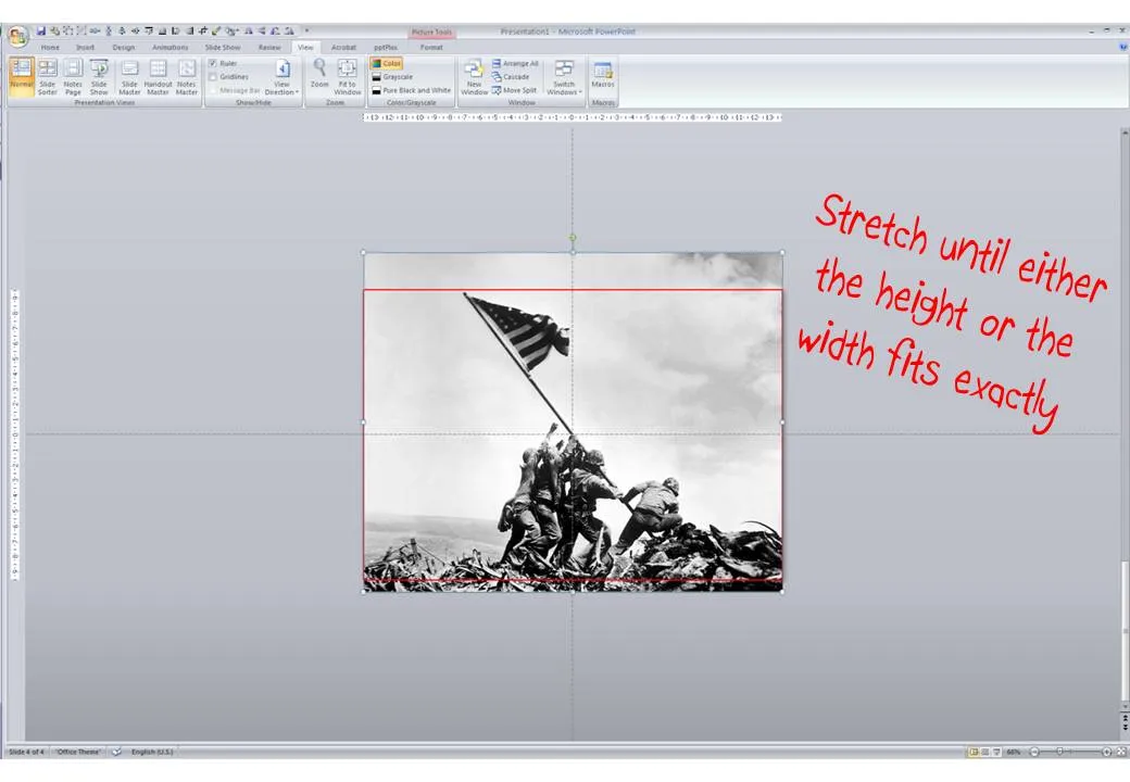
  2. Re-size by dragging a corner until both the height or the width are at least equal to the full screen
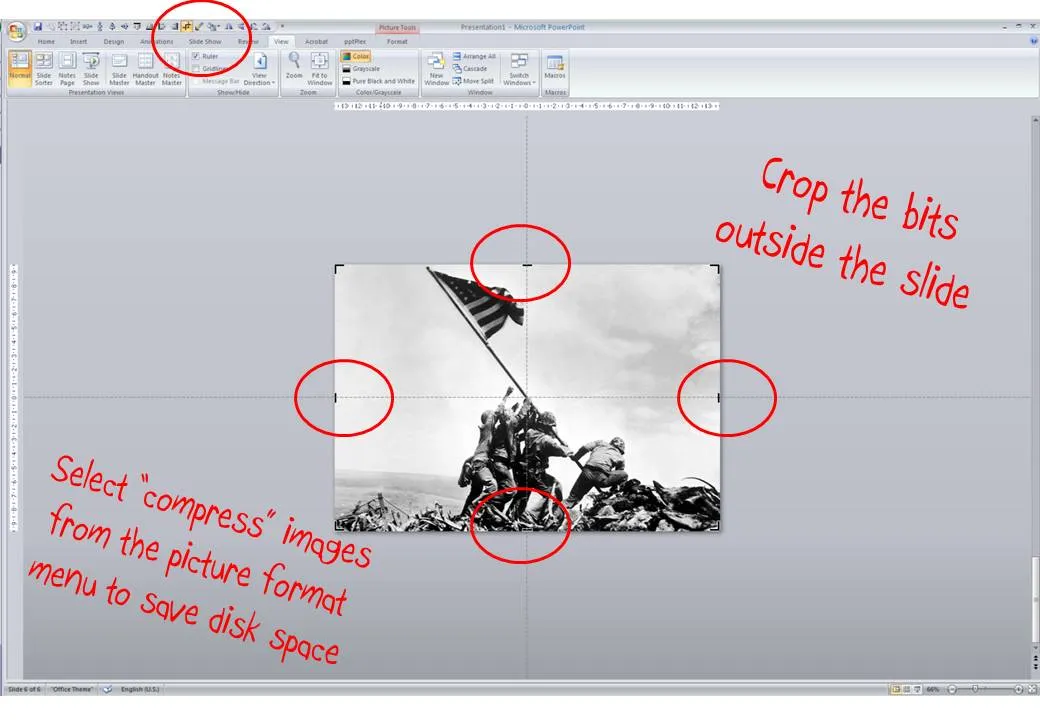
  3. Reposition the image and crop the bits of the image that are sticking outside the canvas
  4. Select the image, press format and compress pictures to reduce the file size of your presentation