SlideMagic Blog

Frequent updates about all things presentations since 2008. Subscribe to never miss a post.

RSS
all posts

Search results for “web design”

·Animations

Creating cartoons with PowToon

PowToon aims to enable you to create cartoon-style, animated presentation and video clips without professional illustration and motion graphics software. I test drove the beta version.

When you look at many cartoon-style videos you see that they are actually not that complicated from a graphics point of view. Usually they involve a number of scenes (slides), they use static characters, basic entrance, exit, and emphasize animations and sometimes a cute hand that puts items on the slide, all accompanied by some simple music.
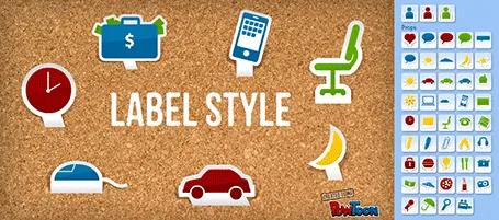
And this is what PowToon does. The edit interface looks Windows blue, it allows you to place items in a slide and specify the animations. In theory, PowerPoint or Keynote can do the same things, but it requires a deep understanding of the software, plus a library of characters.

There is definitely a market for a tool like PowToon. I do not envision these type of animations to be used in a stand-up presentation, but rather they could be useful to create demo videos on web pages, or presentations for emailing to prospects.

The basics of PowToon work great. I spent 10 minutes to stitch together this video based on a pre-defined template. PowToon is still in beta, and there are a number of features that I would recommend the team to incorporate:

  • Invest in the object library, and make them look less clip-arty (the picto character has some resemblance to the 1990s screen bean), this could also be a good revenue model: premium illustrations
  • Create the ability to export the presentation as a movie and embed them in a regular PowerPoint or Keynote file, this will make adoption in corporate environments a lot easier.
  • Make it easy to embed presentation videos in sites (I am sure the team is working on this)
  • Find a way to let the hand draw shapes and write text, so everyone will be able to make animations in the style of RSA Animate.
Continue reading →
·Data visualization

Pretty, but hard to understand

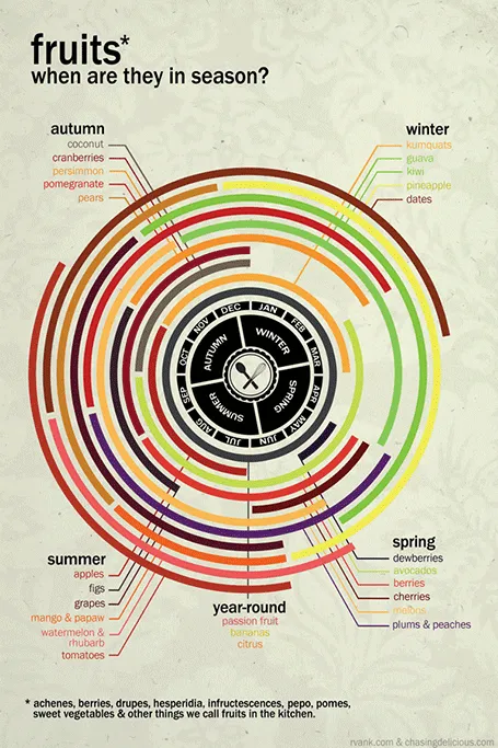
Infographics can be beautiful, but many times this comes at the expensive of clarity. This chart explaining the seasonality of fruit on Life Hacker is an example. The designer went for a circle concept because nature does not break up years between December and January. Still, this one would have been clearer with (fatter) horizontal bars.

Original design by Chasing Delicious.

·PowerPoint

PowerPoint guides using xScope

One of the most annoying shortcomings of PowerPoint 2011 for Mac is the inability to lock drawing guides. An external app can solve the issue.

A guide is a thin blue line on your design canvas along which you can align slide objects. If you drag an object close to the line, the object snaps into place. In this way objects on multiple pages are positioned in exactly the right place. I use them to mark slide borders, and more importantly the vertical center of my drawing canvas when it does not coincide with the center of the screen.

It is very important that these drawing guides stay exactly in the right location, and this is the issue. As soon as your cursor comes anywhere near a drawing guide, PowerPoint will make moving the actual drawing the priority. So if you try to straighten out an object that is a little bit off and want to fixate it against the guide, PowerPoint moves the guide rather than moving or resizing the object.

xScope (affiliate link) is an app for Mac that allows you to draw screen guides independent of the underlying application. The good news: PowerPoint does not move your guides anymore. The bad news, objects do not snap, you have to make sure manually that they are perfectly aligned. One other comment, the app lets you decide where to draw lines and where not when you use 2 screens. xScope does not allow you to manage this on 3 screens.

Continue reading →
·Gadgets

The best iPad stylus

I now have almost completely eliminated paper from my workflow after I switched to hand writing on the iPad. My meeting notes are better organized and searchable, and I can now make design doodles in multiple colors on which it is much easier to erase part of your sketch. I have tested 3 iPad styli extensively and the best one is the Adonit Jot:

  • The Cosmonaut is a cute, beautifully designed, fat pen that resembles a whiteboard marker. Nice for my kids to draw, but not suitable for writing or precision drawing. The fat tip makes it impossible to see what you are writing. I am also not a big fan of the rubbery material on the outside.
  • The Wacom stylus is built of quality materials, feels nice and light and writes comfortably. A close second. The soft tip wears off quickly.
  • The Adonit Jot is my favorite. A small, flat, transparent disk protects your screen while giving completely visibility what you are doing. A very nice, heavy build quality. The disk makes a clacking sound when you write, some if you might find this inappropriate in meetings with other people. I bought the Flip version that has a pen on the back (which I actually never use).

I did extensive research on the web before buying my own styli, and discovered that there is a huge difference in personal preferences. So you are likely to buy a few before finding the one that fits you best. (The links in this posts are affiliate links).

Continue reading →
·Gadgets

iPad "books"

Whenever there is an innovation in visual communication, people initially struggle how to use it best. Hand-written text scrolls did not have page numbers, spaces between words, or sentences. The first ads were either paintings or primitive, poorly designed pamphlets. Color and photography took some time to be used properly. It took 10 years or so after the arrival of PowerPoint before Garr Reynolds had his insight and write Presentation Zen, and he is still busy convincing the world to kill the bullet points as I am writing this.

So here we have this iPad and the iBooks writing platform that enables anyone to create apps that incorporate touch and can be read away from the office chair. I have started to write an app on this platform myself and am constantly changing my approach. I started with the concept of a book in my mind (pages of text with images), but then discovered all this other things you can do: Prezi-like zooming diagrams, embedded slideshows, videos, Keynote presentations, questions. This is not a book writing tool, it is a software development tool. All these visual tools were available before on the web: zooming images, videos, data visualization. But somehow they never made it as the basis for the development of visual stories. I think the fact that an iPad can be used away from the office chair/screen will change that.

Nancy Duarte recently ported her book Resonate over to the iBook platform and the result is beautiful. And it gives some good examples of how new visual techniques are more than just making content prettier or more spectacular. Many of the effects in the Wired magazine iPad edition are just like poorly used animations in PowerPoint or Keynote: interesting, but they do not add to the story. When Nancy analyzes a speech by Ronald Reagan, it is just very useful to be able to watch the actual thing alongside.

Continue reading →
·Gadgets

Review: iPad note taking

Handwritten notes are very important in presentation design. I use 2 kinds:

  1. A very small note book with a beautiful leather cover to take meeting notes
  2. The back pages of old print out for slide design (I take more pages out than I add, the pile is shrinking fast)

For writing I use my favorite pencil: the Lamy 2000 (review).

Let’s look at application 1 first: meeting notes

Although I love my luxury micro note book, there is a big problem with analogue note taking: finding stuff. Since you write sequentially, and often use poor handwriting, it is hard to access notes that are part of a specific project (I can have more than 10 things going on at the same time).

Digital note taking on an iPad can solve this: simply create a note book for every project.

The key problem is the iPad-hand interface. Steve Jobs always was against using a styles, he correctly reminded us that we have 10 of them already. That is true for navigation, but not for writing large pieces of text (fast). The biggest problem is seeing what you do. Big fingers are getting in the way of your eyes, leading to illegible scribbles. And after a while you get tired of holding your finger straight. So there is no escaping from a style.

An iPad stylus needs to have a fat tip with a soft surface, mirroring the texture of a human finger. The resulting line can still be highly thin though, getting drawn at the center of impact of the soft tip. To show this effect, see fashion designer Karl Lagerfeld sketch drawings live on stage during the LeWeb 2011 conference in Paris last year (skip to 19:50).

Continue reading →
·Colors

PowerPoint for Mac color rendering

If you cannot get excited about color rendering in software, please skip this post.

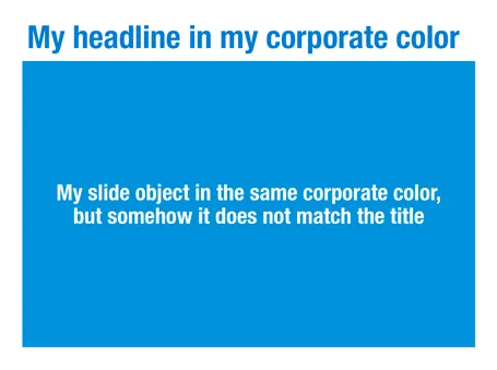
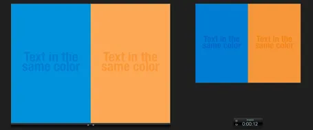
There is something weird in the color rendering of Microsoft PowerPoint 2011 for Mac. First, text and shapes get treated differently. If you make the text and the background the same color, the text will appear different. At first it looks like to be designed on purpose. But the adjusted color is actually a bit off on the hue spectrum, creating color clashes. See the example below.

Maybe there is a problem inside the software though. Look at the screen shot below of a presentation in presenter mode. I copied 2 exactly the same slides and you can see that the preview of the second (identical) slide pulls the blue into same purple direction as the text in the previous example. There must be more than one color rendering engine inside PowerPoint.

PowerPoint 2010 for Windows does not suffer from this, and I hope that Microsoft will fix it in a subsequent update (even it was done on purpose). If I want my text to stand out on a background, I want to freedom to decide myself what colors to pick.

·Concepts

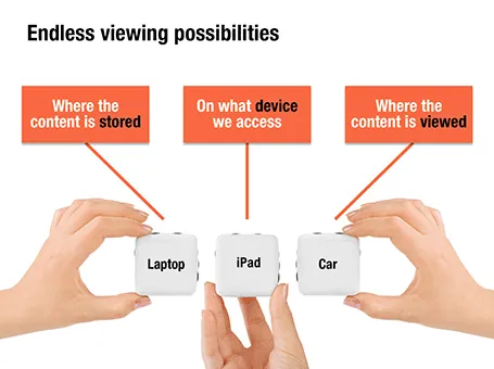
Endless permutations

Here is a nice way to visualize an unlimited amount of possible combinations. The sanitized example below was designed for a client with a new digital media technology. You could create a similar concept with a suitcase combination lock, or maybe a slot machine.

·Advertising

Presentation first

Presentation design often comes at the back of other marketing communication (advertising, scripts for brochures, white papers, and web sites). In many cases, marketing can benefit from the opposite approach. Visuals are much better to lay the foundation of a marketing story than text. And it is far easier to involve a CEO or other senior executive in a visual presentation design process, then force her to go through revisions of text. So a good presentation design project does not only give you a nice slide deck, it might well provide the inspiration for an entire marketing campaign.

·Keynote

Keynote versus PowerPoint

The year 2012 could be the tipping point for Apple’s presentation design software Keynote. Only now I get multiple requests from clients to start designing presentations in this format. Especially smaller companies and startups who have the privilege to be able to decide on a 100% Mac IT infrastructure are the pioneers. So, over the past month it has been the first time that I had the opportunity to use Keynote on an industrial scale, on time critical presentation design projects.

Most Keynote versus PowerPoint evaluations on the web count the number of features, slide transition effects, or the quality of the built-in themes. So this is maybe the explanation why these features get some much prominence in marketing of both products. Personally, I find them the least important aspects of the software. What matters is how easy your workflow is: manipulating objects, changing the order of slides, managing images, creating and editing data charts. My review will focus more on these issues.

People say that the best Apple products are those that Steve Jobs used frequently personally, and Keynote is such a product, and it shows. The interface is lighter, fresher, simpler without PowerPoint’s baggage of older versions.

The concept of the inspector window with the properties of any object you click at (image, shape, graph, text) is incredibly useful and time saving compared to looking for the right menu in PowerPoint.

One of the biggest pains of PowerPoint 2011 are the drawing guides that you cannot lock. Re-size an object near the blue drawing guide, and tsjak, off she goes. Not so in Keynote. Aligning, positioning is all easier and cleaner.

Continue reading →