

Infographics can be beautiful, but many times this comes at the expensive of clarity. This chart explaining the seasonality of fruit on Life Hacker is an example. The designer went for a circle concept because nature does not break up years between December and January. Still, this one would have been clearer with (fatter) horizontal bars.
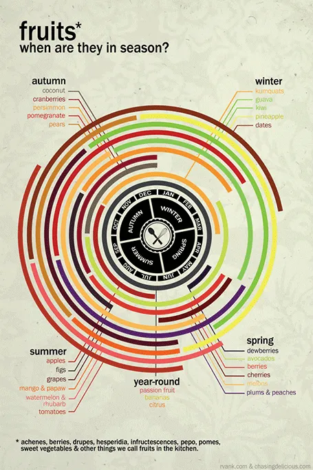
Original design by Chasing Delicious.