SlideMagic Blog

Frequent updates about all things presentations since 2008. Subscribe to never miss a post.

RSS
all posts

Search results for “mckinsey”

·Books

New book by Duarte

Nancy Duarte is probably the only person in the world that has managed to create a very large business in the presentation design market. As a result, she is a true authority on the subject because of here experience with designing presentations ranging from the high profile money-no-issue keynote presentations to the day-to-day high volume make-overs of slides for internal management meetings.
Her new book HBR Guide to Persuasive Presentations is different from the previous two (Slide:ology and Resonate): it is far more practical. Out goes the glossy paper, the beautiful diagrams, the client case examples, and instead we have a highly useful list of tips and tricks that can help you make better presentations the moment you put the book down. Almost every paragraph starts with an action verb, a recommendation of something that you can do better.

The book covers a wide range of subjects related to presentation design, from analysing your audience to building an online social media following for your decks, but the core of the book is in story and slide design. Some new ideas that I got out of the book:

  • Create two endings in your presentation, if you run out of time you can always stop at the first one
  • Pick the right type of slide: walk-in slide, title slide, navigation slide, bullet slide, big word slide, quote slide, data slide, diagram slide, conceptual slide, video slide, walk out slide
  • Ideas how to translate words into diagrams.

One point of disagreement, the book advocates using a 10% rule for executive summary slides, so a 50 slide deck needs 5 summary slides (5 minutes), and 45 appendix slides. Pretty much what we tried to do at McKinsey. I increasingly try to shorten that executive summary to one super short summary, and follow it to a slightly longer story that encapsulates the entire story, hoping to be able to hang on to senior management attention for maybe 10 or 15 minutes instead of 5 when the cross fire of questions begins and your slide presentation in the conference room basically ends.
Continue reading →
·Concepts

Reinforcing loops

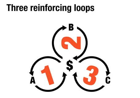
At McKinsey, we used to call this Business Dynamics, mapping reinforcing and opposing forces using arrows. The concept is borrowed from systems theory in mathematics and physics. These circles can make a great chart to show the main growth drivers behind your business.

The notorious US army spaghetti chart is a more complicated execution of the same principle. Contrary to many critical review, I actually liked it as a visualization of the incredibly complex situation over there.

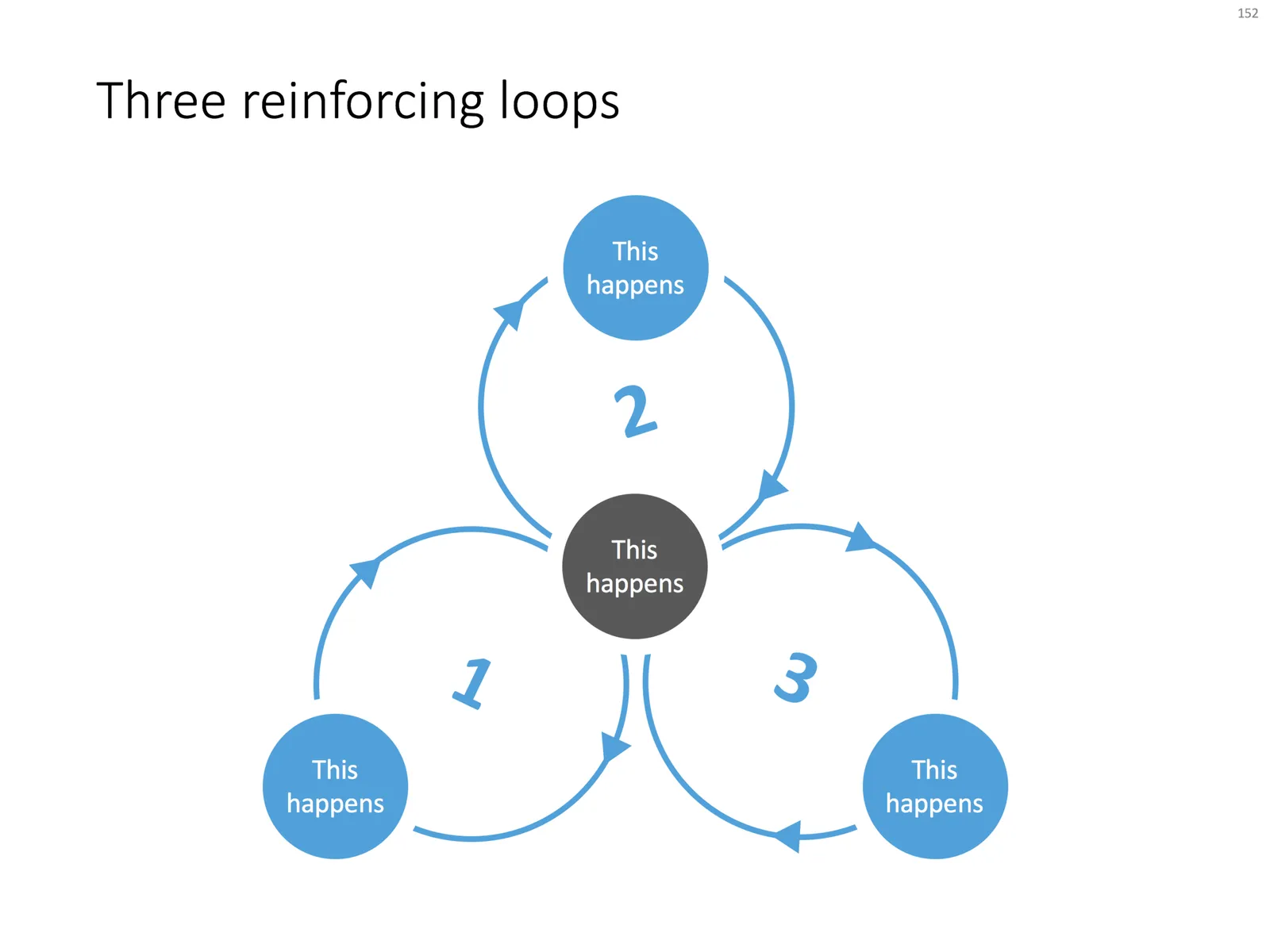
UPDATE: There is now a PowerPoint slide template with 3 reinforcing loops available in the template store.

·Data visualization

Ranges versus point estimates

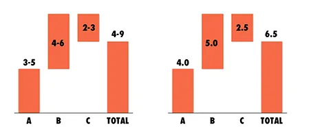
Things are never sure in business analysis. One option to deal with uncertainty is to use data ranges: $3-5m instead of ~$4m.

While it might be the correct approach to qualify your analysis, I do not find it visually pleasing. My approach would be to settle on a point estimate, and put a note on your slide that these numbers are estimates. It also easier to discuss with your audience, it is difficult to refer to ranges all the time: “Next year’s sales of $3-5m”.

One additional complication, ranges amplify when you add or subtract them. In the chart above, you see that 6.5 equals to a range of 4-9 instead of 6-7 for example. If this is the point you want to make, our sales forecast can fluctuate wildly because of things we do not know, then use the chart. If you just want to give a small range to show uncertainty about the exact value go for the point estimate.

And one more issue, a range of $1m more or less can be a big difference if you apply it to a small number, or a big one: 1-2 versus 10-11 for example. The first is a 100% variation, the second 10%. So, to do it correctly you have to write down in your chart: 1.0-1.1 and 10.0-11.0. All this just makes it too complicated to have a meaningful strategy discussion.

And another one: ranges are a pain to use in calculations, as seen in the slightly counter-intuitive column chart above. (See an earlier post on how to make water fall charts here).

Continue reading →
·Data visualization

How to pick the right data chart

PowerPoint offers a vaste number of options for designing a data chart. Which one should you choose? Here are some of the guidelines I use:

  • A ranking by size: horizontal bar
  • Development over time with a handful of data points: column, if there are many data points a (fat) line
  • Decomposition of something in its parts: a waterfall (see a post on how to make waterfalls charts), waterfalls also work great to visualize 1 year of a Profit & Loss statement
  • Showing something as a % of the total: a pie chart if it is one year/period, a series of 100% columns if it is a trend over time.

Data has multiple messages. In the analysis phase of your work, you need to study all of them. But when you are ready to present conclusions, you pick the one and only message that is worth emphasizing. If you cannot settle on one, make 2 charts and present them quickly after each other: the market grew [click], our market share increased.

If things get really complex, for example when there are 3 or more factors driving change going into difference directions, you might have to resort to a source-of-change waterfall chart, followed by a data chart that highlights each of the trends individually.

·Colors

Make the small print really small

On the first day of my career at McKinsey we were told to put the sources of our analysis really prominently at the bottom of each chart. Even if the source of the data was yourself, simply put “Team analysis”.

Still, many presentation slides have very conspicous sources and foot notes at the bottom. It is a typographical eye sore. When you are standing up to present your slides, people are not interested in reading the small print.

I am not advocating to take the foot notes of all together. Readers who go through the deck afterwards might be interested in them. It is also very hard to keep a good book keeping of data sources, better to have them handy all the time (I do not have the discipline to keep on updating that page with all the sources in the back of the document). And finally, taking of the reference to a photographer in an image with a creative commons license is not good practice.

So instead, do the obvious. Make the font really small (you can overwrite the “8” as smallest font size in the PowerPoint drop-down menu and make it a 6). And give the font a color with low contrast with the background. In that way, you get the best of both worlds.

This might also be the way to handle your lawyer who insists to put “confidential” and other disclaimers on every slide of the deck. Page numbers can be treated the same way. Sometimes they need to be there, but only for people who stand with their nose against the screen.

·PowerPoint

Think of yourself as an interviewer

Back in the old days at McKinsey, your interviewing skills as a consultant on a team would be evaluated roughly on 3 levels: 1) you got the piece of information you needed (the market for [x] is $1bn, 2) you managed to get an insight that was completely new to the team, and 3) you actually made the interviewee realize something she did not know before.

Great journalists know exactly what questions to ask at what time in the interview. The interviewer draws out the story of the interviewee.

When designing a presentation think of your self as the interviewer. If you design something for someone else, then you can take it literally. If you design something for yourself, imagine interviewing yourself in front of a big audience.

Poor interview question: what five pieces of research support the assumption about the target market size? Good interview question: what, I thought only 5 people need this product, give me a feel for why this thing is huge? Poor interview question: “Now that we have spent the past 30 minutes analyzing the market, let me ask you: what do you actually want to achieve?” Good interview question: “before we dive in, tell us quickly what your ambition is”. Poor interview question: “So let me re-phrase what I think your story is”. Great interview question: “But is your story not a bigger one if we draw the parallel with this?”

Then you will have hit level 3, the interviewee walks out of the chair with a different perspective, and the re-designed presentation will be more than a beautification of existing slides. Which interview do you want to follow to the end, and which one will you skip with the mouse or remote control?

Continue reading →
·Delivery

Preaching to the converted

A story from the early 90s. Back then I had recently joined McKinsey as a Business Analyst and got involved in recruiting presentations at Dutch universities to try to convince more engineers to apply for a  position. The slide deck covered it all: our offices, our expertise, our clients, our selection process.

Until one day we did a survey asking the audience to rank how useful this presentation was. The outcome: people already knew that we were probably very smart, worked with prestigious clients, were unlikely to starve because of lack of financial resources, and were very professional.

The questions the students had were: are you guys human or nerds, do you really have to work 80 hours a week, how on earth can a physics engineer be useful there? These questions you cannot really address on a slide, so we cut the introduction presentation to the minimum (to re-confirm what people already knew), and then switched off the projector and started talking about us as a person, and opening up the discussion for questions.

Preaching to the converted is a waste of time. Instead, use your presentation to address the issues the audience has.

·Layout

Sentences are useful sometimes

Back at McKinsey in the 1990s we would write a long-hand sentence, or a “lead” at the top of every slide (similar in length to today’s 140-character Tweets. This sentence would give you the message of the chart and you could get the whole story by reading all the leads in a document, without looking at the exhibits below.

I am re-discovering the sentence recently.

  1. In some presentation designs, I switch to a slide template with a 2 line title, creating space for longer sentences at the top of a slide.
  2. Certain thoughts or concepts are just too complex to shorten to 2 bullets of 3 words each, so I am just writing them out.
·Books

Recommended presentation design books

What are the best books about presentation design and public speaking

Some good books about presentation design, public speaking, graphics design, and art. If you click on an image, you will be linked through to Amazon where you can buy the book. We use affiliate links and receive a small commission when you purchase a book through this site.

You can find reviews of presentation design books that I posted on the blog here.

Pitch It! by Jan Schultink, my own book about all things presentation design. The book can be accessed free online here.

Presentation Zen by Garr Reynolds started the revolution in presentation design, transforming bullet point slides into visuals with images. Read my review here (2008).

Design Elements by Timothy Samara takes you through the basics of layout and typography. Read my review here (2010).

Resonate by Nancy Duarte has good instructions on how to design a captivating story that gets your audience to do something, take action after they walk out of the auditorium. The iPad version is free. Read my review here (2010).

Slide:ology by Nancy Duarte is a good general introduction to presentation design and delivery. Read my review here (2008).

Continue reading →
·PowerPoint

Designing analyst presentations

Some random thoughts about designing good investor presentations. Investor presentation in this context is a presentation by a larger publicly traded company to equity analysts and institutional investors, for example a quarterly results announcement or an investor conference.

My blog contains a lot of ideas that visible for only one day, I plan to start writing some longer articles about certain topics that deserve a more permanent presence, and update them with new ideas or input from my readers.

Begin working on the presentation early The worst presentations are finished at 3AM the night before the investor call. It is possible to create 75% of the content of the investor presentation with preliminary data, or even the data from last quarter. Usually changes in data are not that dramatic that completely new visualization approaches are needed. Use existing data to decide on what type of graphs you need and replace the dummy data with the real thing as the information comes in. And: not all sections in an investor presentation are about data. The section with the update on the company strategy can be completed independently of the availability of the latest financial results.

Get the basic formating right Use the correct corporate template, set the colors and the fonts to the correct values. Avoid clip art. Use professional, high resolution images. Use one template throughout all the presentations at the event. Pay special attention to the way data charts are formated. There is nothing worse than a straight copy-paste from Excel. Look the way newspaper or magazines such as The Economist pay attention to the layout of graphs: clean and focussed on one message. A PowerPoint presentation to investors differs from an annual report: it is OK to round up numbers to make the chart more readable. People who want the full detail can always refer back to the accounts. In a 20 minute call those last 3 digits behind the dot do not matter.

Continue reading →