SlideMagic Blog

Frequent updates about all things presentations since 2008. Subscribe to never miss a post.

RSS
all posts

Search results for “web design”

·Keynote

Working title “Pitchera”

I am brainstorming names for my upcoming presentation app and am currently using the working title “Pitchera”. You can start signing up for the mailing list to stay updated on progress here. In that same form you can indicate what sort of presentation designer you are, I am still pondering to what type of audience the app should be targeted at launch.

·Presentation design

From PPT to HTML

Web design involves technical skills that a presentation or print designer does not have. At the same time, (if I may say so), presentation/print designers might have a better feeling for page layout (understatement). Yeah, yeah, I agree, on the interactive technology front the geeks still beat us.

I have blogged many times over the past few years about the similarities between web and presentation design.

Most automated web design tools are aimed at small business owners with zero design or software skills: Wix is an example, or look at Striking.ly. So I was pleasantly surprised to discover Webydo that offers a design environment similar to PowerPoint or InDesign and enables presentation/print designers to create some pretty decent web sites.

The company is still in beta, so there is always the risk that your web site might go down with it in case the company does not get traction (that is why I am giving it some publicity here). Also, the software still has some tiny bugs that I am sure will be ironed out in the near future.

·Design

New look? Don't forget PPT...

When I get the brand guidelines from a client (explanations about logos, colors, fonts), the PowerPoint section is usually at the back, put there as an afterthought after brochures, business cards, and letterheads are being discussed.

Designers usually do not pay much attention to PowerPoint (PPT is uncool for serious designers) and you end up with fonts, shapes, and concepts that are 1) hard to incorporate in presentation design software (no, most people do not have Frutiger installed on their machines) and 2) - more importantly - are very hard to understand for the layman designer.

The face of a company used to be the letterhead, but today it is the website, and yes, the PowerPoint presentations that are cobbled together by the amateur designers and shown to customers everywhere, all the time.

So, when designing a new corporate look, think about those amateur designers, and the best way to do that is to design your look for PowerPoint, then adjust it to other canvases. Sorry.

·3D

LiveSurface 2

A few days ago I wrote about LiveSurface and their set of stock images with blank surfaces to put your own artwork on. On the site, I signed up for their new product: LiveSurface Context (request an invite here). It is a small program that takes care of the 3D manipulation of your artwork in order to fit it on the surface.

The experience is much better than the vanishing point filter in PhotoShop. No more guesswork to draw the guidelines, no more fiddling and copying/pasting to move your artwork. Everything is ultra-precise and with total control for the designer.

A few drawbacks though for the casual designer. You need to have a version of Adobe Illustrator installed on your machine (and more importantly, know the basics of how to work with it). Secondly, the service charges a subscription model that works if you need to use a lot of these compositions, but is not economical for infrequent use. And finally, the library of surface images is smaller than you would find on regular stock image sites.

All in all a good service, and as a professional designer, I might give it a try.

·Colors

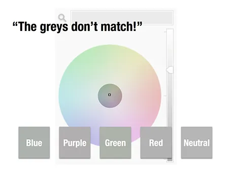
The greys do not match!

A few days ago, a friend posted a “complaint” on her facebook timeline that her husband always failed to spot fashion imperfections, in this case grey tints that did not match.

Grey colours sit in the center of the color wheel with equal balance of Red, Green, and Blue. But tipping the balance of the color mix a little bit instantly makes your grey look different. Use it as a design option to create a matching set of colours, watch out if it is not what you intended to do.

The same is true in black and white images, not every BW image is really pure grey, but it is easy to correct it, just have PowerPoint or Keynote turn it into a proper black and white image.

·Keynote

The story page

Many corporate web sites still emphasise 1990s-style content on their home pages: mission statements, contributions to the community, corporate history. I really like this deck with design concepts for 2013, including a suggestion to turn your home page into your story page.

Trends in interactive design 2013 from Prophets Agency

·Keynote

Zoho Show mini review

Zoho is a web app suite targeted at small businesses. One of the apps is Zoho Show, a presentation design suite. Yesterday, I gave it a test ride.

A cutting-edge presentation design tool is not the key selling point of Zoho, it is just one of the components of a broader offering of business software with different benefits: attractive pricing when compared to Microsoft Office, access to your files from any location with an Internet connection, and easy collaboration on documents with colleagues.

You do not notice that the Zoho slide design interface is run in a web browser. Interactions are smooth and fast. The application is designed to resemble Microsoft PowerPoint, menu colors look similar, and menu options are stored in familiar places. Unlike Google Docs, Zoho does allow you to crop images (a very important feature).

The basic PowerPoint user will have no problem working in Zoho Show, with one big exception: the ability to create data charts. In Zoho, you need to create them in the spreadsheet application and port them across using an image. This is an issue for people that live and breath bar and column charts day in, day out. (Google Docs has the same issue, it is probably complicated to include a full spreadsheet chart engine inside a presentation app).

For more advanced presentation designers, there are certain things missing. Template management is poor (same as with Google), and you miss the ability to align objects, snap them together on the screen. Font selections are limited, and as with all web apps it is hard to configure a tool bar for fast access to functions you often need (aligning objects, etc.).


Continue reading →
·Data visualization

Mailchimp online annual report

A few days ago there was Kickstarter, and now Mailchimp has put its annual overview online. I like these blends of web design and presentation design.

From a form perspective, the presentation is clever. Widen and narrow the screen and see what happens, as you make the window narrower, first the infographics move closer to each other, then the design switches from a 2 column to a 1 column layout.

From a content perspective, there is some work to be done. Data is not rounded up and makes it hard to read, and some of the information presentation is not terribly relevant to the viewer (pizzas served). Then, the objective of the site is to show that a lot of stuff is going on at Mailchimp, and with that in mind, they succeeded conveying the message.

P.S.: another cool annual report: Warby Parker(h/t Duarte)

·Images

Kickstarter presentation

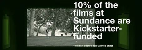
This Kickstarter presentation is a beautiful example of simple visualisations that go beyond PowerPoint slides. It is a series of web pages, with simple typography, well-chosen images that are made uniform in style through a color overlay.

Slide design and web design are converging.

·Gadgets

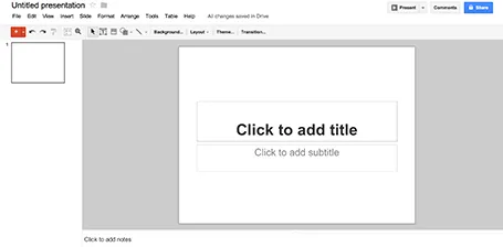
Google Presentations review

As part of my attempts to write a PowerPoint killer I am researching all the presentation apps that are currently available. Today, I have Google Presentations a test drive.

Web apps have come a long way, and the overall user experience is pretty much the same as local software: snappy and fast (that is, if you are connected to the Internet). Right-clicking, dragging, drop downs, it all works. Google Presentations is integrated into the Google Drive environment which makes accessing and sharing files really easy.

While I think that PowerPoint is too bloated with features, Google Presentations is still at the other extreme of the spectrum. Here are the things I a missing:

  • Big, big problem: you cannot crop images
  • Poor integration of data charts (you need to create the chart in a Google Spreadsheet and then copy it across as an image
  • If you create custom templates, everyone can see and use them

Google is making huge improvements in the design of its software, gmail, Google+, mobile apps all look fantastic now. Google Spreadsheets are already a workable alternative to Microsoft Excel sheets. With some additional features, Google Presentations can be come a credible PowerPoint alternative as well.