

SlideMagic Blog

Frequent updates about all things presentations since 2008. Subscribe to never miss a post.

RSS
all posts

Search results for “web design”

·PowerPoint

Parallels: presentation design and web site design

Most web sites are designed around functional content rather than story: find our address, learn about our environmental policies, see how we value compliance, here is a list of all the products we sell. But is that what should get all the attention? Maybe a first-time visitor of a company web site is more interested in the story behind the company? That story should be eye catching. The functional information should be accessible, but does not have to jump at you when you enter.

Similar to PowerPoint templates, web site templates waste too much space on screen clutter. Multiple menu structures, lots of links, buttons. It is all too busy and confusing. The language on corporate web sites is full of clichés. The text sort of all say the same thing. Images are often the cheesy stock photos that good presentation designers try to avoid.

Corporates probably copy each other. They brief a design agency with “I want something like that”. As a result, the same concept gets repeated and repeated. Web design is probably mostly lead by technology developers, not story tellers. The structure, the layering, the architecture come first.

Maybe corporate web design is also ready for a revolution, and maybe story designers can play a big role in it?
·PowerPoint

Presentation design and web design

In many of my presentation design projects, the content of the presentation is already 80% available on the client’s web site: a startup with an exciting new technology, the strategy of a big Fortune 500 company. But it clearly does not a good job at explaining the messages in an interesting visual way. (Otherwise you could just put a modified version of the web graphics as the background to your presentation).

Over the past years, we have learned a lot about effective design of presentation visuals. Maybe web design is next, and can learn from this process? Fewer buzzwords, fewer environmental policies, less prominent contact details. If bullet points and clutter do not work in a presentation, why would they work in a web site? Instead: the web page as a clutter-free presentation canvas that tells your story.

The implication will be that, similar to presentations, we get a level playing field in web design. A good web site template that can handle big images and sliders is all you need from the technical site. That is the easy part. The difficult bit is to get the story right.

·PowerPoint

Designing sliders in web sites

I have been upgrading my business web site recently, and it now includes a slider with continuously scrolling images. All of these were created in PowerPoint. I am new to the world of web design but sense an interesting trend where corporate web sites go from complex to simple, only communicating the key messages about a company.

My site is still far from perfect (slides are too busy, slider goes too fast) and I plan to improve slowly (when I have the combination of inspiration and time).

Here are some things that I think are important when designing these sliders:

  • Avoid plastic/cheesy/standard stock images
  • Pick images with lots of white space
  • Make sure the color of the images sort of match the color scheme of the site
  • Put text elements at exactly the same spot on each slide to avoiding jumping titles
  • Align items in your image with the grid of the web site design
  • Take over as many features from the automated web site template as you can. I am still constrained by my web template (fonts, positioning of headlines etc.). Some low-level HTML editing and conversations with the template designer made things a lot better though.
  • Use a smooth slide transition, avoid aggressive animations and the worst: the fast rewind at the end of the last slide

Let me know if you have more thoughts on this. I am learning.

Web design observations

“Do you do web design as well?” was probably one of the most-asked questions in discussions with new clients. I still don’t do it for a living, but finally finally, I caught up and have a pretty decent understanding about how it works. I must say, web designers have to endure a pretty big mess.

It takes an incredible amount of trial and error to get basic things sorted (try lining up things in a straight line for example). Unlike writing back end algorithms, which you can sort of read/follow, a page full of HTML tags is impossible for a human to understand. Pages are set up as long scrolling bits of text.

No one is to blame though, HTML needs to be backward compatible and fit a huge range of screens and devices.

For productivity application development, things are different. Screen dimensions are more or less the same, people usually work in (almost) full-screen mode, scrolling and resizing is less relevant… All you need is a decent x/y coordinate system and you are done (almost).

That is another business opportunity for someone to cover…

Photo by Pankaj Patel on Unsplash

·Culture

Design culture

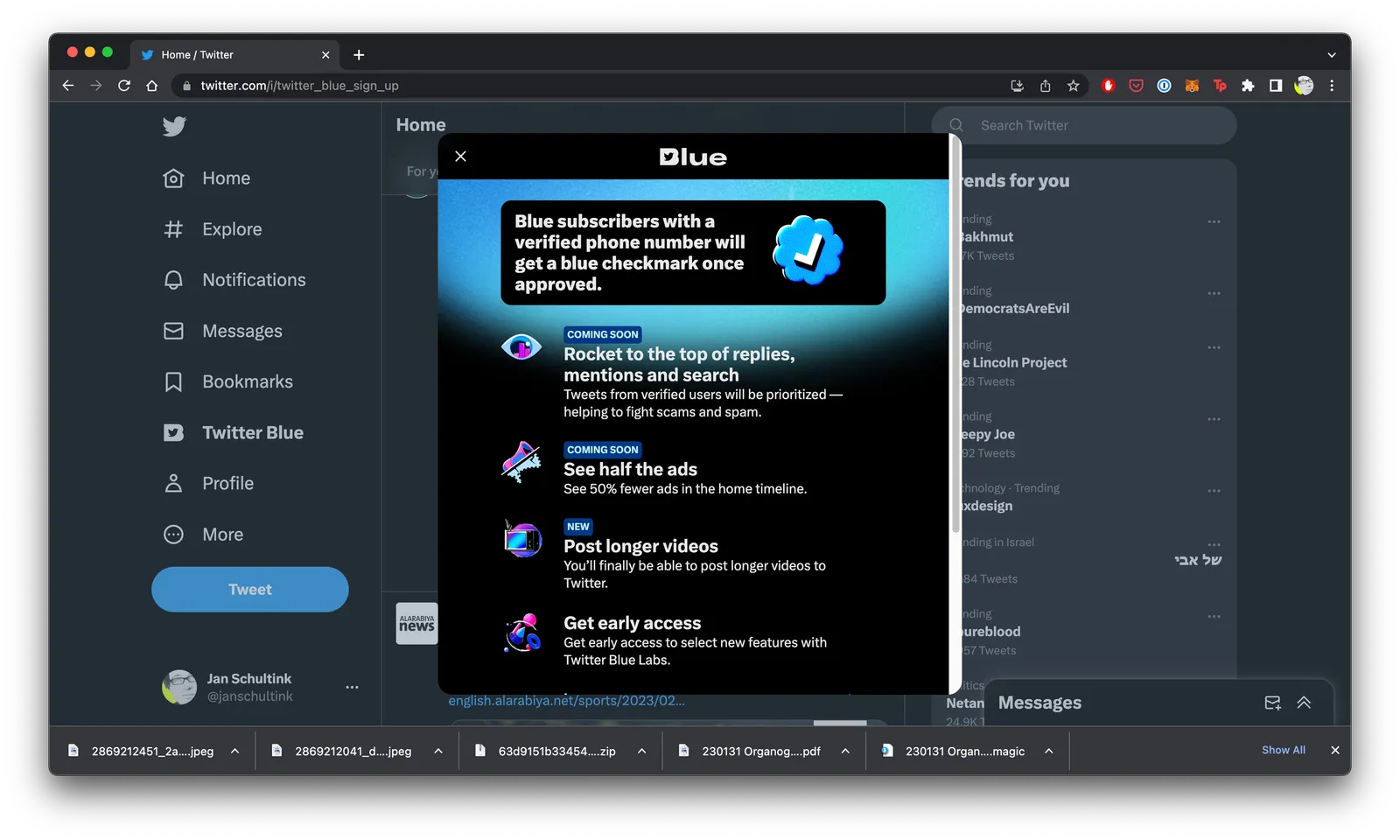
It is tricky to get a big company all aligned behind one consistent approach to design. Twitter is going through a lot changes: changes in strategy, changes in people, etc. You can see it in inconsistencies in the web site. Colors, language, layout, icons, other design elements, etc…

·Design

How do people glance over a corporate web site?

There is a lot of science and analytics available for eCommerce web sites. Changes in layout, design, and content immediately translate into changes in clicks and sales. The story is a bit different for a corporate web site that is not transactional, it does not sell anything, it does not have a big signup button, but plays the role of a digital business card for a company. Let’s say the first web site of a startup aimed at investors and the first enterprise customers.

Some things to look at:

  • The most important aspect is probably the look and feel of the site, regardless of the content. Does it look professional and serious (as in of a serious company). If that funky or complex graphic somehow does not look quite right and you can’t put your finger on the spot why, take it out. A professional looking simple graphic is always better than a botched attempt at a complex one. Make sure that copyright year is the current one.
  • This seems obvious, but is often lacking, the site should actually state what it is you do. Try it on people that have no background at all in the market you work in, try it on people that love to put you in well known boxes (i.e., venture capitalists)
  • Different companies need to emphasize different things. For most companies, the founding team and its head shots will be buried in some ‘about’ section of the web site, for very early stage startups, it might need to feature prominently on the first page since it is basically the only asset it has.
  • No one reads a web site top to bottom like a newspaper article. Instead, people glance. Read a headline, look a the small text below a photo, read a random paragraph. Don’t arrange content in order of importance solely, but think about the visual hierarchy. A small picture might grab more attention than the big cliche headline.
  • It is tempting to lift stories from presentations and translate them to the web site. The founding story of how it all began to where you are now including that big pivot in 2020, the market gap analysis that is the start of your investor pitch deck. These stories need a place, but maybe not on the home page of your web page.
  • Avoid jargon. “Ah, this site is filled with blah blah” and people will stop reading. But do include language that is common in the industry you are working in.
  • Make sure that the site has the details that should be there: contact details, etc.
·Design

Prototype design

I am currently working flat out on a new business that my wife and I are putting together in the field of healthcare. With a bit of luck, we can take the covers of at the JP Morgan Healthcare conference in San Francisco next January. (Hopefully after that I can boost the SlideMagic product more, I have a few interesting ideas).

I am becoming better and better at designing web front ends, fusing what I am learning about HTML, CSS, and JavaScript, with what was already in my head when it comes to slide, spreadsheet, and data dashboard design.

I am surprised of the impact the look & feel of a prototype makes on early users. Investing in design can take a lot of time, and can be wasted when you are taking your product into an entirely new direction.

My approach is similar to presentation design. Focus on easy wins that make your product look professional and organised, and skip the “marketing design” for the moment.

  • Minimal effort on the public facing web site

  • No investment in “flashy” animations, videos, and other spectacular effects

  • Instead get the little details right that make a big impact, and fixing them does not take a lot of time:

    • Layouts of screens
    • Lining things up
    • Colour contrasts
    • Font size and emphasis
    • Rounding of numbers
    • Etc., etc.

Having a prototype that looks good makes it also a lot more fun to work on.

·Design

The right proportions in design

Certain layouts and compositions look right, others seem wrong. We can see it, but we can’t point our finger to exactly why.

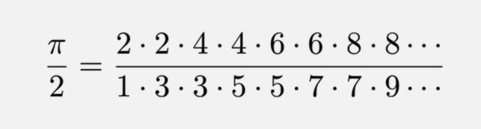
This formula for the constant pi got my attention:

It is the so called Wallis product, a beautifully simple representation of a number that seems very random, the first 50 digits of pi are 3.14159265358979323846264338327950288419716939937510……

Pi governs the shapes of rounded shapes, , waves and much more. The elegance of a circle is simple. But it is governed by a complex set of harmonics and ratios that all relate to each other. Beautiful designs have them, beautiful music has them. In most cases, we only appreciate the end result without grasping the underlying logic.

·Design

Will the designer change your text?

When I started making pitch decks 15 years ago, there were not many people who called themselves “presentation designer”. Now the world is flooded with them. But “designer” is a very broad term used by people with varying skills.

Most “before and after” examples on designer’s web pages are beautiful makeovers of slides. Better fonts, better colours, a nice image. It all looks a lot better. But makeovers are makeovers: the fundamental layout of the slide almost always stays the same, and the text always stays the same.

Maybe this is the question you should ask a potential presentation designer: do you rip up the slide, change the headlines, round up numbers, regroup boxes (these 4 points are actually 3), etc.

The text changer is a very different designer from the makeover artist. And very often the text changer might not be very good at design. (The SlideMagic bespoke design pitch was the unusual combination of skills in one pair of hands).

There are different types of designers, but there are also different type of projects, and different types of clients. I had clients who were not that happy that the first draft of their redesigned pitch deck had almost no resemblance to the original.

The SlideMagic presentation software is designed to reduce the dependence on a makeover designer. The average corporate presentation creator can focus on structuring her story, putting the right messages in, and slides will look pretty decent without the need for a drastic cosmetic overhaul.

But, if you are looking for “presentation designer”: know what type of client you are, know what type of project you have, know what type of designer you need.

Continue reading →
·Creativity

How to evaluate a designer

The web is full of freelance presentation designers and full of sample portfolios. How to get a true feel for the style/skills of a designer: go beyond pages 1, 2, or 3, and look at a page somewhere in the middle of the deck. What does the designer do when no one is looking?