SlideMagic Blog

Frequent updates about all things presentations since 2008. Subscribe to never miss a post.

RSS
all posts

Search results for “web design”

·Books

Book review - slide:ology by Nancy Duarte

A copy of slide:ology: The Art and Science of Creating Great Presentationsfinally made its way across the Atlantic. (Disclosure link via Amazon Associates program) Nancy Duarte is managing Duarte Design, a company that has created some high-profile presentations (Al Gore is one of the clients). They (her husband is the company’s CFO) started out in the 80s when the Apple Macintosh brought desk top publishing and graphics design to the masses, and have now become one of the big brands in professional presentation design. This is the perfect book for those who have mastered the PowerPoint (or Apple Keynote) technical skills and need to make the final jump to master concepts usually taught in art schools (rather than software manuals):

  • Picking pleasing color schemes
  • Slide composition
  • Typography
  • Etc.

The trained eye can extract almost everything there is to know about presentation design. However, this is not the book that will teach you magic that will turn your beginner-level PowerPoint edits into a professional presentation. Many subjects discussed in this books are covered in other material as well (minimal bullet points, cut words, use professional images, etc. etc.) However, there are some very specific things that I picked up in this book that were new to me:

  • Thinking about cinematic movement for animations or slide composition
  • Creating one big map and using the PowerPoint push transition to navigate it: one presentation - one big slide
  • A large library of chart concept sketches, there were many new ones I did not use before
  • Stressing to adopt a “designer” mentality to presentations

Continue reading →
·Software

Slideboom - more online PowerPoint sharing

Mashable features a brief review of Slideboom. There are now many, many of these services for sharing presentations out there (Mashable listed some here). Criteria to evaluate them are usually:

  • Do they actually have enough capacity to work (Slideboom seems to be suffering from the attention last night)
  • Do they convert all possible PowerPoint features and effects including animations (Slideboom seems to be doing good here)
  • Do they have their own proprietary presentation design interface: Slideboom just takes PowerPoint presentations, which makes sense I think, teaching people a completely new user interface might be too much of a challenge (maybe with the exception of applications that focus on specific features, such as Flypaper and Flash)
  • Do they have a big and rich following and sharing community (Slideboom as at a disadvantage from players that are already established)

This looks like a useful service, but the worlds only needs one or two good ones. These good ones should be able to deliver presentation quality that can be put on an overhead beamer and allow for Webex-style meeting/presentation orchestration features. Let’s wait and see how the shakeout plays out.

·Sharing

Publising a PowerPoint presentation online

There are multiple ways to share PowerPoint content online. To put the content of a presentation online directly, you can use SlideShare (or a similar service), or save the presentation as an HTML file and upload it to your site. In the case of my company website (www.axiom.co.il) I used a PowerPoint presentation (this one) as a basis for the entire web site, adding text and links to explain the slides verbally. To do this. Some basic HTML editing skills are required. Pick a clean open source web site template (I used andreas01 designed by Andreas Viklund) and customize it for your own needs (title image, and content sections). Then take each slide in your presentation and save them as individual JPG images. Put the appropriate images with explaining text in the content sections and your company web site (a copy of your company PowerPoint presentation) is ready!

·McKinsey

The McKinsey - or any consulting - presentation

The vast majority of Google traffic that lands on my site is looking for advice on how to write a “McKinsey presentations”. Let’s discuss them a little bit more, including my logic why they might NOT be suitable for just any communication situation. Why do they look so good and professional? A few reasons (some of which are good recommendations for any presentation you prepare)

  • They stick to a strict slide format: every page is laid out exactly the same, making the whole document look very consistent
  • Pages have muted colors and no spectacular animations.
  • Consulting presentations are almost always all about numbers, and this quantitative data is displayed and structured in simple and clean data graphs (i.e., not an ugly, busy cut and paste from Excel), and numbers are rounded
  • Each chart has a single message, which is written out in the chart title and clearly supported by the numbers in the chart body
  • They (sometimes over-)use a lot of frameworks to structure information: a time line, the impact of a number of forces, evaluation of pros and cons, strenghts and weaknesses.
  • The presentation has a clear logical structure, taking you step by step through an argument. A lot of energy is invested in the PowerPoint slide sorter: re-shuffling charts until the story is lined up the correct way. This process is not only for communication purposes, it is an integral part of problem solving. Trying to articulate a logical story will inevitably highlights flaws in logic, sending you back to the drawing boards to do additional analysis or change your recommendations.
  • It is full of summaries. If you have 30 seconds to read a document, you will find the full story on page 1, if you have 5 minutes, you can read the summaries of the next subsections (each section explaining 1 paragraph of the summary in more detail), if you have more time you can read the whole document.
Continue reading →
·McKinsey

How to create a McKinsey-style waterfall chart

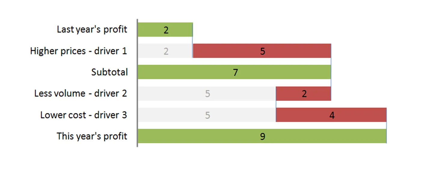
The “water fall” chart is an effective way to summarize the quantitative impact of a number of drivers. For example, you need to put the following story in a chart: “Our profits went up by 7, the positive effect of higher prices and lower cost was offset by a lower sales volume.” A waterfall chart would look something like this:

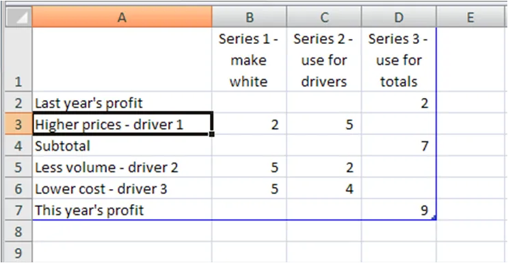
For illustration purposes I left the light grey color and data labels of the supporting series in so you can see how to make the chart: it is basically a stacked bar chart with 3 series:

  • A “white” series to support the drivers
  • One series for the drivers
  • One series for the (sub)totals

The data table for this chart (Powerpoint 2007):

For a final touch, make the color of the light grey series white, take out the data tables and that’s it. There is the temptation to make automated tools (in Excel) that do the work for you. Like almost all my charts, I start with a piece of paper and make my waterfalls manually, to make sure that they

  • Are correct (negative numbers can make these charts a bit tricky to get right sometimes)
  • The chart tells the story I want it to tell (what subtotals to use, in what order to list factors, etc.).

UPDATE 1: here are two other posts related to McKinsey waterfall charts:

Continue reading →
·McKinsey

Googling for free McKinsey PowerPoint templates

Doing a Google search for “McKinsey PowerPoint templates” highlights many entries that are almost all a violation of copy right. Moreoever, the templates are of little use to someone who is not working at McKinsey team on a client engagement. First of all: presentation starts with substance, then follow the frameworks (if any) A bit of historical context. I recognize the frameworks from my time at McKinsey, almost all of them are from the early 90s, when McKinsey was still working with an early pre-PowerPoint presentation tool called “Solo”. Solo was developed specifically for McKinsey, later marketed as an independent application. It vanished when PowerPoint emerged, not because PowerPoint at that time was neccesarily better, but all of McKinsey’s clients were running it and using it to edit presentations. (A slightly outdated looking site is still offering it for sale?). Your graphics assistant (nobody knew how to make charts themselves then), would dive into the template database to find “something that uses 4 arrows”. All these frameworks were meant to be used in densely written strategy/micro-economics documents, not in convincing on-screen presentations. If you would like to learn about McKinsey’s approach to graphics and presentations, try this:

  • The content available on the McKinsey Quarterly site (most of which look actually better than “day-to-day” work)
  • For the chart “Bible” that was used in the early 90s, flick through a copy of the book “Say it with charts” by Gene Zelazny. (I see he’s updated it since I last saw it).
  • The foundation of McKinsey’s approach to writing logical story lines (but not always the most compelling stories that are important in presentations) can be found in Barbera Minto’s book “The Pyramid Principle
  • UPDATE: I posted about a question I get often: how to make a McKinsey waterfall chart here.
Continue reading →