SlideMagic Blog

Frequent updates about all things presentations since 2008. Subscribe to never miss a post.

RSS
all posts

Search results for “web design”

·Cartoons

A "Google Chrome-style" comic novel about the pioneer behind the laptop

Steve Hamm is a writer for Business Week who is about to publish a new book: The Race for Perfect: Inside the Quest to Design the Ultimate Portable Computer

Joe Lambert produced a graphic/comic version of chapter 4 of the book, about the development of the laptop and the contributions of Alan Kay, one of the main visionaries of mobile computing. Alan worked on a number of very important innovations: the graphical user interface and the mouse, the portable PCs, and the PDA just to name a few.
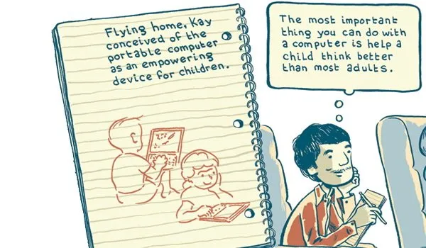
I think that the illustrations are beautiful, and the story is really interesting. However unlike the case of Google Chrome, I do not think that the comic format does a lot to add to delivering the message of this book. Neither Joseph Lambert nor Steve Hamm are to blame (on the contrary the art work and the story are great). The Google Chrome book confirms that comic graphics can do a great job of explaining complex technology. A historical time line simply leaves less room for creative expression. For more about Alan Kay and his ideas see this video at TED, the source of my inspiration for this blog post.

·Humor

Sometimes breaking PowerPoint rules can be a good thing

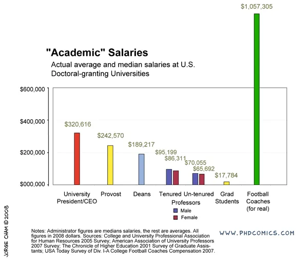
See this chart:

It breaks a number of rules. The most obvious one is the bar towering out of the chart frame. But hey, it helps make the point!

Original chart can be found on PHD Comics. I found it on Junk Charts

UPDATE: this chart does violate some other basic design rules that are better corrected, see an earlier post about cleaning up Excel/PowerPoint data charts.

·Advertising

PowerPoint lessons from consumer advertising

I stumbled across this ad for a Mini. It contains useful lessons for designing a PowerPoint template.

·Images

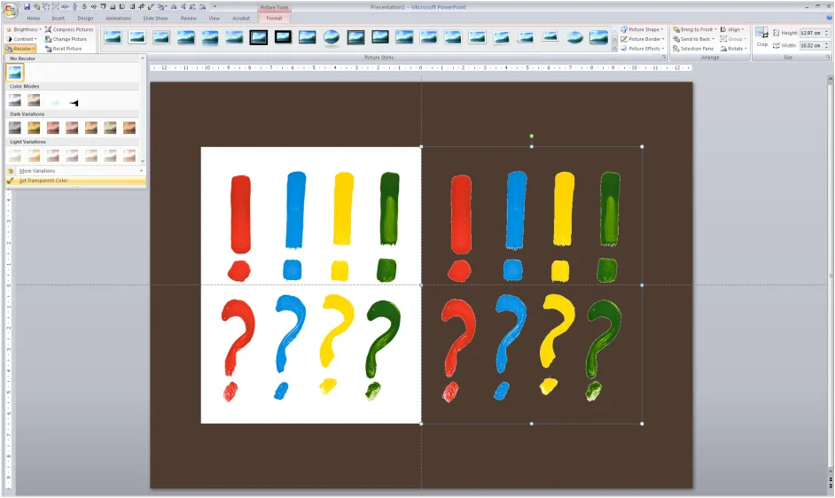
Stripping out the background color of an image in PowerPoint

Adobe Photoshop has professional tools to cut out objects from images. In many cases, setting a transparent color in PowerPoint will do.

In PowerPoint 2007:

  1. Select the image
  2. Go in the “Format” ribbon
  3. Click “Recolor” all the way to the left
  4. Choose “Set Transparent Color” at the bottom of the menu
  5. Click the color that you want to be transparent

The cut out is not perfect and it works best with images with a sharp color contrast. I mostly use it when working with a stock image from iStockPhoto that is an isolated object on a white background. Making the white background transparent gives me more design freedom in PowerPoint.

·Layout

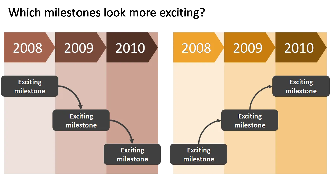
PowerPoint slides - the only way is up!

When designing a flow, always make sure that the direction of the eye is moving upwards to create a more positive feel of the slide. The horizontal orientation (left-right or right-left) is less important and depends in which part of the world you are living.

I use flow charts often when I help startups pitch to a venture capital firm for funding. One of the final slides in the deck talks about milestones and future plans. Without revealing too much detail (in a 25 minute presentation the actual/precise/detailed content of the milestones is strangely enough less relevant, they can be discussed later), the chart should show upward momentum.

·Investor presentation

Free Cisco network icon library for PowerPoint

When helping startups to pitch for VCs, I often need to include a slide with a technical architecture in a presentation. These diagrams are complex to make. Cisco makes life a little bit easier by putting its entire icon set as a free download online (link). They are ready to be copied directly into PowerPoint. The images are not that pretty, but they are functional. A smart move by Cisco, many potential clients will use these icons to design their network requirements before entering the vendor selection process P.S. Technical diagrams that use these type of icons often end up in a handout, or the appendix section of a presentation. I will post my thoughts about technical architectures that need to play a central role in a pitch presentation later.

·Layout

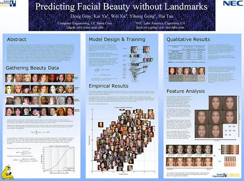
Pimp my poster - scientific conference billboards

I stumbled across this article in The Scientist today: life sciences scientist discussing posters that are used to present work in scientific conferences. It is worth a read, presentation design discussed from another angle. Also have a look in some of the links in the side bar with more related content. (Don’t click around too much as after trying to access too many pages the site requires subscription). Some points that are made (some more serious than others):

  • PowerPoint has killed the scientific conference poster, the program is not build for it, but people do not want to spend a lot of money on huge trial prints that in the end are not good
  • Color-coordinating the clothing of the presenter with those of the presenter (scientifically proven) improves communcation effectiveness
  • There is a bigger debate on the “death of the scientific paper” with ever increasing data sets and new presentation technologies available

(Image source on Flickr) The article does not provide a hot link to the Flickr group “Pimp my poster”, you can find it here. I randomly clicked through some posters, here is an interesting one as an example of the sort of presentations scientists are preparing.

I learned about a new set of communication challenges today.

·Cartoons

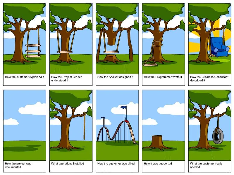
Classic mis-communication cartoon

I like using comic cartoons in my presentations. This one is a classic about mis-communication in a (software development?) project. It can work well in presentations during corporate retreats. With a little creative cutting and pasting you can make an attractive slide sequence.

The (small) text under each image (click the image for a larger picture):

  1. How the customer explained it
  2. How the project leader understood it
  3. How the analyst designed it
  4. How the programmer wrote it
  5. How the business consultant described it
  6. How the project was documented
  7. What operations installed
  8. How the customer was billed
  9. How it was supported
  10. What the customer really needed

The Project Cartoon site has more variations and larger downloads of the cartoon. It is still not clear to me who owns the original copyright on this image.

I posted before about “serious” cartoons in presentations here.

·Templates

Chart concept - hand-written notes

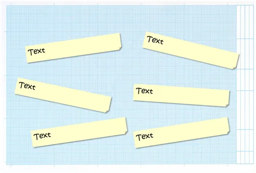
A hand writing style can often be useful in slides describing inputs for product design, or a time line with milestones / todo lists (the latter always runs the risk of looking particularly boring).

This slide was created using a stock image of mm-paper plus the standard PPT “sticky note” shape with a shading put in the back. The font is “Kristen” but it can be any informal looking one.

·Books

Book review - Presentation Zen by Garr Reynolds

I had a big shipment of books coming in recently, hence the stream in book reviews.

I finally had a chance to read Presentation Zenby Garr Reynolds. Garr is a leading authority on presentation design and delivery, advocating his minimalist (or “Zen”) approach to presentations. His blog is one of the most visited web sites on the subject.

That’s what 50% of this book is about, convincing the army of business managers writing thousands of PowerPoint presentations every day to drop their bullet point slides, take off big corporate logos from their slides and use more images supported by minimal text. It is an important message and I forgive Garr for repeating it many, amny times throughout his book.

The other 50% is focussed around taking the designer approach to presentations. I enjoyed reading backgrounds on Japanese and Zen culture and how they can be applied to good design. I did learn a few things about photo composition.

The book is nicely illustrated with example presentations, and many “before and after” slide transformations. There are a lot of references to iStockPhoto in the book. A great site (I use it a lot), but the suggestions could have been put in slightly more subtle

Having read slide:ology by Nancy Duarte just a few days a go, it is interesting to draw a parallel. Slide:ology contains more practical presentation advice: how to define color schemes, specific examples about slide build up. Presentation Zen adds more on the create design process, esthetics, and photo composition.

Continue reading →