SlideMagic Blog

Frequent updates about all things presentations since 2008. Subscribe to never miss a post.

RSS
all posts

Category Typography

·PowerPoint

New free fonts from Google

Google is going through a design metamorphosis and launching a lot of new products and features. Designers should take note of a new series of 180 free fonts. Many of the free fonts available are the kind you would use to spice the invitation for your children’s birthday party, and they usually are not presented on a web site that allows you to search and compare them.
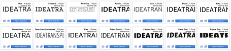
Not so with Google. Most of the fonts are for serious use and are viable replacements for Arial, Calibri and Times New Roman. Also, there are some good extra black ones for headlines and titles. The search interface is great, enabling you to select styles and test out words, sentences, and paragraphs.

You can check the new Google fonts out here.

·PowerPoint

1970s label font

The Impact label font by Tension Type can work great in a presentation design. It is open source, you can download it here at Dafont. It also comes in a white reverse version.

·PowerPoint

Font mix up that hurts the eye

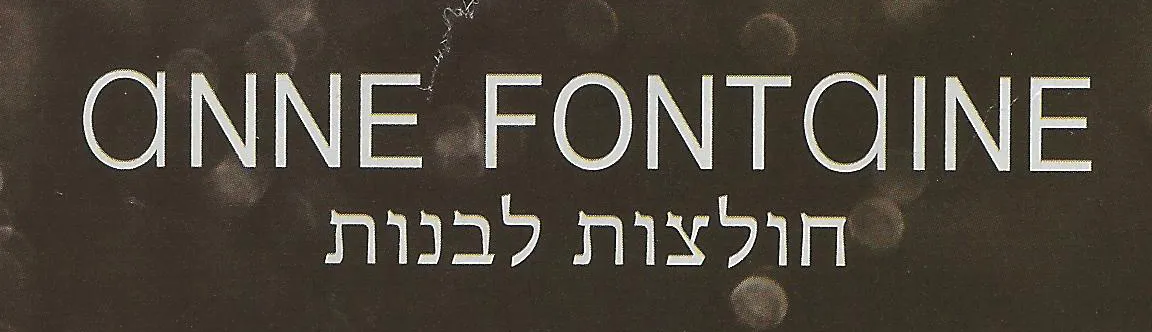
Finally I spotted a newspaper ad of the store that I often drive by in the morning. A mix up of typography that hurts the eye. Here in Israel, many people might not notice since they are used to seeing a different character set all together.

Update: this company actually operates stores all around the world, with the same logo…

·Books

Book review - The visual dictionary of typography

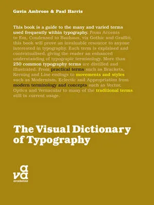
The Visual Dictionary of Typography (affiliate link) is a nice little book that explains 250 concepts in typography, each using a visual example. Dictionary is the wrong title, this is not a reference book, but rather something to browse through and explore. I stumbled on many terms that I have never heard of before. On the other hand, the book also contains some entries that are a bit forced: music for example.

Here are the entries for the letter V to give you an example of the contents:

  • Vector
  • Vernacular
  • Vertical alignment
  • Virgule

All in all a nice little book, I would get it in print rather than as an eBook.

·PowerPoint

Helvetica - the movie

I finally managed to get my hands on the movie Helvetica (affiliate link). It is a wonderful documentary about this famous type face, and how it has managed to infiltrate our daily lives on almost anything we see written in the street. Beautiful movie shots, nice music, and interviews with some well-known typographers.

Somewhere hidden inside the movie is an interview with typographer Erik Spiekermann where he gives his opinion about the typeface helvetica. He speaks very quickly but in a few seconds he makes a great number of points that I have started to notice as well: Helvetica works great with lots of white space around it and Helvetica needs careful attention with weights. (In fact I think one of the reasons that Arial looks so poor is that people usually only use the regular and bold variants. Helvetica comes in an endless range of weights.)

·PowerPoint

Reduce the leading of large font sizes

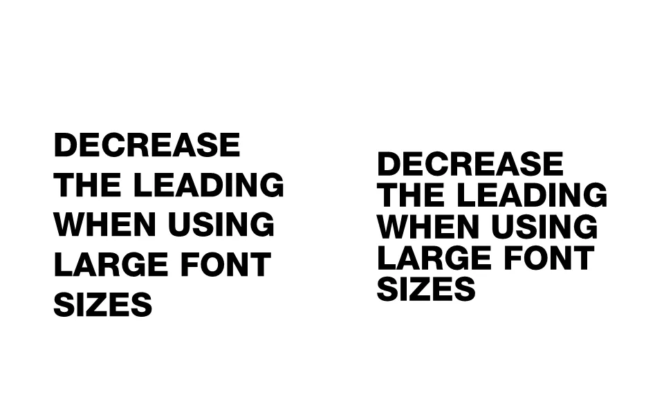
Leading is the horizontal spacing between lines of text. For regular font sizes, PowerPoint adjusts the leading fine. When you start getting to huge font sizes though, things tend to go wrong, the distance between lines of text is too large.

To reduce the leading in PowerPoint, select the text, right-click, select paragraph, set spacing inside the spacing group to exactly, and lower the number that pops up.

·PowerPoint

Narrow fonts: Beebas

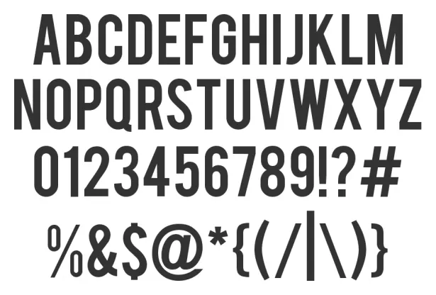
Some fonts are suitable for small text, some for large text, and some for headlines. Narrow fonts are especially useful for the latter. You can still fit in a lot of information, even for large type sizes. See the differences below. Beebas Neue is a free font that is very space efficient, you can download it here.

·PowerPoint

Compare all fonts installed on your computer

A nice link tip from Gee Ranasinha: the site Wordmark.it shows you a text in any font that you have installed on your computer.

·PowerPoint

Poster design: "If you have to explain it, it ain't workin' "

Currently I am in the process of reading book after book about graphics design and typography and it interesting to see see the similarities and differences between presentation slide design and poster design.

  • Similarity: both are meant to communicate a message instantly
  • Difference: designers think days/weeks about a single poster, slides are usually slapped together in 15 minutes.

This TED video of famous graphics designer Milton Glaser (you know the I heart NY campaign) popped up in my Twitter stream this week (Tweeted in 2011, recorded in 1998).

It sparks a few thoughts:

  • It always interesting to hear these very senior, experienced people speak in very abstract language: they can make a short point and their eyes show that they just shared an incredible insight with you.  The ultimate curse of knowledge: I need a few decades more of life experience to grasp it. A bit similar to me saying to my children: “really it does not matter how many toys you have, believe me”. Response: blank stare.
  • Milton summarizes the essence of designing a poster: “If you have to explain it, it ain’t working”. I guess here is where the distinction between art and design comes in, an artist might be happy with an ambiguous interpretation of her work, the poster (and presentation) designer’s job is it to get a specific message across.
  • It was very interesting for me to see/hear Milton describe the creative process he goes through when designing a poster. Maybe we should invest a similar amount of time into designing a slide for a presentation?
Continue reading →
·PowerPoint

Not just bold

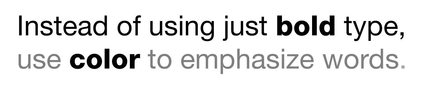
Putting body text in a slightly lighter color gives you opportunities to emphasize words beyond putting them in bold.