SlideMagic Blog

Frequent updates about all things presentations since 2008. Subscribe to never miss a post.

RSS
all posts

Category Typography

·PowerPoint

(Brief) venture into print design

I just completed my first print design. Not that I expect this to be my bread and butter, it was a natural extension of a presentation design project I did.

It struck me how simple and fast it is to design a brochure when you start with a good PowerPoint presentation. You have the right flow, you have the right visuals, you have the right visual language. When you start designing print from a blank sheet of paper, people argue and iterate forever to get the wording of the text right, to do the layout, and then, oh, we need a few illustrations as well.

Here are some of the things I had to do.

  1. Teach yourself InDesign. Luckily it was not necessary for this small project extension, I had to go through this process to write my ebook
  2. Print the PowerPoint as a press-quality Adobe PDF to get huge resolution images. If required, remove foot notes, page numbers and other clutter from slides.
  3. Select the right charts from the deck. Out go the ones that describe the story flow, out go the huge-images-one-word slides, what you are left with are the diagrams, the flow charts, the data charts
  4. When you place a chart crop out the titles, foot notes and other distractions
  5. Go through an iterative process of writing text columns, moving images, re-formatting text until you are happy with the result

So my advice to brochure designers: start with a slide deck…
·PowerPoint

Bullet point punctuation

Bullet points can happen to the best of us. If they are short and to the point, there is no need to end them with a period or full stop.

·PowerPoint

Arial Black in caps

Arial is not as pretty as Helvetica. Arial Black in lower case looks really horrible. However, Arial Black in all-caps looks actually pretty good and is installed standard on most computers in the world. It only fits presentations with very few words on a slide.

·PowerPoint

Back to the 50s

I am reading up on the history of graphics design and typography and it struck me that non-professional PowerPoint presentation designers today have a similar tool set available to them as the analogue graphic design masters from the 30s to the 60s. Classic fonts, simple shapes, primitive/manual image manipulation tools.

Have a look at this poster by Joseph Muller-Brockmann(I cannot paste it here because of rights): basic fonts, basic shapes. The power of the design is solely created by proportions and shapes.

I stocked up on some more books for design inspiration.

·Layout

If it is a text doc, treat it as text doc

Some PowerPoint documents are meant for reading, not for presenting. In many ways, PowerPoint is a more flexible tool to write text documents than a rigid word processor. It is easy to add graphs, shapes, text boxes.

If your document is a text document, treat it as such and do not try to turn it into an on-screen presentation. The resulting presentation will be something in between that is not good to present on screen, and not good to read on a monitor. It does definitely not look Zen, and the short bullet points in big fonts are too cryptic for someone to understand without explanation.

Instead have a look at what great document, brochure and newspaper designers do to make text readable. Smaller, lighter fonts for body text. Lots of white space around text blocks. Subtle use of colors. Subtle highlights of titles. Columns to avoid straining the eye across long lines.

Sometimes you can mix styles. A stunning image with a big headline that says that food shortage will be a major issue in 10 years from now. The next page is a restrained text page full of facts and information supporting your point.

There is nothing wrong with a text document in PowerPoint, as long as you admit that it is a text document.

·Layout

Text columns in PowerPoint

Sometimes, you need to fill a PowerPoint slide with text. These slides are obviously not meant to be presented on a big screen. Still, I make them now and then; a legal disclaimer on page 1 of an investor presentation, detailed bios of the management team in the back, or a page of text in a PowerPoint document that is meant for reading rather than supporting a live presentation.

It is difficult for the eye to follow very long lines of text, because when the eye has reached the far right end of the sentence it has to move all the way back and find the start of the line below it. This gets hard with long lines. Also, long lines of text look ugly. Print designers discovered all this centuries ago, and invented the text column.

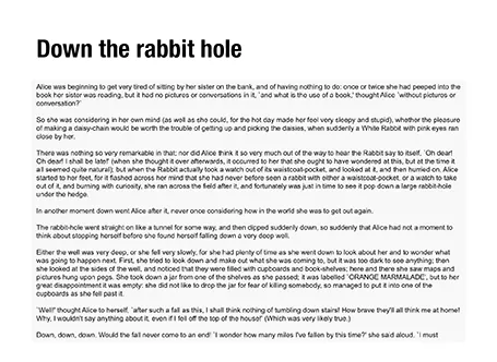
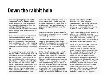
If you right click a text box in PowerPoint and select format text, you see that one of the options you can choose is columns (Mac). Play around with the number of columns and the white space in between them to get the desired effect. As an example, below are the opening paragraphs of Alice in Wonderland.

·Layout

Two ways to emphasize text

Method 1 - emphasize subject: you can apply all bold, italics and underline effects, increase the font size, and pick a nice bright red character color (make sure you use all effects at the same time)

Method 2 - de-emphasize background: cut out all the visual clutter and distractions so that the point you want to make just appears by itself.

Guess which one I prefer?

·Layout

One word per line

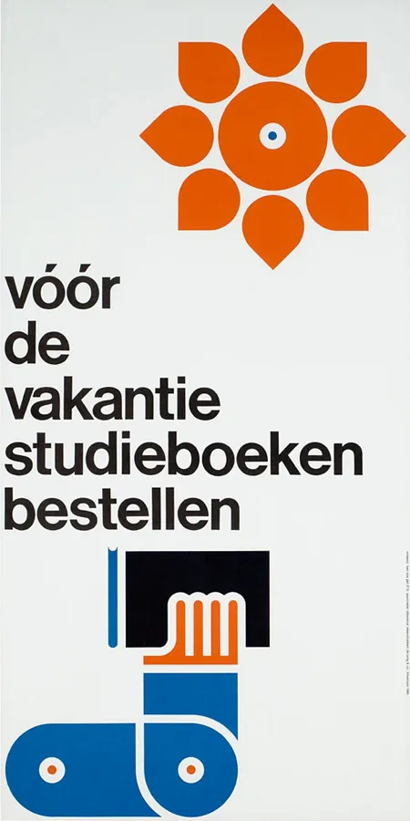
With an elegant font such as Helvetica Neue Medium, breaking a short sentence in one-word lines can create a beautiful effect. Here an example of a poster by Dutch designer Ben Bos

See how he reduced the space between the lines (looks better with bigger fonts), and did not use capitalization to create a more harmonious composition. I would have left a bit more white space under the text though.

For those who are interested, the poster reminds students to order their school books before the summer holiday. Via

AisleOne

.

·PowerPoint

Arial versus Helvetica (2)

Microsoft did not want to pay font license fees for Helvetica and designed its own Arial knock off. Arial definitely does not look as good as the original (earlier post here). Why? There are only minor differences in the characters.

I think the main reason is the availability of weights. In Helvetica, I like using the light and medium font weights. Arial installed on my machine comes in a blunt regular (somewhere in between light and medium), and has a bold that is too heavy.

What do you think?

·PowerPoint

Making quotes prettier

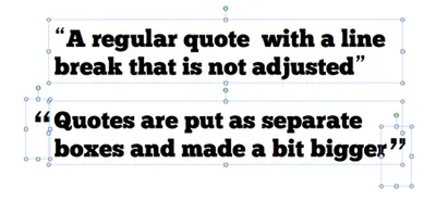
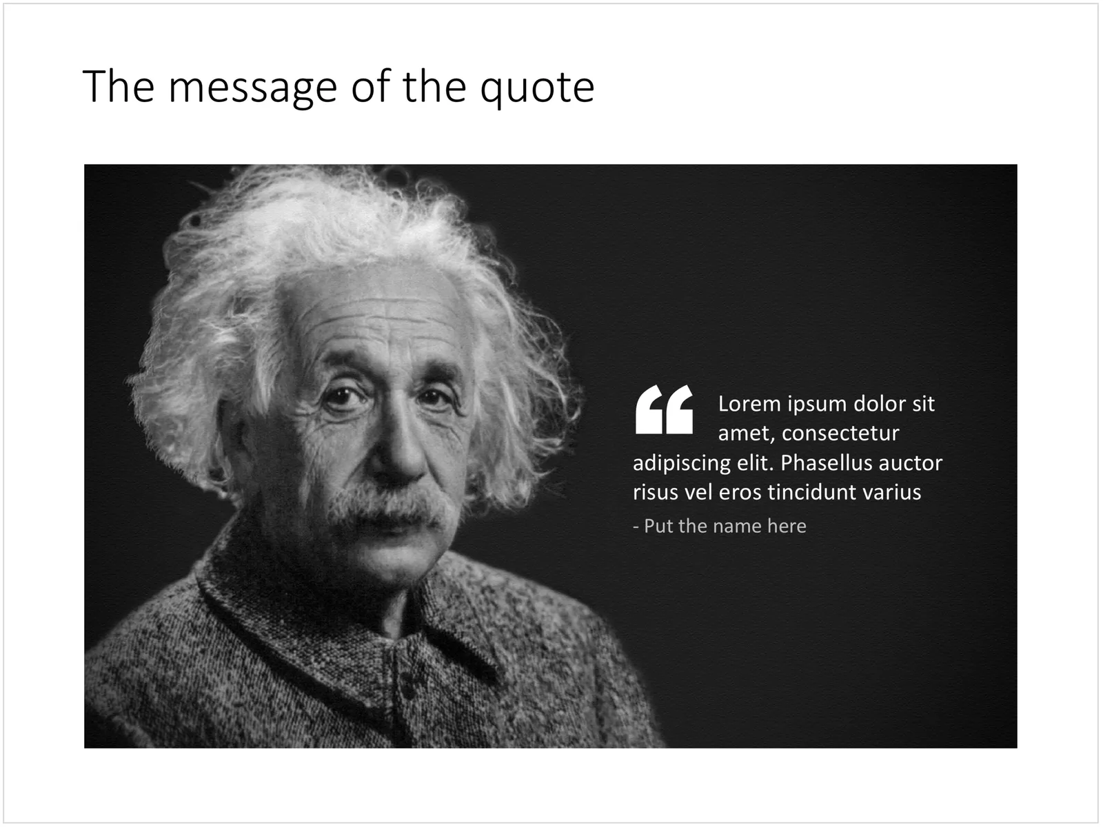
Slides with quotes can be powerful. The standard lay out of quotes is not very interesting. I make manual adjustments to increase the size of the quotes, and make sure the first quote has a small indent. See an example below.

Update January 2018: I have added quote slides in the SlideMagic template store, below is an example:

 A PowerPoint slide with a quote

A PowerPoint slide with a quote