SlideMagic Blog

Frequent updates about all things presentations since 2008. Subscribe to never miss a post.

RSS
all posts

Category Typography

·Keynote

Page numbers?

Big graphical elements that are repeating on every page obstruct your slide design. Examples are legal disclaimers, company logos, banners, and yes: page numbers. I am not a purist here, and will most of the time put a tiny page number in light grey at the top right of the page. Too small for a keynote audience to see, but big enough to guide a page switch in a phone conversation.

·Keynote

Pink URLs

PowerPoint does weird things with URLs and email addresses. When you type in either, it turns them automatically into a hotlink (sometimes useful), but applies a highly ugly formatting (a bright color with underlined text). A slide is not a web page where links compete for your attention, make sure to tone down the formatting or remove the hyperlink all together.

·Images

Crappy paste-as-image

If you use a custom font just on one page of your presentation, it is better to use the text as an image, so viewers of your presentation do not have to install that font on their computers in order to see it. Microsoft PowerPoint gives the option of paste special, past as image but - at least on a Mac - the resulting graphic looks horrible. I simple make a screen shot of the text and paste that in.

·Keynote

PowerPoint as a word processor

PowerPoint or Keynote are perfect alternatives to word processing applications to write documents that are primarily intended for reading and not for presenting on-stage. Corporate executives are so overloaded with information that the memo written in long-hand text is making way for a more visual way of presenting that is somewhere in between a dense text and a keynote presentation. If you write a book or a complex legal contract you probably rely on some of the more advanced word processing functionalities (style sheets, numbering, revision marking, etc.) For all other situations, PowerPoint or Keynote work fine.

The first and most important thing to do is to realize that you are writing a document for reading not presenting and adjust your style accordingly:

  • Reduce your font size to make space for more elaborate sentences. You will not be there to present the document, so the text should be self-explanatory. Big bold fonts work great for catchy headlines, for actual reading a smaller font size is more readable (a bit counter intuitive).
  • Don’t make your sentences to long. A book has only 7-10 words on a line, and newspapers use columns to keep lines short. The eye can get lost if it needs to make left-to-right movements over longer distances. Consider using a column layout of the page as well, either across the page, or one column at the side of the page and an illustration covering the rest.
  • Add tracker pages, page numbers, and other reminders of where the reader is in the document. I believe that in short stand up presentation these elements just add clutter, when we sit down to read, we need to bring them back in.
  • Maintain white space on the page, use wide page borders to create a calmer look. It is better to shrink the text and give it space to breath, rather than increase the font size until you covered the entire canvas.
  • Use very subtle techniques to highlight text. Too many bolds, italics, and underlines create clutter. Only use a few different font sizes.
  • Make sure that objects and text columns are properly aligned on each page.
  • Dark background are usually not very readable with smaller text, and are definitely a problem when your document has to be printed. Go for a light background instead.
Continue reading →
·Investor presentation

"Cute" investor pitches, watch out

The other day I could a project inquiry. The current deck looked like an infographic, it was very nicely done: soft pastel colors, retro fonts, nice icons. Still, the company had difficulty finding traction with investors: where is the meat, where are the numbers, this looks like an ad.

Many VCs come out of the world of engineering or banking which has a certain quantitative, macho communication style to it. Even if your product positioning is “cute”, your investor presentation should probably a bit more testosteron-loaded.

In my previous life as a management consultant, I have spent many years inside consumer goods companies. Believe me, their management presentations do not look like the ads they put on TV for their products.

I am not saying that you should kill the cute slide deck (the world would be a lot more boring if that happened on a large scale), I just wanted to emphasize that if you decide to go with this style to be aware of your audience and compensate in some other way.


·PowerPoint

Custom font U-turn

After a year of experimenting with custom fonts, I noticed that I am going back to Arial more and more in my presentation design, so my decks can be read on Windows, Mac, iPad, PDF, Dropbox, SlideShark, Keynote, PowerPoint on any device in any place. Well at least it forces me to make more effort to let my slides look good if I cannot rely on a pretty font…

·PowerPoint

Dirty typography

Watch out with the text effects in PowerPoint or Keynote. A drop shadow, stroke line, and worst of all: a glow and a gradient fill can reduce the contrast of your test and make your text look dirty, especially on low-resolution screens which are often old VGA projectors in conference rooms. I prefer to keep things clean and crisp.

·PowerPoint

Two industrial narrow (free) fonts

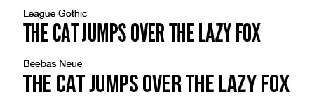
Beebas Neue and League Gothic are my favorite narrow fonts that can fit a lot of text in a headline, and give that industrial modern look to a slide. And best of all, they are open source.

·Art

Diagonal lines

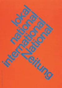
I do not understand why I have not used diagonal lines in presentation slides more, they work great together with simple shapes and colors. The Swiss graphic designers from the 50s and 60s were masters in this. The poster on the left is for the National Zeitung, designed by Karl Gerstner in 1960. On this page, you will find a few more posters that use diagonal lines combined with simple clean typography.

·PowerPoint

Ltd. NV. Inc. AG. SA. Gmbh.

OK, officially these company names include these legal classifications, but on slides they just create extra clutter. Take them out.