SlideMagic Blog

Frequent updates about all things presentations since 2008. Subscribe to never miss a post.

RSS
all posts

Category Typography

·Keynote

Some people do not mind

I had been discussing three versions of a presentation that uses custom fonts with a client, and every time I started the conversation with the question whether they installed the font. Three times, the answer was: “Not yet”.

I already feel uncomfortable when I see a small line break issue due to font compatibility on a slide. Other people can focus on the content of a slide, and consider fixing the fonts as a small todo at the end of a presentation.

·Keynote

OS X - Windows compatibility

Now that the installed base of Macs is growing, especially outside the large enterprises, you need to take into account that your PowerPoint presentation is likely to be opened on both machines.

There are obvious differences to be aware of. The key one is fonts: there is a large set of fonts that are available on both operating systems, but very obvious ones are not always part of the overlap (Helvetica for example is not available on a standard Windwos machine, and Calibri gets only installed on a Mac once the user buys Microsoft Office).

But here are the less obvious ones. Even if you stick to standard fonts, there are still tiny differences in how both operating systems insert line breaks. Watch out especially for tight text in boxes.

Also, there is an annoying difference in the way PowerPoint for Mac colors text and shapes. You pick the same colour for both, but they look different. A design can look perfect on a Windows machine, but off on a Mac.

There is no quick solution to all of this. Installing a second virtual machine on your computer might be a bit overkill. I guess there is no alternative but to ask a friend or the recipient of the presentation to send back a quick PDF file to double check, especially for important presentations that will be presented on screen (as opposed to a document meant for reading).


·Design

Leading

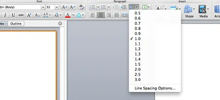
One of the typography elements I play with all the time is leading, the space between 2 lines of text. PowerPoint sets the leading standard to 1.0, or 100% of the typeface size. What leading looks good depends on:

  1. The typeface you use
  2. All caps, sentence caps or lower case
  3. And most importantly: the size of the font, bigger fonts need less leading

There is no general rule here, you need to fiddle and see what looks best. On a Mac, there is a button that controls the leading of your paragraph, see the screenshot below. It is one of the buttons I use most.

·Keynote

Custom fonts - redux

Custom fonts (fonts that are not installed as standard on most computers) give your presentation a nice distinctive look from the rest of the world that uses Calibri and Arial. It comes at a price: viewers who do not have your font installed on their machines get a poor experience.

For these practical reasons, I leaned towards sticking with standard fonts in business presentations. Things are changing though:

  • PDF is now my preferred format for sending presentations to people: it can easily be viewed on mobile devices and has a nicer, more permanent feel to it than an editable file. Once a PDF is created, fonts will display correctly on any device
  • There are more and more free fonts available that make it technically easy to download and install a font quickly, without having to count the number of seats that use the font in order to get in trouble with the license I paid for.

So, when do I consider using a custom font?

  1. Smaller organisations that are relatively tech-savvy. The big traditional Fortune 500 company is still locked into Calibri for the time being I am afraid.
  2. When I can use an open source font, not so much to save money, but to save the hassle of having to deal with license seat counts
·Keynote

What is that font?

I get this question a lot. My logo is set in Futura Condensed Extra Bold. Other major brands have followed me…

·Images

Cheating with headshots

Pages with headshots of people are always a pain to design: the names and titles of people can vary greatly in length.

I spotted this neat trick in a promotion email for this book. People with long titles have been moved to the bottom where a 2 line job title does not break the grid. Also, the right column looks a bit wider than the first 2 to me, again creating a bit more breathing space for long names and/or titles.

Now, hopefully your CEO has a short name (she always wants to go first).

·PowerPoint

Oops, doesn't fit

PowerPoint is not very good at creating line breaks in a shape. With lots of space left, it breaks your long word (&lquo;management” is a favourite) to the next line. Two things you can do:

  1. Right click the shape, hit format shape, select text box and un-tick the wrap-text-in-shape box. Now you can make your own line breaks
  2. For bigger fonts a 1.0 leading between lines is too much. Select the shape, click format, go to paragraph, and set the line spacing to multiple and put in the value 0.8 or 0.9 instead of 1.0.
·Keynote

Uniform logos

A page full of logos in different colours can look cluttered. Apple re-did their partner logos in white on black in their recent product presentation. I am not sure whether all the graphic designers that were behind the logos would agree to this, but it sure looks better. I would have taken the slide design one step further though, and organise the logos in a rigid grid.

·Data visualization

Infographic hieroglyphs

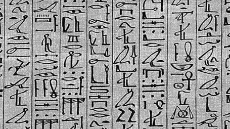
Sometimes I come across slides that simply try too hard. A stunning image with a hard to understand analogy, or an infographic-style rebus that looks like ancient Egyptian hieroglyphs. OK, it is a visualisation, but a puzzle does not make it easier for your audience to understand what you try to say. Even worse, an overly simplistic symbol might play down the seriousness of the business you are trying to pitch. Instead of creating a puzzle, why not simply write down what you want to say. Image via WikiPedia

·Keynote

Stick to your grid

The grid is the imaginary set of horizontal and vertical lines along which the objects on your slides are aligned. Breaking the grid is a key tool that designers use to add an interesting tension to a page layout. But in most cases, it is better just to stick to it. See the example below, your eye will immediately pick up that there is something wrong with the layout of these head shots.