SlideMagic Blog

Frequent updates about all things presentations since 2008. Subscribe to never miss a post.

RSS
all posts

Category Typography

·Investor presentation

Writing for skimmers

Busy investors do not have (want to make) time for long verbose cover letters/emails for your presentation. Write for a skimmer:

  1. Keep it really short
  2. Cut out all management buzzwords and padding (synergies, engagement, strategic, flexible, ROI, etc.) that everyone else is using and which have become verbal white noise. Use conversational, human language
  3. Say how you got to her (our dads were in high school together)
  4. Say what you want early on (advice, money, intro to someone), and ask for a very specific next step.
  5. Prioritise interesting content of the pitch (unusual facts, case example, unexpected advantage over a well-known competitor (2x as many users as Facebook, etc.) over a well structured, complete, business school essay. You are not trying to get a grade for your mid terms, you are trying to get a follow up phone call.
  6. Make it highly/relevant/specific to her: complements portfolio company x, y, z, matches what you spoke about at a conference last week.
  7. Use typography to break the text, to make it easier to speed read: big concept, 3 (short) supporting bullets, another concept, supporting bullets.

·Advertising

Building signage

I drove by a big office tower the other day that featured a new signage:

  • The biggest font size possible, covering the entire width of the building, no (white) space left what so ever.
  • As close as possible to the top, no white space here either
  • The characters’ rhythm and spacing seemed to clash with the repeating patterns of the window.

Typical corporate executive thinking: big and high. What should they have discussed with the architect and the signage supplier instead?

  • Give the logo space, more white (stone, concrete) space around the graphics creates a much stronger presence
  • Adjust the size of the logo based on the characteristics of the building: time the spacing of the characters in such a way that disturbing repeating window patterns are neutralised.
  • Avoid the logo being an after thought, instead explicitly reserve space for building signage when designing the exterior of the building
·Keynote

Writing in a box

Newspaper headline writers are masters in packing a lot of information in very few words, link bait bloggers write titles that people just have to click on.

In day-to-day business presentations, you might not have time, energy, budget to come up with an artistic visual master piece on every slide. The biggest difference to the quality of your slides might simply be your writing.

  1. Cut words that add no content: in order to, etc., avoid passive sentences (Harry was seated on by a bird), management cliche verbs (monetize/strategize/analyze/incentivize)
  2. Avoid long words (small/narrow boxes create uneven line breaks)
  3. Think carefully where you break a line, do it manually
  4. Work with labels, introduce a short catchy name for a more complex strategy, option early on in the presentation, so you do not have to repeat the enter-the-Indian-market-first sequence all the time.
  5. Stay within the constraints, if you have 2 lines, do not make it 3.
  6. Emphasise the contrast between a series of boxes and cut text that is common to all of them: entry in China, launch in India, Japanese entry: becomes China, India, Japan
  7. If you have to, write exceptions or other details in a tiny footnote
·Keynote

I cannot read the footnote!

It is in tiny font, it has a light grey font, nobody can read it!

Perfect.

If the legal department insists on using footnotes, then they should be designed in such a way that someone who stands with her nose against the screen can read them. If you want to read them, you can, if you do not want to, you do not have to.

·Design

License plate design

There is a parallel between the decline in license plate design as discussed in this article by William Morgan on Slate, and presentation slide design. Digital printing technology allows the addition of (background) graphics and unlimited use of colour. The result is a license plate that is unreadable and an ugly blob of graphical clutter on your car.

·Keynote

Scientific slide analysis

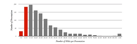
Here is a piece of research that extracts the font sizes, fonts used, lines per slides, slides per presentation of a 1,000 random presentations downloaded from the Internet. Lots or Times New Roman, lots of text, tiny fonts, endlessly long presentations. We knew it intuitively, but now there is the hard data to back it up. Research by Tim Theman.

·Keynote

Free quick logo design tool

I am a big fan of the web design tool Squarespace and am currently turning a restaurant web site template into the marketing site for my presentation app. Hidden inside Squarespace is a cute free quick logo design tool that uses icons from the noun project. If you are a startup on a tight budget, it could be a good source for your first graphical identity before you are ready to pay serious designers.

·Keynote

Icons in PowerPoint

With smaller screen sizes, icons are becoming an increasingly important element of user interface design. Not everyone of you is likely to be using PowerPoint to design a web app (hey I do), but icons can also be useful in regular presentation design.

I am not talking about floppy disks and other ancient icons we still use, but stylised symbols that can be an effective visual short cut to a category of (pick the appropriate) products, benefits, user problems, etc.

One option is to create your own icons in PowerPoint, set the zoom to 400% and create miniature shapes using shape booleans. Often you can use a quick Google Image search to find inspiration for your icon.

Stock photo sites sell endless amounts of icons, but there are compatibility issues when using them in PowerPoint or Keynote. Most icons are design as a vector graphic in Adobe Illustrator. It makes them infinitely scalable (like a PowerPoint shape), but PowerPoint does not read this file format. Copy-pasting Illustrator objects (if you have the software installed) is unpredictable and results in a shape that is hard to manipulate (changing colour for example).

Cropping icons out of a JPG or PNG file is not a solution either, if you forget to compress the small image file, you end up storing a huge image file with all your icons multiple times on a PowerPoint slide. Cropping also kills the vector-like scaling of icons, and background transparency.

A recent trend in web design might provide a solution: custom icon fonts. Modern successors of Zapf Dingbats (what?) provide clean icons that are scalable and can be manipulated (colours, shadows, and - do not use this - reflections).

Continue reading →
·Colors

PPT 2011 for Mac color bug

Microsoft PowerPoint 2011 for Mac has an annoying bug: when you apply a colour to a font, it comes out slightly differently than when you apply the exact same colour to a shape. One: it looks bad on slides, two: it gives surprises when you open a PowerPoint file created on a Mac on a Windows machine (which does not have the same issue).

When I posted about this somewhere on a Microsoft forum I got the response that this was done on purpose; to make text readable against a coloured background. This does not make sense, if I want to make the text readable, I will put in a different colour myself, and definitely not the one that Microsoft is using. See below, the letter colour is a completely different type of blue than the background.

(Geek alert). There is a complicated way to get around it. Type some text, change it to the desired colour. Now select the desired text (not the entire sentence) and bold it: the right colour appears… But, as soon as you do anything else to your text box, the wrong colour gets put in. Annoying…

·Investor presentation

The year in Kickstarter

Kickstarter has posted its 2013 overview here. What I like about it: done in HTML, adjusts for different screen widths, beautiful typography, and very nice use of video.

However, the opening slides with the stats are actually not that powerful. Rounding up numbers, using a simple data chart here and there, and maybe use maps would have driven the points home much stronger.

Still, it would be good if more people try to find a different format to publish their annual report.