SlideMagic Blog

Frequent updates about all things presentations since 2008. Subscribe to never miss a post.

RSS
all posts

Category Templates

·Templates

Examples of slides in the SlideMagic slide bank

I am adding new slides almost every day. Here is slide show of some of the designs that are inside already. Let me know which sort of new additions you would like to see. At the moment I am focussing on 2 types of slides:

  1. Super basic slides that every presentation needs, which are properly designed, and save you time when working on a tight deadline. Boxes are aligned, spaced out, it just works
  2. Tricky slide compositions that not everyone can do: more complex data visualisations, diagrams with complex shapes, 3D effects, or slides that feature an appropriate background image
·Layout

How to present the competition

The best slide to talk about competition of your product or company depends on your specific market.

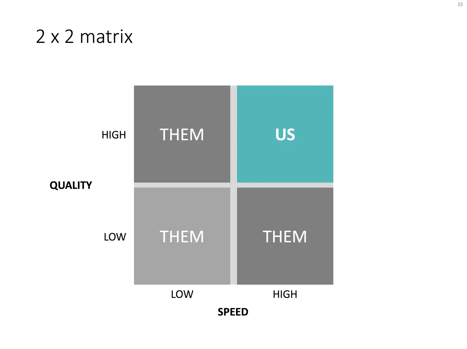
Most people first try to squeeze all competitors on to some sort of 2x2 matrix. This is a great option if there are 2 distinct axes, or 4 market segments.
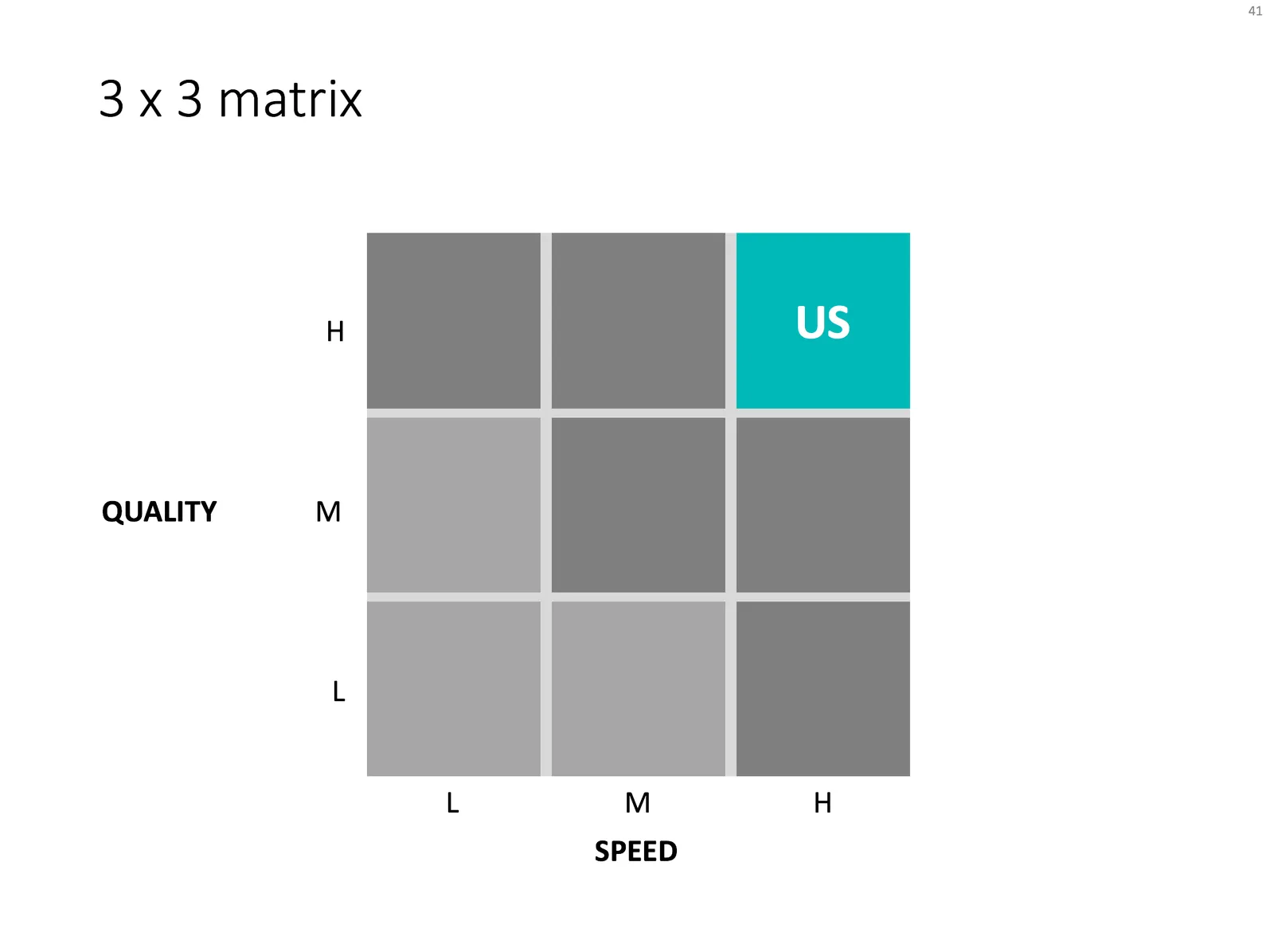
You can add nuance by using a 3x3, creating 9 market segments. I prefer to put the competitors locked to the grid, and don’t get into debates about where they exactly sit on the spectrum.
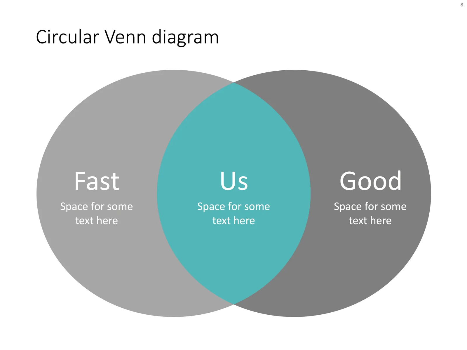
But, if you have a hard time finding the definition of these 2 axes, the matrix is probably the wrong format to use. In many cases, the bottom left quadrant stays empty, and/or is meaningless. In these cases, try using a Venn diagram, which is basically a 2x2 matrix with that bottom left box chopped of.
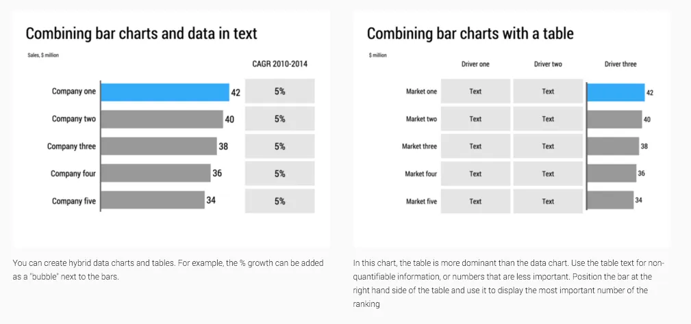
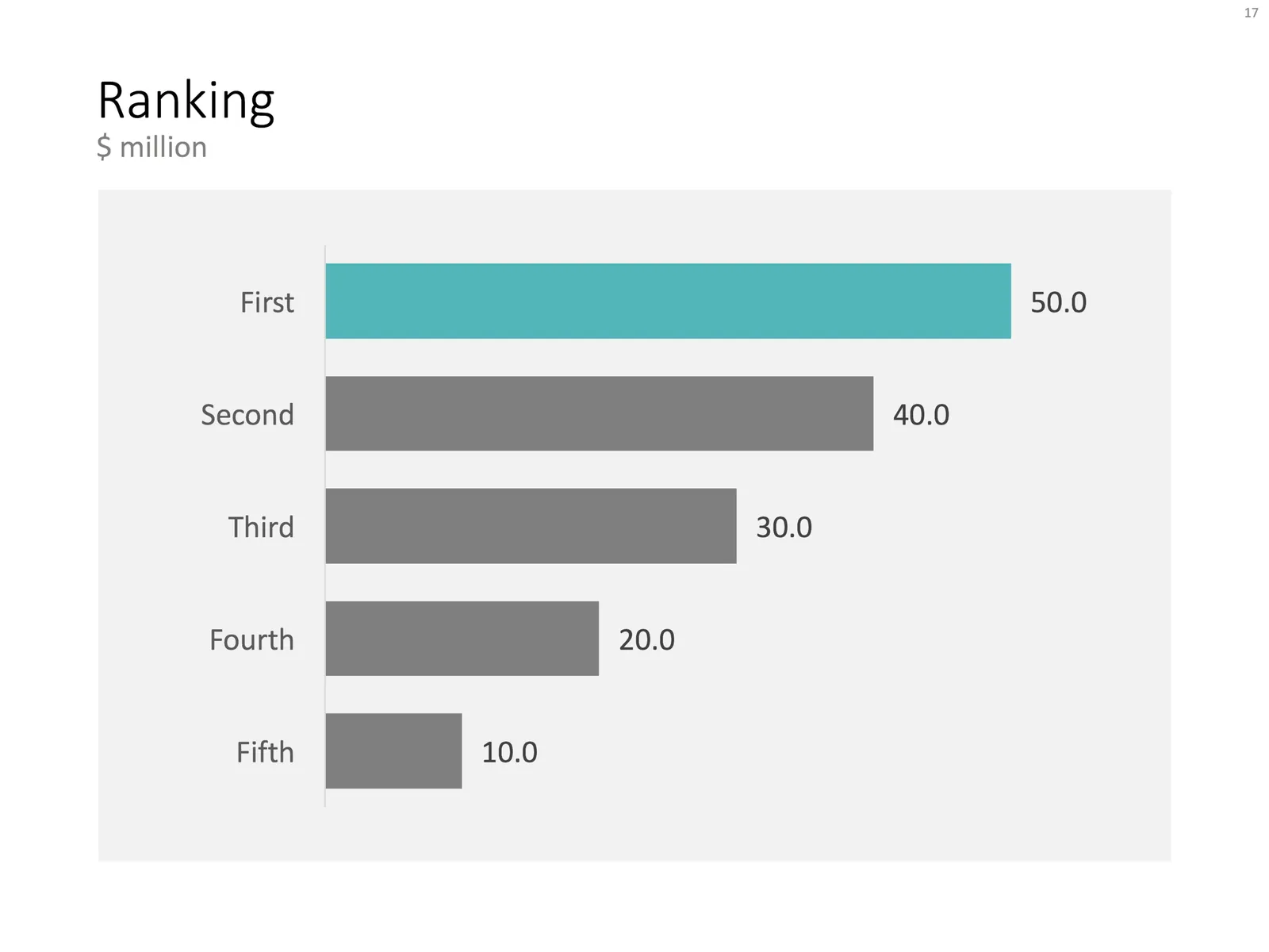
In other cases, a simple bar chart my be sufficient. Rank you versus the competitors with one simple variable.
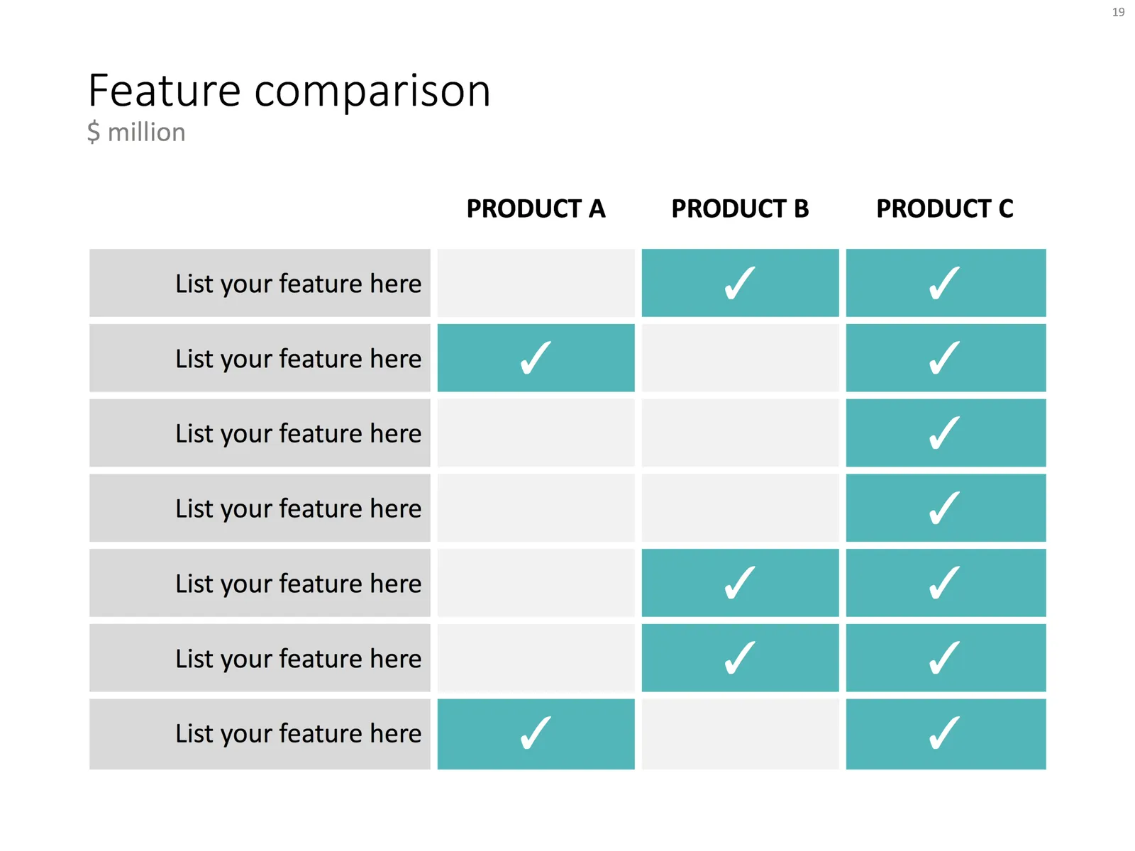
In most situations, I have to use some sort of feature table that can handle more than 2 dimensions on which to compare the competitors. Choose the comparison criteria wisely, avoid duplication, and give them the same level of abstraction/detail. Re-order columns and rows until you get homogenous blocks if “yes” and “no” cells.
Feel free to be inspired by the example layouts in this post. You can also click on the images, which brings you to the template store where I did the work for you. I frequently update the template store and try to tag slides with relevant keywords. A search for “competition” should bring up all the charts that I think are useful for visualising a competitive differentiation.


Continue reading →
·Images

App demo slides

Doing a live app demo in a 20 minute pitch meeting is risky, the technology might go wrong, and probably more than half the time you spent in a 2 minute app demo could be things that are not really interesting: logging in etc.

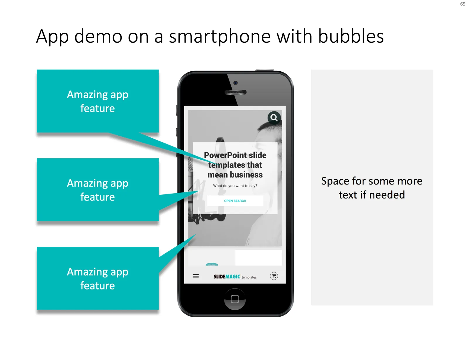
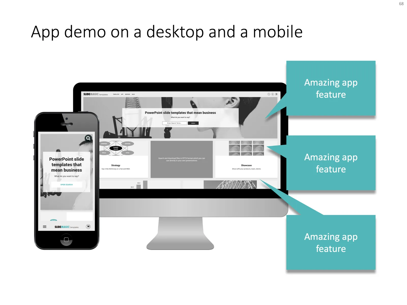
Instead, I usually prepare a series of screen shots with big explanation bubbles in my presentations. No technology risk, no loggin in, setups, and I can set the exact flow I want. The added benefit is that I can zoom into parts of the screen that are hard to do when showcasing the app live in an actual device.

Most of the time, I use page filling images to demo an app, to get as much screen real estate as possible. If I want to introduce the app in a general way, I use a background of a mobile phone or desktop to give the slide a more interesting context. As a result, the the screen itself will hardly be readable by the audience, and becomes a background image.

I added a few examples of app demo slide layouts to my template store.

·Data visualization

Slide make-over: polarising brands

I am across this chart recently:

This chart can be improved in a number of ways:

  • Actually, take down the brand images, or make the smaller. The different colours and sizes make the chart cluttered
  • It is hard to read what the percentages actually mean
  • The biggest problem is the confusing line up of the data bars
  • The data could be sorted, to create additional structure for the viewer

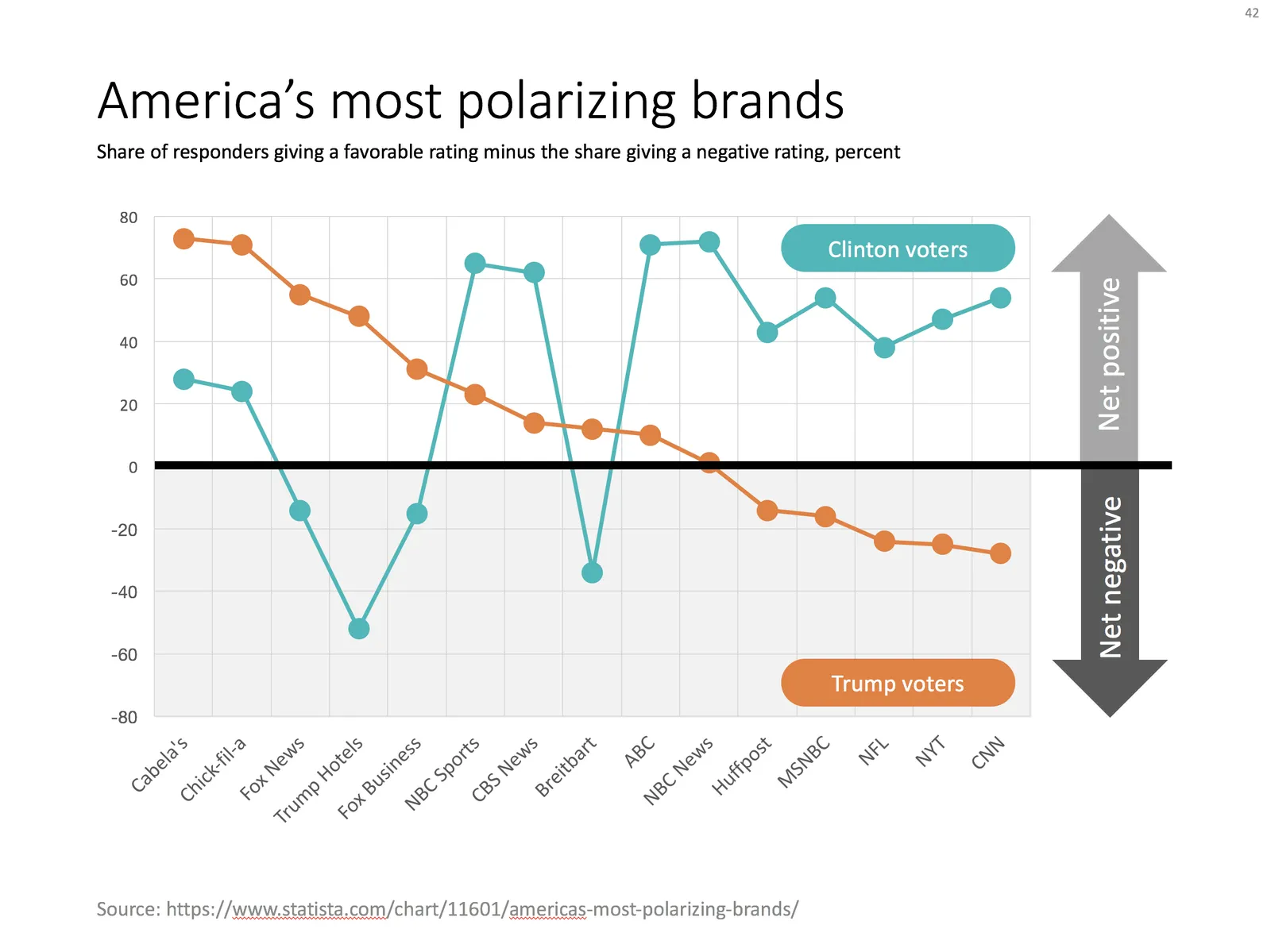
I replaced the chart with the one below in PowerPoint, using a line graph with big markers instead of the bars.

Ideally, I would have like to flip the chart 90 degrees, but this would require quite a lot of PowerPoint surgery (you can probably do it with a scatter chart somehow). The other option is to construct a highly complicated “waterfall” chart.

·PowerPoint

My own clean PowerPoint template

PowerPoint templates get corrupted over time. It usually starts with a template that was designed by a print graphics designer as an after thought after designing the logo and the business cards: creating slide layouts without paying much attention to the technical issues of programming a template that can be (ab)used by thousands of employees. Then over, slowly but gradually, “foreign” templates infect the original until nothing is left of the original.

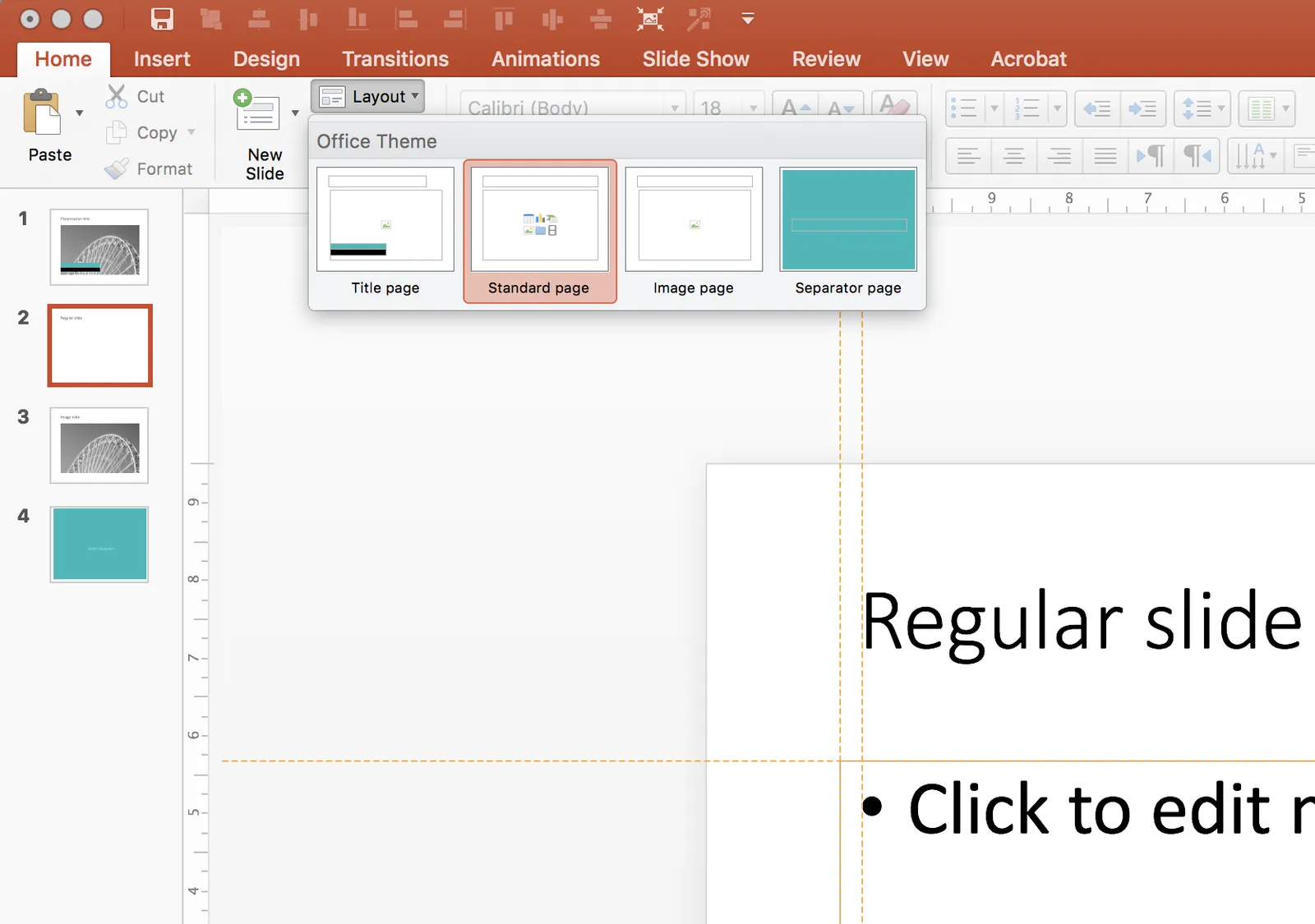
I go back to zero every time I design a new presentation. The file that I put up in the SlideMagic template store is pretty much the one I start every new presentation design project with. It is really simple. You can customise it with your own colours and you are good to go.

When creating a new slide, go to the “Layout” button in the top left of the menu to create a select a new slide layout.

·Templates

Focal point chart

A while ago, I discussed how to create a “focal point” slide, where a series of triangles can create the illusion of text boxes all disappearing in one big point. You can read the instructions how to create it in this blog post, but now you can also find them in the template store.

I am spending part of my daily time that I used to invest in blog posts, and increasing the library of my template store, I have an infinite amount of template ideas in my head, so there is still a lot of work for me cut out. Ultimately, the value of this store will be some sort of subscription, as a sign of support for me, in return for which you get unlimited access to all the designs. The combination of a powerful search engine and the largest library of useful charts on the net, I think the proposition of 1 second downloads will beat the alternative of manually copying my designs. Let’s see how it goes.

·Templates

Soft launch of the SlideMagic template store

Many users of the SlideMagic presentation app ask for the slides that the app generates in PowerPoint format. In response, I have built a SlideMagic presentation slide template store. The basic store infrastructure is finished, but the amount of slides available is still small.

It was quite interesting to see how in 2017 it is possible for a designer to pull of a full-fledged digital content eCommerce store with downloads and payment processing in a matter of days. (OK, my computer science engineering degree came in handy a few times when I had to go deep into HTML to customise the store template in a few places). A few years ago I was toying with the same idea, but the required investment in technology would have been a lot higher.

The main shortcoming of PowerPoint templates vs my presentation design app also applies to my own template store: templates are hard to customise. Adding a row of boxes to an existing design and getting everything to line up properly requires a bit of design skill. It is a trade off you have to make. The app is free to use, and makes these adjustments really easy. Where possible I will add slide variants to accommodate the layman designer where possible.

There are thousands of presentation template stores on the Internet and I tried to make mine different. All stores try to hard: designs are too sophisticated, full supporting graphical clutter that makes slides hard to customise and hard to fit in to corporate templates. My slides are incredibly simple and should blend in nicely when pasted into another corporate colour scheme.

Continue reading →
·Templates

Templates for others to fill in

Some projects involve getting a lot of similar presentations from different business units or people. Examples: the annual investor day, or the annual budgeting round. At the start of the project, the same question comes up? What presentation template to send everyone in order to ensure that things look consistent.

My take:

The most important thing to get right is the programming of the template, not the slide layouts: fonts, colors, default shapes, everything should be hardwired in correctly.

It is very hard to prepare a complete presentation in the absence of specific facts, or a specific story. No business unit is exactly the same. And if they were the same, these uniform presentations combined would make a visually boring story!

One thing you can do is separate data collection from the the summary presentation. Be strict on format for collecting data (boring tables that are well designed), but give freedom for telling the story.

You could do things in 2 steps: send out the broadcast master template, let people work with it a bit, then schedule follow-up calls to make adjustments.

Or: you can have one business unit push a presentation completely to the end, come up with a finished product, and use that as a visual example for the other units. To see slides filled with data is much clearer than empty theoretical layouts.

·Advertising

What the template says about you

These food packaging make overs illustrate what is wrong with many of today’s presentation templates: they make you look like you are “that kind of company”. But remember, the hipster customer segment is likely to be a lot smaller than the mass market. Think about your audience, and whom you want to look like.

·Templates

A new way to organise my presentation templates

I am experimenting with a new way to organise SlideMagic presentation templates and started adding them to www.slidemagic.com/templates. I will be adding more over the coming days. Please let me know if you have request for specific slide concepts I should add and I will see whether I can help you.