SlideMagic Blog

Frequent updates about all things presentations since 2008. Subscribe to never miss a post.

RSS
all posts

Category Templates

·Concepts

Concentric circles in PowerPoint

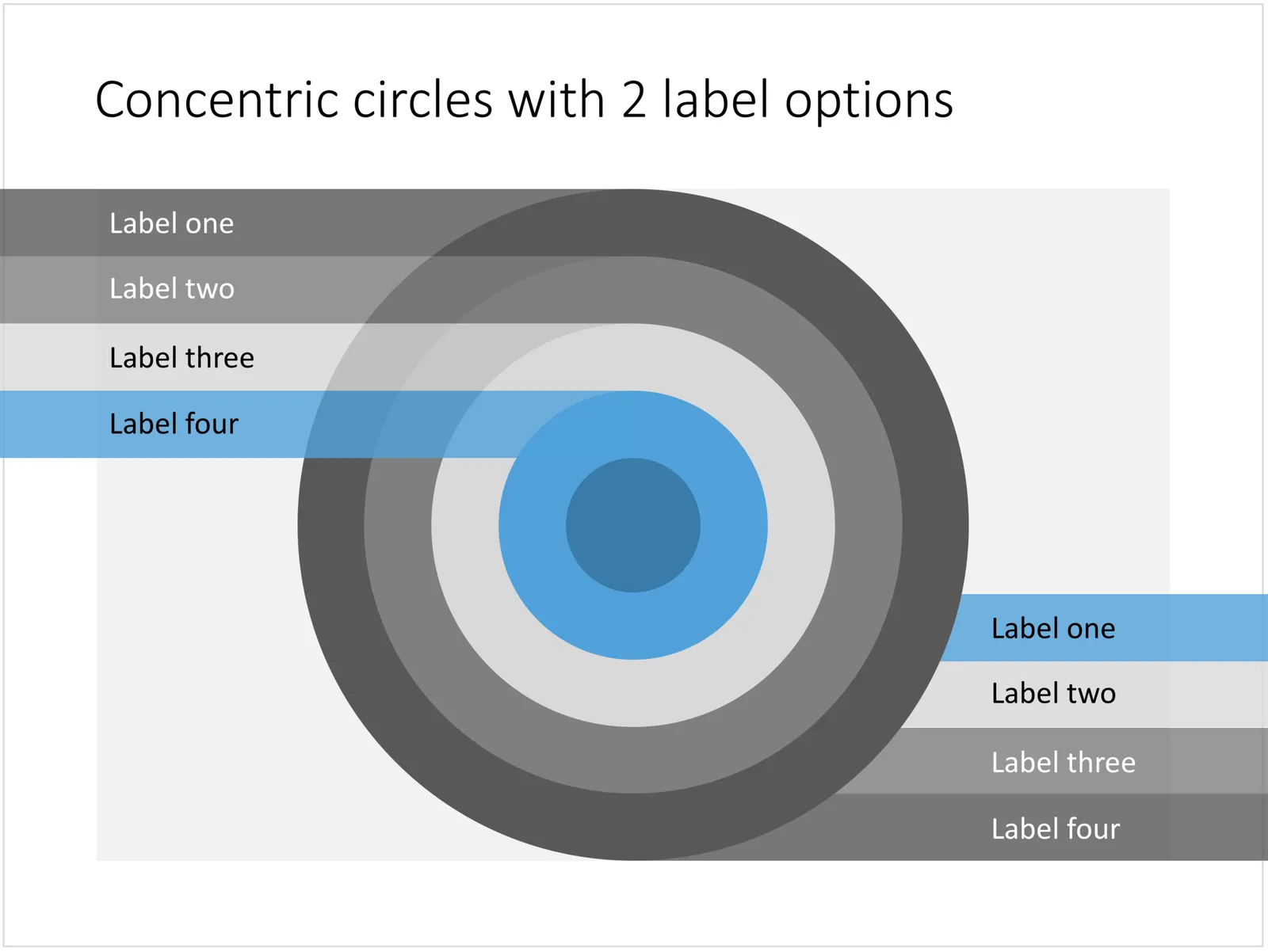
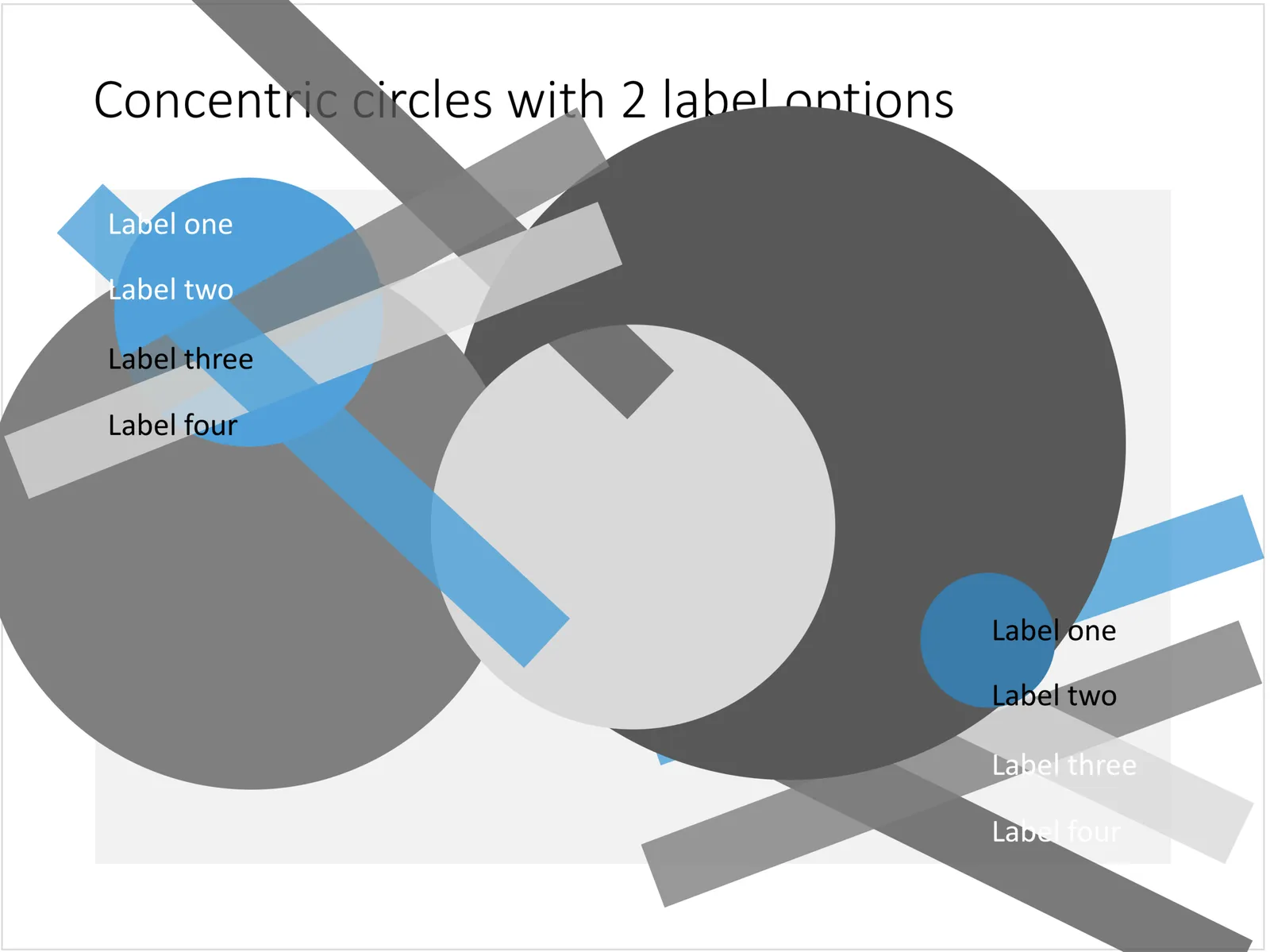
You can create very beautiful compositions by just using basic shapes and a few colours. Below is a presentation slide with concentric circles, and an image that shows how it is constructed. Feel free to borrow the design approach, or you can download the finished slide here.

This technique was often used by the Swiss graphics designers in the 1960s. You can use the slide concept below in a number of ways: show some sort of layering, show multiple layers of security or protection, show a whirl or rolling dynamic. You can take the labels of and just use the circles.

 Concentric circles in PowerPoint

Concentric circles in PowerPoint

 How to make concentric circles in PowerPoint

How to make concentric circles in PowerPoint

·Concepts

Blue ocean strategy in a presentation

Most investor or sales presentation have some sort of slide about the competitive environment. (Here are earlier blog posts about how to present the competition). Usually, people use tables, or 2x2 / 3x3 matrices to show how they are different.

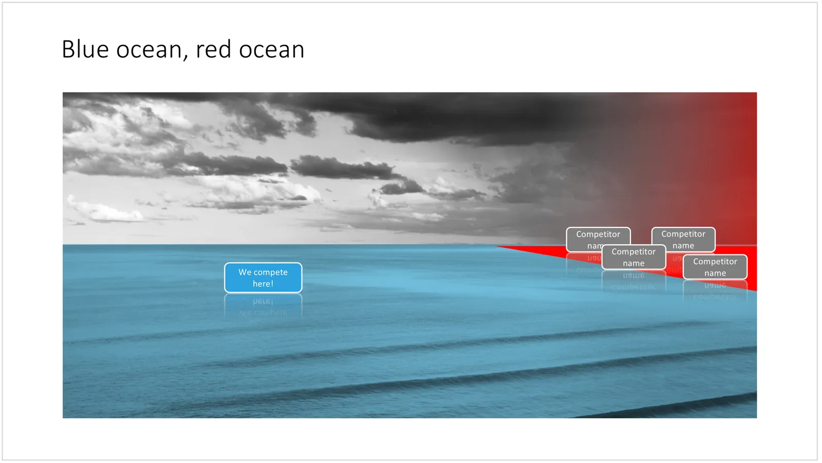
The chart below might a completely different take on the subject. The Blue Ocean strategy concept developed by INSEAD argues that is often better to define an entirely new market rather than battling with all the existing companies that go after well-established market segments. You can download the slide here.

 Visualise the competition using

Visualise the competition using “Blue Ocean Strategy” in a presentation

Cover image by Ishan @seefromthesky on Unsplash

·Concepts

Presentation layout for when you are stuck...

Sometimes the simplest slides can be the most effective ones. This slide layout shows a big arrow crashing into a wall to visualise your obstacle or roadblock. The wall image is framed, while the arrow is bleeding of the page, adding an extra movement effect.Edit to text in the arrow and/or on the wall to show your audience what it stuck. The text in the arrow will automatically tilt in the right 3D angle, and both the wall and arrow will colour in your primary accent colour. Please copy this slide into a presentation that uses your own corporate presentation colour theme.

I am gaining a lot of experience now in translating PowerPoint designs into Keynote. This chart is only available in PowerPoint and not in Keynote, because the latter cannot tilt objects in a 3D space. The same problem arises with charts that rely heavily on bevels or other 3D lighting effects, which is not obvious to do in Keynote.

Here you can find this wall layout in the SlideMagic store. Cover image by Chris Benson on Unsplash

·Concepts

Most templates now available for Apple Keynote

The template store now supports Apple Keynote, a drop down menu let’s you make a selection between your preferred presentation software. Not all templates could be converted, Keynote is missing the 3D shape rotation feature of PowerPoint that I used in some of the slides.
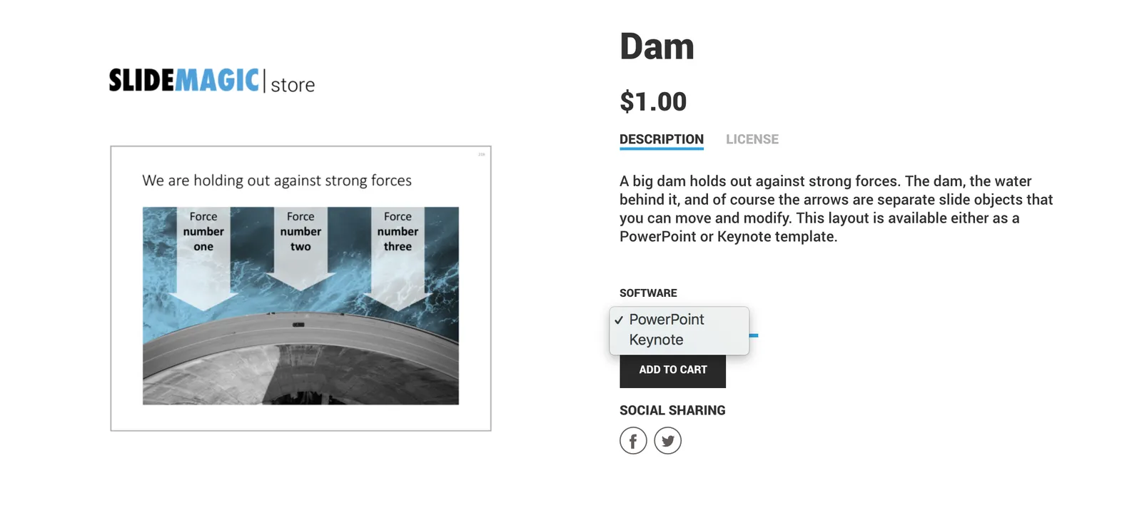
 The store now gives you the option to download templates either as a PowerPoint or Keynote file
The store now gives you the option to download templates either as a PowerPoint or Keynote file

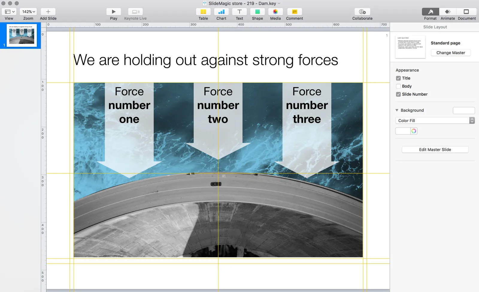
 Slides in Keynote look the same except for the font

Slides in Keynote look the same except for the font

The only adjustment I made was the font: switching it from PowerPoint’s default Calibri to Helvetica Neue for  Keynote. I am keen to keep the look and feel of the charts as “standard” as possible to make it easy to integrate the design in the corporate presentation templates that people are using.
 Under pressure!

Under pressure!

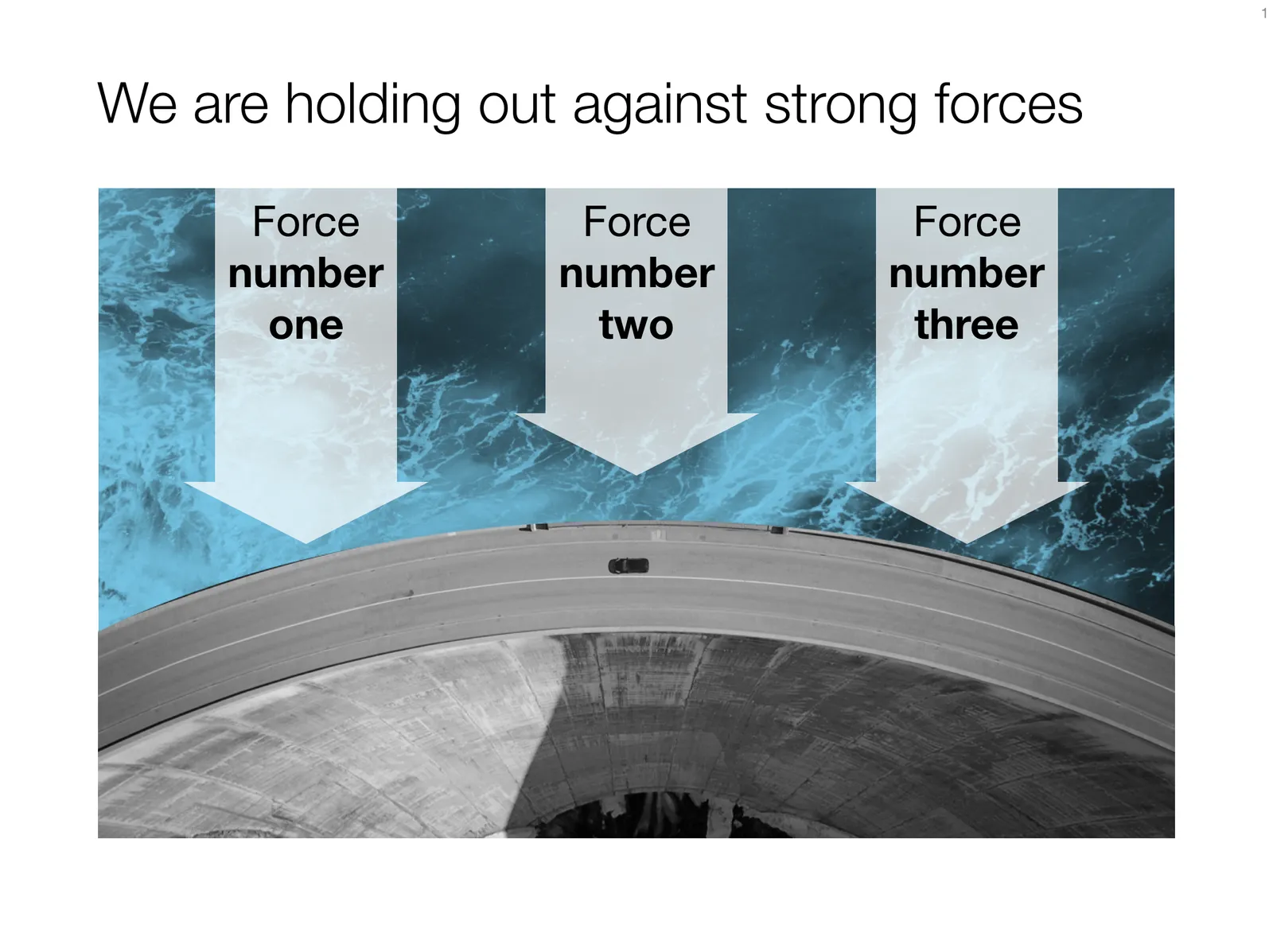
The slide above is a layering of 2 images that visualizes a big dam that is under pressure from something. You can use it either to show that something is about to burst, or the opposite, that defenses are strong and holding out well. I love the massive architectural scale of these hydro power installations, especially when you can highlight it with this tiny car driving across it. You can download this dam template here.

Looking for other visual concepts that are similar? You can try and search the store for “forces”, “down”, or this search “downward” and see what slides come up. That is my longer-term vision: no more boring bullet point charts, and no more searching for “where is that slide that I made 2 years ago”, but rather have all the relevant designs ready at your finger tips. The search engine with design ideas is almost as important as the actual design itself.


Continue reading →
·Concepts

Layering PowerPoint shapes

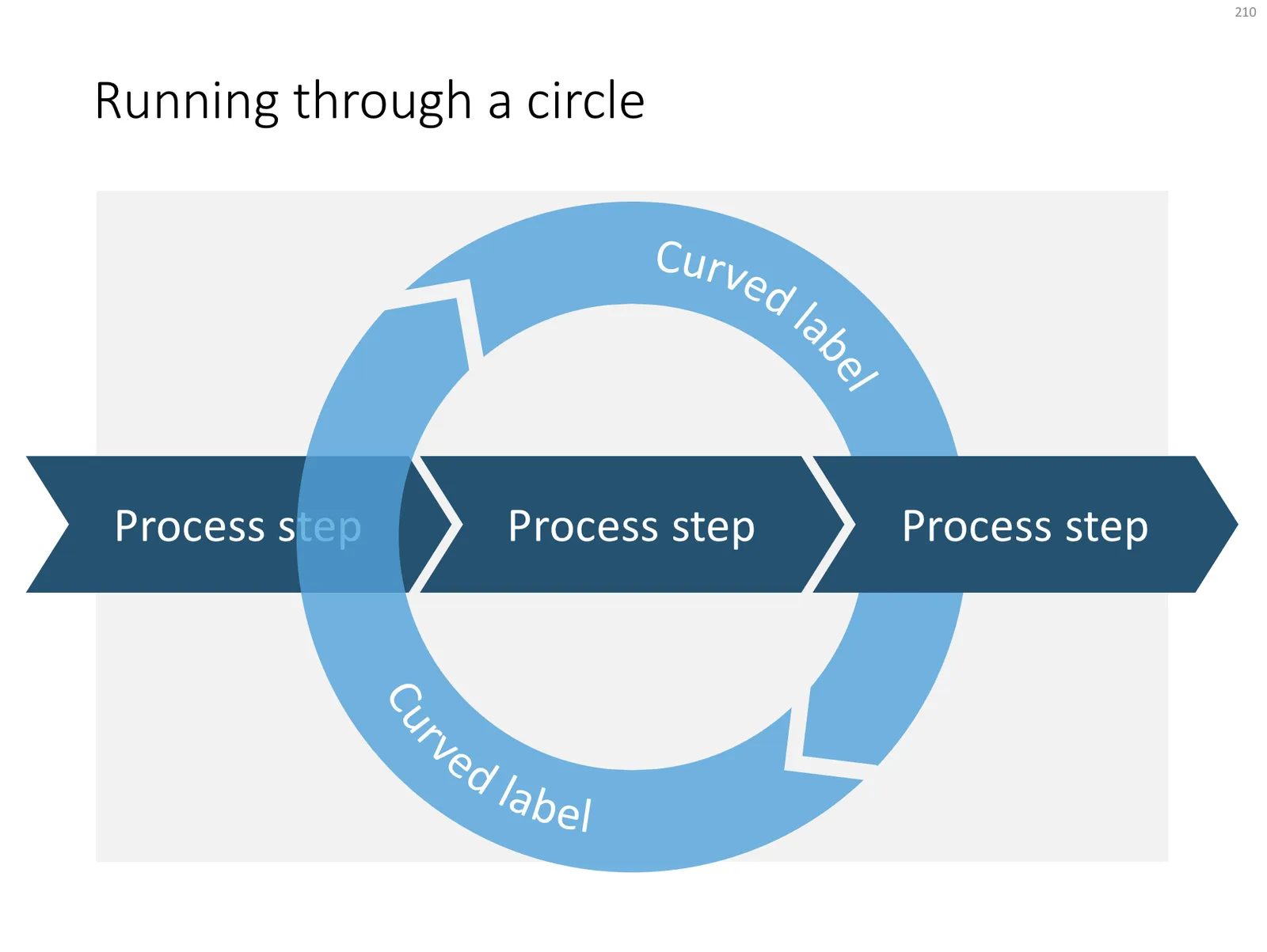
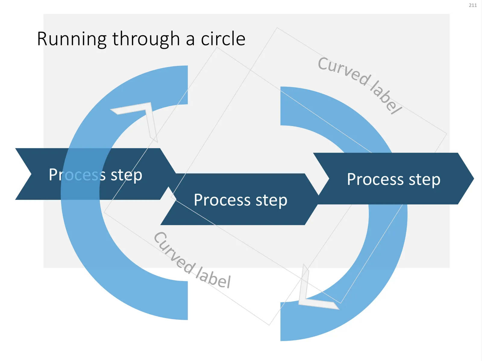
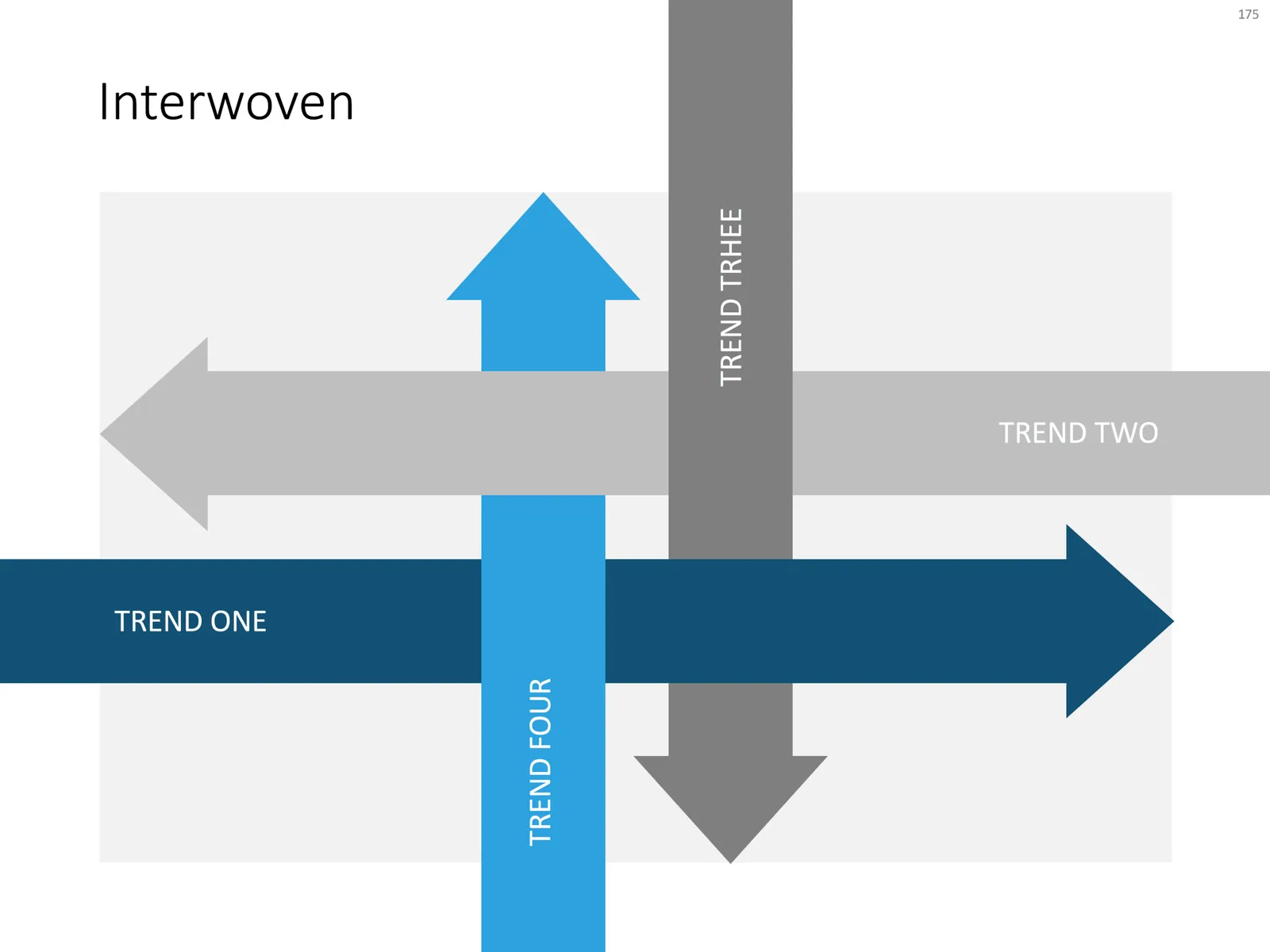
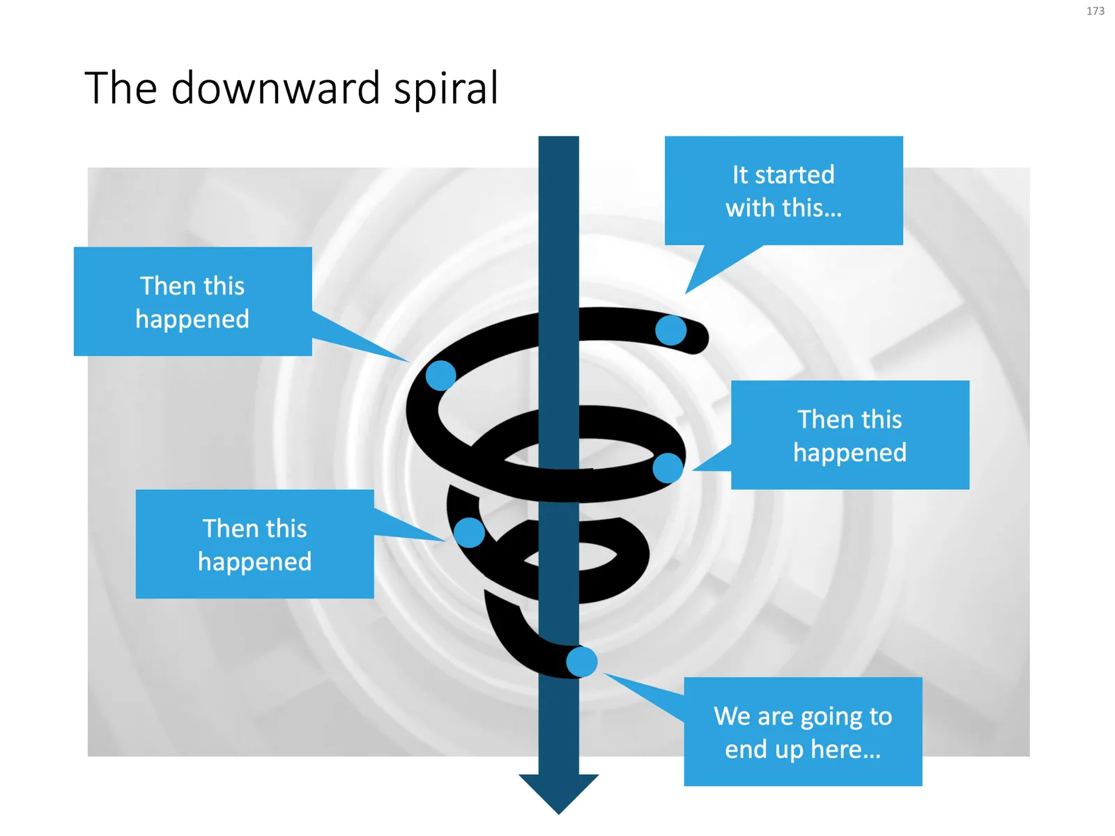
Here are some examples of PowerPoint slides that cleverly use layering to create a “woven fabric” effect. Why clever? Take the circle for example with the arrow flying through. Part of the circle needs to below the arrow, part on top. The solution? Cut the circle in half… The interwoven arrows have small square blocks in the right colours pasted in the relevant junctions, and the spiral was a bit tricky, placing small black cut outs on the junction with the blue arrow.

Click the image if you want to download the relevant slide. Alternatively, search the template store for keywords like “arrow”, “downward”, “circle”, “process” etc. to get to charts like these.

 A regular process, with a circular process around it

A regular process, with a circular process around it

“The making of”

 Layered PowerPoint arrows give a fabric or knot type slide layout

Layered PowerPoint arrows give a fabric or knot type slide layout

 A downward spiral in PowerPoint

A downward spiral in PowerPoint

Photo by Christian Perner on Unsplash

·Templates

100+ new PowerPoint layouts

I am adding designs to the template store at a healthy pace now, so it is not possible to feature every new design as a blog post. Head over to the store and check them out, this link will bring you to the latest additions. This view is chronological, and does not represent the breadth and variety of templates that are available. I encourage you to use the search box and see what comes up, it works really well now.

My objective is to get to such a variety in the store that I can move to a subscription revenue model: you can find a starter slide for every business concept you possibly would want to present. I need to find the “sweet spot”: most PowerPoint template sites offer a huge amount of slides, but very few actual concepts, mostly permutations of images and text box layouts. Stock image sites have gone the the other way: millions and millions of similar compositions, but in the process they have diluted the quality and usability of the site. And of course, an image is in most cases not a finished presentation slide. The ideal is somewhere in the middle.

Photo by Alicia Steels on Unsplash

·Investor presentation

Quarterly performance summary: lots of different KPIs on a page

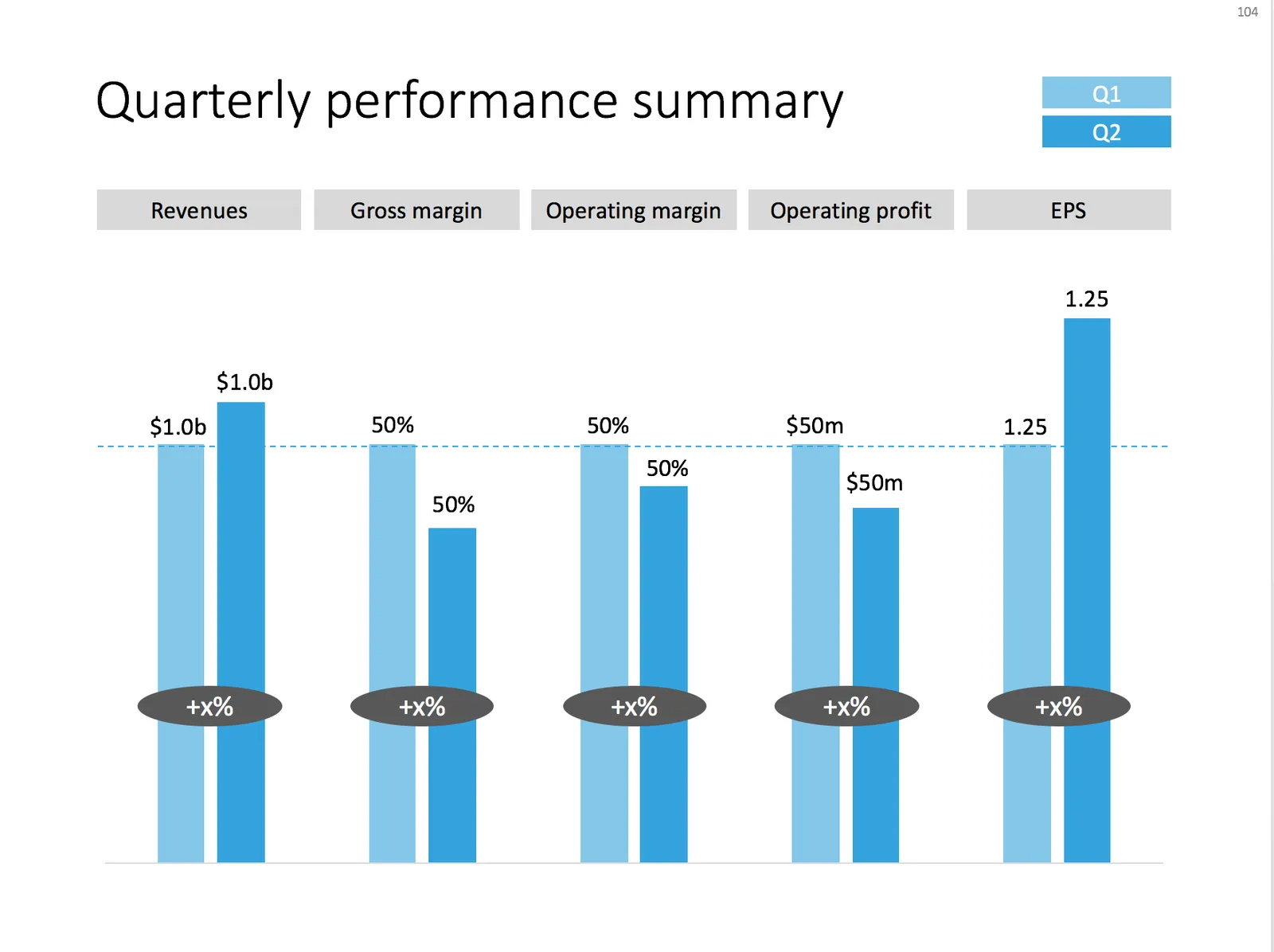
I often use the slide below in quarterly investor presentations for large corporates. How to give a quick overview of the key financials in one chart?

 A chart with an overview of the main financial indicators of the last quarter

A chart with an overview of the main financial indicators of the last quarter

This chart is an example of why often a “manual” chart is much more powerful than a simple copy and paste from Excel:

  • The chart contains values that can differ vastly in range: sales can be 100s of billions of dollars, EPS can be less than a dollar. Margins are percentages, not dollars.
  • Despite this, I forced the Q1 column of each of these values to be the same. In the underlying spreadsheet, they will all say “100”. The other values are calculated as a relative value compared to this 100. To accentuate this in the chart, I connected the left columns with a dotted line.
  • As a result, all labels in the chart need to be filled out by hand, the same for the growth bubbles which I placed over the columns (again a bit unusual)

You can download this KPI chart from the template store.

Photo by Sabri Tuzcu on Unsplash

·Concepts

How to make organization charts in PowerPoint

I added the first organization chart to the template store. It is hard to design a generic template for organizations, there are so many different permutations possible. This is the reason they are still hard to create in my presentation design app, and this is probably also the reason that it is tricky to create beautiful organization diagrams from simply copying pasting a pre-fab template. Let’s give it a try.

Here is the process I usually go through when designing an org chart:

  1. Make a sketch on paper, and reshuffle, re-juggle existing PowerPoint organigrams. These are made by HR people, not by designers. Often you can rearrange objects in such a way that you get a much nicer composition without changing hierarchies and relationships between people and departments
  2. Find out the horizontal layer that has most boxes in it, this will determine the size of the horizontal grid. Find the person with the longest name / role title, which will give you a clue about the maximum font size you can use.
  3. Put this layer in, and add all organization elements relevant to this layer.
  4. Make sure every object is perfectly aligned, and start putting in the PowerPoint connectors. (You will immediately see when you made a small alignment glitch, the connectors will not fit nicely)
  5. Now that the whole structure is in in place it is time to put in names and roles, and if required the FTE count of the various units (the small black bubbles in my example).
  6. Take a step back and look at the whole structure to see whether there are opportunities to use color to make things clearer.
  7. You got your reference slide was all the info about all the people in the right places, the final step is to think what your specific slide actually really needs to say: our organization is big, or organization is flat, our organization mirrors our customer segmentation, everyone in the organization is over-stretched, our organization is basically 3 silos. Start deleting, adding, coloring things just to make that point.
Continue reading →
·Concepts

A multi-dimensional comparison

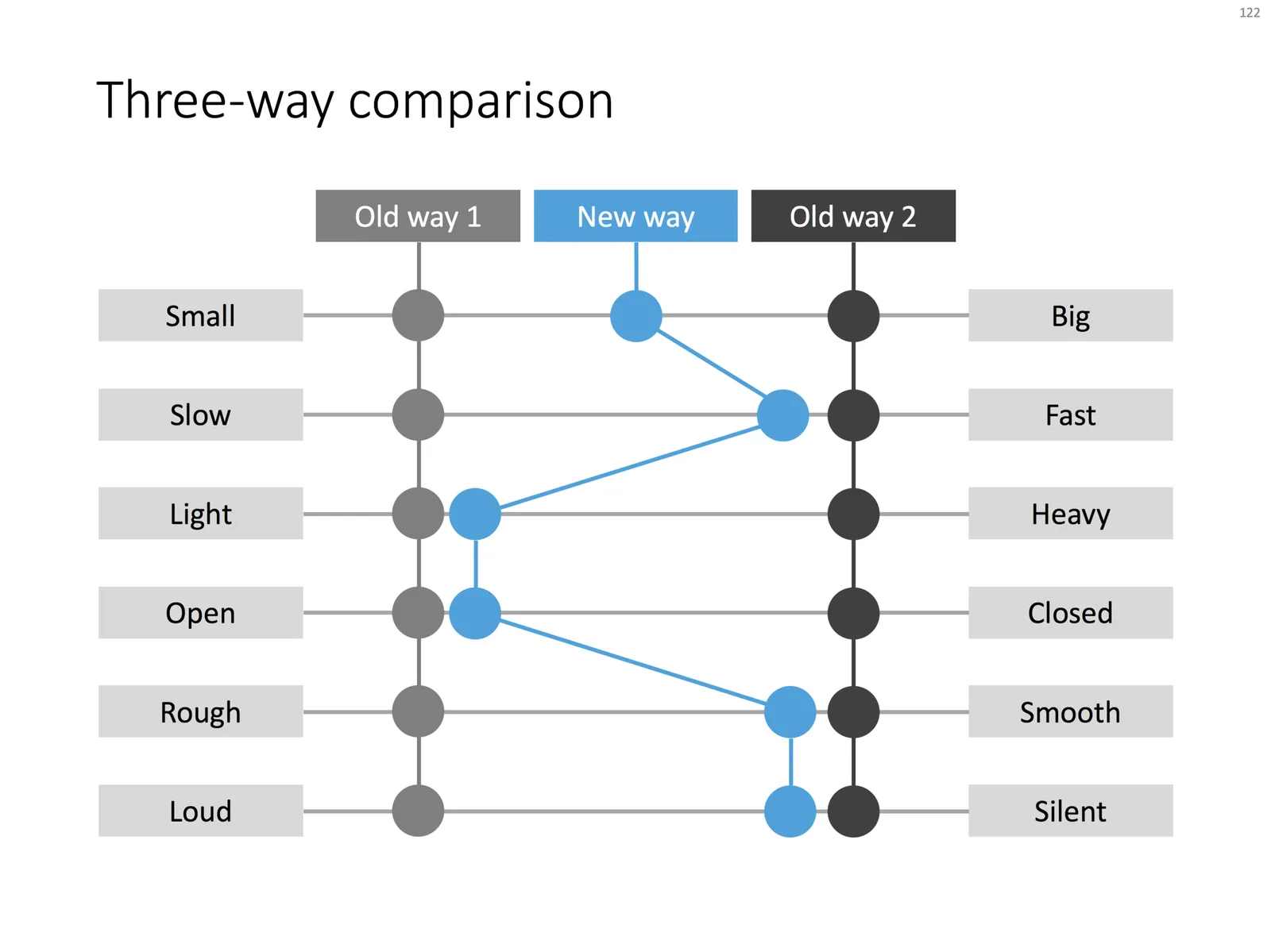
This chart can be your weapon of choice when you need to visualise a complex comparison: multiple options, multiple dimensions, and subtle differentiations (beyond “yes” or “no”). You can position the balls anywhere in between the extremes. When using the slide for your specific situation, it might have to go through a number of iterations. Choose the order of the dimensions in such as way, that the lest complicated line pattern emerges.

Feel free to copy the design, or download the completed slide from the SlideMagic store.

·Concepts

Some decision charts

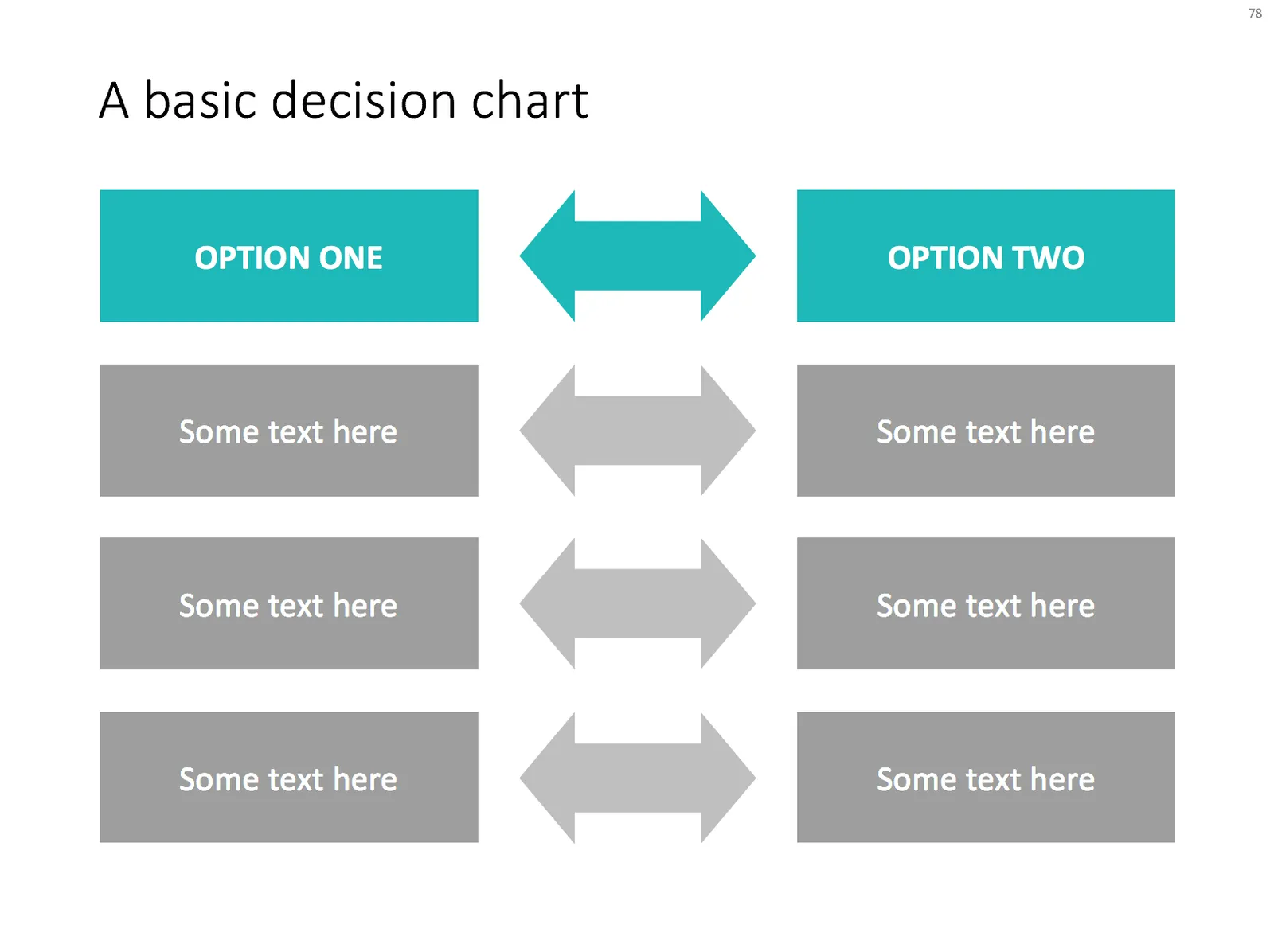
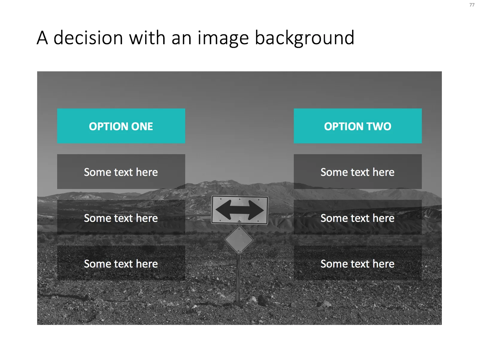
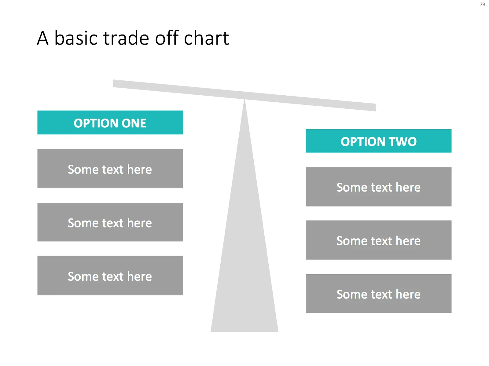
Simple charts are often the best. I added a few slides to visualise a decision or a trade off the store: simple boxes, the same boxes over an image background, and a minimalist scale. With the latter, it is not the objective to make a photo realistic rendering of a scale, but rather give a subtle visual hint of which arguments win.

Feel free to copy the design, or download them from the template store