SlideMagic Blog

Frequent updates about all things presentations since 2008. Subscribe to never miss a post.

RSS
all posts

Category Templates

·Templates

Board deck templates

Tel Aviv VC TLV Partners has updated their funding playbook with a set of PowerPoint and Excel templates to prepare a Board presentation. Board meetings should be productive, and preparing for them should be as efficient as possible (there are other things that a startup needs to do). You can save time by investing less in graphical polishing, and set up smart links between Excel and PowerPoint to copy data across. Maybe you will find these templates useful.

I was not involved in the preparation of these documents.

Photo by Startaê Team on Unsplash

·Templates

Stress-testing a new corporate PowerPoint template

The PowerPoint template is usually an after-thought in a corporate brand image project. Business cards, letterheads, envelopes, are considered more important than the look & feel of almost any document that is exchanged among employees and external investors, clients, etc.

As a result, you will find the PowerPoint template guidelines at the back of the brand book, written in language that is aimed at a print designer, it uses non-standard fonts, and its programming was a copy paste from Adobe InDesign.

Here are some things you can do to stress-test a suggested PowerPoint template that is handed to you by your graphic design agency:

  • Click view, slide master, and see whether it contains dozens of layout slides that are leftovers from Microsoft’s default master, ask why you need them
  • Check the file size of an empty presentation, any huge image hiding in the master?
  • Copy past an old presentation into the new master, see what happens. How much time do your employees have to spend fixing things?
  • Try an empty text box and an empty shape: what are the standard colours, standard fonts? Do the bullet points look decent, or do they come in weird shapes and/or colours
  • Are there any random guidelines all over the slide that no one needs?
  • Open the presentation on your children’s computer, how does the template look? Especially the fonts
  • Create some bar and column charts. Are the colours and fonts correct?
  • Open the deck on a Mac and see what happens
  • Try writing a big headline, maybe one that runs over 2 lines, are any logos or other slide items getting in the way?
  • Same for a big rectangular table, can you fit it, or is there a logo or other graphic element sitting in the one of the corners that gets covered?
Continue reading →
·Images

Flying through

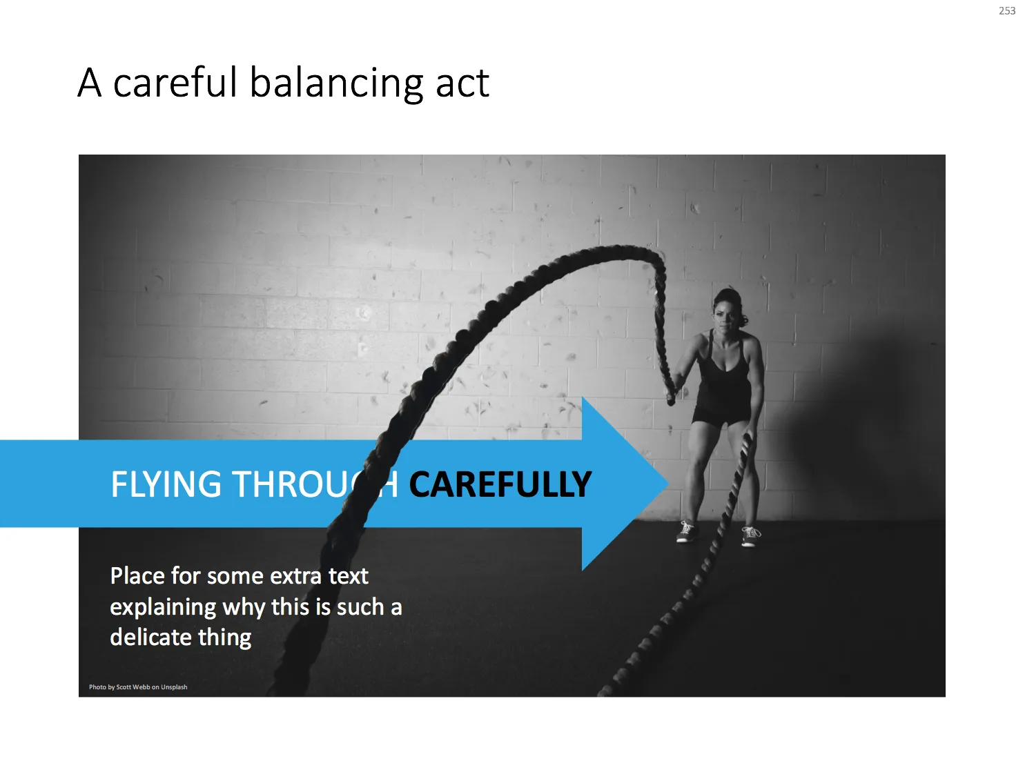
With a bit of Photoshop editing you can create an effect of a PowerPoint shape flying through some loop. I uploaded a new slide to the template store that uses this effect. Over the arrow, I positioned a second layer of the image, but just with a piece of rope with its background isolated. The arrow expanding outside the frame of the image (yes, I look those), adds to the motion feel in the slide.

Click the image to find the slide on the template store, subscribers can download it free of charge.

Cover image by Blake Wheeler on Unsplash

·Templates

Starting to use the store myself

Recently, I have started to use the template store myself for the few bespoke design projects I still do for long standing clients (SlideMagic gave me a really attractive rate :-)). My hard drive is filled with 1000s of slides and still it is difficult to find a nice clean layout to use as a basis for slide number 1001.

Up until a few weeks ago, I started every slide pretty much from scratch, I have gotten pretty fast in setting up yet another 4x5 table grid. But even I can’t beat search the store for “table” and re-download that slide again and hit the ground running.

I am continue to monitor which slides people decide to buy, and which slides are downloaded by subscribers. Many subscribers download a lot of slides right after they made the purchase, and then don’t return for a couple of weeks. Initial downloads include slides that you can only use in very specific situations, like these sheep. They hardly ever download the same slide 2x. There could be 2 possible explanations:

  • Less likely: after that $99 annual subscription, you better make sure you get what you paid for, maybe the store will stop running somehow before the 12 months are up.
  • More likely: we have built up the habit of mining through old decks, and recycling slides into a new presentation.

As a designer who now uses its own store, I would encourage you to think Netflix, iStock, Spotify: your slides will always be there, and search is there to help you find the slide you need at the moment (and nothing else). Change your design process:

Continue reading →
·Concepts

Sensitivity analysis in PowerPoint

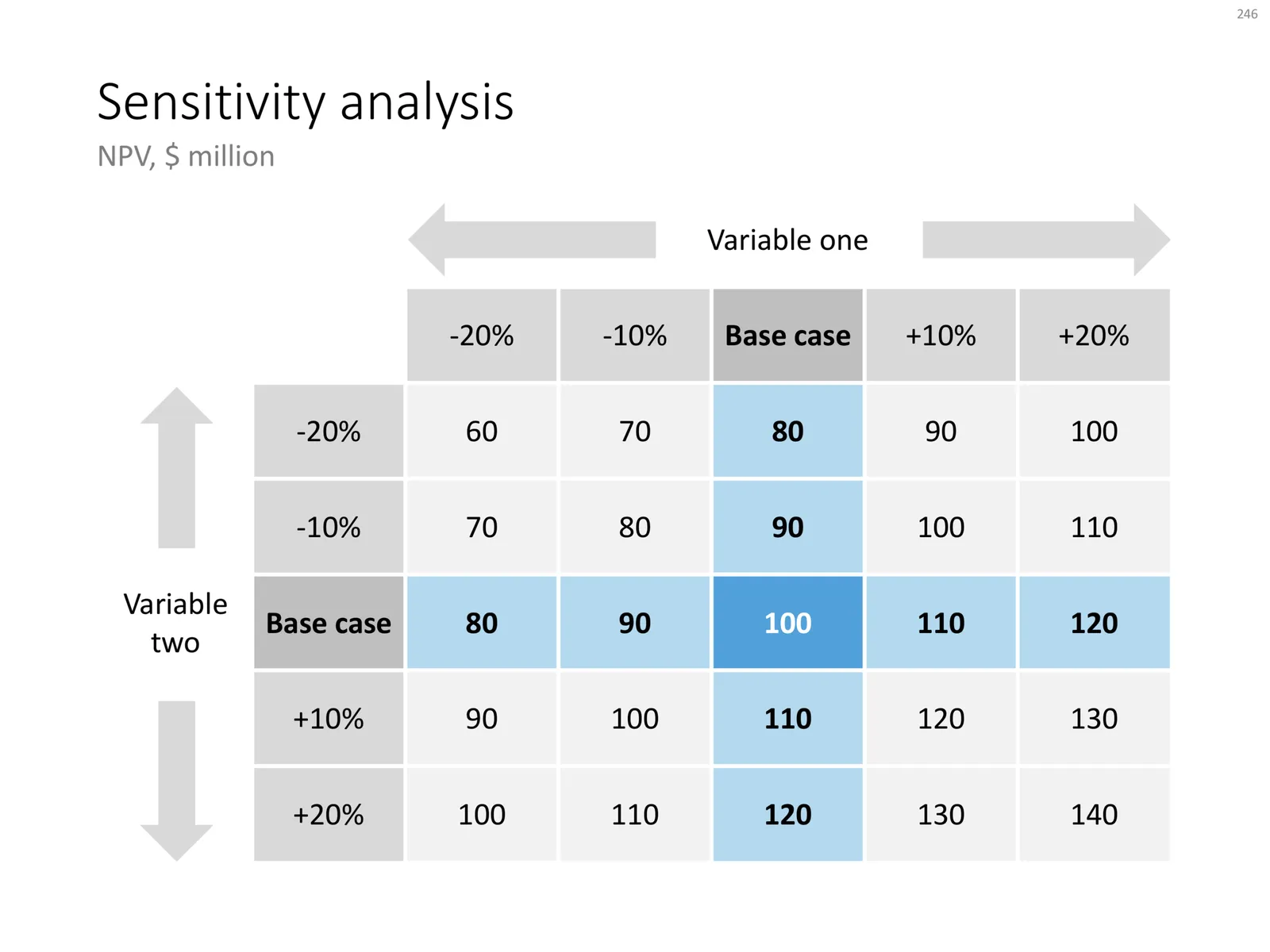
Today, I am adding a simple table to the store to show the sensitivity of an analysis. Each cell in the table shows an outcome of an analysis with a slight variation on 2 critical input variables. I used this type of a slide a lot in discounted cash flow valuation models, where assumptions about discount rates and assumed perpetual growth could make a significant impact on the outcome of your analysis.

The base case scenario is put very prominently in the centre of the table, it is the anchor for the viewer from which to start studying the other scenarios. I prefer making these type of charts manually, and not via a blanket copy-paste out of an Excel sheet. In that way, you have to think about whether each cell in the table is meaningful, and you can make sure that the data is formatted and rounded in the best way.

You can download this sensitivity analysis from the store, subscribers can do so free of charge.

Cover image by Markus Spiske on Unsplash

·Investor presentation

Quick reformat of the YCombinator Seed Deck Template (free)

The application deadline for the next YCombinator is coming up and the incubator posted a suggested seed-stage investor pitch deck template. I quickly ran the template through a make over process using templates available in my store. The resulting pitch deck template can be downloaded free of charge.

Some comments:

  • This is a seed stage pitch deck for an investor which has very specific opinions/requirements about sourcing investments: early stage, seed stage businesses are extremely fluid and change/pivot so many times that there is little point in long-winded elaborations, given the volatility of these extremely early stage businesses, the team is the biggest indicator whether there is a chance that the company will be successful.
  • YCombinator is proud that they can see through fancy-looking decks, you probably even get points for not wasting time on PowerPoint slides, and instead focusing your efforts on the company (pretty much the philosophy behind SlideMagic). This might not work with all investors (hence the slide upgrade in look & feel in my remake).
  • The big selling point in this deck is obviously the placeholder for traction and growth, not many early stage companies will be able to produce the numbers for that “hockey stick” (yet).

All in all, these are good guidelines for crafting a pitch deck for a highly knowledgeable investor. I would up the graphical finish just a notch to make it look more pleasing, without overdoing it. That’s what my template tried to do.

Cover image by Evan Kirby on Unsplash

·Concepts

Risk matrix in PowerPoint

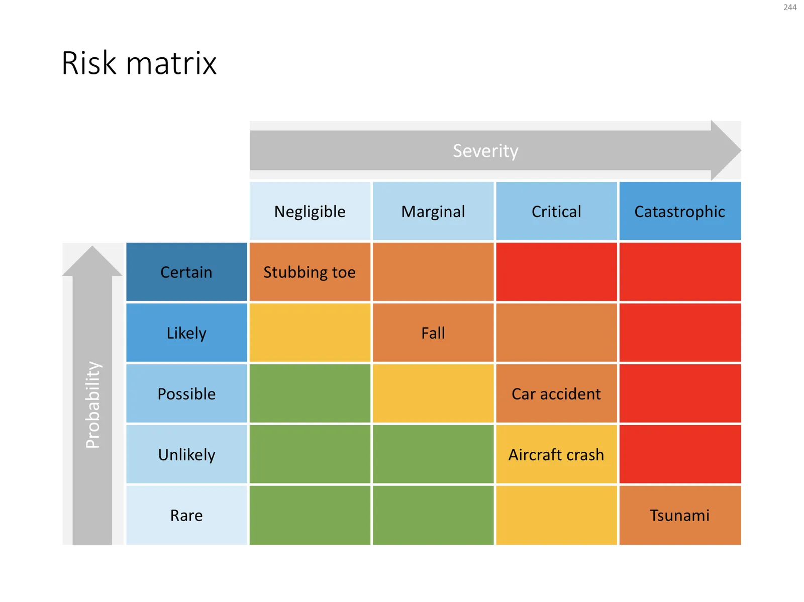
I am continuing to tick off the standard presentation frameworks in the store, yesterday I added a PowerPoint template for a risk matrix. The matrix has 2 axes: one for the probability that a disaster happens, the other one how severe it would be if it were to happen.

The matrix is designed in true SlideMagic style: not very fancy, but highly symmetrical, usable, and adaptable to your everyday presentations. You can download the slide here, subscribers can do so free of charge. Feel free to adjust the axis titles, labels, or dim the bright traffic light style colours to your taste and needs.

Cover image by JC Dela Cuesta on Unsplash

·Concepts

A prism that shows what's inside

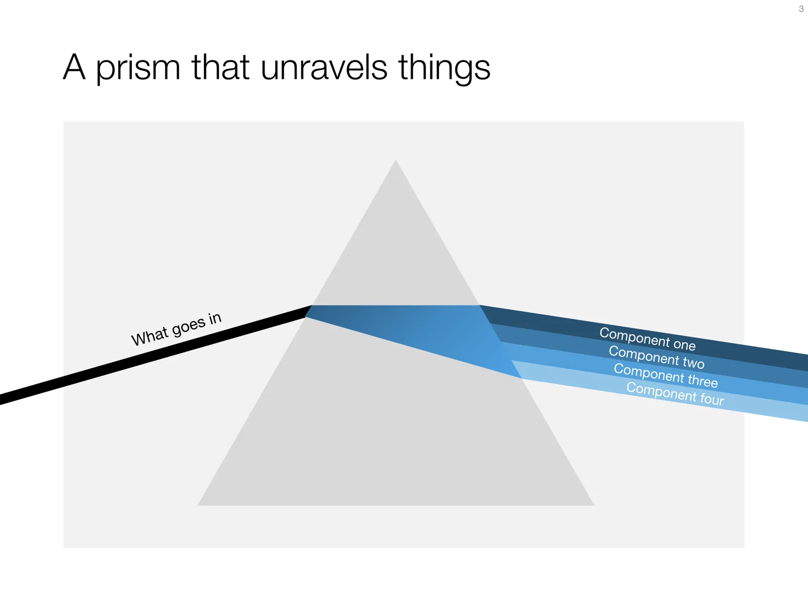
I have used the prism visual metaphor a few times in my client’s presentations to show how rich, intricate, subtle components are present in a service or product that might not be apparent from the outside. Below is an attempt at a minimalist pyramid in PowerPoint (roughly modelled based on the cover of that Pink Floyd album).

I simplified the laws of physics here and there, the tricky bit was to get the blue shape inside the triangle right. I added the slide to the template store yesterday, you can find it ready for download here, and subscribers can do so free of charge.

Cover image via WikiPedia

·PowerPoint

How to present to the CEO

I recently answered this question on Quora about presenting to your own CEO. I think the “what if you had to present a prototype of the iPad to Steve Jobs” is a good mind set. Your presentation should be very good, but a different kind of good than a deck for an external audience. Very clear, brief, and action oriented. (Click this link if the Quora embed is not visible)

Cover image by Farrel Nobel on Unsplash

·Concepts

Puzzle pieces in PowerPoint

Although you could consider them a presentation cliché, puzzles can work really well in a presentation:

  • Show how things fit beautifully
  • Show how your are missing (hopefully just one) critical piece
  • Show that you finally managed to plug that last gap

Puzzle shapes can also work great when you use them in combination with images. You can go back to this blog post about making Photoshop-like image cut outs in PowerPoint.

Stock image sites are flooded with millions of puzzle piece designs, but they are not very practical for the average PowerPoint designer (especially late at night working for tomorrow’s deadline). Almost all these puzzles pieces are vector objects or images that are impossible to edit in PowerPoint. Moreover, all these puzzle pieces have wildly irregular shapes that make them hard to fit in your slide composition that requires exactly nine of them.

ThisPowerPoint puzzle slide solves the problem for you. The pieces inside are fully editable PowerPoint shapes, you can change their colour, you can put text in them, you can reconfigure and piece them together as you see fit. Yo’u can download the finished slide by clicking the image (An Apple Keynote version is available as well).
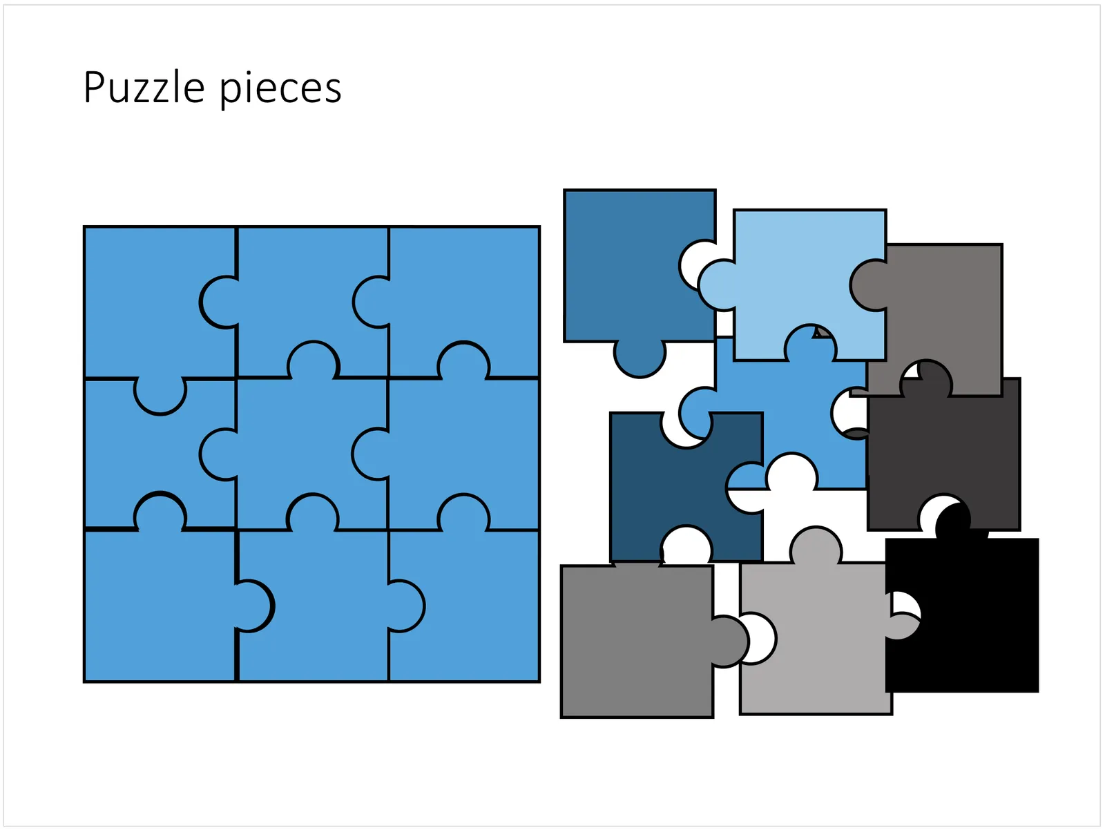
You can try to create the pieces yourself if you want, I used simple square shapes and circles, either joining or subtracting the shapes. Circles and squares might not be the most realistic shapes, but they are very practical when have to piece things together. There is a little bit of math homework to do to determine which type of puzzle shapes you actually need, and which ones you can create by rotating existing pieces.