SlideMagic Blog

Frequent updates about all things presentations since 2008. Subscribe to never miss a post.

RSS
all posts

Category Presentation

·Colors

New startup - do you still need to bother with a logo?
I encounter this situation often when designing fund raising presentations for new startups pitching to VCs. “Oops, what about our logo?”. My answer is usually don’t bother, instead invest time to find a suitable color scheme.

  • Getting a good logo designed is expensive

  • It takes time for logos to become brand icons. First you need a brand story/experience, only then can customers connect it with your symbol. Read Seth Godin’s post (great quote “the iPod didn’t need a logo”).

  • Logos are not important for the look and feel of a presentation, colors are. If a client insist, I will put them in 8pt at the right bottom of the page. Think about what drove logo design in the last century: they needed to fit on a building, a letter head, a form, a black and white fax. Because the user could not manipulate colors, fonts, images like we can today, it was the only “interesting” graphic on an otherwise boring piece of paper without an identity. These times are over.

Forget about logos if you are short of time, or short of cash. Pick some nice colors instead. Worry about your logo later.
·Design

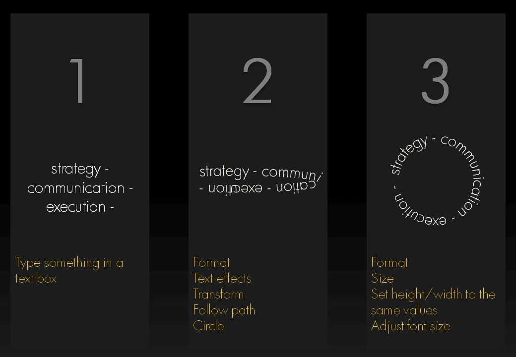
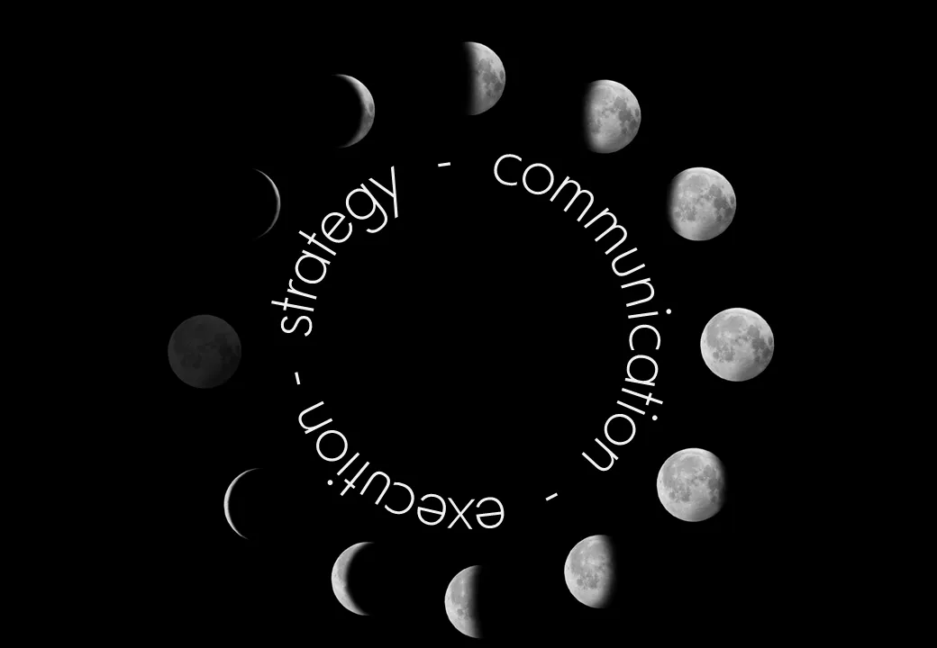
Putting PowerPoint text in a perfect circle

I am revamping my own introduction presentation and needed to align text according to a circle. Untill now, I used to improvise to fit text in a circle. There is a clean and simple way to do this. Click on the image for a bigger picture.

·Design

3D font city - 5 years from now in PowerPoint?

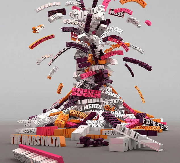
Graphics design has always been ahead of mainstream PowerPoint in terms of graphical abilities (colors, images, drop shadows, etc.). On the front page of Digg Design today an interesting collection of 3D typography put in one place by Naldz Graphics .

A taste of things to come! Wouldn’t it be interesting to navigate around in a 3D city of buildings made of words to support your presentation?

(Image by Serial Cut, advertising for the Zune marketplace)

·Design

Big PowerPoint fonts that don't scream

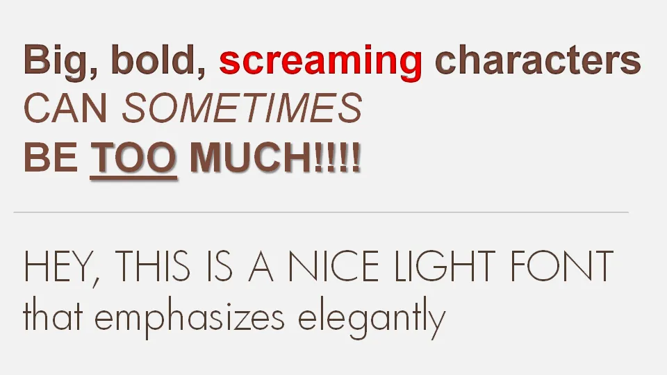
If a message is important there is a temptation to use a “screaming” typography: bold, italic, underline, big fonts in bright red. Resist it. Underlining should always be avoided. Italics almost always. And I am not a big fan of heavy bold characters either. Experiment with a lighter font, such as this Futura Light font that comes with PowerPoint 2007. (Don’t forget to save it with your presentation to prevent catastrophes when presenting on another computer).

·Data visualization

Data visualizations - how bad is this recession compared to previous ones?

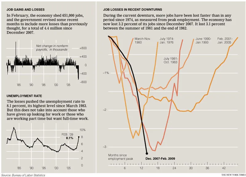
The only up side of economic turmoil is probably that there is plenty of data available for interesting visualizations. The New York Times posted this chart: (click for a larger picture)

I like it because the designer gave some thought about what metric to put in. He/she could have shown a times series of GDP growth, absolute unemployment, or unemployment rate to name just a few. That’s why I do not like these automated PowerPoint chart wizards, it makes you skip the step of actually thinking about what metric really makes your point. (And more importantly, what are the 15 metrics you can get rid of without changing anything to the message of your slide).

Via Junk Charts, an excellent source of data visualization discussions. For more frequent updates about the financial crisis (including many data visualizations) follow Paul Kedrosky.

·Design

Create your own composite images in PowerPoint

It is easy to create your own composite images in PowerPoint:

  1. Select a stock image isolated on a white background
  2. Make the white background transparent
  3. Select image, go in format, picture effects, shadows, interior shadow to make the edges smoother
  4. Paste this image on another image with the background of your choice

·Design

Godin on presenting: give love / get respect

See his recent blog post, great presenters should have:

  1. Respect (from the audience)
  2. Love (to the audience) The only thing I want to add is that I think a speaker can get respect during a presentation, he/she does not necessarily have to have it beforehand (although it helps).
·3D

How to make a 3D translucent ball in PowerPoint

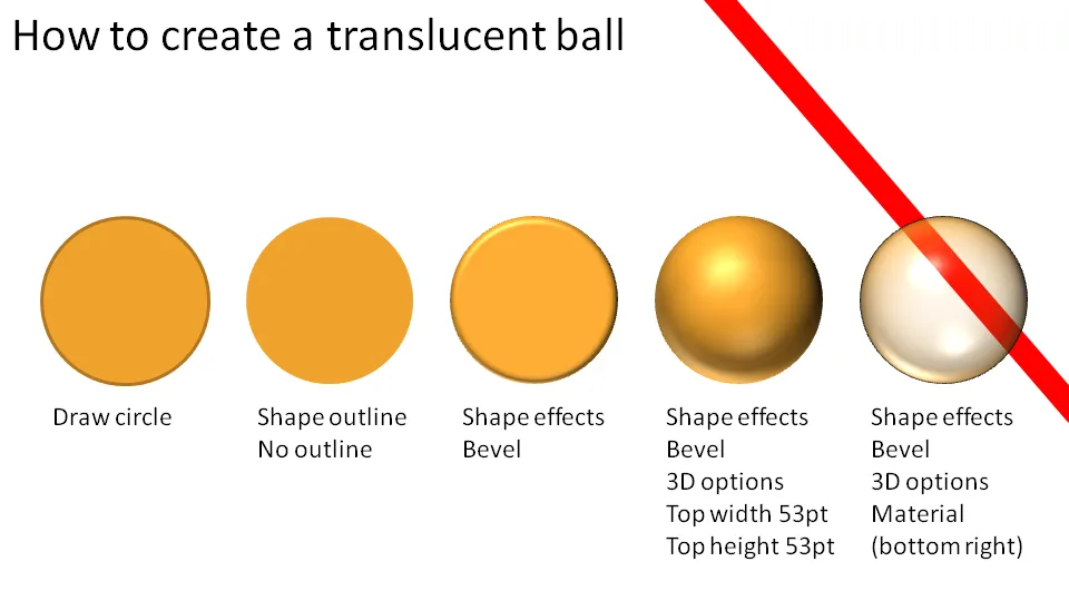
Here is how you make 3D balls used in these images, or these images. Click on the chart for a larger picture.

You should experiment with the “top height” and “top width” to find a value that best fits the size of the object you are working on.

·Design

Why not zoom those images

Stock image sites are trying to convince you to buy higher resolution (and higher price) versions of the same image, I usually don’t buy it.

  • In case you need to print it on a street sign (not required for me)
  • Because you want the very best looking PPT slide (no real difference + big file size)

There is a reason however that might make me change my mind. The same argument holds when buying digital cameras with ever increasing mega pixel capabilities: your ability to zoom.

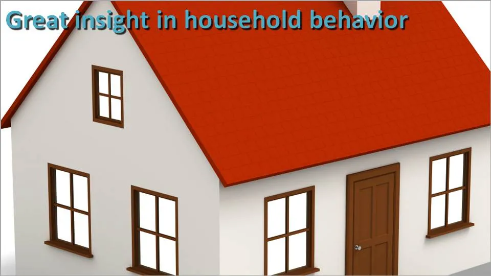
Try to experiment with zooming into stock images (don’t be afraid to create a “bleed”). The result might not look good on your computer monitor, but from a distance it can look refreshing. (Do the slide sorter view test).

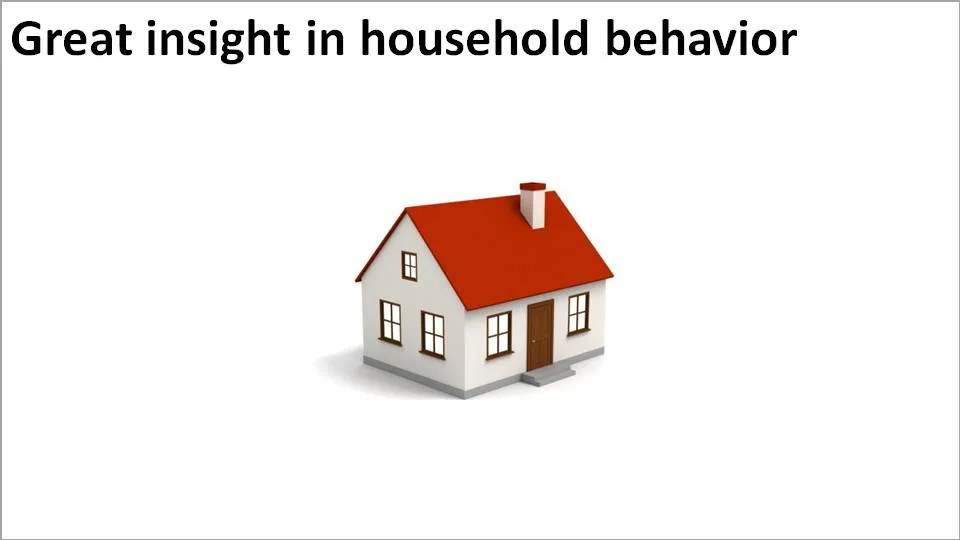
In the example above, both approaches work. A tiny image on a big white background, or an extreme zoom. The middle ground (as usual) is boring.

·Advertising

PowerPoint lessons from a toilet paper ad

I am learning a lot from print advertising. I am learning a lot from the adgoodness blog.

Especially in fund raising presentations I design for startups that are going to pitch to potential investors, I am spending a lot of time/effort in finding that one image or visual concept that really nails down the idea in one big bang. Almost to the extent that the following slides are not required anymore.

Consumer marketing is all about focus on one single and clear consumer benefit. Here is a(nother) great example. Food for thought when designing your next presentation.