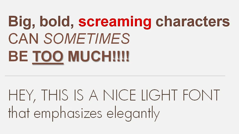
If a message is important there is a temptation to use a “screaming” typography: bold, italic, underline, big fonts in bright red. Resist it. Underlining should always be avoided. Italics almost always. And I am not a big fan of heavy bold characters either. Experiment with a lighter font, such as this Futura Light font that comes with PowerPoint 2007. (Don’t forget to save it with your presentation to prevent catastrophes when presenting on another computer).