Exception: some conceptual stock images can be useful
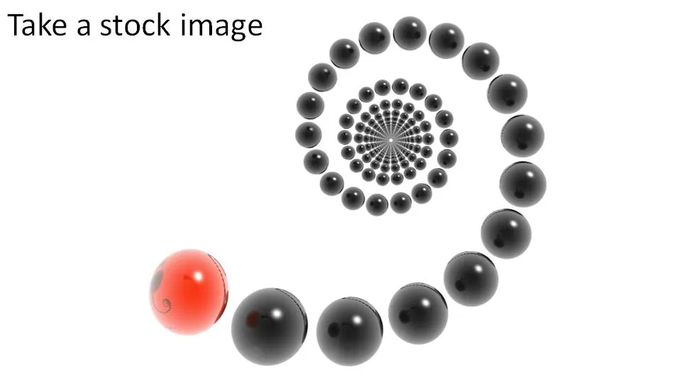
I am not a big fan of conceptual stock images. Compositions you can do yourself. There are exceptions. See the example below.


Frequent updates about all things presentations since 2008. Subscribe to never miss a post.
I am not a big fan of conceptual stock images. Compositions you can do yourself. There are exceptions. See the example below.
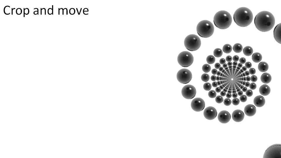
Stretching part of a picture cannot only be used to create white space, you can also let things disappear pretty much like David Copperfield does:

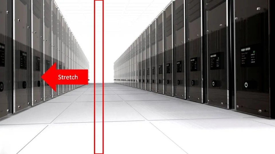
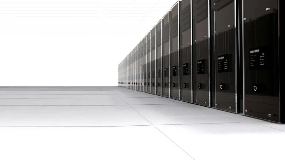
I used this concept to show how a new technology solution of one of my clients can save a lot of server costs. The zapped servers live on in the reflection in their opposite neighbours though…
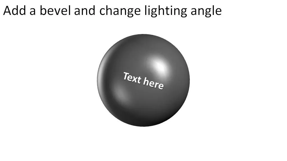
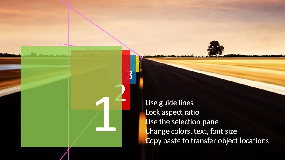
I am continuing to experiment with 3D effects. Here is an alternative idea to visualize a number of obstacles on the road ahead. The last image (click it for a larger picture) contains some explanations on how I did it. If things are not clear feel free to as in the comments.
Does anyone know how to add a smooth moving animation to this, motion paths and re-sizing of objects do not go together?
(Apologies for the image quality as I converted to JPG instead of PNG to improve load times)








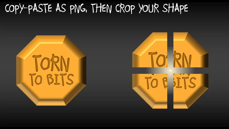
A concept I often use to visualize things that are torn apart by opposing forces in PowerPoint presentations.
Especially for sources in footers I often want to avoid re-typing a complicated title of a document that I found on the web. Copy-paste of the text also copies some of the text formating. Solution: copy the text, paste it into “Note pad” (the standard text editing utility that comes with Windows), select the text again and paste it into a PPT text box. I would be interested if other people have faster solutions for this.
UPDATE: Remy got the solution in the comments: copy any text, then select Edit and “Paste Special” and select unformatted text. Thank you!
UPDATE 2: Glen Turpin recommends PureText (see the comments).Thank you!
For when you want to make the point that it is important to pay attention to the small print, or make sure that you did not skip over important hidden information, you can use this concept.
In PowerPoint 2007:
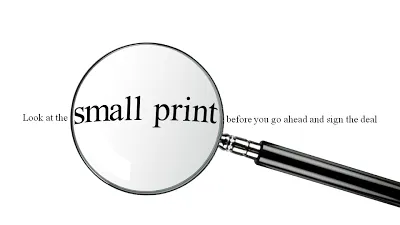
UPDATE: I have added a slide with this concept in the SlideMagic template store, you can download it here.
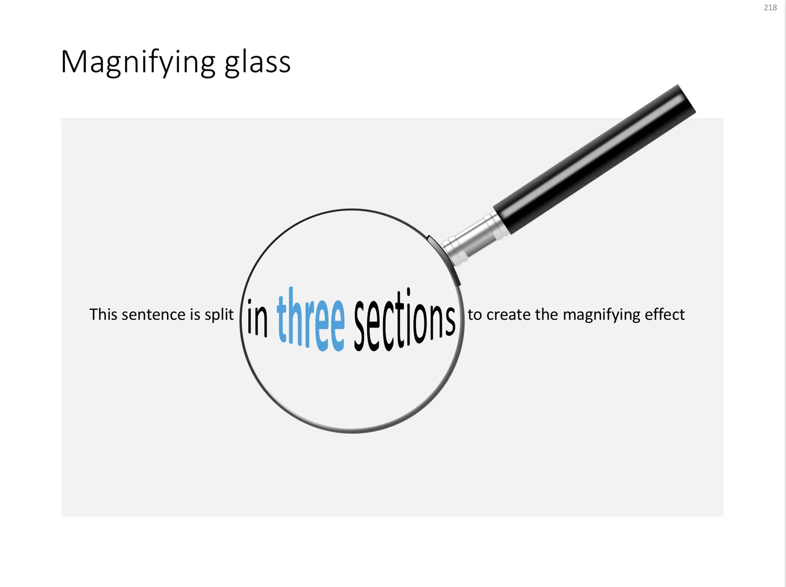
A magnifying glass in PowerPoint
Photo by mari lezhava on Unsplash
Many stock images lack sufficient white space for text. Stretching an image distorts the proportions.
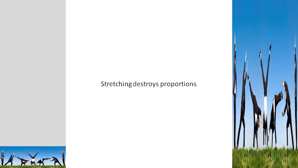
A trick to get around this problem:
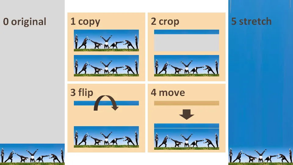
I am creating a presentation for a client today that provides a very simple solution for a very complex problem. While moving around the letters in the words I saw an usual pattern:

I need to find more of these.
Add Letters is a site full with image generators. I noticed that they’ve added a few new images. My personal favorites are those related to The Simpsons.
Don’t fill up your slides to the last square inch. Instead: leave white space (or negative space). Have the courage to write nothing, take a visual break. This ad for a ski resort takes it to the extreme, but makes its point brilliantly (large image here).

Via Ads of the World.